You ready for some more Doctor Who papercrafting fun? First, a little background.
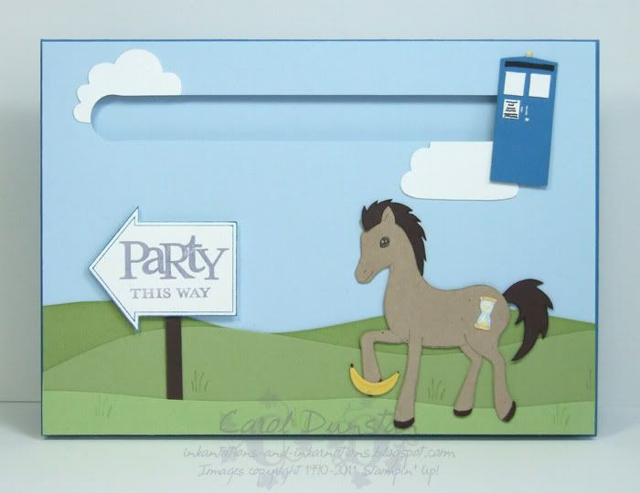
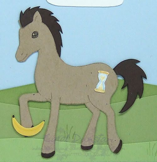
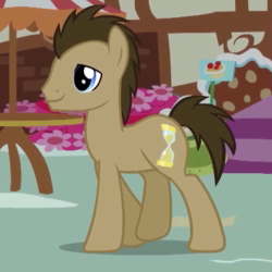
This is Doctor Whooves. He was an unnamed background character in the latest version of My Little Pony. That is, until fans noticed his hour-glass cutie mark and spikey brown hair and decided he was The Doctor in pony form (more precisely, the 10th Doctor). Now those involved in making the show even refer to him as Doctor Whooves apparently! Anyway, Shaelea loves horses and Doctor Who so I decided to combine the two for her birthday card.
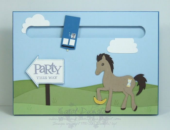
I came up with a spinner card. Originally I wanted the TARDIS spinning through space, but that made it hard to include the pony. So, after landing the TARDIS, the Doctor has set out for Shaelea's party, and the TARDIS decided it wanted to go too.
Normally I would use a 5c piece behind the spinning item, however I made the TARDIS too skinny for that and had to resort to a magnet. The magnet was much chunkier so I had to have two layers Dimensionals so the magnet could spin freely. It's a good thing this card isn't going through the post!
The foreground grass is Certainly Celery, with the other two layers being Pear Pizzazz. The back layer is sponged lightly with Pear Pizzazz ink to make it a little darker. Another bit of tweaking on this card is with the sign. The Party this Way stamp actually has the arrow pointing to the right, so I inked the arrow with the Pacific Point marker (contemplating a name change and calling it Pacific Police Box or something ), stamped that then cleaned the stamp, inked the wrods with the Wisteria Wonder marker and used the Stamp-a-ma-jig to line it up and stamp inside the arrow.
The good Doctor was inked using the Crumb Cake marker, so I could omit the mane, and stamped on Crumb Cake cardstock. I drew in the neckline with the fine writing end of the marker then cut him out. I hand cut the mane and tail from Early Espresso cardstock then went around the edges with the fine writing tip of the Early Espresso marker so they too were outlined. The hour-glass was hand drawn on Whisper White cardstock using So Saffron and Bashful Blue markers.
And don't forget: Always take a banana to a party
Most supplies by Stampin' Up!
Cardstock: Pacific Point, Bashful Blue, Certainly Celery, Pear Pizzazz, Whisper White, Crumb Cake, Early Espresso, Daffodil DelightStamp sets: Pony Party, Party This Way
Inks: Certainly Celery, Pear Pizzazz
Accessories: 1/2" circle punch, Cupcake Builder punch, dauber, Crumb Cake marker, Early Espresso marker, Pacific Point marker, Wisteria Wonder marker, Basic Black marker, So Saffron marker, Bashful Blue marker, Daffodil Delight marker, cutter kit, silver gel pen, Dimensionals
Show watched while creating: North & South
Tuesday, October 18, 2011
Friday, October 14, 2011
It's astounding, I am blogging (and time is fleeting)!
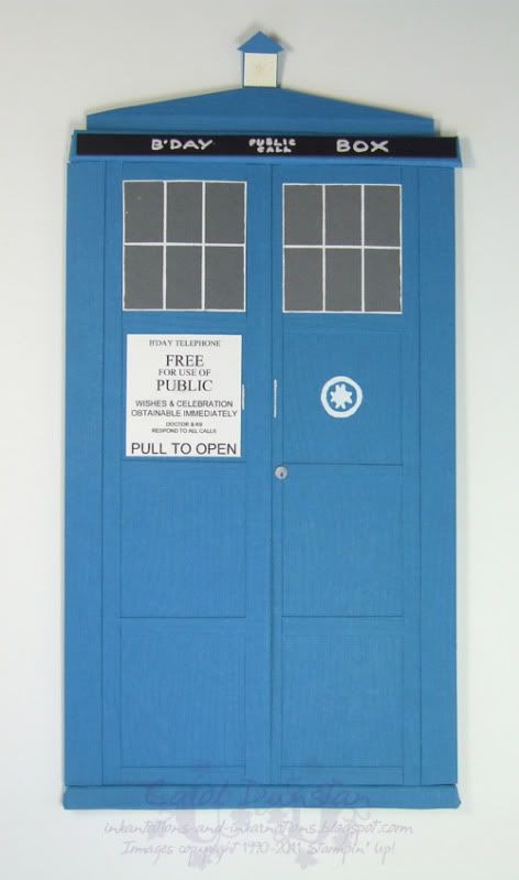
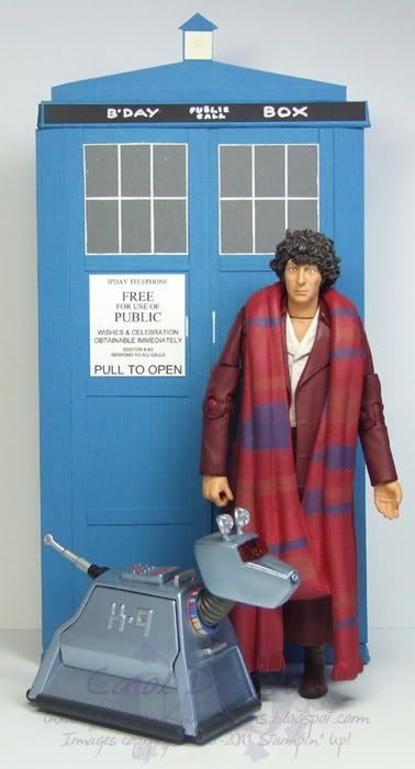
Finally back with a new project to share. This was Tiarna's birthday card this year, and I usually try to make something a little more interesting than your average birthday card when it comes to my kids - inspiration permitting! They have been getting into Doctor Who quite a bit so I decided to try my hand at making the Doctors' TARDIS.
I based my design on the original TARDIS (yes, there has been more than one) as I had better reference pictures for that, but I wanted to incorporate the woodgrain texture that is more prominent on the current TARDIS. I also would have prefered Brilliant Blue for the cardstock (turns out it has a use!) but I didn't have any left so made Pacific Point the new TARDIS Blue. I did make a few other changes such as simplifying the St Johns Ambulance logo, the wording on the phone door sign, the sign across the top, and the windows (the two corner windows in the bottom row on each door should be frosted and the others clear) - I just could not think of a way to pull them off without throwing off other aspects of the construction. The light on top is a bit of a disaster, I kept putting off dealing with it in the hopes a brilliant idea would come to mind but alas that still hasn't happened!
In the above photo you get a better sense of the 3D nature of the card (click on the image to see it full size). I wanted the sign across the top and the base/step at the bottom to be more prominent, and they also help to keep the card shut. They are essentially little boxes that were fiddly to make and attach and are a little worse for wear a month on. The top of the TARDIS slopes back towards the light with Dimensionals along the bottom holding that section up and a tab at the top folding under so it is nearly flush with the back of the card.
And as it turned out, the scale wasn't too bad for the Doctor & K9 action figures she received!
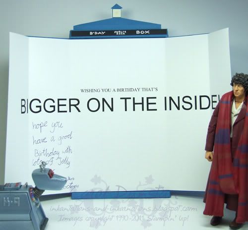
Two things I really wanted to achieve with this card: it had to be gate-fold so the doors opened in the middle as the real TARDIS doors do, and it had to be bigger on the inside as the real TARDIS is. Turned out that was probably the easiest bit of the card!
The card was an absolute hit, which I was pleased about as you can probably imagine. Only thing is I have to come up with something else for the next child's birthday in less than a weeks time... meep!
Most supplies by Stampin' Up!
Cardstock: Pacific Point, Basic Gray, Whisper White, Basic Black, brushed silverStamps: Woodgrain
Inks: Tempting Turquoise, So Saffron
Accessories: White gel pen, dauber, Crop-o-dile, silver gel pen, biro
Subscribe to:
Posts (Atom)