
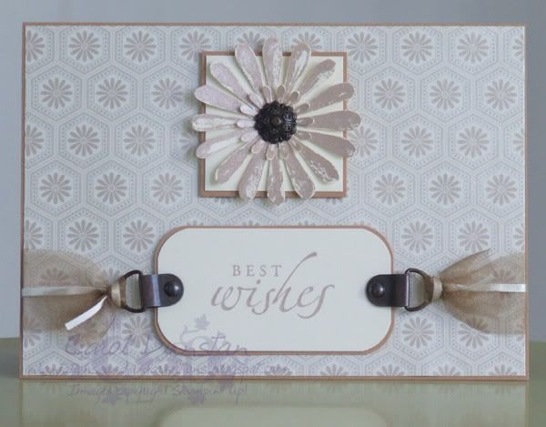
 Not sure who the manufacturer of this paper is. As soon as I pulled it out again I thought that Brilliance Pearlescent Beige ink was a perfect match for it, and it was! I've used Very Vanilla and Creamy Caramel cardstock, some Aged Copper Hodge Podge, a Making Memories brad for the flower centre, and some organza and skinny satin ribbon from my stash (aka I've got no idea where I bought them). The flowers are from the Looks Like Spring set, sentiment from Sincere Salutations.
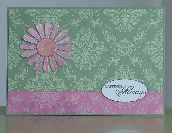 I'm pretty sure these papers are made by Christina Rei. I had used some of the pink piece in the past and knew that Brilliance Pearlescent Orchid ink was a good match for the colour. For the green I found that Mellow Moss was a pretty good match. Cardbase is Mellow Moss, the Looks Like Spring flower has been stamped in the Orchid ink on Blush Blossom cardstock, the sentiment (from the SAB set Happy Harmony) has been stamped in Always Artichoke on Whisper White, punched out with the large oval punch, then the edge rolled across the Artichoke inkpad. For the flower centre I punched out a 3/4" circle from a scrap of the pink paper and coated it in 3D Lacquer (like Crystal Effects or Dimensional Magic... a very old bottle that I wasn't sure would still be ok to work with!).
It was a little odd to make some cards without a lot of stamping, but those papers make up for it I think ;-D
No comments:
Post a Comment