
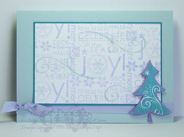
 Here's the last card I started at my friends' place and had to finish off at home - I'd forgotten to take my Taken With Teal inkpad! The inspiration for this card came from a discussion on a demo group I am in, about our favourite colour combinations. I love playing with colour, so I have a lot of favourite colour combinations, but I think these sorts of shades are my favourites at the moment. I did decide to alter it slightly from what I have been using lately and opted for Taken with Teal instead of Blue Bayou. I also went with one of my fave Christmas sets of all time, Season of Joy. This set is from the current Spring Mini, which I have mentioned finishes on Sunday, so you don't have long to order products from it. While I haven't had this set for that long compared to some of my other fave Christmas sets, I have loved creating so many different and easy cards with it, it's such a fabulously versatile set.
To answer a few questions that people have recently asked in comments, the silver lines behind the half pearls in my first KW#32 card is indeed a stamp from the Merry Merry set, which you can probably see best in this card, where I have accented some of the decorative parts of the stamp by putting rhinestone brads over them.
There was also a question about the set up I have for taking photos. Honestly, it's nothing flash at all and I really don't think my photos are that great! I just open up my OTT light, put a couple of sheets of Whisper White under it (one for the "floor" and up the back for the "wall"), and turn my camera to the "close up" setting or "the tulip". The results of this usually aren't what I consider good enough, particuarly on overcast days (and I never take photos at night, even with this set up, they just aren't up to scratch in my opinion). I always touch-up my shots a bit in Photoshop. After a bit of rotation , cropping and reducing the dimensions of the image I always Sharpen it. This helps define any fine lines, the edges of layers etc. I usually also have to brighten the image and increase the contrast a bit - usually it's the whole photo but sometimes I isolate the card itself or just part of it to even out the lighting. Daylight, or artificial lighting that replicates it (like OTT lights, or "daylight bulbs") are essential for accurate colours.
All supplies by Stampin' Up!
Cardstock: Soft Sky, Taken With Teal, Whisper White, Lavender Lace
Stamp Set: Season of Joy
Inks: Almost Amethyst, Soft Sky, Lavender Lace, Taken With Teal
Accessories: Fairytale Ribbon Originals, dimensionals
2 comments:
Oh, i love that colour combo...what a great idea! I think I might have to use that myself :)
Eine sehr schöne Karte. Mir gefällt es sehr gut, dass die Karte schlicht ist und der Tannenbaum das "Tüpfelchen auf dem i" ist.
LG Christina
Post a Comment