
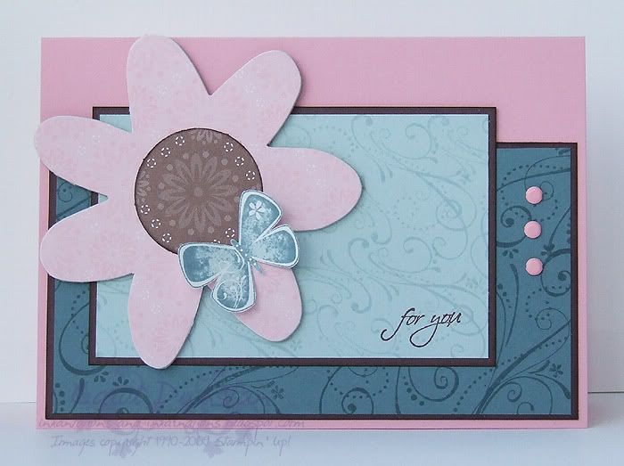
 I'm sharing these cards in reverse order of how I made them. The card above uses completely current SU items, among them are retiring chipboard, Designer Series Paper and two In Colors - Soft Sky and Blue Bayou. I made this one in part so you could see the difference between some of the old and new product, and just how nicely the old and new mix.
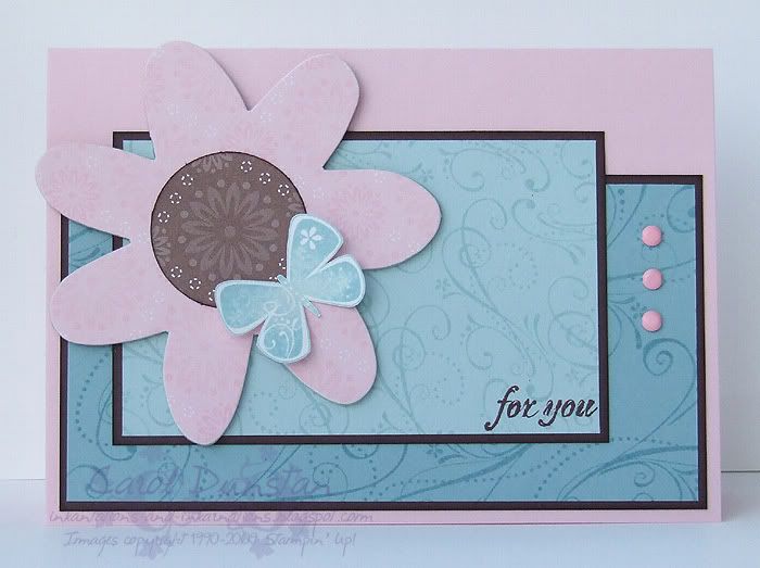 Here's my card as it was intended. Something old is Soft Sky, a retiring In Color; the chipboard flower which is from the retiring Onboard Accents; and the Berry Bliss DSP which is also retiring. Something new is Baja Breeze and Pink Pirouette, forthcoming In Color colours (the sentiment is also from a new set). Something borrowed is the layout, this is from Julee's Mojo Monday challenge. The blue is more for the first card that has Blue Bayou, but Soft Sky, Baja Breeze and Blue Bayou are all in the same vein of greenish blues. If you loved Soft Sky and Blue Bayou I'm sure you'll love Baja Breeze, look how nicely it coordinates!
I also love how Pink Pirouette is so different to Pretty In Pink. You think Pretty In Pink is rather pale until you see it beside Pirouette... I can see myself using the colour a lot. I also think it's rather cool that Pirouette is so close to the base colour of this Berry Bliss paper with Pretty In Pink being the colour of the motifs.
And it's only now that I have thought "I should have put a Pretty In Pink brad in the middle of the flower"! Oh well, I still like both cards and that's two more ready to grab when I am in a hurry!
All supplies by Stampin' Up!
Cardstock: Chocolate Chip, Whisper White, Soft Sky used on both cards. First card also uses Blue Bayou and Pretty In Pink. Second card uses Pink Pirouette and Baja Breeze instead.
Stamp Sets: Priceless, Fresh Cuts
Inks: Chocolate Chip, Soft Sky used on both cards. First card also uses Blue Bayou, second card uses Baja Breeze instead.
Accessories: Berry Bliss DSP, Onboard Accents chipboard, 1 3/8" circle punch, sponge dauber, Soft Subtles brads.
Show watched while creating: Heroes
4 comments:
Very nice card! LOve it! ~Olena~
GORGEOUS -- LOVE the color combination -- so very pretty!! :)
Ohh very pretty. And psst you've been awarded a prize from my blog.
www.kareninks.com go check it out.
Wow, wunderschöne Karte.
En liebe Gruess
Christina
Post a Comment