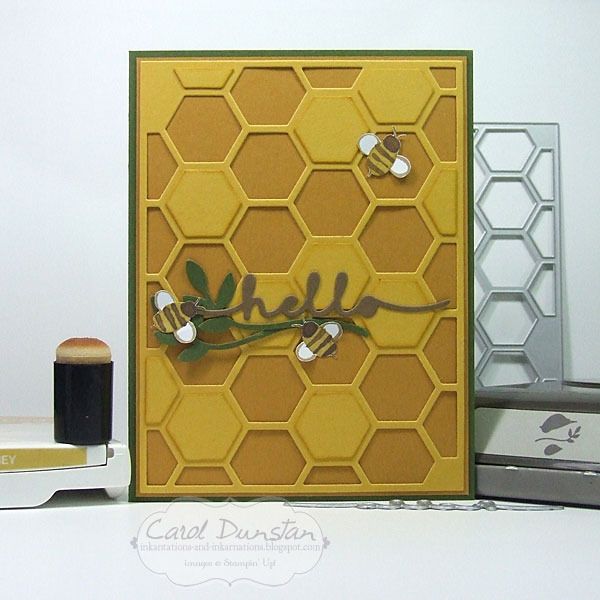
Todays card doesn't focus on a stamp set, but a diecut thinlit. In fact, todays card has no stamping at all!
And back to the more involved cards! Going all-out with the honey/bee references, I ran some Hello Honey cardstock through the Big Shot with the hexagon thinlit. I had a few scraps of the bee paper from the English Garden DSP, so rather than stamp me some bees I cut them out of the paper. I did get a little inky by lightly sponging some Hello Honey ink on the edges of some of the cut out pieces from the hexagon thinlit and layered these in spaces where hexagons weren't cut out in the thinlit.
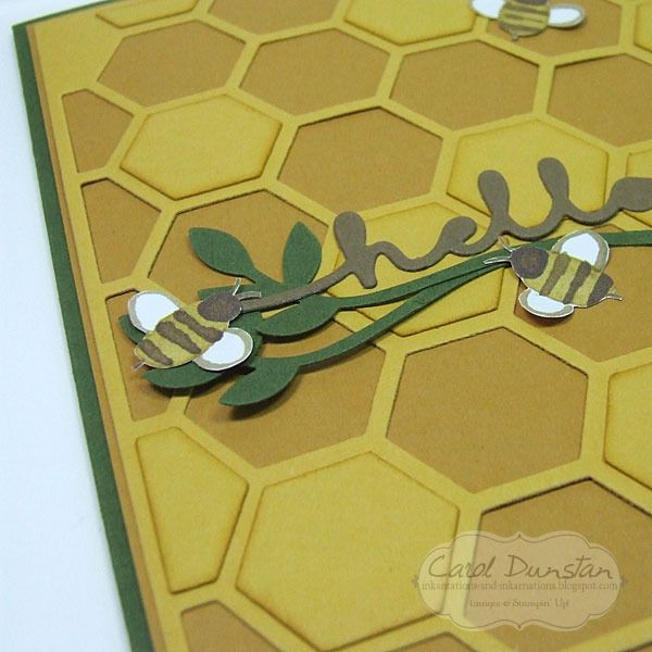
The leafy twigs are from the Bird Builder punch (which I'm still a bit stunned is retiring). I wasn't going to have any layers popped up on dimensionals, so give the card a little more dimension I didn't stick the twigs down flat all over. Just a little glue from the fine tip glue pen where the twigs overlapped, and a mini glue dot under one leaf on each twig to secure them at the other end.The bees are also attached with a mini glue dot, just one under their bodies so their wings can be bent up a little.
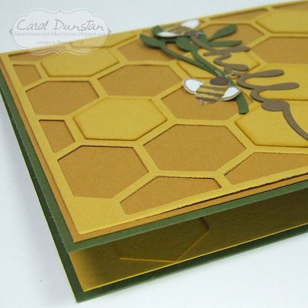
I used a couple of the sponged hexagon shapes inside the card to dress it up a little in there too.
Whenever I am working with yellow and green I find myself thinking of "green & gold" - often Australia's sporting colours - but by minimising the green I think I successfully avoided this card eliciting an "Aussie Aussie Aussie, oi oi oi!" effect.
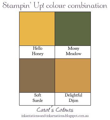
133685 Hello Honey A4 cardstock, 133683 Mossy Meadow A4 cardstock, 138345 Delightful Dijon A4 cardstock, 119982 Soft Suede A4 cardstock, 138440 English Garden DSP, 133643 Hello Honey stamp pad, 132965 Hexagon Hive thinlit die, 138275 Greetings thinlit dies, 117191 Bird Builder punch, 133773 sponge daubers, 138309 Fine-tip glue pen, 103683 mini glue dots
Showing posts with label Hello Honey. Show all posts
Sunday, May 01, 2016
Sunday, January 24, 2016
Honey You're So Sweet
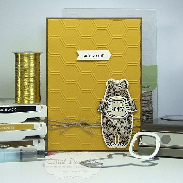
Hello again! I've been a bit quiet again of late, but I'm sure many of you can related... kids off on school holidays, others on holiday from work. Sudden plan changes have really messed with my mojo these holidays, but I've finally managed to finish a card, once again using the Bear Hugs stamp set.
One of the very first ideas I got for this set was putting it with Hello Honey and a honeycomb pattern - there is the embossing folder, pie and punch for a variety of options. What I ended up going for was the embossing folder, I felt the die might have made things a bit too visually busy when I wanted the focus to be on the bear. One of the nifty things the Bear Hugs stamp set and matching dies allow you to do is to stamp on the back of the cardstock so when you fold the arms around you can still see the design. I love that they thought to design the sramps and dies with this in mind.
I think most of this card is straight forward, but you may be wondering how I got the shape the sentiment is stamped on. Well, this is where the hexagon punch came in:
By inserting the cardstock in the back of the punch you can vary how much of the cardstock gets punched. It's a little trick I have used for years and have mentioned before but it's always worth mentioning these things every now and then to jog the memory, let alone for new people who haven't see this before.
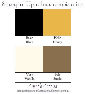
Here are the colours I used...
Bear Hugs clear-mount stamp set & framelits bundle 140823, Soft Suede A4 cardstock 119982, Hello Honey A4 cardstock 133685, Very Vanilla A4 cardstock 106550, Basic Black archival stamp pad, Soft Suede stamp pad 126978, Hello Honey stamp pad 133643, Honeycomb embossing folder 129378, Hexagon punch 130919, Aqua painter 103954, linen thread 104199, gold metallic thread 138401, dimensionals 104430
One of the very first ideas I got for this set was putting it with Hello Honey and a honeycomb pattern - there is the embossing folder, pie and punch for a variety of options. What I ended up going for was the embossing folder, I felt the die might have made things a bit too visually busy when I wanted the focus to be on the bear. One of the nifty things the Bear Hugs stamp set and matching dies allow you to do is to stamp on the back of the cardstock so when you fold the arms around you can still see the design. I love that they thought to design the sramps and dies with this in mind.
I think most of this card is straight forward, but you may be wondering how I got the shape the sentiment is stamped on. Well, this is where the hexagon punch came in:
By inserting the cardstock in the back of the punch you can vary how much of the cardstock gets punched. It's a little trick I have used for years and have mentioned before but it's always worth mentioning these things every now and then to jog the memory, let alone for new people who haven't see this before.
Here are the colours I used...
Thursday, December 31, 2015
Enjoy The Little Things
Here's another card with a sneak peek at products from the Botanical Gardens suite in the upcoming Occasions catalogue.
The sentiment on this card comes from the Enjoy The Little Things set that will also be launching in the Occasions catalogue. I love the font, let alone the words themselves! It was stamped in Mossy Meadow ink and punched out before I went around the edge with my Basic Black marker to give it a little more definition. Without a doubt the big thing about this card is the Botanical Gardens products. The designer series paper in the suite has a great mix of images, though this particular design is one of my favourites. Then there is the stamp set and coordinating dies - all of which of course you can get in a bundle for a 15% saving. It really is a fantastic bundle, I know I am going to have a lot of fun with this. For this card I kept the colours in line with the paper, with some Hello Honey and Watermelon Wonder for pop and some gold for a little glitz. The little Watermelon Wonder flower is from the 2015-2017 In Color Blossom Accent pack and is a nice accompaniment to this range, as is the Gold Glitz Dazzling Details I added to the flower center, hehehehe. For the green leaves, I stamped the vein image in Old Olive in on Old Olive cardstock, and once die cut I sponged two of them with more Old Olive ink to create the darker leaves. The Hello Honey flower also has some sponging in it's center, in Watermelon Wonder ink.
Here's my little graphic for today's colours:
The sentiment on this card comes from the Enjoy The Little Things set that will also be launching in the Occasions catalogue. I love the font, let alone the words themselves! It was stamped in Mossy Meadow ink and punched out before I went around the edge with my Basic Black marker to give it a little more definition. Without a doubt the big thing about this card is the Botanical Gardens products. The designer series paper in the suite has a great mix of images, though this particular design is one of my favourites. Then there is the stamp set and coordinating dies - all of which of course you can get in a bundle for a 15% saving. It really is a fantastic bundle, I know I am going to have a lot of fun with this. For this card I kept the colours in line with the paper, with some Hello Honey and Watermelon Wonder for pop and some gold for a little glitz. The little Watermelon Wonder flower is from the 2015-2017 In Color Blossom Accent pack and is a nice accompaniment to this range, as is the Gold Glitz Dazzling Details I added to the flower center, hehehehe. For the green leaves, I stamped the vein image in Old Olive in on Old Olive cardstock, and once die cut I sponged two of them with more Old Olive ink to create the darker leaves. The Hello Honey flower also has some sponging in it's center, in Watermelon Wonder ink.
Here's my little graphic for today's colours:
Sunday, September 13, 2015
Happy BeeDay
What kind of card do you make for someone who loves making puns? A very punny one of course!
And what colour must you use on a card about bees? Hello Honey of course! After coming up with the idea for a "BeeDay" card, those other elements fell into place pretty quickly - the Honeycomb embossing folder, the bee stamp from Garden In Bloom, and I thought the Brushstokes background stamp would tie in well with the stripes on the bee. Once I had cut the "happy" and D, A and Y and laid them over the striped background I realised it was a little busy and hard to read, so I cut a piece of vellum to lay over the top and was much happier with the result. Of course I then had to deal with attaching the vellum that I hadn't planned for. While I could pretty easily hide some adhesive behind the words and bee, that left the top and bottom edges pretty free. To avoid possible curling I came up with the idea for some candy dots and was happy with how that came out too! So with all that done the spacing felt a little off, which I fixed by adding some black satin ribbon that I folded over to make a little skinnier.
Here are the colours I used:
And what colour must you use on a card about bees? Hello Honey of course! After coming up with the idea for a "BeeDay" card, those other elements fell into place pretty quickly - the Honeycomb embossing folder, the bee stamp from Garden In Bloom, and I thought the Brushstokes background stamp would tie in well with the stripes on the bee. Once I had cut the "happy" and D, A and Y and laid them over the striped background I realised it was a little busy and hard to read, so I cut a piece of vellum to lay over the top and was much happier with the result. Of course I then had to deal with attaching the vellum that I hadn't planned for. While I could pretty easily hide some adhesive behind the words and bee, that left the top and bottom edges pretty free. To avoid possible curling I came up with the idea for some candy dots and was happy with how that came out too! So with all that done the spacing felt a little off, which I fixed by adding some black satin ribbon that I folded over to make a little skinnier.
Here are the colours I used:
Saturday, June 06, 2015
Fluttering Wings
Lucky me received my order from the new Stampin' Up! catalogue on Thursday afternoon, and I hopped straight in to playing. Watercolor Wings and the coordinating Bold Butterfly framelits (which are available in a bundle) were one thing I was especially excited about... and then there was the Fluttering embossing folder, a full 6"x6" embossing folder - how awesome is that! When the designs have a definite direction to them it's handy to have them in a large square size so you can use it on a card which ever way you want! One other new product on this card is the white cardstock used for the sentiment. It might not look any different to regular Whisper White, but it's Stampin' Up!'s new thick Whisper White cardstock. This will be fabulous to use for cardbases, but I am also loving it for raised layers. In the past if I was wanting to raise Whisper White up on dimensionals I would put another layer underneath it to give it that little bit extra support, but I won't have to with the new thick stuff. Woohoo!
I wanted to keep this card pretty simple to show off the embossed background, so just did one butterfly and the sentiment. One tip with these butterflies, it might be better to stamp the body after you have die-cut the wings. I tested stamping these images a few times on paper before I commited to cardstock.
When I laid the die over these images I found I had stamped the body a little too low. So when I was stamping my proper ones, I stamped the body a little higher...
which resulted in decapitated butterflies! So I stamped some bodies by themselves and cut them out to preform a little paper surgery...
There, you can (hardly) tell the difference! Just call me Stamper Frankenstein ;)
As well as the square card I decided to make a more postage-friendly standard size version:
Here are the colours I used -
I wanted to keep this card pretty simple to show off the embossed background, so just did one butterfly and the sentiment. One tip with these butterflies, it might be better to stamp the body after you have die-cut the wings. I tested stamping these images a few times on paper before I commited to cardstock.
When I laid the die over these images I found I had stamped the body a little too low. So when I was stamping my proper ones, I stamped the body a little higher...
which resulted in decapitated butterflies! So I stamped some bodies by themselves and cut them out to preform a little paper surgery...
There, you can (hardly) tell the difference! Just call me Stamper Frankenstein ;)
As well as the square card I decided to make a more postage-friendly standard size version:
Here are the colours I used -
Tuesday, June 02, 2015
Welcome Best Thoughts!
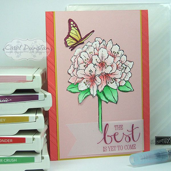
The day has come! From today you can order products from the 2015-2016 Stampin' Up! catalogue :D The set I have used today, Best Thoughts, is one you can only get from hosting a workshop or placing an order that qualify for Stampin' Rewards - or Hostess Dollars under the old system. All these changes can be a little confusing, but playing with this new product is definitely fun!
After I did my Petal Potpourri card I've really been bitten by the watercolouring bug again, so these stamps were perfect to let me have another play with it. The butterfly and flower were both stamped on watercolour paper with black StazOn, watercoloured, then cut out.
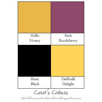
Just the two new In Colors in this card, here's the colour graphic for easy reference -
After I did my Petal Potpourri card I've really been bitten by the watercolouring bug again, so these stamps were perfect to let me have another play with it. The butterfly and flower were both stamped on watercolour paper with black StazOn, watercoloured, then cut out.
Just the two new In Colors in this card, here's the colour graphic for easy reference -
Subscribe to:
Posts (Atom)