Showing posts with label embossing folder. Show all posts

Sunday, January 24, 2016

Honey You're So Sweet

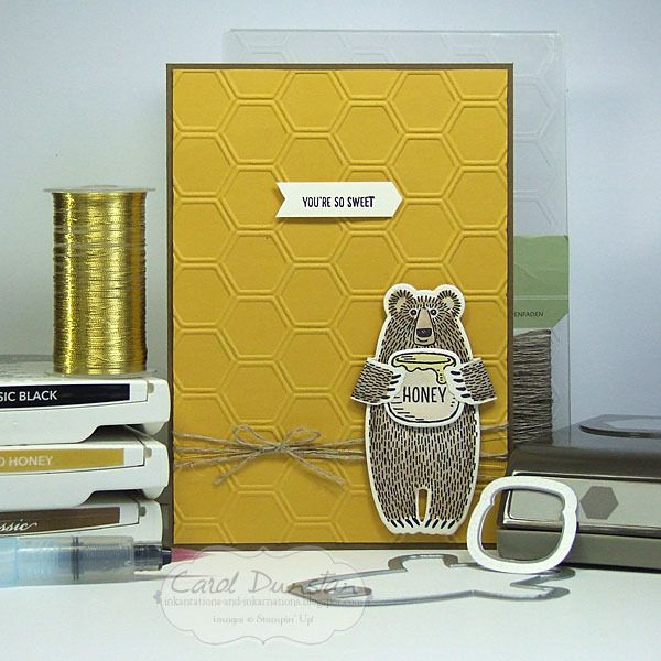
Hello again! I've been a bit quiet again of late, but I'm sure many of you can related... kids off on school holidays, others on holiday from work. Sudden plan changes have really messed with my mojo these holidays, but I've finally managed to finish a card, once again using the Bear Hugs stamp set.

One of the very first ideas I got for this set was putting it with Hello Honey and a honeycomb pattern - there is the embossing folder, pie and punch for a variety of options. What I ended up going for was the embossing folder, I felt the die might have made things a bit too visually busy when I wanted the focus to be on the bear. One of the nifty things the Bear Hugs stamp set and matching dies allow you to do is to stamp on the back of the cardstock so when you fold the arms around you can still see the design. I love that they thought to design the sramps and dies with this in mind.

I think most of this card is straight forward, but you may be wondering how I got the shape the sentiment is stamped on. Well, this is where the hexagon punch came in:

By inserting the cardstock in the back of the punch you can vary how much of the cardstock gets punched. It's a little trick I have used for years and have mentioned before but it's always worth mentioning these things every now and then to jog the memory, let alone for new people who haven't see this before.

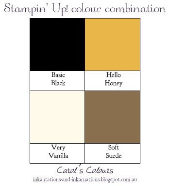
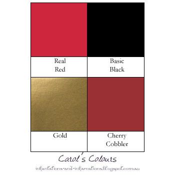
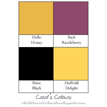
Here are the colours I used...


Bear Hugs clear-mount stamp set & framelits bundle 140823, Soft Suede A4 cardstock 119982, Hello Honey A4 cardstock 133685, Very Vanilla A4 cardstock 106550, Basic Black archival stamp pad, Soft Suede stamp pad 126978, Hello Honey stamp pad 133643, Honeycomb embossing folder 129378, Hexagon punch 130919, Aqua painter 103954, linen thread 104199, gold metallic thread 138401, dimensionals 104430
Tuesday, January 05, 2016

One Two Red Blue

Happy New Catalogue Day! Today the teasing stops and you can finally order some of the fab goodies in the Occasions and Sale-a-bration catalogues for yourself!

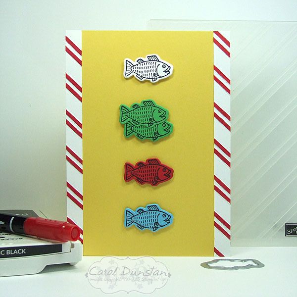
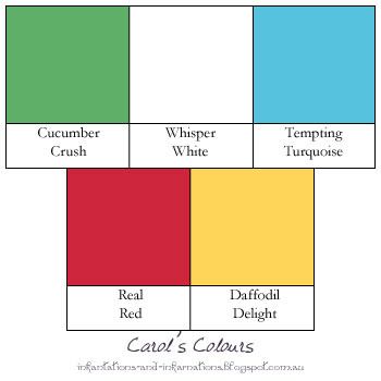
One of my must-have sets from the Occasions catalogue was the Bear Hugs set and the matching dies (gotta love those 15% off bundles!). While I do have a whole bunch of bear related card ideas going through my head (warning: many puns may be involved), once this little idea came to me I thought I really must make it straight away...
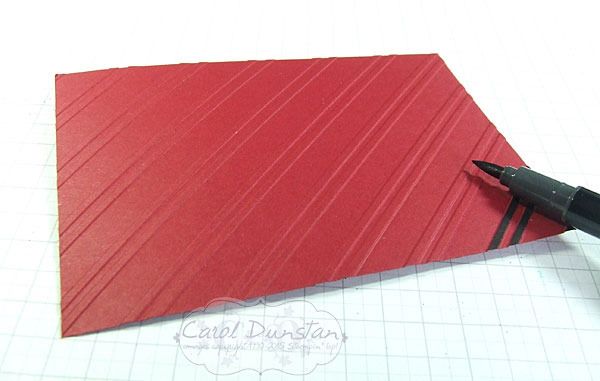
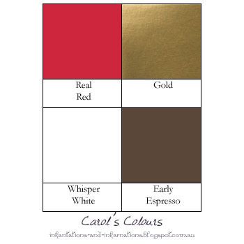
I contemplated adding text to make the One Fish, Two Fish, Red Fish, Blue Fish book connection more obvious, but I knew the font of the ABC Rotary Stamp wasn't a close style to that used on the book cover. It would also lead to much time being spent on contemplating the card design while I debated where to put the text, so I took the easy way out and left it off. The red stripes are a nod at the Cat In The Hat, and for those I put 1cm wide stripes of Whisper White into the Stylish Stripes embossing folder, and then went over the raised stripes with a marker just like I did with the Bombers Christmas card. I've also put as strip of the red stripes on the inside of the card.


Built for Free Using: My Stampin Blog

Monday, December 14, 2015

Delicate Ornaments Are The Bomb

I have another Delicate Ornaments card to share with you today, I hope you aren't getting sick of them!

Once again, not your usual Christmas colours! This was another card I just had to make as soon as I saw the black glimmer paper in the Holiday catalogue. You might be wondering why these colours, and why I gave that title to this post. The answer is simple...


It's a Bombers inspired Christmas cards! I'm a long time Bombers fan, as are a number of my relatives so I made a special Christmas card for them. The ornaments were created the same way as all the others, detailed in my tutorial here. To create the background I went over the ridges of the Stylish Stripes embossing folder with my Basic Black marker.


By holding the marker at a low angle you will get a more even coverage or the ridges and much less likely to get ink where you don't want it.

The colours I used were:

Built for Free Using: My Stampin Blog

Monday, December 07, 2015

Colourful Delicate Ornaments

I have more Delicate Ornament cards to share with you today. These ones use the long ornament dies.


Once again I made a set of six cards, however my plans changed drastically once cutting a lot of the dies out. With some of the little pieces popped out I could start positioning them where I wanted them on the ornament and I decided that things weren't going to look quite how I wanted them. So Plan B was to change the colour combinations a little and cut more ornaments so there were two on each card.


 All of the ornament cards I have posted over the last few weeks I actually started on the same day. On the Saturday I cut all of the ornaments out (except for the extra ones I did for this once I changed my mind), and on the Sunday I started putting them together - as you can see in these Instagram photos. These are definately the easiest of the ornament dies to do this technique with as the majority of the pieces are a decent size - easier to pop out and easier to handle. I did start with these when putting them together, but they were the last to be made into actual cards. I did finish them all over the space of a few days but wanted to spread out the posts for them so you weren't looking at ornament cards for a whole week! After preparing this post I saw a card by Mary Brown on Pinterest that is remarkably similar - clearly a case of great minds think alike! I'm really glad to see someone else doing this :D

Very non traditional colours in these!


Built for Free Using: My Stampin Blog

Tuesday, November 24, 2015

Lovely As A Wonderland

Back today with another Wonderland card for you. It really is going to be sad to see this one go, it pairs so nicely with Lovely As A Tree.


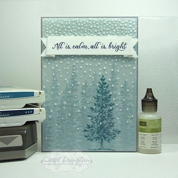
For this card I started off with a piece of Soft Sky cardstock and using Island Indigo ink stamped the Wonderland trees on it a few times side by side, then I stamped them inbetween after first stamping off on scrap paper to make the colour less intense. I then stamped the Lovely As A Tree image on a piece of vellum cardstock with the Island Indigo ink. Dye based inks are quick drying, except when you stamp them on something like vellum that won't absorb the ink straight away. While I was waiting for that to dry I stamped the sentiment on a strip of Whisper White cardstock and marked in some slightly slanted score lines so that when the banner was folded you would see a little underneath and the ends wouldn't be in-line with the main part. Once I had those score lines in place I could work out where I wanted the banner ends to go. The Triple Banner punch is made with guides for cardstock that is 1" (approx. 2.5cm), 1 1/5" (approx 3.8cm) and 2" (approx 5cm) wide. The strip I  was using was 2cm wide, but by holding it steady in the Triple Banner punch I was able to get a nice even banner finish to my cardstock. By now the ink on the vellum was dry so I was able to run it through the Softly Falling embossing folder in the Big Shot. It came out exactly how I hoped it would, the embossed dots turning the vellum white and looking a lot like snow. I put a bit of Fast Fuse behind the banner to attch the vellum at the top, then also placed a glue dot behind the tree, with a couple of little bits of glue dot snipped off and positioned behind and embossed dot to help hold the corners down. Once the card was all stuck together, I looked at it and thought "it's nice... but it needs a snowy sparkle" so I added just a touch of Dazzling Details glitter glue to the embossed dots - which of course doesn't show up int he photo but trust me it's there!

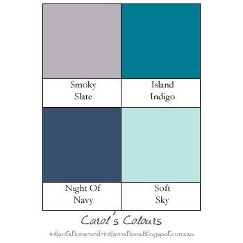
The colours for this card were inspired by Catelyn Stark from Game Of Thrones (Winter Wonderland is coming? hehehehe):

Built for Free Using: My Stampin Blog

Monday, November 23, 2015

Pastel Delicate Ornaments

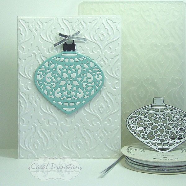
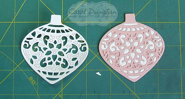
Today I have another Delicate Ornaments card for you, another made by inlaying the little bits from one or more colours into the frame of another.


For this card I kept the overall design simple, and even just the two colours for the ornament itself. By now I was learning...
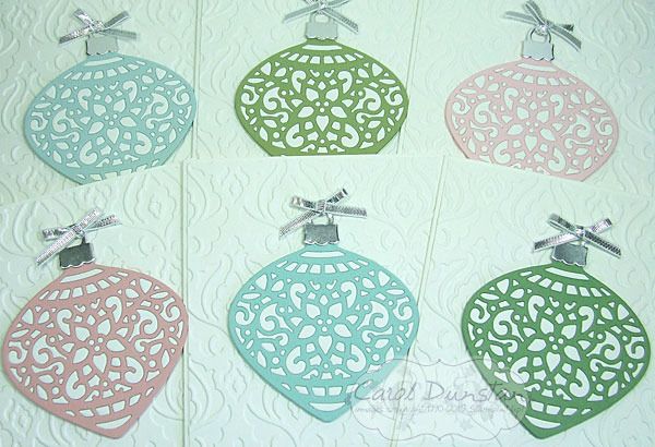
..take the bits from one and put them straight into another! You might already sense what is coming, but that will be a post for another day. Instead of punching a circle to back these ornaments, I used the matching bold ornament framelit die. It is ever so slightly larger, but this isn't a major issue - especially if you cut it in the same colour as the frame you used. Other than that, the rest of the construction was the same as the Stained Glass-esque Ornaments. As you can probably already tell, I cut some ornaments in white and some in a variety of colours. You might be wondering why I would bother doing this technique if I was just using one colour of the little bits. Basically, I hate to waste anything, but also it does give a different look to just backing the ornament frame with another colour. Here is a shot of this group of cards all finished:
While I wanted these cards over all plain I did want a little interest on my background, but didn't feel any of the current embossing folders had the look I wanted so for that I turned to the retired Beautifully Baroque folder.

Colours used on these cards:

Built for Free Using: My Stampin Blog

Friday, November 20, 2015

Minimalist Rudolph

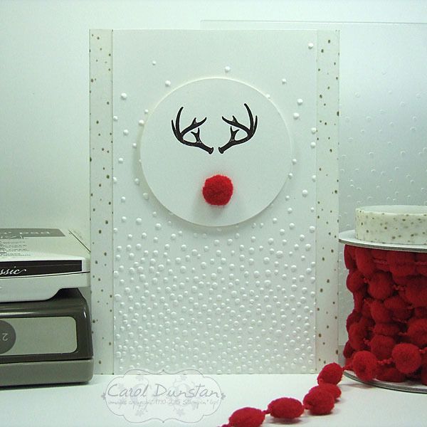
One very popular set that is on the Holiday catalogue retiring list is Wonderland, which was the basis of today's card.


When I first saw this set my eyes quickly caught onto the antler image and I immediately thought of Hannibal. Fans of the show will know what I mean! I'm sure at some point in my future I will make a Hannibal related card with this stamp, but that was not my inspiration today. I'd seen a few cards like this on Pinterest, firstly Billie Moan and then Dani Dziama (who had actually inspired Billie). Then this week I saw a kids shirt with something similar while out shopping. Like all of these, I wanted to keep my card mostly white, but also wanted subtle interest in the background and a touch of gold. The Winter Wonderland washi tape with the flecks of gold was perfect to edge the sides of the card with, and worked nicely with the Softly Falling embossing folder. I even edged the inside of the card with the washi tape to dress it up a little as well. With a fuzzy nose cut from the Real Red pompom trim, don't you just want to give his nose a little rub?


Built for Free Using: My Stampin Blog

Friday, October 30, 2015

Boo! Among The Branches

Haven't had a lot of time for stamping lately, but thankfully this week I had a little more time on my hands - just in time for Halloween!

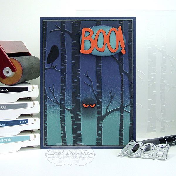
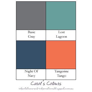
This card is actually a birthday card, for a Halloween birthday sleep-over which I am sure will be a scream!  I was inspired by this fabulous card by Michelle Zindorf. Though my brayering wasn't as smooth as normal (I didn't want the Lost Lagoon bit to get so dark it started looking like Island Indigo so the cardstock probably wasn't as damp as it should have been for a more smooth gradient of colour where the Night Of Navy overlaps) the effect works for a spooky card. After brayering the background, and running the cardstock through the embossing folder I brayered over the raised tree trunks with Basic Gray ink. I'd read you needed a very light touch to not get ink inbetween the trunks... and knowing I was unlikely to succeed with that I took a punt that some strategically placed washi tape would help prevent such mistakes. Which it did... but need to be very careful pulling that off at the end! The eyes were hand cut after stamping the "spooky" image from Among The Branches set on Tangerine Tango cardstock with Basic Black ink. I hadn't originally planned on using a sentiment, but after doing everything else to the card felt it needed something more. It was only after I stuck the "Boo!" with the oval onto the card that I thought the card had a very Scooby Doo feel to it. What do you think?

These were the colours I used (with a touch of Basic Black as well):

Built for Free Using: My Stampin Blog

Sunday, September 13, 2015

Happy BeeDay

What kind of card do you make for someone who loves making puns? A very punny one of course!
And what colour must you use on a card about bees? Hello Honey of course! After coming up with the idea for a "BeeDay" card, those other elements fell into place pretty quickly - the Honeycomb embossing folder, the bee stamp from Garden In Bloom, and I thought the Brushstokes background stamp would tie in well with the stripes on the bee. Once I had cut the "happy" and D, A and Y and laid them over the striped background I realised it was a little busy and hard to read, so I cut a piece of vellum to lay over the top and was much happier with the result. Of course I then had to deal with attaching the vellum that I hadn't planned for. While I could pretty easily hide some adhesive behind the words and bee, that left the top and bottom edges pretty free. To avoid possible curling I came up with the idea for some candy dots and was happy with how that came out too! So with all that done the spacing felt a little off, which I fixed by adding some black satin ribbon that I folded over to make a little skinnier.

Here are the colours I used:

Built for Free Using: My Stampin Blog

Monday, June 22, 2015

The Festival Of Trees Continues

The Festival Of Trees stamp set was released in the Holiday catalogue last year, was carried over to the Occasions catalogue and is now included in the new annual catalogue! I'm sooooo happy that the Christmas section has returned to the annual catalogue, and having the option of Christmas sets available all year round... because let's face it, it's never too early to start on your Christmas cards! With that in mind, I thought I would get started on mine in June, and hopefully I won't end up in what has become a mad rush the last few years. The worst part about that isn't so much the "chasing your tail" feeling, but the burn-out I often feel afterwards, and needing a break from stamping for a while. Anyway, enough jibber-jabber, here's the cards:
yep... I couldn't settle on one design so I made four. Design is based on Sweet Sunday Sketch #272.

I also kept with my tradition of non-traditional Christmas colours... it felt a little too soon in the year for that!


Built for Free Using: My Stampin Blog

Thursday, June 11, 2015

Mojo Monday 401

It's been a very long time since I played along with a sketch challenge, this week I finally got back into that swing of things with the Mojo Monday sketch.

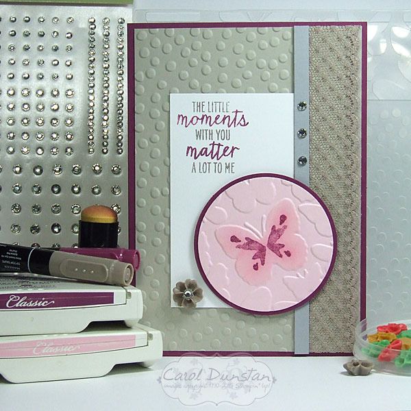
When my order from the new catalogue arrived last week I immediately noticed that one of the stamps from the Watercolor Wings could fit on some of the butterflies of the Fluttering embossing folder. I thought this sketch would suit highlighting that, so the rest of the card fell into place around that focal point. To really emphasise the butterfly I sponged some Pink Pirouette ink over the raised butterfly.

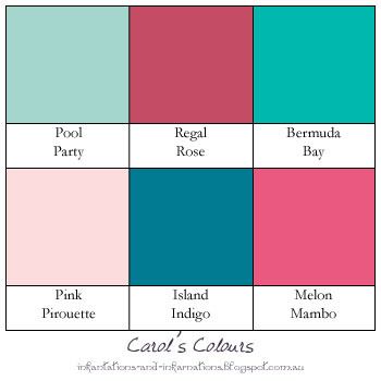
Here are the colours I played with for this card:

Built for Free Using: My Stampin Blog

Saturday, June 06, 2015

Fluttering Wings

Lucky me received my order from the new Stampin' Up! catalogue on Thursday afternoon, and I hopped straight in to playing. Watercolor Wings and the coordinating Bold Butterfly framelits (which are available in a bundle) were one thing I was especially excited about... and then there was the Fluttering embossing folder, a full 6"x6" embossing folder - how awesome is that! When the designs have a definite direction to them it's handy to have them in a large square size so you can use it on a card which ever way you want! One other new product on this card is the white cardstock used for the sentiment. It might not look any different to regular Whisper White, but it's Stampin' Up!'s new thick Whisper White cardstock. This will be fabulous to use for cardbases, but I am also loving it for raised layers. In the past if I was wanting to raise Whisper White up on dimensionals I would put another layer underneath it to give it that little bit extra support, but I won't have to with the new thick stuff. Woohoo!

I wanted to keep this card pretty simple to show off the embossed background, so just did one butterfly and the sentiment. One tip with these butterflies, it might be better to stamp the body after you have die-cut the wings. I tested stamping these images a few times on paper before I commited to cardstock.
When I laid the die over these images I found I had stamped the body a little too low. So when I was stamping my proper ones, I stamped the body a little higher...
which resulted in decapitated butterflies! So I stamped some bodies by themselves and cut them out to preform a little paper surgery...
There, you can (hardly) tell the difference! Just call me Stamper Frankenstein ;)

As well as the square card I decided to make a more postage-friendly standard size version:

Here are the colours I used -

Built for Free Using: My Stampin Blog

Friday, June 05, 2015

A Day Stacked With Ice Cream

It's been pretty chilly here lately, and the only way I usually do ice cream in this weather is on the side of some hot dessert (mmm, pie). However, with the new set Sprinkles Of Life I can have the ice cream without the extra chill! Well, I do also miss out on the delicious flavour... I might have to do something about that later...

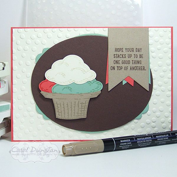
So for this card, I wanted three scoops, but just to be difficult I wanted the card in the landscape orientation. To help accomodate that I teamed the basket stamp with part of the cone stamp, which I inked up using the Crumb Cake marker. This stamp set is a transparent photo-polymer one, but using such a light colour it was still hard to line things up perfectly, so the handy-dandy Stamp-a-ma-jig ably assisted with that :) To get a light impression on the Vanilla cardstock, since we don't have Vanilla ink I inked the stamp with Crumb Cake and stamped it off on scrap paper a couple of times before stamping on the cardstock.

The ice cream theme dictated the colours they used - they had to be yummy!

Built for Free Using: My Stampin Blog

Monday, June 01, 2015

Flower Potpourri Farewell

Tomorrow is the last chance you will have to order products from the current Stampin' Up! catalogue, and the Stampin' Up! Occasions catalogue. Fabulous products like these...
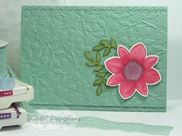
I so so love the Spring Flowers embossing folder, and I am really sad it isn't carrying over to the next catalogue. The Petal Potpourri set also won't be in the new catalogue either, nor will the coordinating Flower Medallion punch. I loved the variety of styles in Petal Potpourri, and of course I am a punch fanatic so always sad to see one go. As sad as that is, tomorrow will be your first opportunity to purchase new items, like the Mint Macaron cardstock and Dotted Lace Trim! There's so many things I love in the new catalogue that it does ease the pain of what we'll be saying goodbye to.

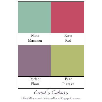
This card is pretty straight forward, the flower was stamped on watercolour paper in the Rose Red and Perfect Plum ink, then the aquapainter was used to just spread the colour to fill in the petals and flower center. I also picked up a bit of ink from the inkpad itself to add a bit more to the base of the petals to make the colour there more intense and add a bit more depth to them. I also sponged a little bit of Pear Pizzazz around the edges of the punched leaves to help them stand out against the Mint cardstock.

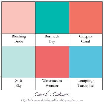
And today's colours are...

Built for Free Using: My Stampin Blog

Tuesday, May 19, 2015

Mixed Bunch Farewell


For me Mixed Bunch was a surprise inclusion on the retiring product list this year. The clear-mount version is sold out so if you are still thinking about purchasing woodmount is your only option and you need to get in quick! There's only 2 weeks left to order retiting items, but remember they are only available while stocks last.

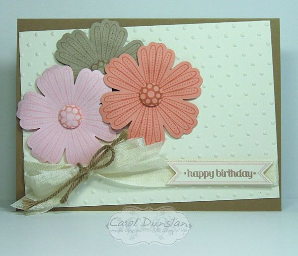
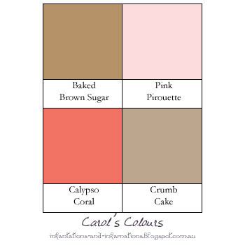
For this card I once again decided to use an image in the set that I hadn't used that often. I thought the little dots on the petals would team well with the Perfect Polka Dots embossing folder that is also retiring. And then I had to give Itty Bitty Banners a last hoorah to finish the card off!

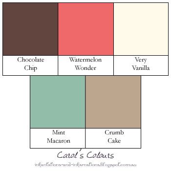
Do you like the colours I have used on this card? I thought I would start using a simple graphic to give an easy reference for colours I use on projects so you don't have to piece together the info from the product list :)


Built for Free Using: My Stampin Blog

Tuesday, May 12, 2015

Mother's Day Mosaic

Feel like I have been chasing my tail since coming back from convention, so this is a little later than intended but better late than never!

One item I was really sad to see on the recent retirement list was the Mosaic Madness stamp set and co-ordinating punch. Thankfully we will still have the mosaic embossing folder! So I thought for a last hoorah I would use Mosaic Madness for some Mother's Day cards this year - and I would use images from the set that don't coordinate with the punch (since I tended to use those co-ordinating ones more). The Modern Label punch, and the Label Something stamp set are on the retired list as well. I've also used three of the retiring In Colors with Crisp Canteloupe, Strawberry Slush and Coastal Cabana. I really love these colours together and have been using them quite a bit over the last few months, it will be sad to see them go :(

Built for Free Using: My Stampin Blog

Wednesday, May 06, 2015

Cap's Shield

Last week I shared a Captain America card with you and promised more Avengers-inspired cards. Well today I actually have three! They are all based on Captain America's shield, and were very easy to make.
The great thing about these cards is that when cutting the circles I automatically had pieces for another card, with a different sized shield. To get the rings for the shield I positioned all the circle framelits on the cardstock before putting it through the Big Shot. So from one "cutting" I got 3 or more circles to use. I left some space on the bottom two cards in case I wanted to add a sentiment.

Built for Free Using: My Stampin Blog