
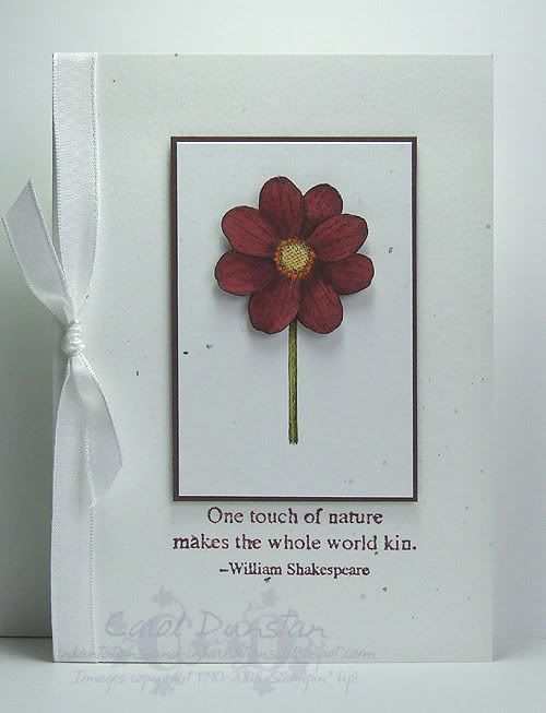
 This weeks challenge from Kristina uses Bravo Burgundy again but this time I found it much easier to work with. In part I think it is the other colours in the combination, but perhaps having to use it last week has helped me warm up to it a little more. After pulling out my swatches, and thinking about how Kristina had described the colours as "autumn-y" and I wasn't in the mood to make an autumn card, I started off with the Touch of Nature butterfly. Not liking how that came out I switched to the Touch of Nature flower and it wasn't until much later that I looked at the inspiration photo again and remembered that it had flowers in it too! Often I am consciously inspired by the subject of the colour challenges, but this week I seem to have immediately put it out of my mind and yet still came back to it.
The proportions of this card were going to be a little different before I forgot the old adage "measure twice, cut once" and stuffed up one stem piece and so deferred to this one. I had also intended for the central piece to be layered on Old Olive but it did not look right in any way, so I've ended up with a high contrast card but I am quite happy with how it has turned out.
All supplies by Stampin' Up!
Cardstock: Confetti White, Chocolate Chip, watercolour paper
Stamp set: Touch of Nature
Inks: StazOn Jet Black, Bravo Burgundy; So Saffron, Pumpkin Pie and Old Olive also used for watercolouring
Accessories: aquapainter, Whisper White taffeta ribbon, dimensionals
Shows watched while creating: Stargate Atlantis, NCIS, Rush
24 comments:
Wow Carol, this is just beautiful! That flower is absolutely perfect!
Oh my word, this is gorgeous! Love the simplicity!
A very striking card, Carol! Great use of the challenge colours.
So elegant!
this is perfect Carol...I absolutely love it...I always feel there are SO many colors we need to use they get over powered but, you showed with beauty that doesn't need to be the case...It is lovely...I love it! ~Donna
Carol, this is charmin, girl!!! I love this card!
So simple yet so elegant! Love how you used the colours esp Bravo Burgundy
Carol, this is beautiful!
OH I love the Simplicity of this card.. Brilliant usage of the challenge colors. Beautiful CARD again!!!
Hugs
Brooke
Such a simple elegant card Carol but you managed to combine all those colours and do it so well! Beautiful!
This card is stunning, so simple with the white on white ... and a gorgous combination of colours.
Simple elegance -- love it! :)
Beautiful card! WOW! Love that flower.
This is just BEAUTIFUL!!! LOVE. One of my faves. Oh I hope top 10! Will be well deserved!!
Love this stamp set! Great job with the challenge!
So simple and beautiful! I love the little border around the image! so Sweet.
Wow! Wow! Wow! This is absolutely stunning Carol. :)
Hi Carol,
Your card is sooooo pretty, I love it! Just lovely!
Take Care
~Kylie~
So simple, yet so beautiful!
wow Carol, this is stunning!
Love the way you used the colors! beautiful and simple, crisp and lovely!
So clean and simple, my favorite kind! Love it!
Gorgeous card! I love it!!
Hi Carol,
I absolutely LOVE your card! So simple and very very elegent! I struggled with this challenge this time round BUT by keeping it simple I got there in the end! Phew! lol
Karen
xo
Post a Comment