Showing posts with label Touch of Nature. Show all posts

Sunday, March 08, 2009

KW Colour Inspiration #44

What a pretty colour combo Kristina picked this week! Since I have played with similar colour combos recently I thought I'd pick a stamp set I wouldn't normally use these colours with, and I went with Touch of Nature.. yes, Touch of Nature two weeks in a row for a KW challenge! Since it is retired at the end of the month Imaking sure it knows it is loved wink. I may have over-done the ferns a little, but this is pretty much how I saw it in my head from the start. The butterfly was stamped off before stamping on the Whisper White so I had a paler second-generation impression.

All supplies by Stampin' Up!
Cardstock: Pretty In Pink, Chocolate Chip, Whisper White
Stamp Set: Touch of Nature
Inks: Pretty In Pink, Close To Cocoa, Chocolate Chip
Accessories: Berry Bliss DSP, Pretty In Pink tafetta ribbon, Earth Elements & Neutrals buttons, paper piercer, cutter kit
Show watched while creating: Aus v SAf test cricket

Monday, March 02, 2009

KW Colour Inspiration #43

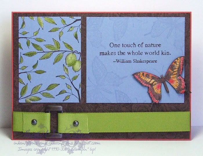
Finally I've found some time to take part in Kristina's colour challenge while it's still current! And I just had to use the colours with one of my favourite sets from the retirement list, Touch Of Nature. I've combined two challenges in one for this one too, putting Kristina's colours with Beate's WSC (sketch by Lori). The only real thing of note with this card is I stamped the leaves on the left panel with StazOn before bleaching inside them (well, Exit Mould-ed them!) to remove the blue, then coloured over top with Olive.

Most supplies by Stampin' Up!
Cardstock: Ruby Red, Chocolate Chip, Brocade Blue, Confetti White
Stamp sets: Floral, Touch of Nature
Inks: Chocolate Chip, StazOn, VersaMark; Old Olive, Pumpkin Pie and Ruby Red also used for watercolouring.
Accessories: Old Olive wide grosgrain, Aged Copper Hodgepodge, aquapainter, bleach
Show watched while creating: Sarah Connor Chronicles

Saturday, November 08, 2008

Recycled Flower


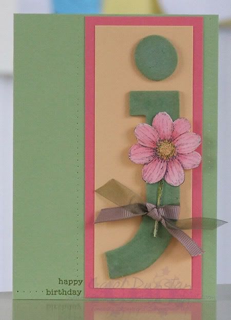
I recently gave my scrap draw a tidy, and while it is still fuller than I would like with half-finished things, it's a bit more organised and I have started working through the half-completed projects. These two flower pieces were among the items in my drawer, originally stamped and coloured for a Kristina colour challenge, but I started trimming the full flower closer than I meant to, so I re-did it. I trimmed the full flower as I had started, so little bits of petal would poke off the edge, layered it and then went looking for a sketch so I could finish it off quickly. I settled on Julee's Mojo Monday for last week, creating a little tag sentiment and stamping the Floral background and sponging the edges.

All supplies by Stampin' Up!
Cardstock: So Saffron, Old Olive, Confetti White
Stamp Sets: Touch of Nature, Occasional Greetings, Floral
Inks: Old Olive, StazOn Jet Black
Accessories: District Ribbon Originals, linen thread, Earth Elements eyelets, dimensionals, 1/8" circle punch

Wednesday, October 29, 2008

Happy Birthday Dad!

This is the card I made for my Dad. I went back to some simple water colouring for this one, and went with the bird from Touch of Nature since we always seemed to have at least one "What Bird Is That?" type of book in the house when I was growing up. Unfortunately, looking at it now I'm thinking it looks like a sparrow, but I was using the colours from the paper - oh well! For the photo corners I used the square image from Simple Delights and the photo corner punch.

All supplies by Stampin' Up!
Cardstock: Sage Shadow, Really Rust, watercolour paper
Stamp Sets: Touch of Nature, Simple Delights
Inks: StazOn Jet Black; Sage Shadow, Really Rust, Chocolate Chip and Creamy Caramel for watercolouring
Accessories: Earth Elements buttons, Earth Elements & Neutrals buttons, linen thread, Photo Corners punch, cutter kit, dimensionals

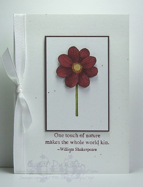
Wednesday, September 17, 2008

KW Colour Inspiration #23

This weeks challenge from Kristina uses Bravo Burgundy again but this time I found it much easier to work with. In part I think it is the other colours in the combination, but perhaps having to use it last week has helped me warm up to it a little more. After pulling out my swatches, and thinking about how Kristina had described the colours as "autumn-y" and I wasn't in the mood to make an autumn card, I started off with the Touch of Nature butterfly. Not liking how that came out I switched to the Touch of Nature flower and it wasn't until much later that I looked at the inspiration photo again and remembered that it had flowers in it too! Often I am consciously inspired by the subject of the colour challenges, but this week I seem to have immediately put it out of my mind and yet still came back to it.

The proportions of this card were going to be a little different before I forgot the old adage "measure twice, cut once" and stuffed up one stem piece and so deferred to this one. I had also intended for the central piece to be layered on Old Olive but it did not look right in any way, so I've ended up with a high contrast card but I am quite happy with how it has turned out.

All supplies by Stampin' Up!
Cardstock: Confetti White, Chocolate Chip, watercolour paper
Stamp set: Touch of Nature
Inks: StazOn Jet Black, Bravo Burgundy; So Saffron, Pumpkin Pie and Old Olive also used for watercolouring
Accessories: aquapainter, Whisper White taffeta ribbon, dimensionals
Shows watched while creating: Stargate Atlantis, NCIS, Rush

Tuesday, July 15, 2008

Touch of Prints


I felt like doing some collage-style stamping on Sunday, so I decided to make the card for the Boomerang Sketch Challenge blog. Boomerang is one of the first stamping yahoogroups I joined way back when, and the only one I am still active on, so many things to fill a day now I just don't have time for them all! Anyway, when I started working on the card I had thought I would do some crayon resist, so I started with some white gloss, cut it in half and started stamping. I then decided that it might be better to mask the areas I didn't want other things, which I did to one piece and then forgot to move the masks to this second piece! I also sponged Blue Bayou ink over the other piece, and it was all just a bit much and that piece fo cardstock now resides in the bin. Oh well, you can't win them all! The butterfly has been stamped on Blue Bayou cardstock using StazOn Jet Black and I then coloured it with a blender pen and Whisper White craft ink (picked up from the lid of the ink pad). The Fine Lace background is a second-generation impression (initial impression stamped off on scrap so the colour isn't as intense).

All supplies by Stampin' Up!

Cardstock: Always Artichoke, Blue Bayou, white gloss
Stamp sets: Touch of Nature, Petal Prints, Heartfelt Thanks, En Francais, Fine Lace
Inks: Purely Pomegranate, Blue Bayou, Old Olive, Always Artichoke, StazOn Jet Black, Rose Red
Accessories: Purely Pomegranate double-stitched grosgrain ribbon
Things watched while constructing card: Ghost Ship, Cloverfield

Monday, July 07, 2008

Colour Challenged Butterfly

Saturday night was another Inklings Cyberstamp, this time hosted by Kari. The second challenge she gave us was a colour challenge: Ballet Blue, Soft Sky, Not Quite Navy, Pink Passion and Really Rust. Boy was it a challenge (I'm kinda wondering if this was her revenge on the colour challenge I posted when hosting the cyberstamp!)! I just couldn't tackle it on the night though just before I went to bed I did a test run on colouring this butterfly. Taking a look at it in the morning I decided it would work so I set to on my card proper. For the butterfly's body I used my aquapainter to pick up Really Rust ink direct from the reinker bottle so the colour was more intense... a bit of a cheat as it was easy to make it darker and more brown than Really Rust but hey, whatever works! Cutting around the antennae of the butterfly is rather tricky as they are so skinny, so once trimmed I coloured the edge and back of the paper with Soft Sky ink to blend in with the layer underneath.

All supplies by Stampin' Up!

Cardstock: Soft Sky, Very Vanilla, watercolour paper
Stamp Sets: Touch of Nature, Fine Lace, So Many Sayings
Inks: StazOn Jet Black, VersaMark, inks used for colouring: Ballet Blue, Soft Sky, Not Quite Navy, Pink Passion, Really Rust
Accessories: Basic Black marker, aquapainter, Earth Elements brads, Very Vanilla taffeta ribbon, 1/8" circle punch, dimensionals

Thursday, June 19, 2008

Touch of Hope

This card was inspired by a dress worn by Arwen in the Lord of the Rings movie The Two Towers. The dress is known as Arwen's Hope Dress due to the scene in which it is seen. I decided to focus on the gorgeous sleeves (though if i had some burgundy velvet ribbon it may have been a different story), and wheel the Watercolr Vine jumbo wheel on Pale Plum cardstock using Whisper White ink. I used the 2-way glue pen to go over the vines so I could get as much Dazzling Diamonds to stick as possible. To finish off the card I took some liberties and took inspiration from beyond the dress alone. Arwen had a lot of butterfly motifs incorporated into her various costumes, so I stamped the butterfly from Touch of Nature on silver cardstock using Bravo Burgundy ink and cut it out. I mounted it over some white taffeta ribbon that I used to simulate a belt worn by Galadriel. As I was sticking the card together I wondered whether I should have found somewhere to stamp "hope", but then realised that the elves never had slogans on their clothing so felt it appropriate to leave it off. I'm sad, I know it!

Monday, May 26, 2008

Pretty Prints

Here's the results of another sketch challenge I took a stab at, Beate's WSC #49. This one also came together reasonably quickly, other than waiting for the saffron flower to dry! I again took the opportunity to play with another old colour challenge from Kristina Werner, and since two of the colours were available in the Palette o' Prints pad it was like half my card was already made. I layered the So Saffron and Certainly Celery pieces of Prints paper on a Bashful Blue 10.5cm square card base and ran a piece of Close To Cocoa velvet ribbon (from the Theater Ribbon originals pack) across, tying it off the edge with a bit of linen thread. To make the butterfly stand out a little more I decided I wanted a vanilla flower, so I coloured it with the Very Vanilla watercolour crayon. I dyed another Pretties Kit flower with So Saffron ink and stuck that on next, then stamped the Touch of Nature butterfly on watercolour paper using StazOn Jet Black and coloured with Bashful Blue and Close To Cocoa inks, trimmed and mounted on top of both flowers. I the bottom right corner I added a few cream half-pearls from the Pretties Kit.

As a side note, the Palette o' Prints promotion has been so popular that Stampin' Up! have advised they expect to run out mid-week and will not be printing more. If you'd like to get your hands on a pad before they're all gone you can email me to place an order.

En Thyme Chocolat birdie

I didn't have any pressing need for particular cards this weekend so I took the opportunity to play with some challenges. This is for Julee's Mojo Monday #38. I decided to combine this with an old colour challenge from Kristina Werner, and when I realised I had a number of these colours in patterned paper (albeit, retired paper) the card kind of made itself. Normally I colour images realistically, but for this I opted to have some fun and decided that teal wasn't that far from the blue of a Superb Fairy-Wren or Splendid Fairy-Wren. So I stamped my Touch of Nature bird on watercolour paper and coloured him with an aquapainter and inks in Tempting Turquoise, Taken With Teal, Chocolate Chip, Close to Cocoa, Old Olive and a touch of Very Vanilla watercolour crayon. The edges of this and it's Chocolate Chip later were distressed with the Cutter Kit and embellished with a Close To Cocoa button and a couple of Prima leaves. Papers are from Enchante, Holiday Thyme and Au Chocolat packs, cardbase is Chocolate Chip, hodgepodge is Aged Copper and the teal velvet ribbon is from the retired Flirty pack.

Saturday, March 08, 2008

Pop-up naturally

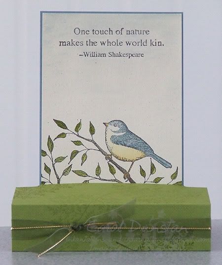
This is another card made for the Inklings cyberstamp. Challenge 1 was to make a free-standing pop-up card. I have made these before, but it took me ages to decide on what stamps I wanted to use! The images have been stamped with StazOn Jet Black on Ivory Naturals cardstock, then watercoloured with inkpads and an aquapainter. Colours used are Buckaroo Blue, Old Olive, Morning Marigold and a touch of Chocolate Chip and True Thyme for the branches. The base has been stamped with the fern image using Certainly Celery and Old Olive inks. Olive organdy and gold cord used for a finishing touch.

Thursday, February 21, 2008

A Touch of Paisley


This card was inspired by Claire Daly. I've kept with much the same colour scheme as my last card, except there is no green in sight so it's almost monochromatic. This style of card is great for using up little scraps of cardstock... in which case I should probably make a lot more of them! The butterfly is from the Touch of Nature set and was inked with Vintage Violet and stamped on the brushed Silver cardstock. I love the effect this gives.

Thursday, January 24, 2008

CASEing stems

This card is a CASE of a Nichole Heady card. Of course, I changed a few things but wanted a similar feel so my changes weren't drastic. Probably the hardest thing about a card like this is getting consistent sponging around all those edges! For my card I have used Certainly Celery, Very Vanilla and Sahara Sand cardstocks, Certainly Celery and True Thyme inks, and Regal Rose brads. The sentiment is from the Touch of Nature set and the background is Stem Silhouettes. To get the varying colours on the branches I first inked the stamp using the Celery inkpad then inked along the stem with True Thyme using a blender pen as marker. This quite easy to do, just put a drop or two of the reinker in the reinker lid then dip the tip of the blender pen in to soak up the colour.

Saturday, November 03, 2007

Good Intentions

I had good intentions of sharing a card with you all last night, but I post my pics via photobucket and it didn't want to play fair. I also had good intentions with the card below, but it ended up being late for the recipients birthday. Ah well, better late than never!

I just love the combination of Cameo Coral and Apricot Appeal, and lately I've been adding some other warm tones to the mix. But for this card I decided to go for a contrast of greens and use Certainly Celery and Old Olive (and a bit of Taupe grosgrain). I coloured the chipboard but dragging and pressing it into the Celery inkpad, then using the Celery marker to fill in any spots that were missed. The Touch of Nature flower was stamped on watercolour paper with StazOn Jet Black and coloured using an aquapainter and inkpads. The words are from Everyday Flexible Phrases. All products by Stampin Up! and available for purchase for me (where ever you are in Australia). Please contact me if you'd like to place an order.

Saturday, September 08, 2007

I'm still alive

Sorry I haven't been posting much lately, I just thought I should take the opportunity to get some non-creative stuff done, so I haven't had anything to share... then I forgot to take photos of what I did create, then I forgot to share those photos! Anyway, here's one:
I didn't really have a vision in mind for this one when I started, though I'm not sure it ended up where I thought it would. Anyway, I gave colouring on Whisper White another go (I much prefer to use the watercolour paper), it didn't turn out too bad. Image is stamped in StazOn black and coloured with inkpads and aquapainter. Colours are Always Artichoke, Brocade Blue, Ruby Red and More Mustard.