Showing posts with label Early Espresso. Show all posts

Thursday, December 10, 2015

Santa's Gifts

We are moving ever closer to the end of the year, and the end of the 2015 Holiday catalogue. Remember that many of the products in the catalogue are retiring and are only available while stocks last, so your chance to snap them up is growing smaller every day. Santa's Gifts is on that list, a very cute set that is great for watercolouring, like I did for the card I am sharing today:


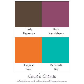
Aw, look at that adorable reindeer... how can you say no to this guy? I still have a few sheets of the old watercolour paper floating around, so I used a full piece for this. I stamped Santa and the reindeer with Basic Black archival ink, then made a little mask for Santa's hand by stamping the image on a sticky note so that when it was cut out I had some of the sticky on the back and it would stay in place while I stamped the gift. Masking is such a nifty little technique! Once I had all of these stamped on the water colour paper I did a wash of Bermuda Bay in the background. Yep, all of that is Bermuda Bay. By using a lot of water and little ink I could achieve a nice pale colour. While I had the Bermuda Bay ink out I did the reindeer's scarf, using a lot less water and a lot more ink to get a more intense colour. For Santa's face I used Blushing Bride ink, which I left out of the colour combo graphic because... well it was such a small bit and doesn't stand out that much. For Santa's suit I used Rich Razzleberry. Such a lovely colour, and true to it's name - rich! It's a nice middle ground between the traitional red for Santa, and my favourite colour of purple. Santa's boots, and belt, along with the reindeer hooves, were done with Early Espresso - lots of ink and little water in the brush for those so the colour is so dark it is nearly black. The body of the reindeer is all Early Espresso. I know I have talked in the past about how brown shades in particular are made up of a mix of colours and tend to separate into these when you watercolour with them. I deliberately made use of that this time, the side taking on a warm reddish-brown tone and the face and inner ear a tan with a tinge of pink where I pulled the colour into areas where I already had a lot of water on the cardstock so the colour became quite diluted. To finish off the watercolouring, and for some real "pop" on the card, I used Tangelo Twist on the present.

Built for Free Using: My Stampin Blog

Friday, November 20, 2015

Minimalist Rudolph

One very popular set that is on the Holiday catalogue retiring list is Wonderland, which was the basis of today's card.


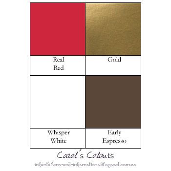
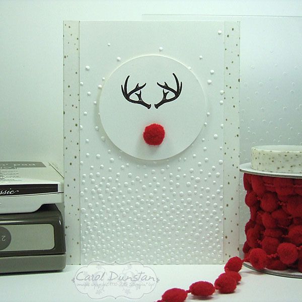
When I first saw this set my eyes quickly caught onto the antler image and I immediately thought of Hannibal. Fans of the show will know what I mean! I'm sure at some point in my future I will make a Hannibal related card with this stamp, but that was not my inspiration today. I'd seen a few cards like this on Pinterest, firstly Billie Moan and then Dani Dziama (who had actually inspired Billie). Then this week I saw a kids shirt with something similar while out shopping. Like all of these, I wanted to keep my card mostly white, but also wanted subtle interest in the background and a touch of gold. The Winter Wonderland washi tape with the flecks of gold was perfect to edge the sides of the card with, and worked nicely with the Softly Falling embossing folder. I even edged the inside of the card with the washi tape to dress it up a little as well. With a fuzzy nose cut from the Real Red pompom trim, don't you just want to give his nose a little rub?


Built for Free Using: My Stampin Blog

Saturday, August 08, 2015

Feeling Special?

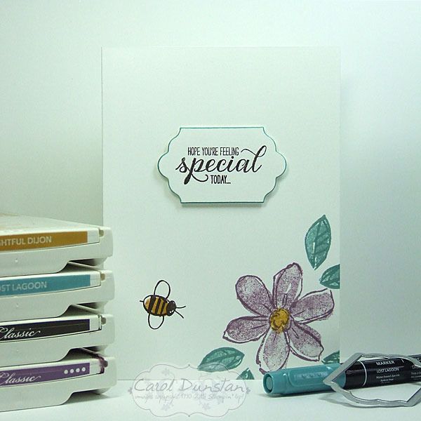
Time for another card using thick Whisper White cardstock for the cardbase.
I had thought I would load this one up and really give the cardbase a workout... but ultimately opted for another simple card. The outlines for the flower and leaves were stamped in colour rather than the standard black - or for this card that would have been Early Espresso. I inked up the flowers and leaves in the same colour as their outlines, then lightly stamped them off before stamping on the card to give a little more variation in the colours. To help the sentiment layer stand out I went around the edge with the Lost Lagoon marker.

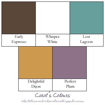
Today's colours are:

Built for Free Using: My Stampin Blog

Friday, May 29, 2015

I Have A Mint Crush

I've been busy busy busy again, so here's TWO cards I managed to make a few days ago.

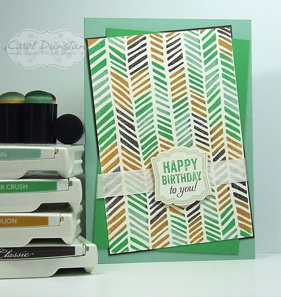
I'm sad about a number of stamps that are retiring, and this Handcarved background stamp is one of them. I love it's informal chevron-ish look. I sponged the colours on with daubers and didn't worry about being too neat - but also didn't want to be overly messy and get some horribly muddied colours. I teamed this background with some more retiring products, the Label Love set and coordinating Artisan Label punch.
For the next card I decided to stick with the same colour scheme but go for a completely different look. I don't have a lot of Thank You cards in my stash, so decided to make one with the Because You Care set. If you haven't noticed it, it's a hostess set in the Occasions Catalogue and won't be available after June 2. I let a piece of Mint Macaron cardstock take centre stage on this card, it's definitely my favourite of the new In Colors, so expect to see a lot of it! Some of the items used in these cards, like that yummy Mint Macaron cardstock, can't be ordered until June 2nd, but don't forget June 2nd is a wonderful day when you can order from the current catalogue, the Occasions catalogue and the new 2015-2016 catalogue! That said, any retiring items you like you really shouldn't wait to order as they are only available while stocks last.

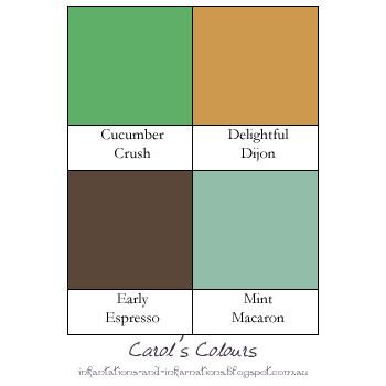
And the colour combination for both cards:

Built for Free Using: My Stampin Blog