Hello again all! Todays card is another one to send off Enjoy The Little Things.
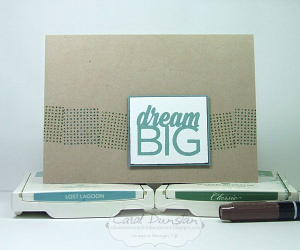
My cards have been quite simple of late, but this easily takes the cake! Just the cardbase with a sentiment on a couple of layers of cardstock. That said, in my usual style I had to do it in a way that wasn't quick...
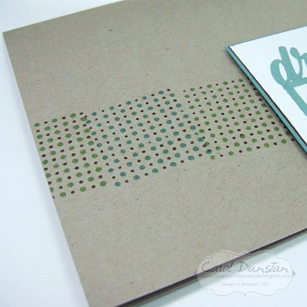
For the stamping on the card base I used the square of dots image and inked it up on an inkpad first then coloured the smaller dots with the Chocolate Chip marker. While some will think I am crazy for going with such a fiddly technique I would point out I wasn't crazy enough to ink all the dots individually with a marker :P (never say never though!)
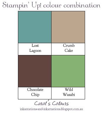
140958 Enjoy The Little Things photopolymer stamp set, 121685 Crumb Cake A4 cardstock, 133686 Lost Lagoon A4 cardstock, 106549 Whisper White A4 cardstock, 133644 Lost Lagoon stamp pad, 126959 Wild Wasabi stamp pad, 131261 Neutrals markers, 104430 dimensionals
Showing posts with label Lost Lagoon. Show all posts
Friday, April 29, 2016
Thursday, April 28, 2016
Farewell Enjoy The Little Things
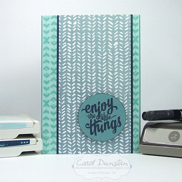
Enjoy The Little Things is a set from the Occasions catalogue that won't be carrying over to the new Stampin' Up! catalogue. It coordinates with the Enjoy The Little Things Project Kit, but the set has some nice sentiments that work just as well for cards. For todays card I'm using a sentiment I've used before because I really love the font.
The long leafy image in the set reminded me of the Lost Lagoon paper in the English Garden DSP, so I came up with a design that worked in both. I deliberately stamped it so the image went off the edge both top and bottom and it would look a little more natural. After punching out the sentiment I edged the circle with a Basic Black marker to give the edge a bit more definition and make it pop out against the DSP behind it.
The Lost Lagoon cardstock, English Garden DSP, and the Enjoy The Little Things stamp set are all retiring and all still currently available.
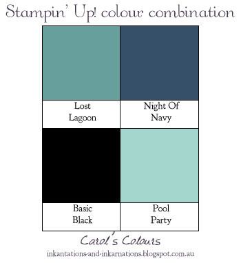
140958 Enjoy The Little Things photopolymer stamp set, 133686 Lost Lagoon A4 cardstock, 124391 Pool Party A4 cardstock, 106577 Night Of Navy A4 cardstock, 138440 English Garden DSP, 126982 Pool Party stamp pad, 126970 Night Of Navy stamp pad, 100082 Basic Black marker, 133782 2" circle punch, 104430 dimensionals
The long leafy image in the set reminded me of the Lost Lagoon paper in the English Garden DSP, so I came up with a design that worked in both. I deliberately stamped it so the image went off the edge both top and bottom and it would look a little more natural. After punching out the sentiment I edged the circle with a Basic Black marker to give the edge a bit more definition and make it pop out against the DSP behind it.
The Lost Lagoon cardstock, English Garden DSP, and the Enjoy The Little Things stamp set are all retiring and all still currently available.
140958 Enjoy The Little Things photopolymer stamp set, 133686 Lost Lagoon A4 cardstock, 124391 Pool Party A4 cardstock, 106577 Night Of Navy A4 cardstock, 138440 English Garden DSP, 126982 Pool Party stamp pad, 126970 Night Of Navy stamp pad, 100082 Basic Black marker, 133782 2" circle punch, 104430 dimensionals
Sunday, March 13, 2016
A Wink Of Watercolouring
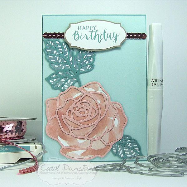
Yes I am still playing with the Rose Garden thinlits! I'm enjoying mixing things up a little bit with each card I make, and come up with different ways to work with the dies.
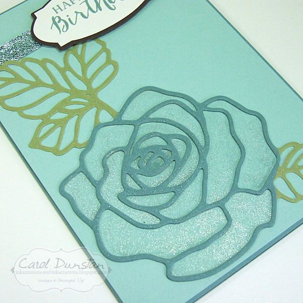
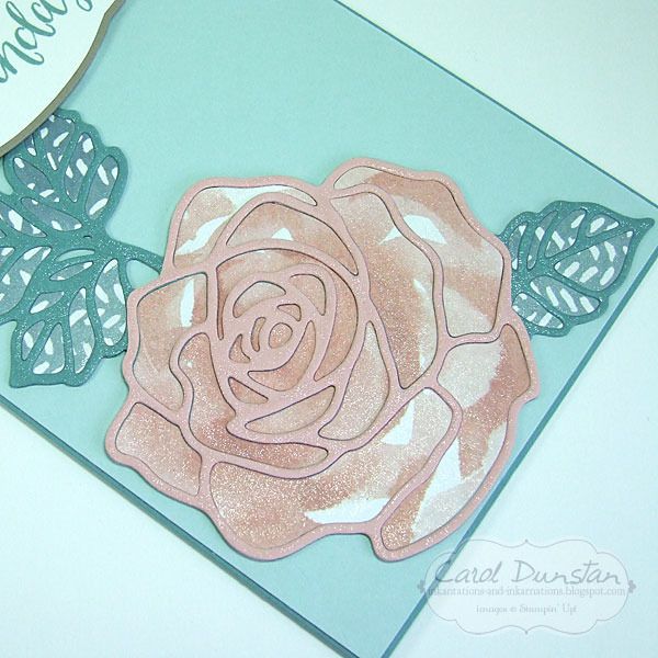
For this card I decided not to use any patterned paper, and instead have watercoloured inside the die cut.
In this case I used the clear Wink of Stella brush in place of an aquapainter to pick up the ink colour. Since I was using Lost Lagoon ink on Pool Party cardstock it doesn't take much ink to noticeably colour the cardstock.
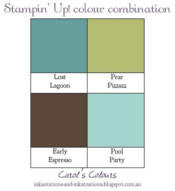
I know a lot of people will look at these colours and think they are quite masculine, and as such not what you'd expect on a floral card, but I like playing with expectations.
Rose Wonder stamp set & Rose Garden thinlits dies bundle 140804, Lost Lagoon A4 cardstock 133686, Pool Party A4 cardstock 124391, Pear Pizzazz A4 cardstock 131290, Early Espresso A4 cardstock 121686, Whisper White A4 cardstock 106549, Lost Lagoon stamp pad 133644, clear Wink Of Stella glitter brush 141897, Pool Party glitter ribbon 140561, Fine-tip glue pen 138309, dimensionals 104430
For this card I decided not to use any patterned paper, and instead have watercoloured inside the die cut.
In this case I used the clear Wink of Stella brush in place of an aquapainter to pick up the ink colour. Since I was using Lost Lagoon ink on Pool Party cardstock it doesn't take much ink to noticeably colour the cardstock.
I know a lot of people will look at these colours and think they are quite masculine, and as such not what you'd expect on a floral card, but I like playing with expectations.
Rose Wonder stamp set & Rose Garden thinlits dies bundle 140804, Lost Lagoon A4 cardstock 133686, Pool Party A4 cardstock 124391, Pear Pizzazz A4 cardstock 131290, Early Espresso A4 cardstock 121686, Whisper White A4 cardstock 106549, Lost Lagoon stamp pad 133644, clear Wink Of Stella glitter brush 141897, Pool Party glitter ribbon 140561, Fine-tip glue pen 138309, dimensionals 104430
Saturday, March 05, 2016
English Garden Birthday
I've done a string of cards using the small rose die from the Rose Garden thinlits, so I felt it was high time I set the large rose and leaves die to work.
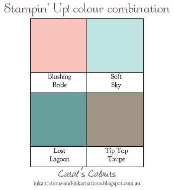
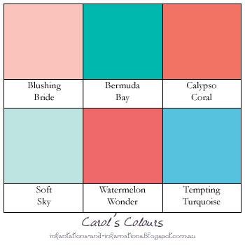
I liked the effect of the inside parts of the rose being card cut from the large flowers of patterned paper that I did on my last card, so thought I would replicate that with this larger rose. It was a little harder to find a flower on the paper large enough when I wasn't working with full sheets, but happy with how this came out. This time I decided to do the same method for the leaves as well, though the patterned paper I used for them was just an all over pattern and not leaves themselves. The rose and leaves are all part of one large die, so I cut it out in Blushing Bride cardstock and trimmed that down to just the flower part and layered that over a full die cut that I did in Lost Lagoon. I created the sentiment piece using the same method as on my last card, layered over a full string of Blushing Bride sequin trim.
You've probably already guessed that I once again went over the rose with the Wink Of Stella glitter brush. Love that shimmer!
I loved the colour combination I used on the Valentine's card that I had to give it another whirl
Lost Lagoon is among the 2014-2016 In Colors that will soon be retiring in lead up to the launch of the new catalogue and a new group of In Colors, and I'm going to be so sad to see it go! If you have some favourite 2014-2016 In Colors and you haven't already thought to stock up on cardstock and get a reinker to extend the life of your stamp pad now is the time to do it and beat the rush. Once those colours are listed as retiring they are then only available while stocks last and tend to get snapped up pretty quick.
Rose Wonder stamp set & Rose Garden thinlits dies bundle 140804, Lost Lagoon A4 cardstock 133686, Soft Sky A4 cardstock 131292, Blushing Bride A4 cardstock 131287, Tip Top Taupe A4 cardstock 138343, Whisper White A4 cardstock 106549, English Garden designer series paper 138440, Lost Lagoon stamp pad 133644, clear Wink Of Stella glitter brush 141897, Blushing Bride sequin trim 138400, Fine-tip glue pen 138309, dimensionals 104430
I liked the effect of the inside parts of the rose being card cut from the large flowers of patterned paper that I did on my last card, so thought I would replicate that with this larger rose. It was a little harder to find a flower on the paper large enough when I wasn't working with full sheets, but happy with how this came out. This time I decided to do the same method for the leaves as well, though the patterned paper I used for them was just an all over pattern and not leaves themselves. The rose and leaves are all part of one large die, so I cut it out in Blushing Bride cardstock and trimmed that down to just the flower part and layered that over a full die cut that I did in Lost Lagoon. I created the sentiment piece using the same method as on my last card, layered over a full string of Blushing Bride sequin trim.
You've probably already guessed that I once again went over the rose with the Wink Of Stella glitter brush. Love that shimmer!
I loved the colour combination I used on the Valentine's card that I had to give it another whirl
Lost Lagoon is among the 2014-2016 In Colors that will soon be retiring in lead up to the launch of the new catalogue and a new group of In Colors, and I'm going to be so sad to see it go! If you have some favourite 2014-2016 In Colors and you haven't already thought to stock up on cardstock and get a reinker to extend the life of your stamp pad now is the time to do it and beat the rush. Once those colours are listed as retiring they are then only available while stocks last and tend to get snapped up pretty quick.
Rose Wonder stamp set & Rose Garden thinlits dies bundle 140804, Lost Lagoon A4 cardstock 133686, Soft Sky A4 cardstock 131292, Blushing Bride A4 cardstock 131287, Tip Top Taupe A4 cardstock 138343, Whisper White A4 cardstock 106549, English Garden designer series paper 138440, Lost Lagoon stamp pad 133644, clear Wink Of Stella glitter brush 141897, Blushing Bride sequin trim 138400, Fine-tip glue pen 138309, dimensionals 104430
Sunday, February 07, 2016
Balloon Valentines
It's coming up to that time of year again... when I think "what kind of card can I make that is obviously Valentine's but not over the top". Yep, I've got one of those people in my life. There have been times he's been dubbed "Mr Brown Paper Bag". Anyway I did go with some pink and some lace, let's see if it gets any comment from him!
I went with a very simple design, because... well, "Mr Brown Paper Bag" and all! Even though I was thinking "Love Is In The Air" with the heart balloon, I thought adding that sentiment from the stamp set would busy the layout a bit too much. With all the product coordination that Stampin' Up! have it was almost odd to hand-cut the balloon out.
Now I certanly think this is quite a pretty colour combination, but I think I played down the pretty factor enough for this, hehehehe.
Balloon Builders stamp set 140645, Lost Lagoon A4 cardstock 133686, Soft Sky A4 cardstock 131292, thick Whisper White A4 cardstock 140490, Blushing Bride stamp pad 131172, Tip Top Taupe dotted lace trim 138422, Whisper White Bakers Twine 124262, dimensionals 104430
I went with a very simple design, because... well, "Mr Brown Paper Bag" and all! Even though I was thinking "Love Is In The Air" with the heart balloon, I thought adding that sentiment from the stamp set would busy the layout a bit too much. With all the product coordination that Stampin' Up! have it was almost odd to hand-cut the balloon out.
Now I certanly think this is quite a pretty colour combination, but I think I played down the pretty factor enough for this, hehehehe.
Balloon Builders stamp set 140645, Lost Lagoon A4 cardstock 133686, Soft Sky A4 cardstock 131292, thick Whisper White A4 cardstock 140490, Blushing Bride stamp pad 131172, Tip Top Taupe dotted lace trim 138422, Whisper White Bakers Twine 124262, dimensionals 104430
Monday, December 07, 2015
Colourful Delicate Ornaments
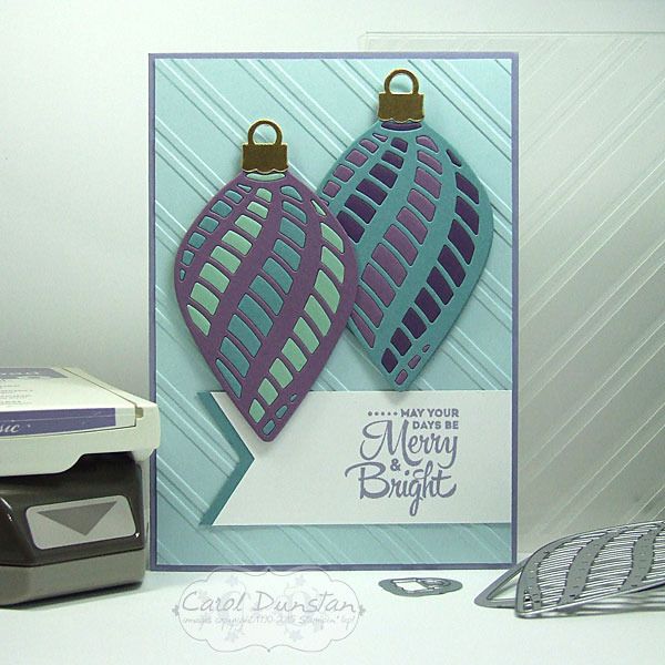
I have more Delicate Ornament cards to share with you today. These ones use the long ornament dies.
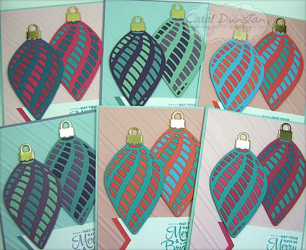
Once again I made a set of six cards, however my plans changed drastically once cutting a lot of the dies out. With some of the little pieces popped out I could start positioning them where I wanted them on the ornament and I decided that things weren't going to look quite how I wanted them. So Plan B was to change the colour combinations a little and cut more ornaments so there were two on each card.
All of the ornament cards I have posted over the last few weeks I actually started on the same day. On the Saturday I cut all of the ornaments out (except for the extra ones I did for this once I changed my mind), and on the Sunday I started putting them together - as you can see in these Instagram photos. These are definately the easiest of the ornament dies to do this technique with as the majority of the pieces are a decent size - easier to pop out and easier to handle. I did start with these when putting them together, but they were the last to be made into actual cards. I did finish them all over the space of a few days but wanted to spread out the posts for them so you weren't looking at ornament cards for a whole week! After preparing this post I saw a card by Mary Brown on Pinterest that is remarkably similar - clearly a case of great minds think alike! I'm really glad to see someone else doing this :D
Very non traditional colours in these!
Once again I made a set of six cards, however my plans changed drastically once cutting a lot of the dies out. With some of the little pieces popped out I could start positioning them where I wanted them on the ornament and I decided that things weren't going to look quite how I wanted them. So Plan B was to change the colour combinations a little and cut more ornaments so there were two on each card.
All of the ornament cards I have posted over the last few weeks I actually started on the same day. On the Saturday I cut all of the ornaments out (except for the extra ones I did for this once I changed my mind), and on the Sunday I started putting them together - as you can see in these Instagram photos. These are definately the easiest of the ornament dies to do this technique with as the majority of the pieces are a decent size - easier to pop out and easier to handle. I did start with these when putting them together, but they were the last to be made into actual cards. I did finish them all over the space of a few days but wanted to spread out the posts for them so you weren't looking at ornament cards for a whole week! After preparing this post I saw a card by Mary Brown on Pinterest that is remarkably similar - clearly a case of great minds think alike! I'm really glad to see someone else doing this :D
Very non traditional colours in these!
Saturday, November 07, 2015
Jolly Jumping Reindeer
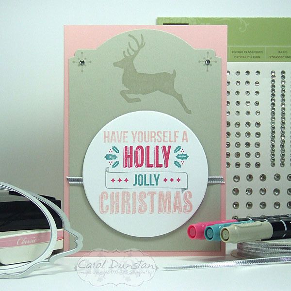
I haven't got very far with making Christmas cards this year, but got back into the swing of it with the Jolly Christmas set.
As is often the case, the idea that came to mind was multiple colours on an image, so out came the markers for some direct to rubber technique. I did cheat a little bit in using the Blushing Bride inkpad to ink up the top and bottom lines. As I was working on this my brain was ticking over how I would do the rest of the card, and initially I thought I would have the reindeer leaping more to the right hand side of the card, but when I started spacing things I found there wasn't a lot of room at the side... but plenty at the top. The idea to shape the top of the reindeer layer came not long after, and I have to say I am really pleased with how it came out. I trimmed the Sahara Sand cardstock to the width I wanted, then positioned it so it was half in/half out of the Deco Labels framelit so just the top edge would be cut.
Almost traditional Christmas colours used today:
As is often the case, the idea that came to mind was multiple colours on an image, so out came the markers for some direct to rubber technique. I did cheat a little bit in using the Blushing Bride inkpad to ink up the top and bottom lines. As I was working on this my brain was ticking over how I would do the rest of the card, and initially I thought I would have the reindeer leaping more to the right hand side of the card, but when I started spacing things I found there wasn't a lot of room at the side... but plenty at the top. The idea to shape the top of the reindeer layer came not long after, and I have to say I am really pleased with how it came out. I trimmed the Sahara Sand cardstock to the width I wanted, then positioned it so it was half in/half out of the Deco Labels framelit so just the top edge would be cut.
Almost traditional Christmas colours used today:
Friday, October 30, 2015
Boo! Among The Branches
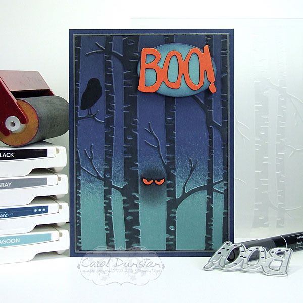
Haven't had a lot of time for stamping lately, but thankfully this week I had a little more time on my hands - just in time for Halloween!
This card is actually a birthday card, for a Halloween birthday sleep-over which I am sure will be a scream! I was inspired by this fabulous card by Michelle Zindorf. Though my brayering wasn't as smooth as normal (I didn't want the Lost Lagoon bit to get so dark it started looking like Island Indigo so the cardstock probably wasn't as damp as it should have been for a more smooth gradient of colour where the Night Of Navy overlaps) the effect works for a spooky card. After brayering the background, and running the cardstock through the embossing folder I brayered over the raised tree trunks with Basic Gray ink. I'd read you needed a very light touch to not get ink inbetween the trunks... and knowing I was unlikely to succeed with that I took a punt that some strategically placed washi tape would help prevent such mistakes. Which it did... but need to be very careful pulling that off at the end! The eyes were hand cut after stamping the "spooky" image from Among The Branches set on Tangerine Tango cardstock with Basic Black ink. I hadn't originally planned on using a sentiment, but after doing everything else to the card felt it needed something more. It was only after I stuck the "Boo!" with the oval onto the card that I thought the card had a very Scooby Doo feel to it. What do you think?
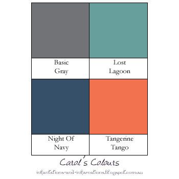
These were the colours I used (with a touch of Basic Black as well):
This card is actually a birthday card, for a Halloween birthday sleep-over which I am sure will be a scream! I was inspired by this fabulous card by Michelle Zindorf. Though my brayering wasn't as smooth as normal (I didn't want the Lost Lagoon bit to get so dark it started looking like Island Indigo so the cardstock probably wasn't as damp as it should have been for a more smooth gradient of colour where the Night Of Navy overlaps) the effect works for a spooky card. After brayering the background, and running the cardstock through the embossing folder I brayered over the raised tree trunks with Basic Gray ink. I'd read you needed a very light touch to not get ink inbetween the trunks... and knowing I was unlikely to succeed with that I took a punt that some strategically placed washi tape would help prevent such mistakes. Which it did... but need to be very careful pulling that off at the end! The eyes were hand cut after stamping the "spooky" image from Among The Branches set on Tangerine Tango cardstock with Basic Black ink. I hadn't originally planned on using a sentiment, but after doing everything else to the card felt it needed something more. It was only after I stuck the "Boo!" with the oval onto the card that I thought the card had a very Scooby Doo feel to it. What do you think?
These were the colours I used (with a touch of Basic Black as well):
Monday, October 26, 2015
Lighthearted Birthday
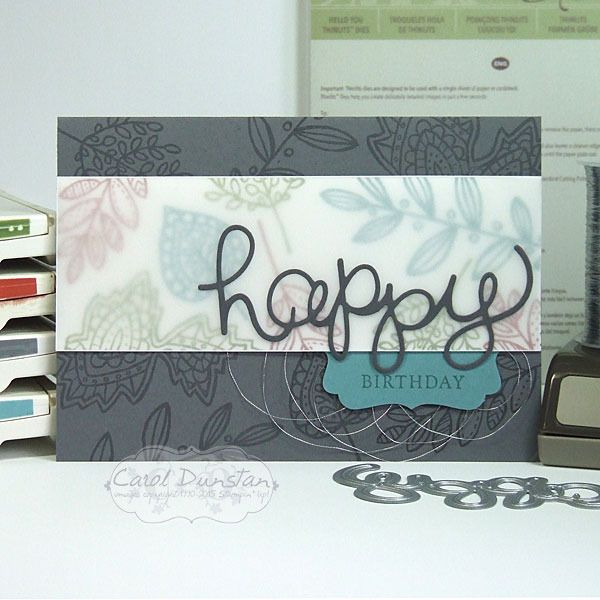
While I think there are a lot of fantastic sets in the Stampin' Up! Holiday catalogue, one of the more popular ones seems to be the Lighthearted Leaves set. I'm not immune to it's charms either!
For this card I didn't colour in the leaves, or cut them out with the coordinating Leaflets Framelits dies. I chose to just randomly stamp the various leaves in in Basic Gray for the card base, and for the feature panel I used a mix of Old Olive, Lost Lagoon... and Cajun Craze. I love playing with all colours, but Cajun Craze is probably my least favourite Stampin' Up! colour. I've tried using it before but really wasn't happy with the end result. This time I was much happier, and that was even before I put vellum over it! Sometimes what makes or breaks a colour combination is how you balance the colours: how much you use of the colours and where you put them. Using a lot of white is one trick to try if you aren't sure of a combination, but for this card I was determined to give Cajun Craze a fair showing. Unfortunately the background was a little busy and made reading the "happy" difficult, so I softed things with the layer of vellum. I didn't have a current set with "birthday" in a font or size that really worked with everything else, so I went back to the trusty Basic Phrases for that one.
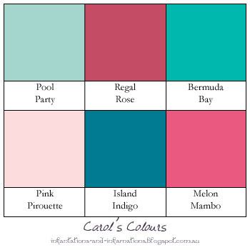
Here's the graphic for the colour combo:
For this card I didn't colour in the leaves, or cut them out with the coordinating Leaflets Framelits dies. I chose to just randomly stamp the various leaves in in Basic Gray for the card base, and for the feature panel I used a mix of Old Olive, Lost Lagoon... and Cajun Craze. I love playing with all colours, but Cajun Craze is probably my least favourite Stampin' Up! colour. I've tried using it before but really wasn't happy with the end result. This time I was much happier, and that was even before I put vellum over it! Sometimes what makes or breaks a colour combination is how you balance the colours: how much you use of the colours and where you put them. Using a lot of white is one trick to try if you aren't sure of a combination, but for this card I was determined to give Cajun Craze a fair showing. Unfortunately the background was a little busy and made reading the "happy" difficult, so I softed things with the layer of vellum. I didn't have a current set with "birthday" in a font or size that really worked with everything else, so I went back to the trusty Basic Phrases for that one.
Here's the graphic for the colour combo:
Saturday, August 22, 2015
Father's Day In The Garden
Anyone else feel like the year is rushing by? I can't believe we are coming up to Father's Day already!
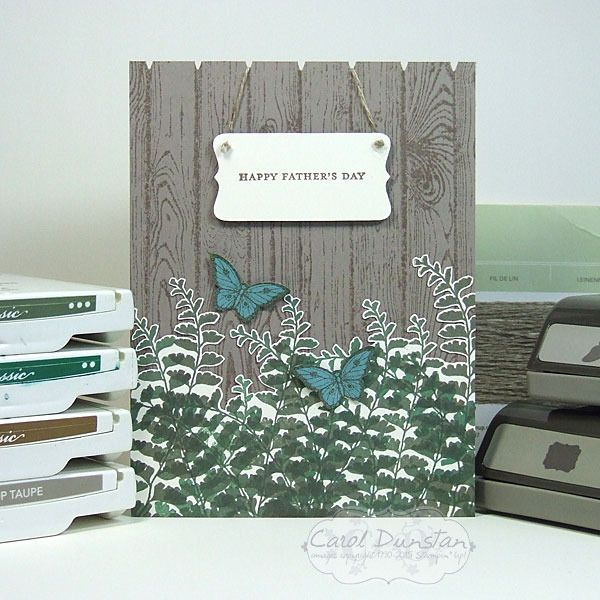
My Dad is a keen gardener, and ever one to buck the system I decided to make a male card with butterflies on it. This card was a lot of fun to make as I took advantage of the flexible nature of photopolymer stamps and varied how it was shaped as I randomly stamped it in Always Artichoke and Garden Green. I even mixed my inks a little as I skipped cleaning the stamp between inking it up, when I wasn't just sponging a bit of the other colour on to give the fronds some colour variation. Cutting out the fronds wasn't quite so much fun, but it is funny how you can zone out and time flies when doing something like that. To create the little sign I simply trimmed down the cardstock after stamping and punching it out. To get the even notches at the top of my "fence" I lightly penciled a line across on the back of the cardstock at the desired distance from the edge, then used the Christmas tree punch cut the little wedge out between the pailings.
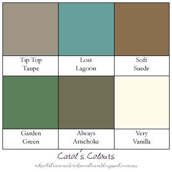
Here are the colours I used:
My Dad is a keen gardener, and ever one to buck the system I decided to make a male card with butterflies on it. This card was a lot of fun to make as I took advantage of the flexible nature of photopolymer stamps and varied how it was shaped as I randomly stamped it in Always Artichoke and Garden Green. I even mixed my inks a little as I skipped cleaning the stamp between inking it up, when I wasn't just sponging a bit of the other colour on to give the fronds some colour variation. Cutting out the fronds wasn't quite so much fun, but it is funny how you can zone out and time flies when doing something like that. To create the little sign I simply trimmed down the cardstock after stamping and punching it out. To get the even notches at the top of my "fence" I lightly penciled a line across on the back of the cardstock at the desired distance from the edge, then used the Christmas tree punch cut the little wedge out between the pailings.
Here are the colours I used:
Saturday, August 08, 2015
Feeling Special?
Time for another card using thick Whisper White cardstock for the cardbase.
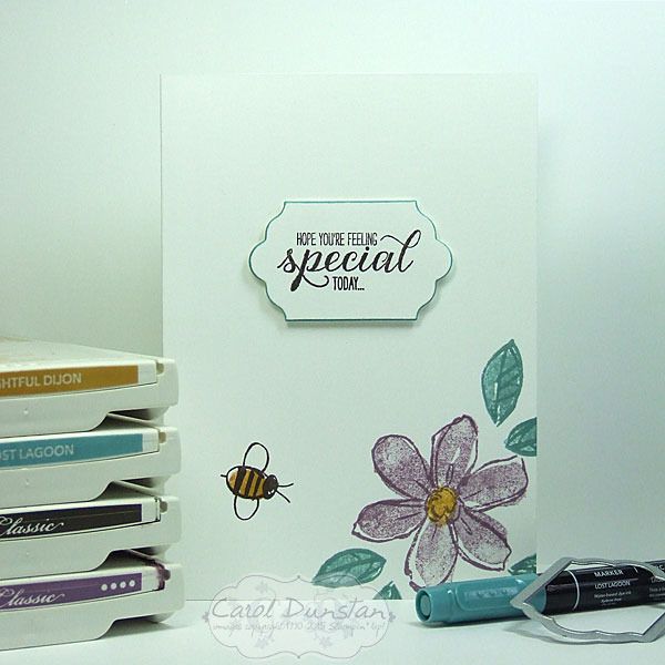
I had thought I would load this one up and really give the cardbase a workout... but ultimately opted for another simple card. The outlines for the flower and leaves were stamped in colour rather than the standard black - or for this card that would have been Early Espresso. I inked up the flowers and leaves in the same colour as their outlines, then lightly stamped them off before stamping on the card to give a little more variation in the colours. To help the sentiment layer stand out I went around the edge with the Lost Lagoon marker.
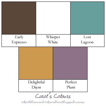
Today's colours are:
I had thought I would load this one up and really give the cardbase a workout... but ultimately opted for another simple card. The outlines for the flower and leaves were stamped in colour rather than the standard black - or for this card that would have been Early Espresso. I inked up the flowers and leaves in the same colour as their outlines, then lightly stamped them off before stamping on the card to give a little more variation in the colours. To help the sentiment layer stand out I went around the edge with the Lost Lagoon marker.
Today's colours are:
Subscribe to:
Posts (Atom)