Showing posts with label Paisley. Show all posts

Tuesday, March 03, 2009

Bring on the Bling!

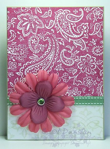
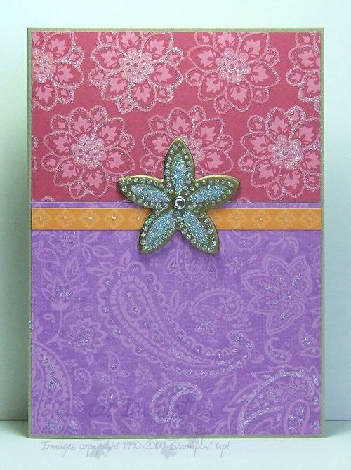
This is my card for Cinema Saturday this week, the movie being Bride & Prejudice. I hadn't seen this movie before but had wanted to because I expected it to be fun - I wasn't wrong there! Our requirement this week was to bling up our cards - not hard to do! In conjunction with some Bali Breeze paper I stamped the (retiring cry) Paisley on Orchid Opulence cardstock - had to get some purple in! Once all my layers were stuck down I went over certain parts with my 2-way glue pen and then dumped lots of Dazzling Diamonds all over it. To create the center piece I took a piece of chipboard, covered it in VersaMark then heat embossed gold embossing powder over top. I repeated this another 2 or 3 times (can't remember!) then stamped the flower stamp into the warm embossing powder. This left an impression of the flower that I then went over with the Tombow glue and covered that in Dazzling Diamonds glitter. Below you get a better idea of just how much glitter is on this card.
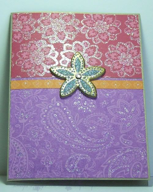
Brooke also wanted to know what our favourite dance scene was from the movie. I would have to say mine is the first, I still crack up laughing at Sayid shaking his goove thang! It also brings back some memories of uni life... though nothing was that elaborate!

All supplies by Stampin' Up!
Cardstock: brushed gold, Orchid Opulence
Stamp Sets: Paisley, In The Spotlight
Inks: Orchid Opulence, VersaMark
Accessories: Bali Breeze DSP, Tombow Multi Mono adhesive, 2-way glue pen, Dazzling Diamonds glitter, Blossoms & Basics chipboard, gold embossing powder, Pretties Kit
Show watched while creating: Bride & Prejudice

PS I also wanted to let you know that I have updated the availability list for retiring products, and I have two cards over at the Elite Challenge blog: Wild Orchid Nights and SC 19.

Monday, January 19, 2009

Cinema Saturday #15

AKA "We'll always have Paisley" lol.

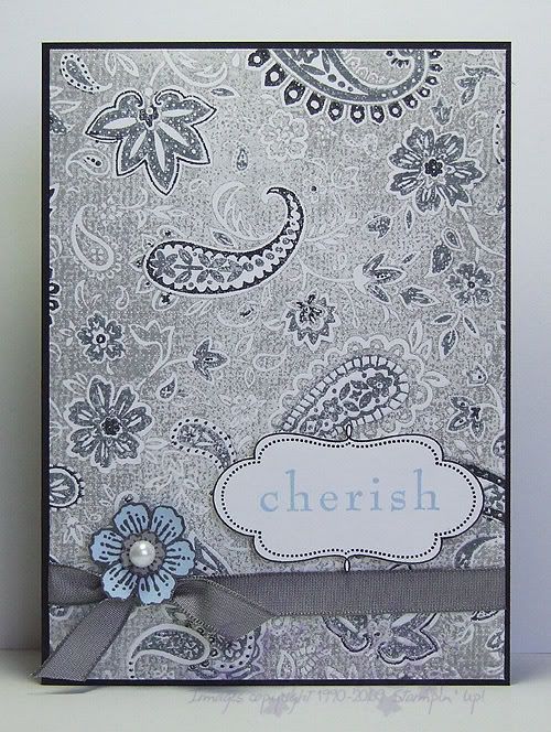
This weeks Cinema Saturday challenge is Casablanca. A classic no doubt, yet a movie I had not seen in full until last night. This week Sankari and Brooke also gave us colour guidelines, very fitting for this movie. I had initially picked out Pale Plum as my free choice, but as soon as Rick mentioned that Ilsa had worn blue the last time he'd seen her I changed my mind. I knew I was going to use this additional colour sparingly, aided by choosing a pale shade of the colour, though I wasn't quite sure how, but I made myself watch the whole movie before really starting on my card and I am glad I did. I was going to draw inspiration from Sam's piano though I have few stamps with a real Morrocan feel to them (ooooh, but how i would love it!), but as soon as I saw Ilsa's paisley blouse it was a done deal... I am a sucker for paisley, especially when I have such a gorgeous stamp of it! I ended up basing my card on that whole scene, the conversation that gave fond memories of Paris back to Rick and Ilsa. There's the paisley for her blouse, the ribbon for her sash/belt, the frame for a slightly Morrocan touch, the sentiment for the memories and the Carte Postale flower for the French connection.

All supplies by Stampin' Up!
Cardstock: Basic Black, Whisper White, Bashful Blue, Going Gray
Stamp Sets: Paisley, Frames With A Flourish, Baroque Motifs, Carte Postale
Inks: Going Gray, Basic Black, Basic Gray, Bashful Blue
Accessories: Basic Gray marker, Basic Black marker, Basic Gray taffeta ribbon, Pretties Kit, dimensionals
Show watched while creating: Casablanca of course!

Friday, January 09, 2009

KW Colour Inspiration #37

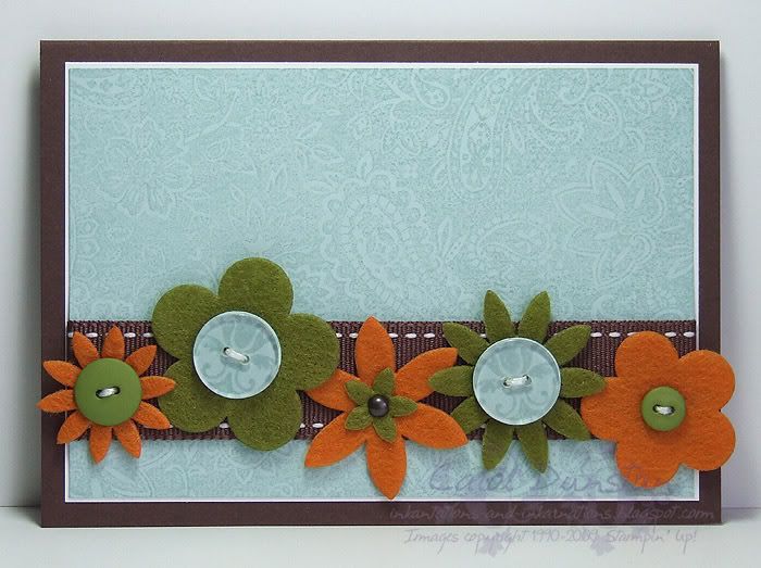
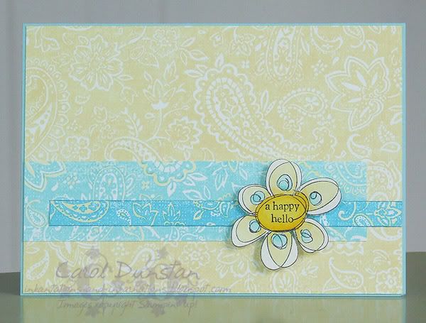
What a fabulous colour challenge Kristina posted this week! Quite often when i am working on a colour challenge I will get out my swatches of the particular colours and then start thinking about stamp sets that might work with that. This week however I got out my swatches and then the matching ribbons and embellishments... from that this card fell into place smile. Which is probably why there isn't a whole lotta stamping, but I still like it.
Most supplies by Stampin' Up!
Cardstock: Chocolate Chip, Whisper White, Soft Sky
Stamp Sets: Paisley, Simple Delights
Inks: Soft Sky
Accessories: Felt Fusion flowers, Earth Elements buttons, clear buttons, Aged Copper Hodgepodge (for the measley little brad), 3/4" circle punch, Chocolate Chip 1" double-stitched ribbon, white cotton floss

Wednesday, November 26, 2008

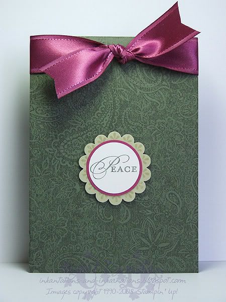
Paisley Peace

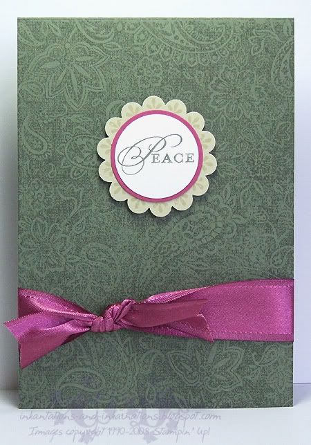
Here's another couple of cards I started last week and have finished this week. The hold-up with these ones was that I had only taken Christmas sets (well, obviously I also brought Paisley but that is because I had this sort of card in mind) to my friends house, and after punching the River Rock scallop circles I decided they need some stamping on them in the form of the large circular motif from Wanted. The sentiment comes from a stamp that actually says "Peace Love Joy", but since the whole thing wouldn't fit I just used my Artichoke marker to ink the one word. Good news for all you marker fans who haven't already snapped up your favourite colours - Stampin' Up! have extended the marker promotion until December 14!
That gorgeous Purely Pomegranate satin ribbon is only available in the current Spring mini catalogue. If you'd like some you had better be quick! The catalogue ends this Sunday, so contact me today if you'd like to order some before it is gone for good.

All supplies by Stampin' Up!
Cardstock: Always Artichoke, River Rock, Purely Pomegranate, Whisper White
Stamp Sets: Paisley, Occasional Greetings, Wanted
Inks: Always Artichoke, River Rock
Accessories: scallop circle punch, 1 3/8" circle punch, 1 1/4" circle punch, Purely Pomegranate satin ribbon, Always Artichoke marker, dimensionals

Thursday, September 18, 2008

Almost Paisley

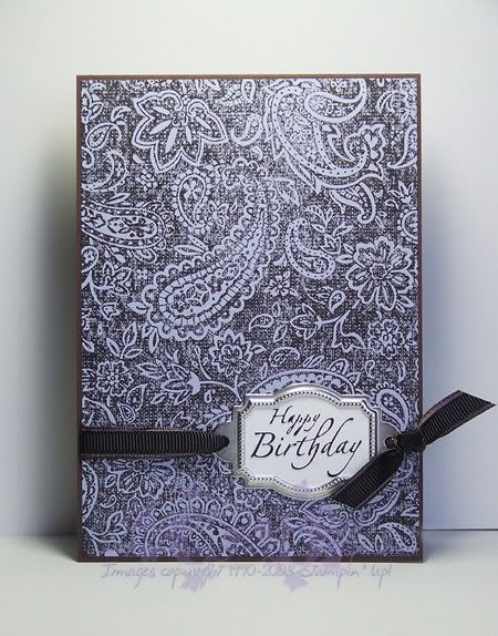
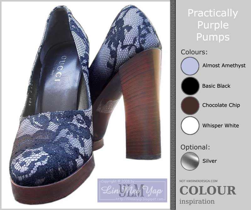
This is my card for the first Inklings Cyberstamp challenge. Lin Mei kicked off the night with a colour challenge, using some shoes as inspiration. My first response used Fine Lace as the background stamp, because on this occasion I was consciously inspired by the photo with it's lacey shoes. I decided that it wasn't really the look I was after, so I remade the card using Paisley for the background... If only those shoes were Paisley I think I'd be hunting them down (although what I would wear them with I have no idea!)! If you click on the image of my card to view it larger you will be able to just make out that the sentiment has been shadowed with Almost Amethyst. Another little trick I used was to SNAIL the two ribbons together so they were easier to control. And I have to say I love using Basic Black when I need a black but don't need to watercolour, much easier to clean (and it smells better too).

All supplies by Stampin' Up!
Cardstock: Chocolate Chip, Almost Amethyst, Whisper White
Stamp sets: Paisley, It's Your Birthday
Inks: Basic Black, Almost Amethyst
Accesories: designer label punch, Styled Silver hodgepodge, Chocolate Chip taffeta ribbon, black grosgrain ribbon

Sunday, June 29, 2008

Blame it on the Paisley

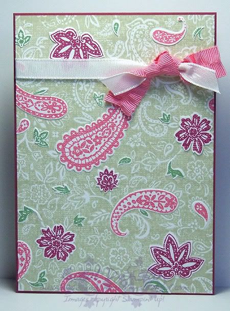
I just couldn't help myself... this idea wouldn't leave me alone! I spent some time yesterday cutting out bits of paisley from all the images I stamped up for Kristina's colour challenge, then sticking them on to another image of the Paisley and then just adding a bit of ribbon to finish it off. Idealy, or not depending on your opinion of the sanity of the idea, I would've cut out everything, but it was taking forever and I had other things to do. I also contemplated popping some bits up on dimensionals, but you've got to draw the line somewhere...

All supplies by Stampin' Up!

Cardstock: Purely Pomegranate, Whisper White
Stamp Sets: Paisley
Inks: River Rock,
Purely Pomegranate, Regal Rose, Wild Wasabi
Accesories: Whisper White taffeta ribbon, Fairytale Ribbon Originals

Thursday, June 26, 2008

KW Colour Inspiration #13

Kristina Werner took me by surprise by posting a colour challenge yesterday afternoon - I didn't think we'd have another one till Friday at the earliest! But I no complain wink. One look at the inspiration photo and all I could think of was Paisley... by dinner time my desk was covered in all these bits of stamped Paisley and I had a million ideas going through my head. I eventually settled on this one, though I may get time to work on one of my other ideas... we'll see! If you go to the website where the bedding came from you'll see there is a video you can watch. It was from that, and the mention of the French, that I also decided I had to use Carte Postale some way. I decided to base my design on the quilt cover and had planned on stamping a Wasabi sentiment in the bottom right corner, but decided I like it better with no words at all.
All supplies by Stampin' Up!

Cardstock: River Rock, Whisper White
Stamp Sets: Paisley, Carte Postale
Inks: Purely Pomegranate, River Rock
Accesories: Pretties Kit, Regal Rose marker, blender pen and Purely Pomegranate reinker, Ice Circle Rhinestone Brads, Wild Wasabi Double-stitched ribbon.

Saturday, June 14, 2008

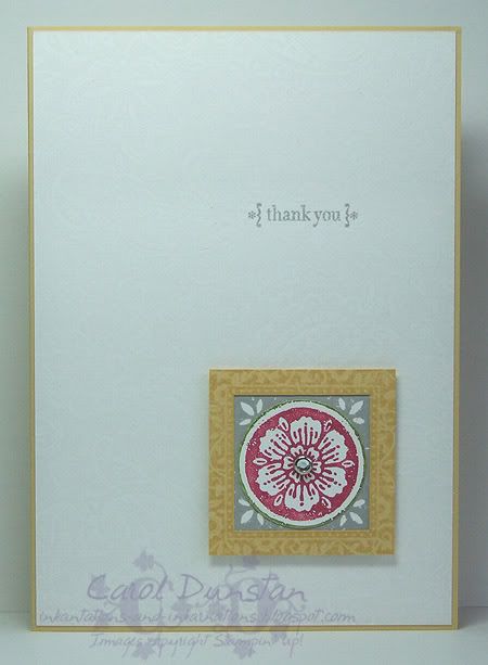
KW Color Inspiration #11

Yesterday afternoon I saw that Kristina Werner has posted another colour challenge. The colours this time were Rose Red, Old Olive, Whisper White, So Saffron and Going Gray. With the girls' swimming lesson and dinner at the inlaws, I didn't get a chance to work on it till late (well, late for me), but that did give me plenty of time to think about it. I decided to go with the light, airy feel I got from the inspirational photo so I stamped a piece of Whisper White with the ever wonderful (razz to you JanTink for suggesting it will retire!) Paisley background using VersaMark. I love the effect of VersaMark on white, however your stamp has to be *very* clean. Seems I haven't been completely diligent with my Paisley and had to give it a thorough clean and try again. The other piece is still useable, just not what I wanted for this card. I did find it a little tricky working in the grey, but do like my end result. I stamped the square flower image from another old favourite Carte Postal twice, first with Going Grey ink on Whisper White, then the second time I used my Rose Red and Old Olive markers to ink it. I punched the Rose out with the 1 1/4" circle punch, cutting the slightest rim of Old Olive with it, layered this over the Gray square, put a So Saffron Frames with a Flourish frame over top, attached a clear rhinestone brad (Pretties Kit) in the center and mounted it to the card front using dimensionals. The sentiment, from Occasional Greetings, is stamped in Going Gray. Unfortunately it's a grey ol' day here, so the photo isn't great! Anyway, I'm off to have a nice cuppa to warm up and get cracking on Beate's latest sketch biggrin

Tuesday, May 27, 2008

Purely Pretty Trees

Another old Kristina Werner colour challenge, this time without combining it with a sketch challenge. I love "warm" colour combinations like this, though I have to say I don't think I would have put Pumpkin with Pomegranate. Lovely As A Tree is another old favourite stamp set of mine, though as I haven't played with it for a while I thought this was the perfect opportunity: for a few weeks now I have been daily walking past trees with their changing leaves and loving the mix of hues, though the purple end of their spectrum is often left out so I felt it was my duty to do something about it! I used my markers to ink the stamp (remember, I have created my own In Color markers by using a pack of blender pens and the ink refills) and stamped it on Pretty In Pink cardstock. With an aquapainter I washed in some Pretty in Pink along the horizon, blurred/blended the trees a bit and added a bit more Chocolate Chip to the ground. I mounted this to a piece of Whisper White, the edges of both layers having been distressed with the Cutter Kit, and mounted this on top of a piece of Pumpkin Pie that had been stamped with good ol' Paisley using VersaMark. A piece of Pomegranate stitched ribbon and Aged Copper hodgepodge were added and then it was all mounted onto the Whisper White card base. The sentiment, from Occasional Greetings, was stamped on Whisper White with Purely Pomegranate, punched out with the 1 1/4" circle punch and layered on a Chocolate Chip designer label punched piece, and all this was mounted to the card front using some dimensionals.

Friday, May 23, 2008

Cherished Paisley

This was my response to the second Inklings cyberstamp challenge, a sketch and colour combo challenge. As I was playing catch-up with the challenges I had only skimmed what they were, opened the corresponding images in separate tabs in my browser, yadda yadda yadda... created a card based on the colours, then created a card base on the sketch. At some point I went back and saw they were to be combined... d'oh! Ah well lol

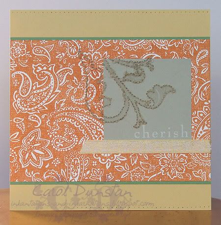
For this card I used a So Saffron card base (14.8 cm square), a layer of Whisper White stamped with Paisley in Pumpkin Pie on a slightly larger Wild Wasabi layer, and a small piece of Sahara Sand with that "cherish" stamp from Baroque Motifs again stamped in Whisper White. I stamped the large image from Brocade Basics on both the Sahara Sand piece and Paisley layer (masking a lot of it off) using VersaMark, pierced holes around the edge and then stitched this outline with linen thread. This took ALL DAY and nearly KILLED my fingers... I tend not to like large holes showing in my stitching and my fingers really paid for it that day, pulling the needle through rather than making extra large holes that the needle would just glide through. I also pierced holes along the horizontal edges of the base card and ran a piece of So Saffron ribbon (from the Fairy Tale Ribbon Originals pack) across the card. Like a lot of people who took up the challenge, these are not colours I would normally team-up, but I really what I came up with.

Thursday, May 22, 2008

Paisley Wishes

Do you have a stamp or set that you turn to time and again? The Paisley background is one of those for me. As my Mum commented when looking through all the swaps I got from convention, it's a versatile stamp that can look very different depending on how you use it. On this card (my SIL's birthday card) I have inked Paisley with VersaMark and stamped it on the River Rock card base. Subtle, but it adds interest. I then turned to a new favourite set, Wanted, and stamped the large circular image on the card base using River Rock ink. I punched the center of the image out with the 1 3/4" circle punch to create a window. I cleaned the stamp, inked it with Rose Red, Perfect Plum and Bashful Blue markers, stamped it on Whisper White, punched it out and mounted it to the inside of the card (using dimensionals) so it would show through the window. For the main image I randomly stamped images from the Wanted set in Bashful Blue on Whisper White, then stamped the horse over top using Perfect Plum ink and the sentiment (from Take Three) using Rose Red ink. The edges of this, and the Rose Red and Perfect Plum layers, were then distressed using the cutter kit, stuck together and mounted over some more Beachfront ribbon (I'm finding the neutral tones of that pack very useful!) using dimensionals yet again. The ribbon has been tied through a piece of pewter hodgepodge.

Saturday, May 17, 2008

just a brag or two

I have been meaning to post for some time now that I have some more cards published in Australian Paper Craft issue 76. This is actually the last issue of APC and soon we will see a new magazine that is an combination of APC and For Keeps, so keep your eyes out! APC 76 has been out for a while, though I did spot some in Borders last weekend.

But wait, there's more! I also have cards in Stamping & Papercraft this month! Volume 13, number 9. I particuarly love these cards because I challenged myself to use some different colours (for me) and they came out rather well I thought! So all thanks to Pumpkin Patch for the inspiration wink. There are 4 cards featured in the magazine, so I thought I'd share one of them with you:

Thursday, February 21, 2008

A Touch of Paisley


This card was inspired by Claire Daly. I've kept with much the same colour scheme as my last card, except there is no green in sight so it's almost monochromatic. This style of card is great for using up little scraps of cardstock... in which case I should probably make a lot more of them! The butterfly is from the Touch of Nature set and was inked with Vintage Violet and stamped on the brushed Silver cardstock. I love the effect this gives.

Wednesday, February 20, 2008

Paisley in the Spotlight

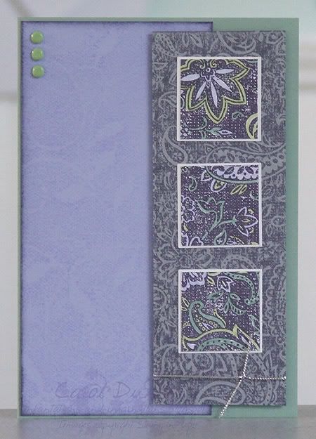
Here's another card for the Inklings cyberstamp. For challenge #1 we had to use the spotlight technique. Since I have done that technique a few times I decided to do things a bit differently. I wanted to use a background stamp for the spotlighing, and then I decided to follow Beate's sketch #33 and have three spotlights! The Paisley background stamp has been inked with Vintage Violet and stamped once on Whisper White, and once on Silver (re-inked before stamping of course). I then carefully coloured the paisley with markers in Almost Amethyst, Certainly Celery and Sage Shadow. My spotlights were then cut out, mounted on 1 1/4" squares of Whisper White to highlight them, and mounted onto the silver layer. The background piece is the Fine Lace background stamp inked with Almost Amethyst and stamped on Almost Amethyst cardstock, then the edges have been inked with Vintage Violet. The card base is Sage Shadow cardstock, and I've used some Celery brads and silver cord to finish the card off.

Wednesday, February 13, 2008

My Friend the Chocolate Cake

Mmmmm, just the thought of chocolate cake is making me drool lol

For this card I've used three sets: 'Birthday Whimsy', 'Paisley' background and 'Time Well Spent'. Once I got the idea of combining the cake with the sentiment I had to make it into a card or two to get it out of my head... though I very nearly used the other sentiment "Time spent with friends is time well spent"... I think I was channeling those old Tim Tam ads that compared men to Tim Tams. Anyway, back to the card. Colours are Regal Rose, Close to Cocoa, Chocolate Chip, Cool Caribbean and Whisper White. I've used a white gel pen to do faux stitching down the side and to colour in parts of the sentiment. All products are Stampin' Up! and available through me (although "Time Well Spent" is not released yet).

Tuesday, February 12, 2008

Birthday Bug

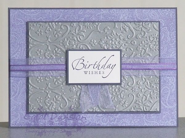
I've been trying to get in front of my birthday cards this year, and I'm afraid I'm not off to a great start but there's always room for improvment. This card I made for my sister last week and I went to town with the purple again - Vintage Violet, Almost Amethyst, Silver and Whisper White. The Almost Amethyst layer has been stamped with the Paisley background in Almost Amethyst. The silver layer I ran through my Textile embossing folder in the Cuttlebug. I've got no idea on the origin of the ribbons, but I thought they worked nicely.

Sunday, September 09, 2007

Happy Days

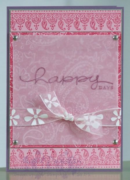
Another card I did the other day, and unusually very pink! SU Happy Everything and Paisly background, See D's Mehndi stamp for the border. Had to have a Perfect Plum as the card base to make up for all that Pale Pink and Rose Red, and there's also a bit of Mellow Moss. Silver brads I think are Renoir and the ribbon is Celebration from Spotlight.

Monday, August 06, 2007

Danish Wishes

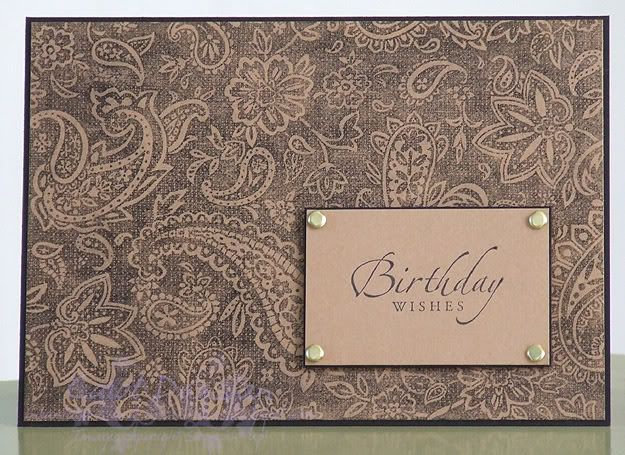
What's so Danish about this card, you ask? It was inspired by the top Claire Danes wore on Rove last week (as seen in the first pic in this slideshow). I decided the paisley background had the look I was after (Fine Lace was a completely different lace...), then had to think how I was going to stamp it... Basic Black wasn't going to be black enough and I didn't relish the thought of StazOn all over my precious paisley. So in the end I opted to stamp in VersaMark and dab the black pastel over it with a sponge dauber. The sentiment (from Sincere Salutations) was stamped in StazOn on caramel, with some gold brads to finish it off. Pretty simple, but quite elegant I think.

Tuesday, July 31, 2007

Both Way Blossoms Both Ways

Took a minor break from playing with Spring Mini stamps , but revisted my colour combo from yesterday. This card came out pretty much how I envisioned it... Both Ways Blossom stamped on Sahara Sand using StazOn, also stamped on Whisper White, flower coloured, trimmed and mounted over the flower on the Sahara Sand piece. This was then layered on a piece of Always Artichoke with some paper piercing down the left. Sentiment from Warm Words also stamped on Whisper White, punched with Word Window punch and attached with an artichoke brad, all mounted on an Old Olive cardbase. I really liked how it came out... but wanted to see what it would look like jazzed up a bit more.
On this card the cardbase has been stamped with the Paisley background using VersaMark, and I added some stitched artichoke ribbon from the Ribbon Originals 'Rustic Retreat' collection along with piercing around the Shara Sand piece. I was also really pleased with how this came out. Below you can see them side by side.

Monday, July 30, 2007

Office in the Springtime

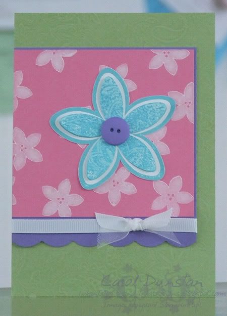
Since the new catalogue is for spring I thought it was time I got some spring-ish colours out. Haven't managed to put Office Accoutrements away yet, this time combined with an old favourite, the Paisley background. The large flower is stamped on Whisper White twice, once with Cool Caribbean, the second time it is double stamped, firstly with Cool Caribbean and then it has been kissed with the Paisley that was inked in Tempting Turquoise. These are then trimmed, with the inner part mounted just in the centre so the petals sit up a little. The flower centre is a Lovely Lilac button. The cardbase is Certainly Celery with the Paisley stamped in VersaMark, on top of this is a layer of Lovely Lilac (scallop edge courtesy of the corner rounder with the guard removed), a layer of Regal Rose with the small Office flower stamped in Whisper White. To finish it all off is some white grossgrain and white organdy ribbon.