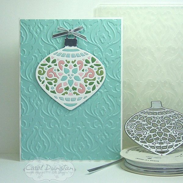
Last week I showed you another Delicate Ornaments card. This week I will show you what I did with the other pieces from those ornaments.
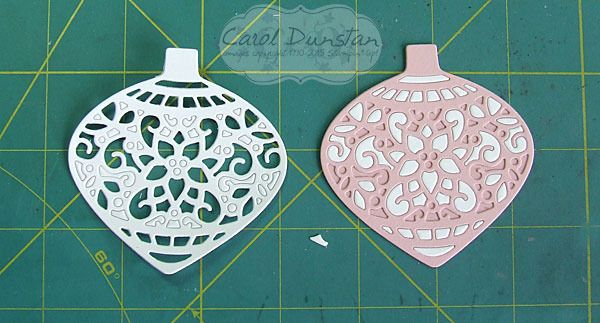
I kept the styling very similar to the matching ornament cards, but since the ornament frame was white I used a coloured background instead. I think I like these ones slightly more than their counterparts, I think it's the multiple colours in the ornaments themselves, but think both types come out really pretty. However, these ones were a bigger headache to make... if you think about it, with the other ones I was popping the white pieces straight out and into the coloured frame. So all those pieces from the coloured frames had to have already come out right? And I wasn't thinking terribly clearly when I did that. This is what I was working with for these cards:
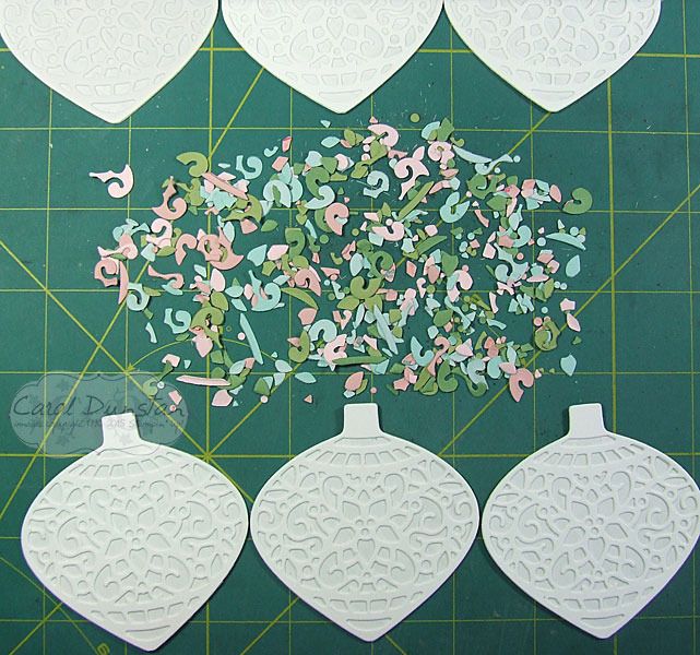
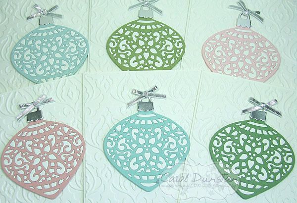
What a mess! At least after a little while I stopped looking for specific pieces and just randomly picked up pieces to see if their shape could quickly tell me where they went. Eventually I caved to the idea that I should have done when popping them out of their frames: keep the colours separated. Oh well, I got there in the end! Here are all 6 cards finished:
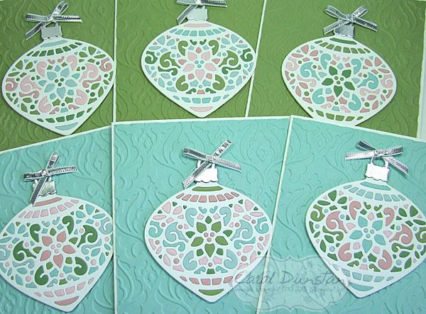
I did "stuff up" a little when putting these together, as I had planned to put those ornaments with a lot of blue on the green background and vice versa, but I shuffled things around a bit too much and didn't realise till I had already stuck most of them down. Another "Oh well"! They still look nice, just not exactly what I had planned.
Colours and supplies are the same as the Pastel Delicate Ornaments.
Showing posts with label Pear Pizzazz. Show all posts
Monday, November 30, 2015
Monday, November 23, 2015
Pastel Delicate Ornaments
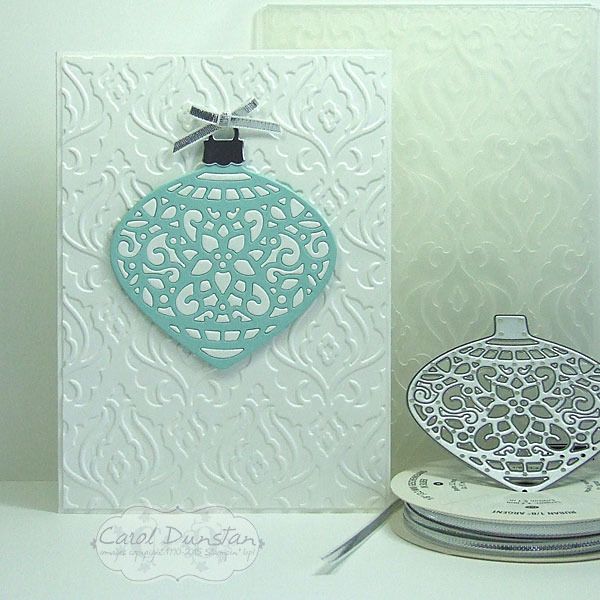
Today I have another Delicate Ornaments card for you, another made by inlaying the little bits from one or more colours into the frame of another.
For this card I kept the overall design simple, and even just the two colours for the ornament itself. By now I was learning...
..take the bits from one and put them straight into another! You might already sense what is coming, but that will be a post for another day. Instead of punching a circle to back these ornaments, I used the matching bold ornament framelit die. It is ever so slightly larger, but this isn't a major issue - especially if you cut it in the same colour as the frame you used. Other than that, the rest of the construction was the same as the Stained Glass-esque Ornaments. As you can probably already tell, I cut some ornaments in white and some in a variety of colours. You might be wondering why I would bother doing this technique if I was just using one colour of the little bits. Basically, I hate to waste anything, but also it does give a different look to just backing the ornament frame with another colour. Here is a shot of this group of cards all finished:
While I wanted these cards over all plain I did want a little interest on my background, but didn't feel any of the current embossing folders had the look I wanted so for that I turned to the retired Beautifully Baroque folder.
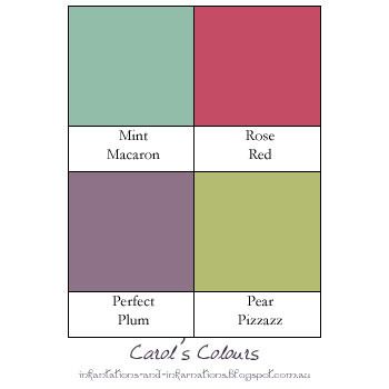
Colours used on these cards:
For this card I kept the overall design simple, and even just the two colours for the ornament itself. By now I was learning...
..take the bits from one and put them straight into another! You might already sense what is coming, but that will be a post for another day. Instead of punching a circle to back these ornaments, I used the matching bold ornament framelit die. It is ever so slightly larger, but this isn't a major issue - especially if you cut it in the same colour as the frame you used. Other than that, the rest of the construction was the same as the Stained Glass-esque Ornaments. As you can probably already tell, I cut some ornaments in white and some in a variety of colours. You might be wondering why I would bother doing this technique if I was just using one colour of the little bits. Basically, I hate to waste anything, but also it does give a different look to just backing the ornament frame with another colour. Here is a shot of this group of cards all finished:
While I wanted these cards over all plain I did want a little interest on my background, but didn't feel any of the current embossing folders had the look I wanted so for that I turned to the retired Beautifully Baroque folder.
Colours used on these cards:
Wednesday, November 18, 2015
Occasions Catalogue Sneak Peek
As I mentioned last week, over the weekend I attended one of the new events put on by Stampin' Up!, OnStage Local in Melbourne. Other than the usual catching up with old friends and making some new ones, we got to see a lot of new product from the upcoming Occasions catalogue - oh boy I think this one is going to be as popular as the current Holiday catalogue! We also got to see product the upcoming Sale-a-Bration catalogue. Everyone received a few of the new goodies, and I had to get stuck in and have a little play yesterday. Another perk of attending was being able to purchase more product before the pre-order period offically begins, so I am crossing my fingers that arrives before the weekend so I can have more of a play. I know, I know, I am teasing you horribly. So here's a glimpse of what is in store:
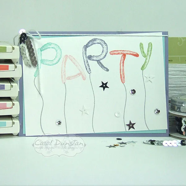
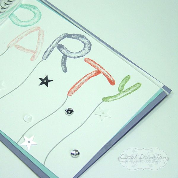
This is the Balloon Builders set, which has a variety of balloon shaped stamps that are fabulous for combining to create other images - it's a great one for letting your imagination run wild! Along with the stamped images I used some sequins (just like those that were scattered on the tables at OnStage, that felt fitting) to jazz the card up a little. I even tucked some clear ones behind my cardstock layers, which you might be able to see a little better below (above the T and diagonally up to the left from my watermark):
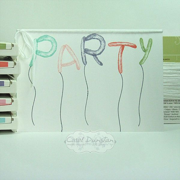
I also decided to make a stripped back version, for those who don't like the jazzing-up:
Like what you see? Let me know if you'd like to receive a catalogue, when they become available I can pop them in the mail for you to drool over. If you book a workshop you could even earn some of the products for free!
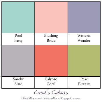
Colours used:
This is the Balloon Builders set, which has a variety of balloon shaped stamps that are fabulous for combining to create other images - it's a great one for letting your imagination run wild! Along with the stamped images I used some sequins (just like those that were scattered on the tables at OnStage, that felt fitting) to jazz the card up a little. I even tucked some clear ones behind my cardstock layers, which you might be able to see a little better below (above the T and diagonally up to the left from my watermark):
I also decided to make a stripped back version, for those who don't like the jazzing-up:
Like what you see? Let me know if you'd like to receive a catalogue, when they become available I can pop them in the mail for you to drool over. If you book a workshop you could even earn some of the products for free!
Colours used:
Monday, June 01, 2015
Flower Potpourri Farewell
Tomorrow is the last chance you will have to order products from the current Stampin' Up! catalogue, and the Stampin' Up! Occasions catalogue. Fabulous products like these...
I so so love the Spring Flowers embossing folder, and I am really sad it isn't carrying over to the next catalogue. The Petal Potpourri set also won't be in the new catalogue either, nor will the coordinating Flower Medallion punch. I loved the variety of styles in Petal Potpourri, and of course I am a punch fanatic so always sad to see one go. As sad as that is, tomorrow will be your first opportunity to purchase new items, like the Mint Macaron cardstock and Dotted Lace Trim! There's so many things I love in the new catalogue that it does ease the pain of what we'll be saying goodbye to.
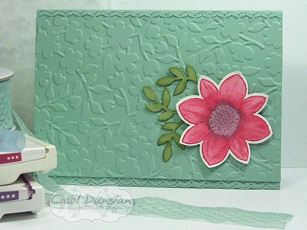
This card is pretty straight forward, the flower was stamped on watercolour paper in the Rose Red and Perfect Plum ink, then the aquapainter was used to just spread the colour to fill in the petals and flower center. I also picked up a bit of ink from the inkpad itself to add a bit more to the base of the petals to make the colour there more intense and add a bit more depth to them. I also sponged a little bit of Pear Pizzazz around the edges of the punched leaves to help them stand out against the Mint cardstock.
And today's colours are...
I so so love the Spring Flowers embossing folder, and I am really sad it isn't carrying over to the next catalogue. The Petal Potpourri set also won't be in the new catalogue either, nor will the coordinating Flower Medallion punch. I loved the variety of styles in Petal Potpourri, and of course I am a punch fanatic so always sad to see one go. As sad as that is, tomorrow will be your first opportunity to purchase new items, like the Mint Macaron cardstock and Dotted Lace Trim! There's so many things I love in the new catalogue that it does ease the pain of what we'll be saying goodbye to.
This card is pretty straight forward, the flower was stamped on watercolour paper in the Rose Red and Perfect Plum ink, then the aquapainter was used to just spread the colour to fill in the petals and flower center. I also picked up a bit of ink from the inkpad itself to add a bit more to the base of the petals to make the colour there more intense and add a bit more depth to them. I also sponged a little bit of Pear Pizzazz around the edges of the punched leaves to help them stand out against the Mint cardstock.
And today's colours are...
Subscribe to:
Posts (Atom)