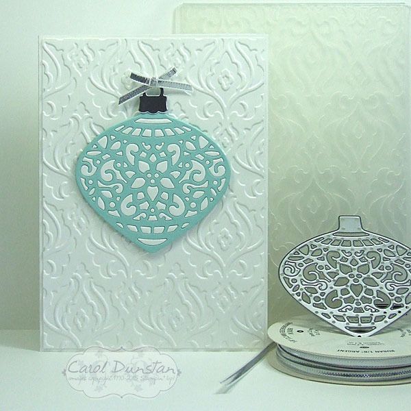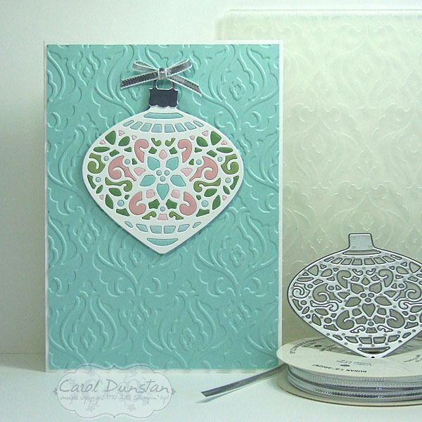
Last week I showed you another Delicate Ornaments card. This week I will show you what I did with the other pieces from those ornaments.
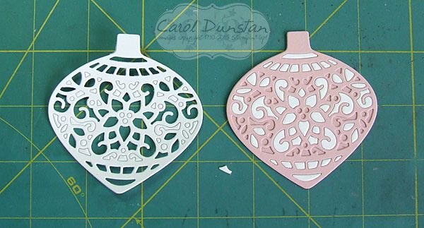
I kept the styling very similar to the matching ornament cards, but since the ornament frame was white I used a coloured background instead. I think I like these ones slightly more than their counterparts, I think it's the multiple colours in the ornaments themselves, but think both types come out really pretty. However, these ones were a bigger headache to make... if you think about it, with the other ones I was popping the white pieces straight out and into the coloured frame. So all those pieces from the coloured frames had to have already come out right? And I wasn't thinking terribly clearly when I did that. This is what I was working with for these cards:
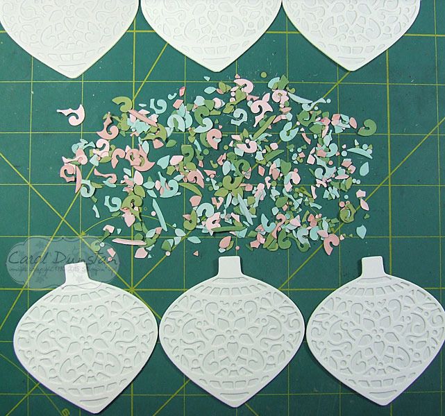
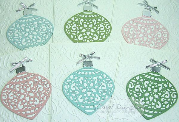
What a mess! At least after a little while I stopped looking for specific pieces and just randomly picked up pieces to see if their shape could quickly tell me where they went. Eventually I caved to the idea that I should have done when popping them out of their frames: keep the colours separated. Oh well, I got there in the end! Here are all 6 cards finished:
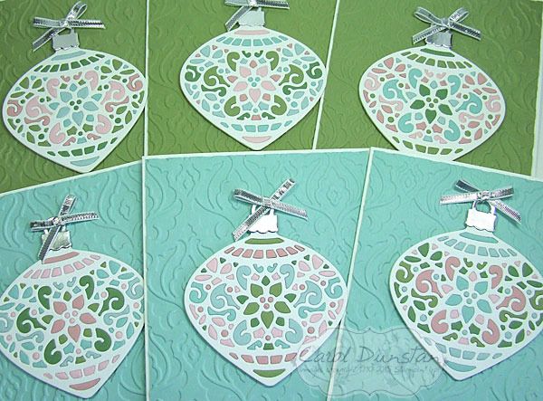
I did "stuff up" a little when putting these together, as I had planned to put those ornaments with a lot of blue on the green background and vice versa, but I shuffled things around a bit too much and didn't realise till I had already stuck most of them down. Another "Oh well"! They still look nice, just not exactly what I had planned.
Colours and supplies are the same as the Pastel Delicate Ornaments.
Showing posts with label Pink Pirouette. Show all posts
Monday, November 30, 2015
Monday, November 23, 2015
Pastel Delicate Ornaments
Today I have another Delicate Ornaments card for you, another made by inlaying the little bits from one or more colours into the frame of another.
For this card I kept the overall design simple, and even just the two colours for the ornament itself. By now I was learning...
..take the bits from one and put them straight into another! You might already sense what is coming, but that will be a post for another day. Instead of punching a circle to back these ornaments, I used the matching bold ornament framelit die. It is ever so slightly larger, but this isn't a major issue - especially if you cut it in the same colour as the frame you used. Other than that, the rest of the construction was the same as the Stained Glass-esque Ornaments. As you can probably already tell, I cut some ornaments in white and some in a variety of colours. You might be wondering why I would bother doing this technique if I was just using one colour of the little bits. Basically, I hate to waste anything, but also it does give a different look to just backing the ornament frame with another colour. Here is a shot of this group of cards all finished:
While I wanted these cards over all plain I did want a little interest on my background, but didn't feel any of the current embossing folders had the look I wanted so for that I turned to the retired Beautifully Baroque folder.
Colours used on these cards:
For this card I kept the overall design simple, and even just the two colours for the ornament itself. By now I was learning...
..take the bits from one and put them straight into another! You might already sense what is coming, but that will be a post for another day. Instead of punching a circle to back these ornaments, I used the matching bold ornament framelit die. It is ever so slightly larger, but this isn't a major issue - especially if you cut it in the same colour as the frame you used. Other than that, the rest of the construction was the same as the Stained Glass-esque Ornaments. As you can probably already tell, I cut some ornaments in white and some in a variety of colours. You might be wondering why I would bother doing this technique if I was just using one colour of the little bits. Basically, I hate to waste anything, but also it does give a different look to just backing the ornament frame with another colour. Here is a shot of this group of cards all finished:
While I wanted these cards over all plain I did want a little interest on my background, but didn't feel any of the current embossing folders had the look I wanted so for that I turned to the retired Beautifully Baroque folder.
Colours used on these cards:
Monday, June 22, 2015
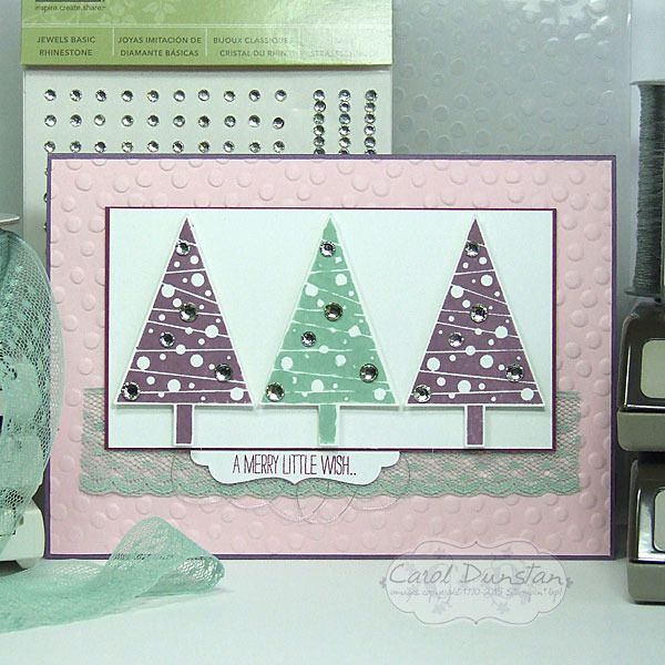
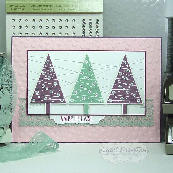
The Festival Of Trees Continues
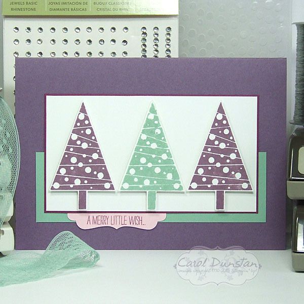
The Festival Of Trees stamp set was released in the Holiday catalogue last year, was carried over to the Occasions catalogue and is now included in the new annual catalogue! I'm sooooo happy that the Christmas section has returned to the annual catalogue, and having the option of Christmas sets available all year round... because let's face it, it's never too early to start on your Christmas cards! With that in mind, I thought I would get started on mine in June, and hopefully I won't end up in what has become a mad rush the last few years. The worst part about that isn't so much the "chasing your tail" feeling, but the burn-out I often feel afterwards, and needing a break from stamping for a while. Anyway, enough jibber-jabber, here's the cards:
yep... I couldn't settle on one design so I made four. Design is based on Sweet Sunday Sketch #272.
I also kept with my tradition of non-traditional Christmas colours... it felt a little too soon in the year for that!
yep... I couldn't settle on one design so I made four. Design is based on Sweet Sunday Sketch #272.
I also kept with my tradition of non-traditional Christmas colours... it felt a little too soon in the year for that!
Thursday, June 11, 2015
Mojo Monday 401
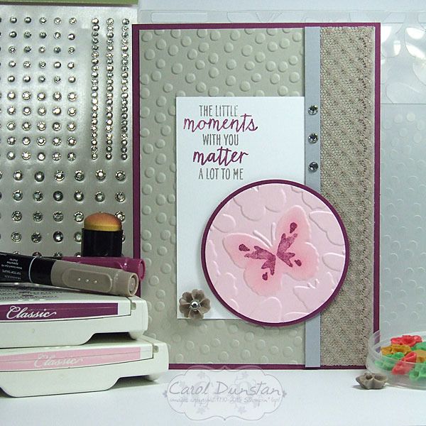
It's been a very long time since I played along with a sketch challenge, this week I finally got back into that swing of things with the Mojo Monday sketch.
When my order from the new catalogue arrived last week I immediately noticed that one of the stamps from the Watercolor Wings could fit on some of the butterflies of the Fluttering embossing folder. I thought this sketch would suit highlighting that, so the rest of the card fell into place around that focal point. To really emphasise the butterfly I sponged some Pink Pirouette ink over the raised butterfly.
Here are the colours I played with for this card:
When my order from the new catalogue arrived last week I immediately noticed that one of the stamps from the Watercolor Wings could fit on some of the butterflies of the Fluttering embossing folder. I thought this sketch would suit highlighting that, so the rest of the card fell into place around that focal point. To really emphasise the butterfly I sponged some Pink Pirouette ink over the raised butterfly.
Here are the colours I played with for this card:
Tuesday, May 19, 2015
Mixed Bunch Farewell
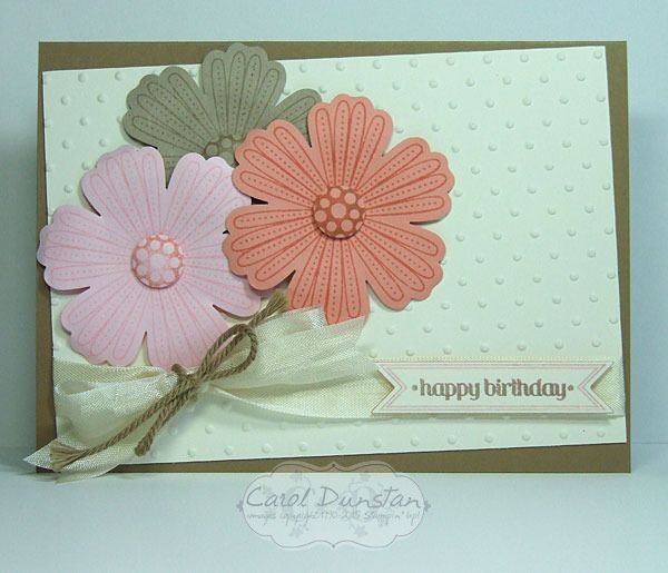
For me Mixed Bunch was a surprise inclusion on the retiring product list this year. The clear-mount version is sold out so if you are still thinking about purchasing woodmount is your only option and you need to get in quick! There's only 2 weeks left to order retiting items, but remember they are only available while stocks last.
For this card I once again decided to use an image in the set that I hadn't used that often. I thought the little dots on the petals would team well with the Perfect Polka Dots embossing folder that is also retiring. And then I had to give Itty Bitty Banners a last hoorah to finish the card off!
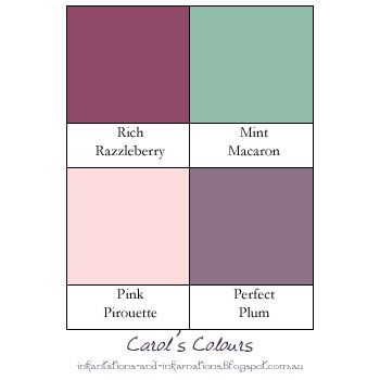
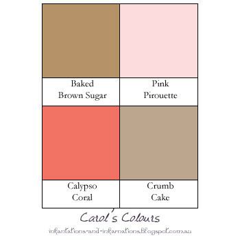
Do you like the colours I have used on this card? I thought I would start using a simple graphic to give an easy reference for colours I use on projects so you don't have to piece together the info from the product list :)
Subscribe to:
Posts (Atom)