Showing posts with label Carte Postale. Show all posts

Sunday, September 13, 2009

Cinema Saturday 49

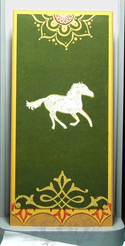
I'm sure you can imagine that I was exstatic to be asked to guest design for Cinema Saturday's Lord of the Rings: The Two Towers challenge. Those of you who have seen the Extended Edition dvd sets will have noticed that each one has a different style - FOTR is Elvish, TT is Rohirric (if that isn't a word it is now!) and ROTK... well maybe I will save that for when the girls nominate that as the weeks challenge! Anyway, it seemed that the thing to do would be to make something for The Two Towers that had a Rohan theme. One thing that really stood out for me was all the banners that are displayed in Meduseld, so I selected one and based my piece on that. I also have a bookmark of one of these banners, so I decided to make one of my own.
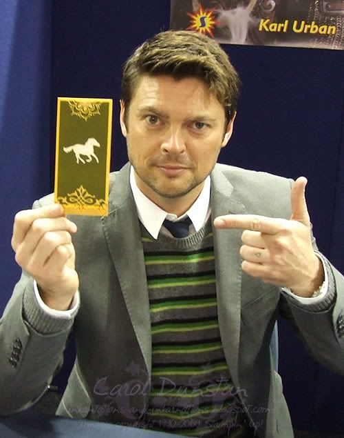
Thank you to my lovely assistant Karl Urban for helping me to present my bookmark to you. biggrin

Here's a closer shot of it. I used the emboss resist technique for most of this card as I wanted details in yellow on a green background. The horse was embossed with white, and I then went over it with my VersaMarker to fill the gaps and create a border and then embossed in clear. The base has a fold along the top so it will fold over your page.

Most supplies by Stampin' Up!
Cardstock: More Mustard, Summer Sun, So Saffron
Stamp Sets: Carte Postale, Wanted, One Of A Kind
Inks: VersaMark, Ruby Red, Garden Green (I think... it's been a while)
Accessories: white embossing powder, clear embossing powder, 1 3/8" circle punch (again I think, it's been a while), brayer

PS For the curious... I knew there would eventually be a CSCC for The Two Towers, and when working on cards for Fellowship I had ideas sparking for this. I then found out that Karl Urban would be attending the SupaNova convention in Sydney, so I made the bookmark and took it along and got him to pose with it. Squee!

Monday, January 19, 2009

Cinema Saturday #15

AKA "We'll always have Paisley" lol.

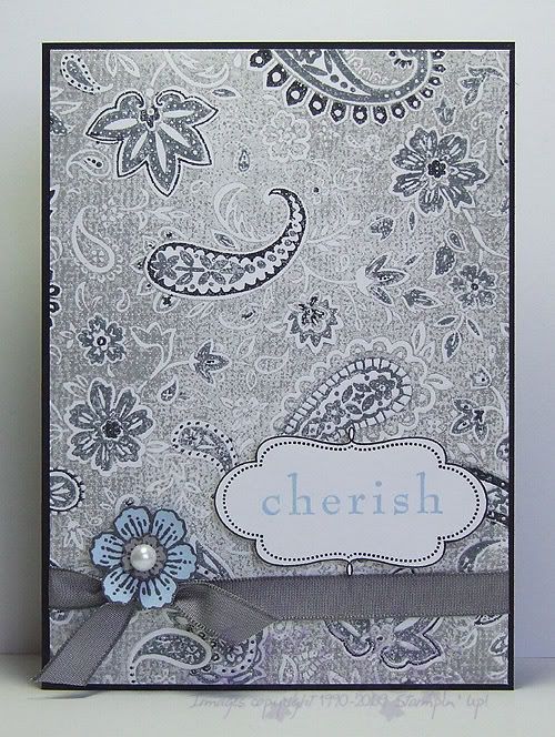
This weeks Cinema Saturday challenge is Casablanca. A classic no doubt, yet a movie I had not seen in full until last night. This week Sankari and Brooke also gave us colour guidelines, very fitting for this movie. I had initially picked out Pale Plum as my free choice, but as soon as Rick mentioned that Ilsa had worn blue the last time he'd seen her I changed my mind. I knew I was going to use this additional colour sparingly, aided by choosing a pale shade of the colour, though I wasn't quite sure how, but I made myself watch the whole movie before really starting on my card and I am glad I did. I was going to draw inspiration from Sam's piano though I have few stamps with a real Morrocan feel to them (ooooh, but how i would love it!), but as soon as I saw Ilsa's paisley blouse it was a done deal... I am a sucker for paisley, especially when I have such a gorgeous stamp of it! I ended up basing my card on that whole scene, the conversation that gave fond memories of Paris back to Rick and Ilsa. There's the paisley for her blouse, the ribbon for her sash/belt, the frame for a slightly Morrocan touch, the sentiment for the memories and the Carte Postale flower for the French connection.

All supplies by Stampin' Up!
Cardstock: Basic Black, Whisper White, Bashful Blue, Going Gray
Stamp Sets: Paisley, Frames With A Flourish, Baroque Motifs, Carte Postale
Inks: Going Gray, Basic Black, Basic Gray, Bashful Blue
Accessories: Basic Gray marker, Basic Black marker, Basic Gray taffeta ribbon, Pretties Kit, dimensionals
Show watched while creating: Casablanca of course!

Wednesday, January 14, 2009

Cinema Saturday #14 part 5

The next card I have for you in the Cinema Saturday #14 series is for the other Fellowship member who parted ways in the FOTR movie: Boromir. Boromir's costume has a lot of texture and detail, and I have drawn on a few specific parts for this card. The background is based on Boromir's fur-line cloak, most prominent as they trudge through the snow. It was impossible to replicate burn-out velvet with cardstock so I just opted to stamp the swirly design in Chocolate Chip so it had the darker colour like the design on the cloak appears darker than the velvet nap (in truth the back of the velvet is the same colour as the nap it is just the lining fabric that makes it appear darker... some geeky costume details for you!). Of course the Close To Cocoa velvet ribbon had to come out again for the fur lining. The Ruby Red layer is inspired by the gorgeous bullion embroidery on the sleeves of his tunic (~cough~ sari fabric ~cough~), and the framed sentiment piece is supposed to be reminiscent of the decoration on his belt. This is another thank you card because in the end he did good (the EE gives a lot more to his story and thus his end isn't as big a turn-around as it seems in the original cinema version... and I will admit I was tainted with knowledge of ROTK EE too which adds to Boromir's story even more).

All supplies by Stampin' Up!
Cardstock: Close to Cocoa, Chocolate Chip, Basic Black, Ruby Red
Stamp Sets: Carte Postale, Simple Delights, Occasional Greetings, Baroque Motifs
Inks: Close To Cocoa, VersaMark, StazOn Jet Black
Accessories: Ruby Red marker, Close To Cocoa marker, Designer Label punch, Styled Silver Hodgepodge, gold embossing powder, dimensionals
Show watched while creating: Fellowship of course! (yes, I have watched this a lot over the last week)

Monday, September 29, 2008

Leaves With A Flourish

I promise this will be the last Carte Postale card I share with you for a while - I hope you're not sick of it! I think I am going to have to hide it again so I will actually use some other sets. This is a card I have been demonstrating lately, it's a reincarnation of this card, however the above card features masking, In Color markers/blender pen markers and of course one of the bundles from the Free Wheelin' special that ends tomorrow. If I've inspired you with all my Carte Postale cards, or any of the other bundles catch your eye, get your order to me quickly so you don't miss out!

All supplies by Stampin' Up!
Cardstock: Purely Pomegranate, Whisper White, Soft Sky
Stamp Sets: Carte Postale, Leaves a la Carte, Frames With A Flourish
Ink: River Rock, Purely Pomegranate, Basic Gray, VersaMark
Accessories: Pretties Kit, Purely Pomegranate blender pen marker, Soft Sky blender pen marker, River Rock blender pen marker, dimensionals

Friday, September 26, 2008

Pretty Postale

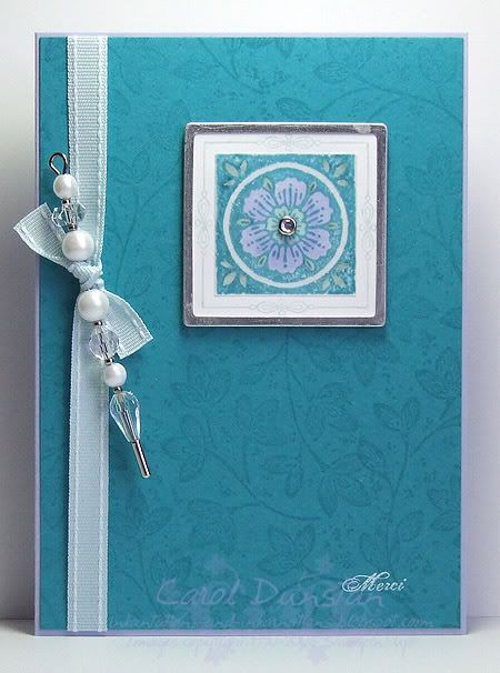
September is drawing to a close, which means there are not many days left to take advantage of Stmapin' Up!s Free Wheelin' special. This card again uses one of the bundles available from the special, Carte Postale. I think every time I use it I can't help mentioning it is one of my favourite sets, though I tend to use colours that traditionally fit it's "vintage" style. When I started makin gthis card I felt it was high time I used some brighter, prettier colours - so teaming it with some Pretties Kit accessories seemed a natural progression. The main feature of this card uses a square aluminium edged tag. I stamped directly onto this with the 'Carte Postale" stamp using my Stamp-a-ma-jig to position it (which was a little awkward given the raised edge of the tag). I didn't even need to mask the words on the stamp as these went onto the aluminium edge and any ink was easy to wipe off. And yes, I know it's another green & purple card but at least I did mix it up a bit and swap out the Bayou for Teal!

All supplies by Stampin' Up!
Cardstock: Almost Amethyst, Taken with Teal, vellum cardstock
Stamp sets: Carte Postale, Leaves a la carte
Inks: Taken With Teal, Soft Sky, Whisper White
Accessories: White Aluminium Square Tags, Pretties Kit, Soft Sky double-stitched ribbon, Sage Shadow marker, Almost Amethyst marker, Soft Sky "marker" (blender pen + refill), dimensionals
Show watched while creating: House

Sunday, September 07, 2008

SU! September Promotion

During September Stampin' Up! are offering free wheels with 6 selected stamp sets. The wheels on offer are coordinating jumbo wheels, so it really is a great deal - you can read more about it at the SU! website. I love the wheels, particularly the jumbo ones because you can have a card front covered in no time. The other day I posted a card using the Merry Merry bundle over on the Elite Challenges blog, and on KW challenge card used stamps from the Bodacious Bouquet bundle, but today I am going to share a couple of cards using one of the other bundles. This is probably my favourite bundle of the lot, as Carte Postale is one of my fave sets and Leaves a la Carte works so well with it. I started off with a very simple card, using the current Elite Challenges colour challenge as inspirationI knew before I started these cards I was going to make two basically the same, so I took an A6 piece of Certainly Celery, wheeled over it with Leaves a la Carte using Certainly Celery ink, then cut it in half length ways and used one piece on this card (with a little trimming off it's length).
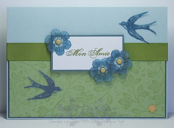
For this second card I trimmed the Celery piece a little smaller than in the first card and layered it on Night of Navy before attaching it to the card front. The other main difference in this second card is I used more than just a sentiment from Carte Postale. The bird and flowers were stamped on vellum cardstock, the flower stamped three times using Blue Bayou ink and the bird twice using Not Quite Navy. I stamped on vellum as I wanted one bird to be flying in the opposite direction and this is probably the simplest way to do that. The flowers were coloured using blender pens on the back of the image.

If you'd like to order any of these bundles don't forget to use the special code as listed on the SU site

All supplies by Stampin' Up!
Cardstock: Soft Sky, Certainly Celery, Blue Bayou, Whisper White, Not Quite Navy, vellum cardstock, So Saffron
Stamp Sets: Carte Postale, Leaves a la Carte
Inks: Certainly Celery, Old Olive, Blue Bayou, Not Quite Navy
Accessories: Old Olive 5/8" grosgrain, Rich Regals brads, mini glue dots

Thursday, June 26, 2008

KW Colour Inspiration #13

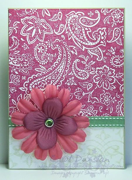
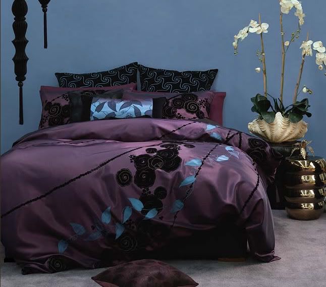
Kristina Werner took me by surprise by posting a colour challenge yesterday afternoon - I didn't think we'd have another one till Friday at the earliest! But I no complain wink. One look at the inspiration photo and all I could think of was Paisley... by dinner time my desk was covered in all these bits of stamped Paisley and I had a million ideas going through my head. I eventually settled on this one, though I may get time to work on one of my other ideas... we'll see! If you go to the website where the bedding came from you'll see there is a video you can watch. It was from that, and the mention of the French, that I also decided I had to use Carte Postale some way. I decided to base my design on the quilt cover and had planned on stamping a Wasabi sentiment in the bottom right corner, but decided I like it better with no words at all.

All supplies by Stampin' Up!

Cardstock: River Rock, Whisper White
Stamp Sets: Paisley, Carte Postale
Inks: Purely Pomegranate, River Rock
Accesories: Pretties Kit, Regal Rose marker, blender pen and Purely Pomegranate reinker, Ice Circle Rhinestone Brads, Wild Wasabi Double-stitched ribbon.

Monday, June 23, 2008

Beate's Sketch #53

I whipped this quick card up last night as a response to Beate's WSC #53. When I got started on it I didn't take a close enough look at the sketch to remember it very well but it is still rather close. For something different I decided not to have a circle or flower accent and went with the Fleur de lis from Carte Postale.

All supplies by Stampin' Up!

Cardstock: Naturals Ivory, Soft Sky, Chocolate Chip, Blue Bayou, Real Red
Stamp set: Carte Postale, Leaves a la Carte
Ink: Chocolate Chip, Blue Bayou
Accessories: Fire Square Rhinestone Brads, dimensionals

Saturday, June 14, 2008

KW Color Inspiration #11

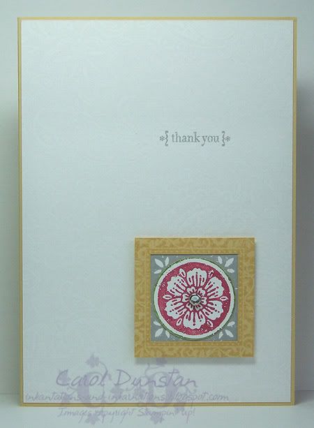
Yesterday afternoon I saw that Kristina Werner has posted another colour challenge. The colours this time were Rose Red, Old Olive, Whisper White, So Saffron and Going Gray. With the girls' swimming lesson and dinner at the inlaws, I didn't get a chance to work on it till late (well, late for me), but that did give me plenty of time to think about it. I decided to go with the light, airy feel I got from the inspirational photo so I stamped a piece of Whisper White with the ever wonderful (razz to you JanTink for suggesting it will retire!) Paisley background using VersaMark. I love the effect of VersaMark on white, however your stamp has to be *very* clean. Seems I haven't been completely diligent with my Paisley and had to give it a thorough clean and try again. The other piece is still useable, just not what I wanted for this card. I did find it a little tricky working in the grey, but do like my end result. I stamped the square flower image from another old favourite Carte Postal twice, first with Going Grey ink on Whisper White, then the second time I used my Rose Red and Old Olive markers to ink it. I punched the Rose out with the 1 1/4" circle punch, cutting the slightest rim of Old Olive with it, layered this over the Gray square, put a So Saffron Frames with a Flourish frame over top, attached a clear rhinestone brad (Pretties Kit) in the center and mounted it to the card front using dimensionals. The sentiment, from Occasional Greetings, is stamped in Going Gray. Unfortunately it's a grey ol' day here, so the photo isn't great! Anyway, I'm off to have a nice cuppa to warm up and get cracking on Beate's latest sketch biggrin

Wednesday, June 04, 2008

Challenging Colours

Last night was a cyberstamp on the Inklings forum, and I was hosting! This card is for the first challenge, to use the colours Perfect Plum, Tempting Turquoise, Brocade Blue, Basic Black and Very Vanilla. I took these colours from the Hepburn bedding range from Linen House. It proved to be a challenging combination, the Tempting Turquoise seeming to throw everyone off. I'm planning on tackling this challenge again because I think I do them more justice... I think because this card is also an attempt at replicating the photo I have it in the back of my head that things are shimmery enough. To get the Turquoise leaves on the Plum layer I stamped with the Whisper White craft ink and sponged Turquoise pastel over top, aka the chalkboard technique. I think my white pad needs reinking and hence the stamping didn't come out as crisp as it should but I can live with it. To get the ribbon to wrap around only part of the card I cut a slit through the layers under the central piece to pass the ribbon through. As well as the Carte Postale set I used the Linen background to stamp over the Very Vanilla layer using VersaMark. The layout for the card was based on Jen's recent SFYTT.

Monday, April 21, 2008

???

Has it really been over a month since I last posted here? I truly did not mean for it to be that long, but between life, reinstalling Windows twice in five days, SU! convention, an extended stay in Brisbane cuddling my 6 week old nephew, school holidays and getting the computer back in order I've been a tad busy!

Convention was fabulous... I think I had a sore throat within a couple of hours of landing due to the talking and laughing as I caught up with fellow team members and met some others for the first time. Between convention and the new IB&C I have so many ideas going through my head it's a bit hard to know where to start. However, according to the Sound of Music, the beginning is the best place to start, so lets rewind to about a month ago when Jayne held a cyberstamp on her demo forum.

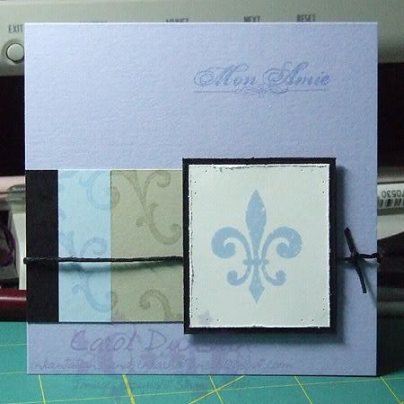
The first challenge involved copying a card from the new catty. Mine is from page 42, oddly enough, and I changed the stamp set and colours. I was having a very big Moonlight day, so the colours are inspired by Mick St John - yep, I think this proves I can be inspired by anything! I think he had something to do with the fleur de lis getting on there too. This is probably one of the quickest cards I have made... I am a very slow stamper, deliberating over colour and layout for an age, but with this one half of that was already decided for me and I had the card finished in about an hour. The stamp set is Carte Postale and colours are Whisper White (teeth), Bashful Blue (eyes), Basic Black (jacket), Sahara Sand (shirt) and Almost Amethyst (ok, that one's all me!).

I plan on being back tomorrow with one of my swaps from convention... I forgot to take photos of the others so one is all you're going to get!

Sunday, March 16, 2008

Enchanted Greeting

Here's another card using paper from the Enchante pack. This time I have used two different papers, both layered on Perfect Plum cardstock. I just find these papers so pretty, they really appeal to the old fashioned part of me. The sentiment was stamped on Very Vanilla cardstock with Perfect Plum ink and punched out with the small oval punch, which is a perfect fit for the small oval hodgepodge frames. Once again I have used Aged Copper hodgepodge, and I have some ivory organdy threaded through the frame as well. The square motif was stamped three times on Very Vanilla cardstock, the bottom later uses Close to Cocoa, the second layer uses Perfect Plum and the top layer uses Chocolate Chip. All have been coloured using markers, however for the top image I wanted an inbetween shade of Plum so I used the Pale Plum marker to pick up some Perfect Plum and worked from the inside of the flower out to the edge, picking up more Perfect Plum before each stroke. Each layer is raised on dimensionals (can you tell I love my dimensionals?). The green layer of paper has been double stamped (thank you Stamp-a-ma-jig, I love you too!) with the large motif using Perfect Plum ink to give a very dark Plum colour.

After my post this morning we took the girls shopping. Not regular shopping, tricksy shopping. This is when we tell them we are going shopping at an odd time but really have a surprise outting up our sleeve. This time we didn't go quite so far as Queensland, just to Speer's Point to see Webers Circus. The girls absolutely loved it! They clapped, they laughed, and they gasped through two hours or great entertainment. It's worked out really well that they are in town now because I'll be at SU! convention when the Newcastle Show is on. Not sure where Webers are headed next, but they're worth checking out wink

Thursday, March 13, 2008

Flourish and Flair

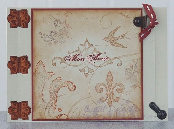
I went through a phase a few years back of making a lot of cards with a spine. As I was sitting there the other day, looking at my retiring Finials and Frames set it suddenly hit me that I could use the hinges on the spine like they were holding the card together. I went for quite a warm colour combination, so decide to also use some Aged Copper hodgepodge. I coloured the hinges to kind of match, but the colours look completely different in the photo.

The card base is Ivory Naturals cardstock, and I stamped the hinge three times along the folded edge using Chocolate Chip ink. I then carefully coloured them in with a Really Rust marker, going over certain sections to make them darker and appear more in shadow. The main part of the card also uses Ivory Naturals, stamped with stamps from Carte Postale, Finest Flourishes and French Flair in VersaMark, Creamy Caramel, Really Rust and Chocolate Chip. Some images were stamped off on scrap paper and then reinked in parts to get a more mottled, aged look. I then lightly sponged over most of the card with Creamy Caramel to make the central motif and sentiment stand out a bit more. This has been mounted to a piece of Cranberry Crisp cardstock, mounted to the cardstock and then I added the hodgepodge and a bit of stitched Cranberry ribbon to finish it off. I trimmed about 1cm off the right side of the cardfront so the photo turn acted as a closure.

All products are by Stampin' Up! and available for purchase through me. Don't forget your last chance to order items on the retiring list is March 31st (unless sold out). The Summer mini, which features both Carte Postale and French Flair, also ends on March 31st.

Saturday, March 01, 2008

An ATC


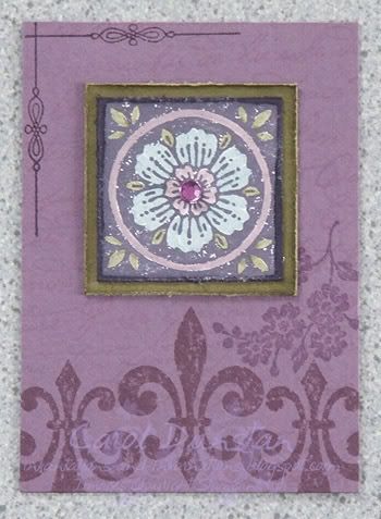
Yesterday I went into the Newcastle Craft Fair. As I was meeting some people I decided to make up some ATC's. It's been so long since I made one I had to look up the measurements to be sure (2 1/1" x 3 1/2" for anyone else who has forgotten wink ). For this ATC I used Carte Postal (from the SU Summer Mini) and French Script (retiring at the end of the month!). I got the colours for this from a colour guide that features the current In Colors (SU put on the guide on the demo website), and the colours are Vintage Violet, Perfect Plum, Bordering Blue and True Thyme. I loved how this came out! The French Script was stamped on the Perfect Plum base using Pale Plum ink (since I wanted a really subtle effect) and over that I have stamped various images from the Carte Postale set using VersaMark and Perfect Plum ink. For the flower motif I stamped in Vintage Violet, let it dry thoroughly and then coloured using markers. The Perfect Plum marker was much darker than I wanted so I scribbled it on a Stamp-a-ma-jig imaging sheet and picked some of it up with a Pale Plum marker, creating an in-between shade. The Thyme layer had it's edge sponged before it and the flower motif had their edges distressed. After sticking all that together I finished them off with an adhesive gem as the flower centre.

Anyone in the area reading this I encourage you to pop along to the fair. It was wonderful to have some of those shops come here (though not sure my wallet feels the same). I'm really looking forward to it's return next year.

Monday, January 07, 2008

Bonjour Postale

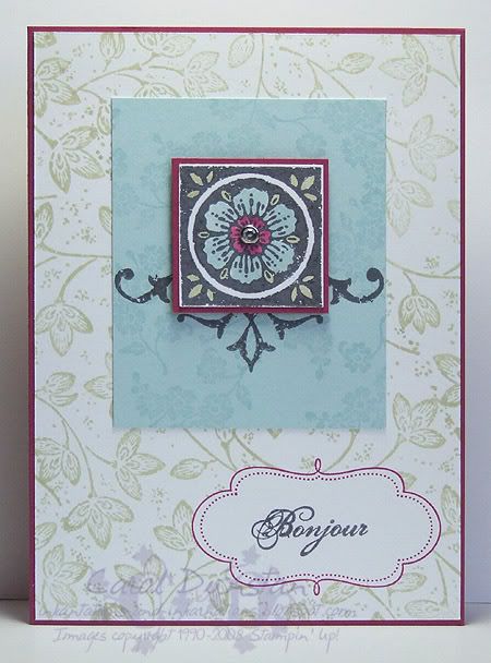
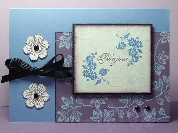
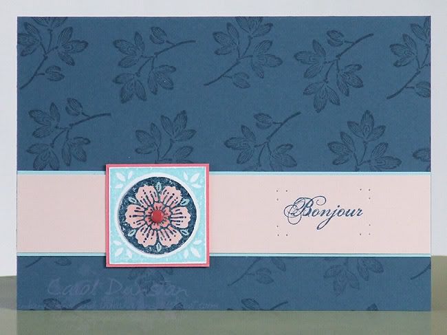
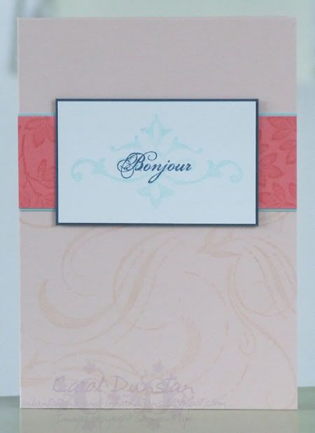
Another card using Carte Postale and the same colour combination - Blush Blossom, Cameo Coral, Cool Caribbean and Not Quite Navy. Here I also added a brad for the centre of the flower and used some paper piercing to frame the sentiment. The flower motif was stamped by first inking with VersaMark then Not Quite Navy, stamping on Whisper White and clear embossing it. It was then coloured using a blender pen to pick up colour from the inkpads and the circle part cut out and mounted over a Cool Caribbean impression of the image.

Sunday, January 06, 2008

Happy New Year!

Yes, I am rather behind the 8-ball... please excuse me but December got rather hectic (the kitchen and built in wardrobe are finally done, woohoo!). So I'll be playing a little catch up. I haven't had much chance to stamp yet this year but I'd still like to post the cards I intended to post last year...


Here's another card using the Carte Postal set, in conjunction with the French Flair background. I've used Cool Caribbean as the cardbase, plus a bit of Cameo Coral and Whisper White. The flower image has been inked with the Cameo Coral and Not Quite Navy inks. I love the light, fresh feel of this card... not quite appropriate for the weather we've been having though!

Saturday, December 01, 2007

Summer is here!

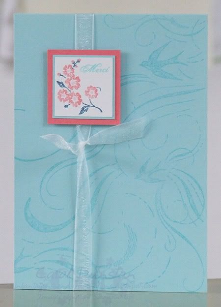
The Summer Mini is finally here! If you haven't got a copy, you can view it here, or contact me and I can send out a hard copy to you (let's face it - you can't dog-ear a computer screen lol). If you'd like to place an order for products in the mini I can help you out with that too.

I have a few favourites from this catalogue, so I thought I would share a card with you that uses a couple of them.
See Australian Paper Crafts issue 76 for details.

Wednesday, November 21, 2007

Again with the Chocolate and Teal!

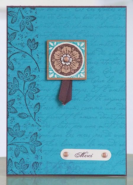
On Saturday I was in Sydney to attend Sydney Regional training put on by Stampin' Up! I squeezed in some time to make some swaps and this is the first design I did, reprising the colour combination of one of my Christmas cards with a bit of a tweak. The flower and sentiment are from the Carte Postal set, the leaves along the left edge are from the matching Leaves a la Carte wheel (both available in the Summer mini which starts on December 1st). The background is an old favourite - French Script. I swapped metallics, changing the gold I used in this Christmas card to copper.

I had such a great time at regionals. Between all the members of Angela's downline (and downlines of those downlines), and those I know through online groups etc, everywhere I turned there was a familiar face or name. We also had some creative time and focused on the business side of things. If you'd like to hear more about the benefits of being a Stampin' Up! demonstrator, contact me and I'd be happy to answer any questions you have.

Tuesday, November 20, 2007

Birdy Blessings

It's not long now till December, till the start of summer, and do you know what that means? A new Stampin' up! mini catalogue! The Summer mini catalogue isn't online yet, but if you'd like a copy just let me know and I'll send one out to you. Here is a card that uses three sets from the new mini.
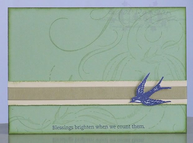
This card was created for a cyber night sketch challenge over at The Little Scrapbook Shop. I've used the gorgeous French Flair background stamp, the matching swallow is from the Carte Postale set and the sentiment is from Stem Silhouettes (this set is diecut, so no need for trimming). Colours are Certainly Celery, Barely Banana, Old Olive and Night of Navy.