Showing posts with label Frames With A Flourish. Show all posts

Tuesday, June 15, 2010

She's Got Dame Edna Eyes

I love owls, and I love creating them with punches. While I've really liked the owls I have created, I wanted to be able to make something larger, an owl that would dominate a card front. So I turned to Barry (my Big Shot) and put him to work with the ovals die. I was obviously going to be making some bigger owls, with bigger ovals for the base, but I looked at my punches and tried to think of some other new features I could make with them. And then I noticed a spare wing on my desk, from using the Two-Step Bird punch on another project.

And Dame Edna Owl was born!
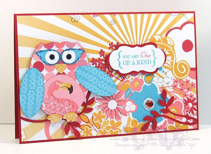
Hello owlies!

Of course I had to use bright colours for the Dame, so I pulled out the Pink Flamingo DSP pack and selected my papers and got Barry to work on them. With the papers all spread out, I spotted the "sun rays" sheet and immediately knew how I wanted the rest of the card to go. When I came to put it together however, I realised that it just wasn't all going to fit on a standard card front. Some years ago I was given a bunch of larger envelopes, and I still have quite a few left (all really bright ones... think Yoyo Yellow). I grabbed one of these envelopes and measure it up and made my card to fit. Now the Dame had space to stretch her wings! And because I loved the effect so much, I once again layered the Lots of Tags die on the similar Frames With A Flourish image for the sentiment.

Remember, Pink Flamingo is one of the 5 DSPs on special this week as part of Deals Of The Week. But tonight is your last chance to order it at the special price, so be quick & don't miss out!

All supplies by Stampin' Up!
Cardstock: Real Red, Whisper White
Stamp Sets: Frames With A Flourish, One Of A Kind
Inks: none
Accessories: Pink Flamingo DSP, Ovals die, Lots of Tags die, Two-Step Bird punch, large oval punch, Curly Label punch, Boho Blossoms punch, 3/4" circle punch, 1/2" circle punch, Crop-a-dile, 5 Petal Flower punch, Circle Fire rhinestone brads, Real Red marker, Tempting Turquoise marker, Cameo Coral marker, Tombow mono glue, fine Supernova glitter, dimensionals
Show Watched While Creating: True Blood (WARNING: there will be season 3 spoilers on this page so careful what you look at or read!)

Sunday, April 11, 2010

Cinema Saturday #74


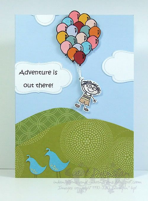
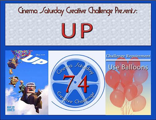
The Cinema Saturday Creative Challenge #74 is Up! I was lucky enough to have my "13 Going On 30" card receive the Audrey so I got to be a guest designer for UP.


While I think Pixar make good movies, the premise of this one had me a little dubious (it just didn’t sound as fun as toys or monsters), so I was pleasantly surprised when I did get to see UP! If you are ever around me and my girls you may hear random “Squirrel!” comments, heh heh heh. Anyway, when I found out what movie I would be designing for the basic idea for the card was in my head straight away. I did struggle with the sentiment though… I had a few stamps that were appropriate for the movie (inspired by Ellie’s passion for life) but I just didn’t feel they were right for the card. I decided to print out the “Adventure is out there!” catch-phrase because it can bring together the idea of grand and simple adventures of life.

Most Supplies by Stampin' Up!
Cardstock: Bashful Blue, Whisper White
Stamp Sets: All In The Family, Frames With A Flourish
Inks: StazOn Jet Black, Blush Blossom (watercolouring)
Accessories: aquapainter, Creamy Caramel marker, Close To Cocoa marker, So Saffron marker, dimensionals, Basic Black marker, white cotton thread, computer-generated sentiment, 1 3/8" circle punch (to stick balloons to), various DSP's most notably Good Morning Sunshine, Haiku and Pink Flamingo
Show watched While Creating: UP

Thursday, March 18, 2010

It's In The Bag

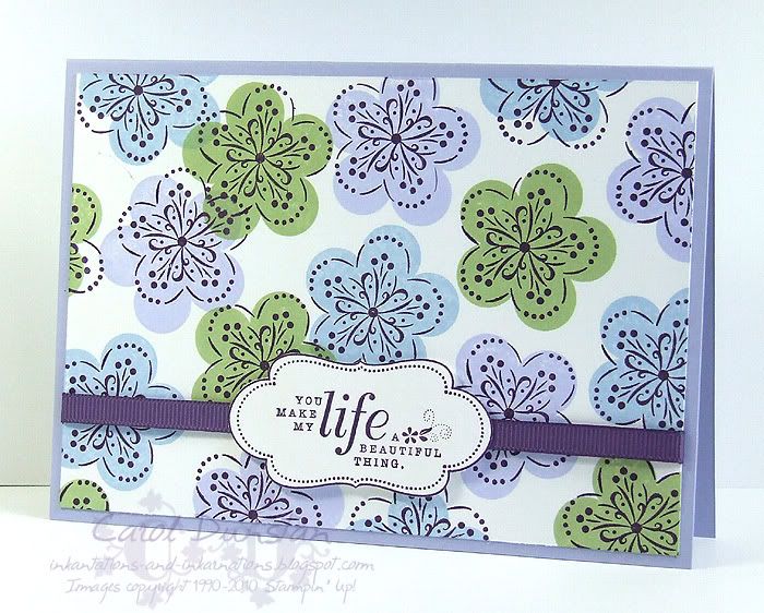
Monday night was the Inklings Cyberstamp for March, hosted by Ryn. The first challenge she presented to us was to create something inspired by a reusable shopping bag from Target. She didn't mention what she felt were the closest colours, so I erred on the side of purple and went with Almost Amethyst, Bashful Blue and Certainly Celery. The bag had butterfly designs on it but I felt like something different so I went back to an old favourite and pulled out A Beautiful Thing and didn't worry about getting the outline image remotely close to the solid colour as the original bag had the outlines well and truly offset... in fact it was almost a challenge in itself to not automatically try and line the limages up closely!

All supplies by Stampin' Up!
Cardstock: Almost Amethyst, Whisper White
Stamp Sets: A Beautiful Thing, Frames With A Flourish
Inks: Almost Amethyst, Bashful Blue, Certainly Celery, Elegant Eggplant
Accessories: Elegant Eggplant 1/4" grsograin, dimensionals
Show watched While Creating: Picnic At Hanging Rock (ah the memories!)

Friday, May 29, 2009

Cinema Saturday #33

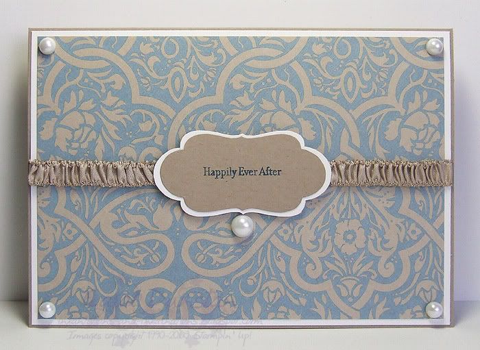
This week's Cinema Saturday movie was Ever After, a movie that I haven't seen too often but love. While I would have loved to have made a card based on the "Just Breathe" dress, I didn't end up with a lot of time to work on my card and I knew I couldn't do it justice (I mean, have you SEEN this dress in all it's detail? Simply stunning!) So I went with my next favourite dress, the blue one from the library scene. Due to the nature of the fabric, the colours look completely different depending on the angle of the light, but the basic colour and pattern combination reminded me of this Bella Bleu paper, so that's what I went with. I also knew there was a stamp with at least "Ever After" on it, but once I located it I decided to use the whole "Happily Ever After" as it is something that Henry says to Danielle. There are a few interesting things with this
card even though it looks simple - the frame has been stamped on Whisper White and Kraft, cut out and then layered so the stamped side is facing down. The main reason for this is that there is no Kraft ink and I wasn't happy with any other colour for this. The other interesting thing is the ribbon. I simply pulled a couple of threads at the top and bottom of some Kraft tafetta and pulled them untill I had a long enough piece of ribbon bunched up to my satisfaction. The ribbon is stuck down across the front with Sticky Strip so it would lay in a nice straight line.

All supplies by Stampin' Up!
Cardstock: Kraft, Whisper White
Stamp Set: Lots of Thoughts (retired), Frames With A Flourish
Ink: Not Quite Navy
Accessories: Pretties Kit, Kraft tafetta, mini glue dots, sticky strip
Show watched while creating: Ever After

Sunday, May 17, 2009

The Card That Started It All

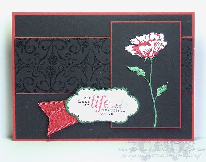
This card was made weeks ago, for Taylor's sketch challenge #64, but I kept it under wraps because I very quickly decided that I had to use these elements again for convention swaps and didn't want to spoil the surprise. You may notice a lot of white flecks on the card: that's not white embossing powder or anything like that, it's just dust and fluff that collected on the card over the weeks it sat here waiting to be photographed and a quick brush didn't get them off (I was in a rush as I needed to attend to dinner!). The main image is the Bloomin' With Beauty flower stamped on Whisper White and cut out just as I did for the bookmark swaps (though the others are coloured much nicer). The black strip across the middle has Bella's Border embossed in black just as I did for the "Bella & Edward/Jacob" cards, although here I did it twice (turning the wheel around the second time and trying to get a mirror image effect but I didn't quite line it up perfectly). The sentiment comes from yet another set, A Beautiful Thing, which I inked with my Basic Black, Riding Hood Red and Garden Green markers. I was quite happy with how this turned out!

All supplies by Stampin' Up!
Cardstock: Riding Hood Red, Basic Black, Garden Green, Whisper White
Stamp Sets: Bloomin' With Beauty, Bella's Border, A Beautiful Thing, Frames With A Flourish
Inks: StazOn Jet Black, VersaMark
Accessories: Basic Black marker, Riding Hood Red "marker", Garden Green marker, Dress Up Ribbon Originals, aquapainter, dimensionals
Show watched while creating: Twilight

Monday, January 19, 2009

Cinema Saturday #15

AKA "We'll always have Paisley" lol.

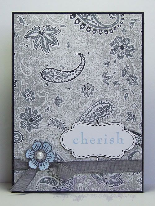
This weeks Cinema Saturday challenge is Casablanca. A classic no doubt, yet a movie I had not seen in full until last night. This week Sankari and Brooke also gave us colour guidelines, very fitting for this movie. I had initially picked out Pale Plum as my free choice, but as soon as Rick mentioned that Ilsa had worn blue the last time he'd seen her I changed my mind. I knew I was going to use this additional colour sparingly, aided by choosing a pale shade of the colour, though I wasn't quite sure how, but I made myself watch the whole movie before really starting on my card and I am glad I did. I was going to draw inspiration from Sam's piano though I have few stamps with a real Morrocan feel to them (ooooh, but how i would love it!), but as soon as I saw Ilsa's paisley blouse it was a done deal... I am a sucker for paisley, especially when I have such a gorgeous stamp of it! I ended up basing my card on that whole scene, the conversation that gave fond memories of Paris back to Rick and Ilsa. There's the paisley for her blouse, the ribbon for her sash/belt, the frame for a slightly Morrocan touch, the sentiment for the memories and the Carte Postale flower for the French connection.

All supplies by Stampin' Up!
Cardstock: Basic Black, Whisper White, Bashful Blue, Going Gray
Stamp Sets: Paisley, Frames With A Flourish, Baroque Motifs, Carte Postale
Inks: Going Gray, Basic Black, Basic Gray, Bashful Blue
Accessories: Basic Gray marker, Basic Black marker, Basic Gray taffeta ribbon, Pretties Kit, dimensionals
Show watched while creating: Casablanca of course!

Wednesday, December 03, 2008

Embrace Frames

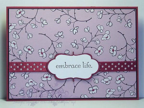
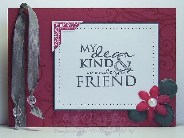
Still playing with Embrace Life... in fact it's exactly the same stamps as I used on yesterdays card. On the previous Embrace Life card I coloured the flowers with the white gel pen to get a very full and stack white. On todays card I used a blender pen to colour the flowers with Whisper White craft ink so I could vary the intensity.

This morning I have uploaded another card to the Elite Challenges blog, this time using the Eastern Blooms set. If you note my comment about the Soft Sky marker, I'll have more about that tomorrow.

All supplies by Stampin' Up!
Cardstock: Purely Pomegranate, Basic Black, Pale Plum, Whisper White
Stamp Sets: Frames With a Flourish, Embrace Life
Inks: StazOn Jet Black; Whisper White for colouring
Accessories: blender pen, Purely Pomegranate "marker" (blender pen + refill), Sherbet Ribbon Originals, dimensionals

Tuesday, December 02, 2008

Embrace Scallops

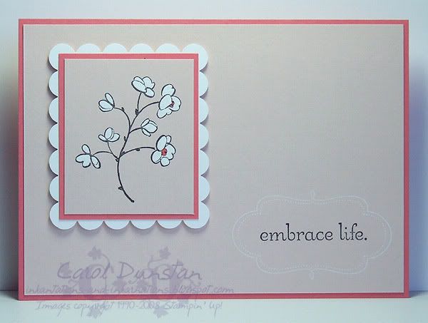
This card features another new set from the Summer Mini - Embrace Life. The scallop rectangle is not another new punch, I simply used the Scallop Edge punch to create that... with one punch you can make scallop squares and rectangles in a heap of different sizes! I love me some versatile products biggrin As for the rest of the card, I went back to a neglected colour for this one - Cameo Coral, which has had to make room for Groovy Guava this year. I know Cameo Coral doesn't have a wide fan base, but I really like it so it was about time it came out to play again.
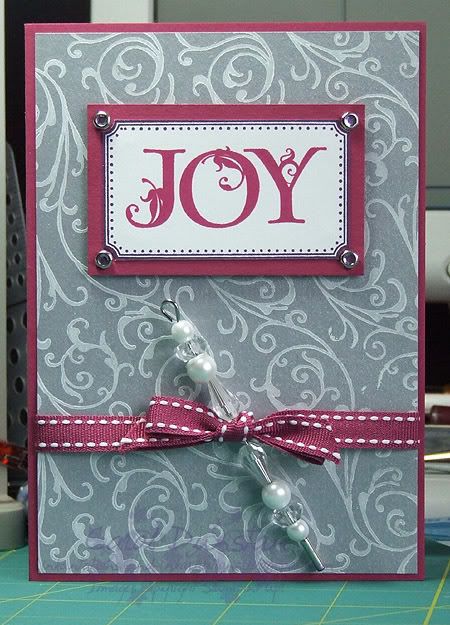
I also wanted to mention I uploaded a card to the Elite Challenges blog yesterday. I used the new Ocean Commotion set for it, which I totally love... seahorses and swirly seaword - what's not to love?

All supplies by Stampin' Up!
Cardstock: Cameo Coral, Blush Blossom, Whisper White
Stamp Sets: Embrace Life, Frames With A Flourish
Inks: Whisper White, StazOn Jet Black
Accessories: scallop edge punch, white gel pen, Cameo Coral marker, dimensionals

Tuesday, October 14, 2008

Cardmaking, Stamping & Papercraft Vol 14 No 3

Cardmaking, Stamping & Papercraft's first big Christmas issue for the year is out now, and I am lucky enough to have been a part of the "Time Savers" section. This section focuses on Christmas card designs for mass-production, with each artist having a "simpler" design that you reproduce quite a few of in a night, and then a "stepped up" version for when you want cards that are a little more special. Here is my "stepped up" card:

For product information see CSP Vol 14 No 3!

Thursday, October 09, 2008

7 Loves of Card Making - Embellishment

Like most people I think, when I started stamping my cards were quite simple with no real embellishment. These days I rarely make a card that doesn't have a bit of ribbon or a brad on it - how times change! My card today gets most of its embellishments from the Pretties Kit, a fabulous collection of flowers, beads, brads, pearls and hatpins. I've also used the very yummy Basic Gray taffeta ribbon and created a corner feature by punching a stamped image. Paper piercing is a simple embellishment method that I often use as it adds a little bit of extra interest without overdoing things.

All supplies by Stampin' Up!
Cardstock: Purely Pomegranate, Blue Bayou, Whisper White
Stamp Sets: Occasional Greetings, Frames With A Flourish, Baroque Motifs
Inks: VersaMark, Purely Pomegranate, Basic Gray
Accessories: Pretties Kit, Basic Gray taffeta ribbon, crafters tool kit, photo corner punch, mini glue dots, dimensionals

My challenge to you today is to create a card using a variety of embellishments. Put a link to your card in the comments for this post and at the end of the week I'll pick my favourite one and send a little something to that person. Australian residents only, SU! demos welcome.

Friday, October 03, 2008

KW Colour Inspiration #24

It's time for another Kristina Color Inspiration challenge. When this first popped up on my Google Reader I wasn't sure I was going to be taking part... I was in the middle of something else and I'm going out this morning so I didn't think I'd be able to squeeze it in. But I managed to finish the other thing and it was just before 11pm so I thought I'd give it a go. While the name of the style of plates had me first thinking of Baroque Motifs and wheel etc, part of the pattern made me think of this frame, and then this Simple Delights image that I knew would fit inside it. I went to bed still undecided about putting a sentiment on the card, but when I woke up this morning I felt that the card was too long and chopped the bottom off so it is now a 10.5cm square card. It's now much more in proportion and much cuter! lol

This morning I have also posted another card over on the Elite Challenges blog.

All supplies by Stampin' Up!
Cardstock: Pumpkin Pie, Chocolate Chip, Very Vanilla
Stamp Sets: Simple Delights, Frames With a Flourish, Linen
Inks: Chocolate Chip, Pumpkin Pie, VersaMark
Accessories: clear embossing powder, brayer, 1 1/4" square punch, Chocolate Chip taffeta ribbon, dimensionals, Earth Elements brads
Show watched while creating: Stargate Atlantis

Monday, September 29, 2008

Leaves With A Flourish

I promise this will be the last Carte Postale card I share with you for a while - I hope you're not sick of it! I think I am going to have to hide it again so I will actually use some other sets. This is a card I have been demonstrating lately, it's a reincarnation of this card, however the above card features masking, In Color markers/blender pen markers and of course one of the bundles from the Free Wheelin' special that ends tomorrow. If I've inspired you with all my Carte Postale cards, or any of the other bundles catch your eye, get your order to me quickly so you don't miss out!

All supplies by Stampin' Up!
Cardstock: Purely Pomegranate, Whisper White, Soft Sky
Stamp Sets: Carte Postale, Leaves a la Carte, Frames With A Flourish
Ink: River Rock, Purely Pomegranate, Basic Gray, VersaMark
Accessories: Pretties Kit, Purely Pomegranate blender pen marker, Soft Sky blender pen marker, River Rock blender pen marker, dimensionals

Thursday, August 14, 2008

Merry Baroque

Yep, we are yet another week closer to Christmas! This card is a mix of simple and more complex elements, the simple being the abstract Baroque Motifs tree, and the more complex part is the sentiment and frame. I first stamped the frame, then used a marker to ink just the one word from the Many Merry Messages stamp and used the Stamp-A-Ma-Jig to help me position it. It's really not that complex, but does lift the card from "quick and easy" status. I just love trimming that frame and popping it up on dimensionals!

All supplies by Stampin' Up!
Cardstock: Garden Green, Purely Pomegranate, Whisper White
Stamp Sets: Baroque Motifs, Frames With A Flourish, Many Merry Messages
Inks: Purely Pomegranate, Wild Wasabi
Accessories: Garden Green marker, dimensionals, Pretties Kit, 2-Way glue pen, Dazzling Diamonds glitter

Wednesday, August 13, 2008

Stippled Butterfly


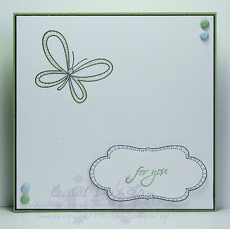
The other week (yes, I am slow!) Jayne challenged her Inklings to try out the Stippling technique, and this is my response. I varied the spacing, size and shape of the dots to accentuate the colour I wanted in specific areas. It didn't feel right to make the card too busy, so again I have gone with simple and lots of white.

All supplies by Stampin' Up!
Cardstock: Certainly Celery, Basic Black, Whisper White
Stamp Sets: Celebrate Everyday, Occasional Greetings, Frames With a Flourish
Inks: StazOn Jet Black, Wild Wasabi
Accessories: Soft Subtle brads, Certainly Celery marker, Bashful Blue marker, Wild Wasabi marker (blender pen + refill), dimensionals

Thursday, July 17, 2008

Peaceful Flourish

Yes, we are another week closer to Christmas! This card uses the same colour scheme and stamp sets as last weeks Christmas card post, but with rather a different look. I stamped the Flourish first as I felt this would help me get the letters straight. When stamping letters like this I start from the middle, in this case "A", and then work my way out. For this card it made sense to stamp the "C" next, then the two "E"s and finish with "P". And angle of the brads makes it difficult to tell, but the rhinestones are Lilac.

All supplies by Stampin' Up!

Cardstock: Elegant Eggplant, silver (Brushed Metallics), Purely Pomegranate, Whisper White
Stamp sets: Lovely Letters, Frames with a Flourish
Inks: Elegant Eggplant, Purely Pomegranate
Accessories: Pretties Kit, Circle Ice Rhinestone Brads, 1/8" circle punch, dimensionals

Saturday, June 14, 2008

KW Color Inspiration #11

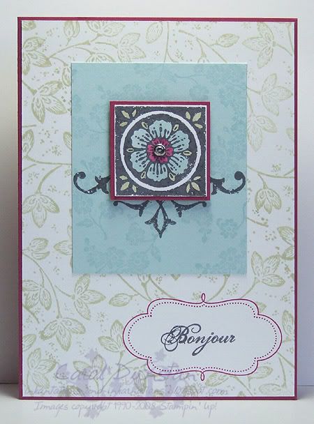
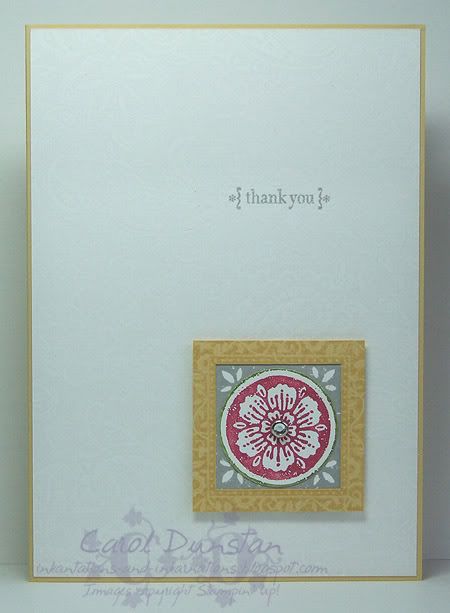
Yesterday afternoon I saw that Kristina Werner has posted another colour challenge. The colours this time were Rose Red, Old Olive, Whisper White, So Saffron and Going Gray. With the girls' swimming lesson and dinner at the inlaws, I didn't get a chance to work on it till late (well, late for me), but that did give me plenty of time to think about it. I decided to go with the light, airy feel I got from the inspirational photo so I stamped a piece of Whisper White with the ever wonderful (razz to you JanTink for suggesting it will retire!) Paisley background using VersaMark. I love the effect of VersaMark on white, however your stamp has to be *very* clean. Seems I haven't been completely diligent with my Paisley and had to give it a thorough clean and try again. The other piece is still useable, just not what I wanted for this card. I did find it a little tricky working in the grey, but do like my end result. I stamped the square flower image from another old favourite Carte Postal twice, first with Going Grey ink on Whisper White, then the second time I used my Rose Red and Old Olive markers to ink it. I punched the Rose out with the 1 1/4" circle punch, cutting the slightest rim of Old Olive with it, layered this over the Gray square, put a So Saffron Frames with a Flourish frame over top, attached a clear rhinestone brad (Pretties Kit) in the center and mounted it to the card front using dimensionals. The sentiment, from Occasional Greetings, is stamped in Going Gray. Unfortunately it's a grey ol' day here, so the photo isn't great! Anyway, I'm off to have a nice cuppa to warm up and get cracking on Beate's latest sketch biggrin

Thursday, June 05, 2008

Frames with a Greeting

This was my card for the Inklings cyberstamp challenge number 2, a sketch challenge using a CPS sketch. For my card I used stamps from the Occasional Greetings and Frames With a Flourish sets, Linen background stamp, Old Olive and Always Artichoke ink, papers from the Secret Garden Simply Scrappin' kit, Sherbet and Theater Ribbon Originals, Always Artichoke brads and cardstock in Whisper White, Groovy Guava, River Rock and Always Artichoke and the Cutter Kit to rough up the edges on my top two layers. I really liked how this turned out, the only downside is that my central panel is so large it didn't leave much room to show off the papers!

Thursday, May 01, 2008

Mum's The Word

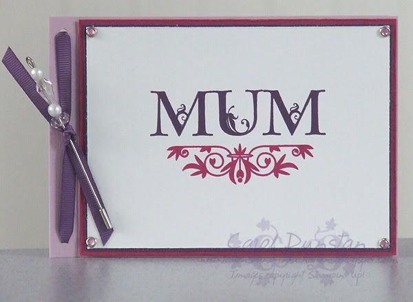
The start of May means Mother's Day isn't far off, right? Here's the card I have made for my Mum this year. However, Mother's Day is further off than I thought it was! Well, not really thought it was... just half-thought... I was a week ahead of myself, but it beats being a week late! For this card I have used lots of stuff that is brand new in this years SU! IB&C. The stamp sets are Lovely Letters and the flourish-y bit is from Frames With A Flourish, cardstock is textured Pale Plum, Purely Pomegranate, Elegant Eggplant and Whisper White, and I've used some of the new Elegant Eggplany grosgrain ribbon, Fire Circle Rhinestone brads and bits and pieces from the pretty kit. Lucky for me Mum quite likes the purple section of the spectrum!