Showing posts with label paper piercing. Show all posts

Thursday, October 09, 2008

7 Loves of Card Making - Embellishment

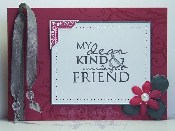
Like most people I think, when I started stamping my cards were quite simple with no real embellishment. These days I rarely make a card that doesn't have a bit of ribbon or a brad on it - how times change! My card today gets most of its embellishments from the Pretties Kit, a fabulous collection of flowers, beads, brads, pearls and hatpins. I've also used the very yummy Basic Gray taffeta ribbon and created a corner feature by punching a stamped image. Paper piercing is a simple embellishment method that I often use as it adds a little bit of extra interest without overdoing things.

All supplies by Stampin' Up!
Cardstock: Purely Pomegranate, Blue Bayou, Whisper White
Stamp Sets: Occasional Greetings, Frames With A Flourish, Baroque Motifs
Inks: VersaMark, Purely Pomegranate, Basic Gray
Accessories: Pretties Kit, Basic Gray taffeta ribbon, crafters tool kit, photo corner punch, mini glue dots, dimensionals

My challenge to you today is to create a card using a variety of embellishments. Put a link to your card in the comments for this post and at the end of the week I'll pick my favourite one and send a little something to that person. Australian residents only, SU! demos welcome.

Monday, October 06, 2008

7 Loves of Card Making - Occasions

As I mentioned before, I got into stamping and card making initially so I could making birthday cards for family members. That soon extended to Christmas cards. I don't know what it is about Christmas cards, but every year I love making heaps of them, even when I have left it to the last minute and it's a bit of a mission to get them done in time.

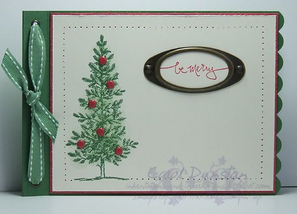
I'm not big on the traditional colours for Christmas, but I know I have relatives who do prefer traditional coloured cards, so this one is for them. The stamping on this is very basic but i have added a lot of little features so it is a little time intensive but if you do it product-line style (complete each step on all cards before moving onto the next step) things do go quicker.

All supplies by Stamping Up!
Cardstock: Garden Green, Ruby Red, Very Vanilla
Stamp Sets: Lovely As A Tree, Warm Words
Inks: Garden Green, Ruby Red, Wild Wasabi (for sponging)
Accessories: 3/16" scallop punch, large oval punch, 1/8" circle punch, metallic eyelets, Wild Wasabi double-stitched ribbon, Earth Elements brads, Crafters Tool Kit, Antique Brass hodgepodge, sponge dauber

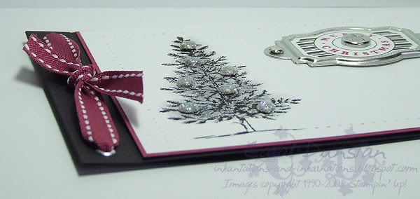
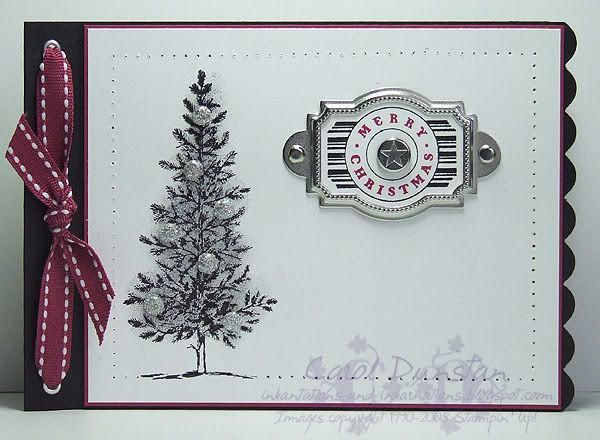
For this card I thought I would go even further than I normally do on the "non-traditional" colour scale. I still think a black Christmas tree looks a little odd, but i have seen a few this year in particular that when decorated look very striking.

Here's a close-up of the brads. I've attached a mini-glue dot to the top of a silver brad and then dipped the brad in Dazzling Diamonds glitter to get my sparkly brads.

All supplies by Stampin' Up!
Cardstock: Basic Black, Purely Pomegranate, Whisper White
Stamp Sets: Lovely As A Tree, Party Punch
Inks: Basic Black; Basic Gray and Going Gray for sponging
Accessories: 3/16" corner rounder, designer label punch, 1/8" circle punch, metallic eyelets, Purely Pomegranate double-stitched ribbon, Styled Silver hodgepodge, Vintage brads, mini glue dots, Dazzling Diamonds glitter, Basic Black marker, Purely Pomegranate "marker" (blender pen + reinker), sponge dauber

And now for my challenge to you: create aChristmas card using a colour combination you've never used for Christmas before (eg if you usually use red and green, use something non-traditional). Put a link to your card in the comments for this post and at the end of the week I'll pick my favourite one and send a little something to that person. Australian residents only, SU! demos welcome.
Saturday, June 21, 2008

KW Colour Inspiration #12

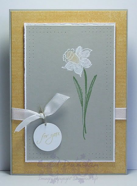
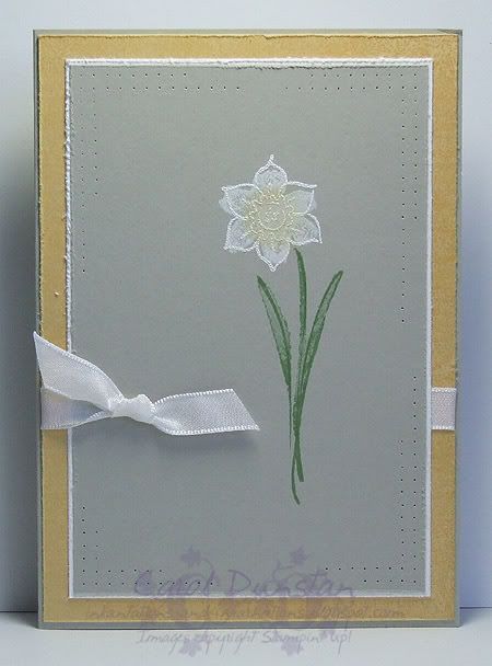
Yes, it's time for another colour challenge from Kristina! The card you see above is actually my third attempt at this... I'll show you my first attempt below, while I wanted a good deal of "clean space" around the daffodil, I didn't like how much I had left, so when I got up this morning I tried again and was much happier with the results. I've used the Beautiful Life set as I have had this idea in my head for a while, to stamp the flower in white. It also took me a few goes to figure out the best way to achieve that as the outline image wasn't showing up enough for my liking. A few of you have probably read me grumble about the lack of powerpoints in here. Well, that situation has not changed, but no telling Glenn! I had no other alternative than to crawl under the desk (someone should really clean under there) and unplug the print so I could plug my heat gun in. A girl should not have to go through that, her heat gun should be plugged in at all times so it is ready to use whenever the need arises, right? Right! Anyway...

I stamped the leaves first using Wild Wasabi ink and then stamped the solid flower using Whisper White craft ink and applied So Saffron pastels to part of it using a dauber. I then went out shopping and bought all four seasons of Enterprise and some Rooibos Fireside while the ink dried biggrin . When I came home I stamped the outline flower using VersaMark and embossed it with white embossing powder. I then distressed the edges, stuck the Sahara Sand layer to Whisper White, added some paper piercing and punched a 1/8" hole to thread the White taffeta ribbon through. The sentiment (from Occasional Greetings) is stamped in So Saffron on Whisper White then punched out with the 1" circle punch, a 1/16" hole punched at the top and linen thread used to tie. The background is Well-Worn Words stamped in So Saffron on So Saffron (I used it because it has daffodils on it... then I promptly covered them up!). The main image is popped up on a few dimensionals (though I didn't do this with the card below, I also haven't added the sentiment yet).

Friday, May 23, 2008

Cherished Paisley

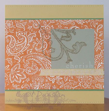
This was my response to the second Inklings cyberstamp challenge, a sketch and colour combo challenge. As I was playing catch-up with the challenges I had only skimmed what they were, opened the corresponding images in separate tabs in my browser, yadda yadda yadda... created a card based on the colours, then created a card base on the sketch. At some point I went back and saw they were to be combined... d'oh! Ah well lol

For this card I used a So Saffron card base (14.8 cm square), a layer of Whisper White stamped with Paisley in Pumpkin Pie on a slightly larger Wild Wasabi layer, and a small piece of Sahara Sand with that "cherish" stamp from Baroque Motifs again stamped in Whisper White. I stamped the large image from Brocade Basics on both the Sahara Sand piece and Paisley layer (masking a lot of it off) using VersaMark, pierced holes around the edge and then stitched this outline with linen thread. This took ALL DAY and nearly KILLED my fingers... I tend not to like large holes showing in my stitching and my fingers really paid for it that day, pulling the needle through rather than making extra large holes that the needle would just glide through. I also pierced holes along the horizontal edges of the base card and ran a piece of So Saffron ribbon (from the Fairy Tale Ribbon Originals pack) across the card. Like a lot of people who took up the challenge, these are not colours I would normally team-up, but I really what I came up with.

Monday, April 21, 2008

???

Has it really been over a month since I last posted here? I truly did not mean for it to be that long, but between life, reinstalling Windows twice in five days, SU! convention, an extended stay in Brisbane cuddling my 6 week old nephew, school holidays and getting the computer back in order I've been a tad busy!

Convention was fabulous... I think I had a sore throat within a couple of hours of landing due to the talking and laughing as I caught up with fellow team members and met some others for the first time. Between convention and the new IB&C I have so many ideas going through my head it's a bit hard to know where to start. However, according to the Sound of Music, the beginning is the best place to start, so lets rewind to about a month ago when Jayne held a cyberstamp on her demo forum.

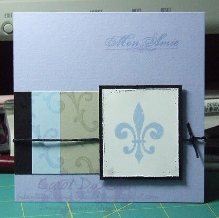
The first challenge involved copying a card from the new catty. Mine is from page 42, oddly enough, and I changed the stamp set and colours. I was having a very big Moonlight day, so the colours are inspired by Mick St John - yep, I think this proves I can be inspired by anything! I think he had something to do with the fleur de lis getting on there too. This is probably one of the quickest cards I have made... I am a very slow stamper, deliberating over colour and layout for an age, but with this one half of that was already decided for me and I had the card finished in about an hour. The stamp set is Carte Postale and colours are Whisper White (teeth), Bashful Blue (eyes), Basic Black (jacket), Sahara Sand (shirt) and Almost Amethyst (ok, that one's all me!).

I plan on being back tomorrow with one of my swaps from convention... I forgot to take photos of the others so one is all you're going to get!

Tuesday, March 11, 2008

Springtime Happiness

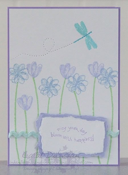
Here is my last card from the Inklings cyberstamp, an inspiration challenge based on a card on the Aussie SU demo website. I kept with the theme of the card - flowers - and used some tearing and dimensionals like the original card, however I've used a completely different stamp set, colour them and embellishments. The sentiment is from the outgoing hostess set "Bloming with Happiness", the other stamps are from another outgoing hostess set "Springtime Stems". After stamping the flowers along the bottom of my piece of card I decided I wanted to have a dragonfly cruising over them, but don't have a dragonfly stamp in a matching style. My solution was to use the stem and solid tulip images as body and wings for my dragonfly. I used a blender pen dipped in Cool Caribbean ink to colour two petals of the tulip for the wings, and the end of the stem was inked with Tempting Turquoise.

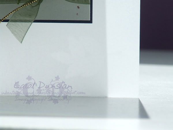
I've also uploaded another card to the Elite Stampers blog, but wanted to share a close up with you as a little feature isn't all that clear in the full shot.

Inspired by Julie Buhler, I used Stampin' Up!'s vellum cardstock for the card base. In the bottom right corner of the card front I have stamped one leaf from the three-leaf stamp, inked with VersaMark. The VersaMark makes the image appear more translucent, but makes it tricky to capture an image of! The other advantage of using vellum is I was able to stamp this on the inside, so from the front the leaves go the opposite direction to how they normally stamp (and I just thought they'd look better this way).

Friday, February 15, 2008

Last of The Chocolate Cake

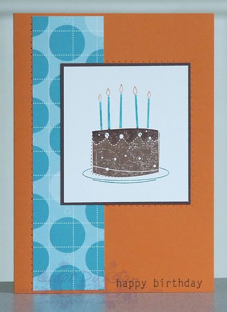
I made this card for a nephew's birthday, so to make it a bit more boy-ish I swapped out the rose/pink and used Pumpkin Pie instead. Another difference with the other cards is I added some paper piercing along some of the edges.

Wednesday, February 13, 2008

My Friend the Chocolate Cake

Mmmmm, just the thought of chocolate cake is making me drool lol

For this card I've used three sets: 'Birthday Whimsy', 'Paisley' background and 'Time Well Spent'. Once I got the idea of combining the cake with the sentiment I had to make it into a card or two to get it out of my head... though I very nearly used the other sentiment "Time spent with friends is time well spent"... I think I was channeling those old Tim Tam ads that compared men to Tim Tams. Anyway, back to the card. Colours are Regal Rose, Close to Cocoa, Chocolate Chip, Cool Caribbean and Whisper White. I've used a white gel pen to do faux stitching down the side and to colour in parts of the sentiment. All products are Stampin' Up! and available through me (although "Time Well Spent" is not released yet).

Thursday, January 17, 2008

Colour Challenged

This is one of those cards that didn't turn out quite like it should have. The Inklings cyberstamp colour challenge was Vintage Violet, Cool Caribbean, Chocolate Chip and Ruby Red. There I was, merrily stamping away and assembling my card. When it came to going over the paper piercing with the Chocolate Chip marker I suddenly realised I had made an error - I'd grabbed the Close To Cocoa inkpad instead of Chocolate Chip! Suddenly it all made sense why the brown wasn't showing up as much as I thought it should. Hopefully I'll get around to remaking this card with the right colours soon, and it'll be interesting to compare the difference, but at the time I felt like such a goose that I just couldn't face it (I also had to get dinner ready). The stamps I used are from Friendship Blooms, quite possibly my favourite Sale-A-Bration set.

ETA: I forgot to mention that the layout for this card is from a Janelle Richmond sketch.

Wednesday, January 16, 2008

Butterfly Thanks

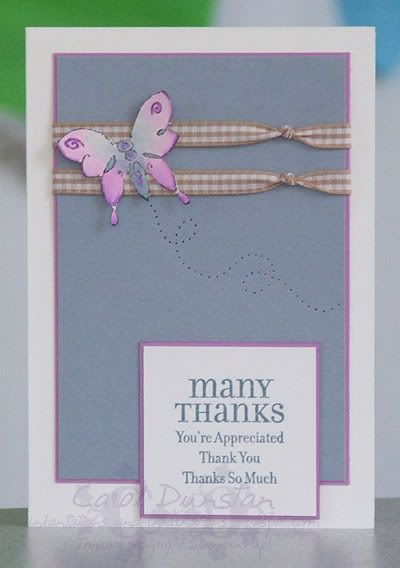
We recently had a cyberstamp over on Jayne's downline forum, and this is the card I made for the sketch challenge. I decided I hadn't been using enough purple lately so I settled on Orchid Opulence, to be accompanied by Creamy Caramel and a couple of other colours I haven't used very much - Bordering Blue and Buckaroo Blue. The card base is a little Stampin' Up! notecard, which I recieved as part of my Elite Stampers Secret Santa pressie (thanks Cass!). The Merci butterfly was stamped on watercolour paper using StazOn Jet Black and coloured using an aquapainter to pick up colour from the inkpads. The Lots of Thoughts sentiment was stamped on Whisper White using Buckaroo Blue. The butterflys trail was done by free-hand paper piercing. Both of these stamp sets are only available as benefits of Sale-A-Bration.

Tuesday, January 15, 2008

Simple Friendship

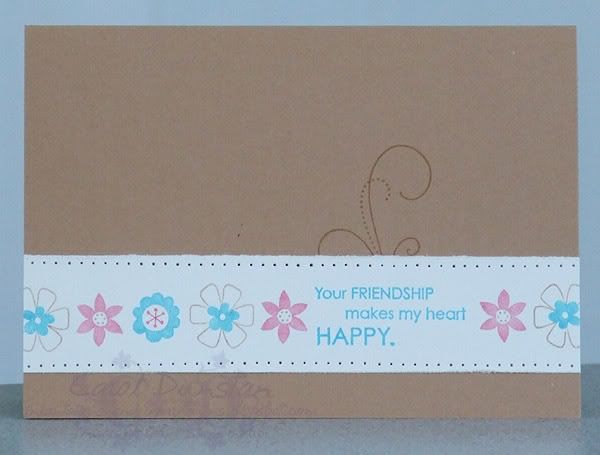
Here's another card from the day at Jayne's place. The challenge for this one was to create a one layer card. I was having trouble getting started and settling on colours to use until Kim threw a colour challenge at me as well. I picked out Creamy Caramel, she nominated Tempting Turquoise and Regal Rose. After that (and some lunch - a yummy quiche cooked by Kim) the card just fell together biggrin. I went for a Caramel layer and strip of Whisper White with stamps from the SAB set Friendship Blooms. The sentiment is in Tempting Turquoise, the flower trio stamp has been inked with the Caramel, Turquoise and Rose markers. The swirly/scrolly stamp from the same set was then stamped on the base card with Caramel, my one and only layer mounted on top and then I paper pierced along the top and bottom of the white layer. Quite a simple card, but I like how it turned out... I could easily play with this colour combination more!
Friday, January 11, 2008

Stem Blessings

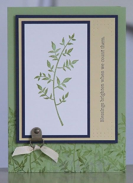
Stem Silhouettes would have to be my next favourite set from the Summer mini, a great set for those all too tricky male cards. This card uses a Certainly Celery base that has been randomly stamped along the bottom with the same stem as the main image. The stamp was inked with Old Olive which was stamped off on scrap paper a couple of times then stamped a couple of times on the cardstock before reinking to get varying shades of the green. The main image was first inked with Certainly Celery and then lightly inked with Old Olive to get a speckled effect. I've also used layers of Night of Navy and Barely Banana, some Antique Brass hodgepodge, cream grosgrain ribbon and a wee bit of paper piercing to frame the sentiment.

Monday, January 07, 2008

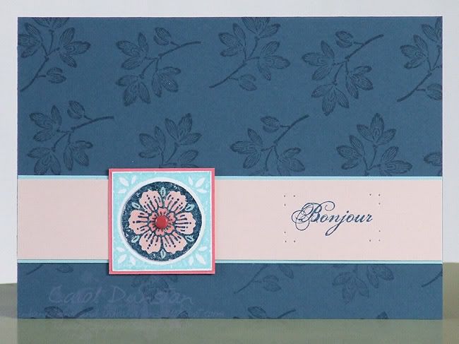
Bonjour Postale

Another card using Carte Postale and the same colour combination - Blush Blossom, Cameo Coral, Cool Caribbean and Not Quite Navy. Here I also added a brad for the centre of the flower and used some paper piercing to frame the sentiment. The flower motif was stamped by first inking with VersaMark then Not Quite Navy, stamping on Whisper White and clear embossing it. It was then coloured using a blender pen to pick up colour from the inkpads and the circle part cut out and mounted over a Cool Caribbean impression of the image.

Saturday, November 03, 2007

Good Intentions

I had good intentions of sharing a card with you all last night, but I post my pics via photobucket and it didn't want to play fair. I also had good intentions with the card below, but it ended up being late for the recipients birthday. Ah well, better late than never!

I just love the combination of Cameo Coral and Apricot Appeal, and lately I've been adding some other warm tones to the mix. But for this card I decided to go for a contrast of greens and use Certainly Celery and Old Olive (and a bit of Taupe grosgrain). I coloured the chipboard but dragging and pressing it into the Celery inkpad, then using the Celery marker to fill in any spots that were missed. The Touch of Nature flower was stamped on watercolour paper with StazOn Jet Black and coloured using an aquapainter and inkpads. The words are from Everyday Flexible Phrases. All products by Stampin Up! and available for purchase for me (where ever you are in Australia). Please contact me if you'd like to place an order.

Tuesday, August 21, 2007

Happy Dreams

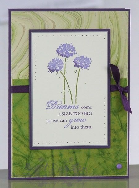
I really loved this set, Happy Harmony, that was only available during Sell-a-bration earlier this year. I've been wanting to use it again for a while and finally decided on something it would work well with, though an old faithful layout. While shuffling through my salvaged papers I decided that these two worked quite nicely together and made for a quick(er) card. The flowers and sentiment have been inked using Elegant Eggplant, Lovely Lilac and Old Olive markers. The card base is Elegant Eggplant, with layers of Going Grey and more Elegant Eggplant. The ribbon is from Spotlight, and the brad is Doodlebug Lilac.

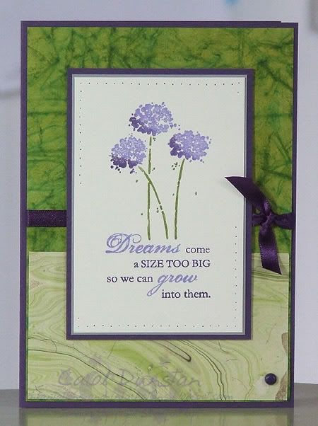
Then I decided to remake the card, but give it a tweak. I have this compulsion for putting darker colours at the bottom of a card (to 'ground' things I guess). So for the next card I flipped things around, and used a Plum brad instead. I think I like the second one slightly better as it's a but more unusual and interesting to my mind.


In other news, we finally picked up our new lounges today. YAY! It's nice to actually have something to sit on again.

Sunday, August 19, 2007

Double duty

This card is for both the second Inklings cyberstamp challenge and Beate's weekend sketch challenge. Sorry the photo isn't very good, it's a rainy ol' day here and this was the best I could do.

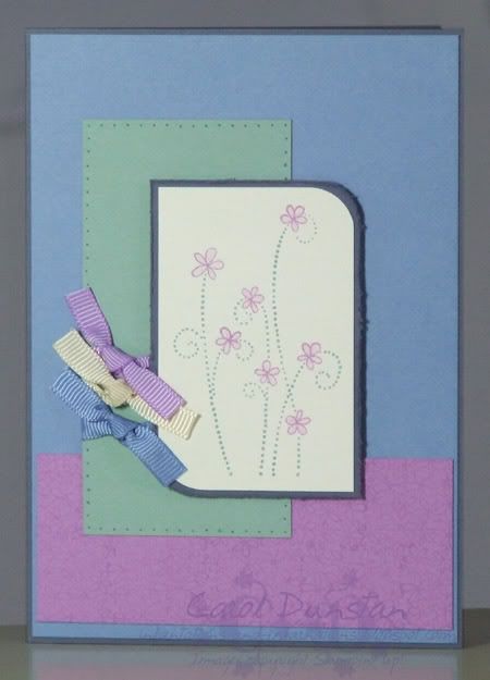
The central image, from Simply Said, was inked using the Orchid Opulence and Sage Shadow markers then stamped on Very Vanilla. It is layered on Vintage Violet, both layers having two corners rounced with the corner rounder punch. I also roughed up the edges of the Violet layer with the distress tool from the cutter kit.The card base is also Vintage Violet, layered on it is a piece of Brocade Blue that has been stamped with linen using VersaMark. The strip of Orchid Oppulence along the bottom has been stamped with the cake from Blooming With Happiness, and the Sage Shadow strip up the left side has been pierced (and the piercings hightlighted by going over with the writing end of the Sage Shadow marker) then pieces of Bluebird, Cream and Orchid grosgrain ribbon have been tied around it. The central image has been popped up on dimensionals.


This morning we trekked off to do the groceries at Kotara. A bunch of new shops had opened during the week, along with more parking spaces, so there was a stack of people there to check it all out. We got there a little later than we intended, and after a bit of a look at the new shops (I went into Riot and didn't buy a thing. Well, Glenn was with me! But I did start a shopping list...) we decided to have some morning tea before embarking on the groceries, and gave the new Dreamy Donuts a go. In a word: YUM. I'm not going to think about the calories I have consumed today, I had to try those donuts out! I started with a Blueberry one, and finished with a chocolate filled one. The chocolate one was ok, the filling was like chocolate Yogo, it's just that knowing they use Lindt chocolate on others it was a bit of a let down. We also drove and walked past where Borders will be - I squealed both times and Tiarna is sharing my enthusiasm having been to the Borders at Tuggerah. All that said... it was a nightmare getting out. It took us over 20 minutes, normally we'd be well and truly home by then. Anyway, going to have to find some time to get back there so I can shop properly (and I don't have two girls to drag away from the scented erasers at Smiggle)

Thursday, August 09, 2007

Scribble-dee-ay

Could I have called this post anything else???
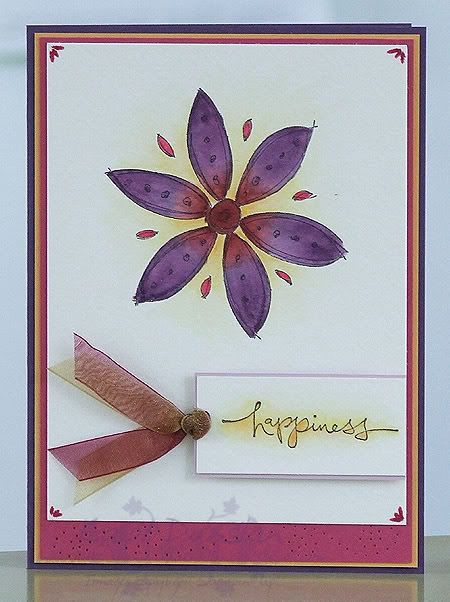
I think this has to be the first card I have made with the large Scribble This flower and not cut it out! It is stamped in StazOn and coloured with ink and aquapainter on watercolour paper. It kinda felt a waste to use the whole piece of watercolour paper, but I wanted it nice and clean, uncluttered, around the flower, so it had to be done. The decoration in the corners is done with the side of the brush tip of the Rose Red marker. Warm Words sentiment stamped in StazOn on watercolour paper with Marigold Morning ink painted around it, layered on Pale Plum then wine and gold organza ribbon attached. The cardbase is Elegant Eggplant with layers of Rose Red and Marigold Morning. The rose layer has some freeform piercing on it

Wednesday, August 08, 2007

Happy Scraps

After making some cards using "scraps" from the pretty papers I thought I might tackle some of the pieces in my scrap drawer. Admittedly this card only has two scraps, so I didn't put much of a dent into the collection, but hey... you gotta start somewhere! The two scraps were the main image and the strip of Chocolate Chip. The main image features stamps from the Delight in Life set. I started by stamping the solid inner part of the flower and the dotty-ish background in VersaMark on the gloss cardstock and sponging over this with Apricot Appeal ink for the petals, Regal Rose for the flower centre and Almost Amethyst around the flower. I then stamped over the top with Chocolate Chip ink. The Chocolate Chip strip was plain, so I added some faux stitching. The cardbase is Almost Amethyst, next up a layer of Blush Blossom with some paper piercing and some Francheville pastel purple brads. Sentiment is from All Year Cheer I stamped in Regal Rose ink.

Thursday, August 02, 2007

SU August Promotion

Stampin' Up! is saying a big "Thank you!" to it's hostesses. On top of the normal fabulous benefits for hosting a workshop, hostess can now recieve a free set to the value of $53.93 for workshops over $600. There are three sets to choose from: All About U, Nice & Easy Notes and my personal fave of the three - Petal Prints. If you are interested in hosting a workshop (or catalogue party), contact me for more details. Offer available until September 15th.

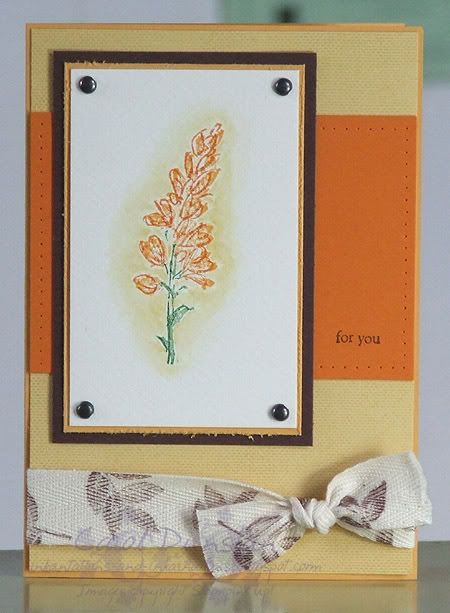
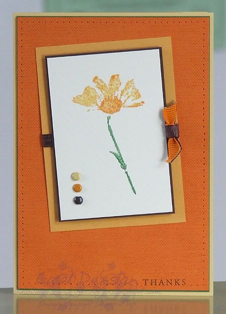
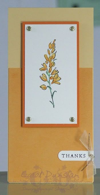
In light of the promotion, I thought I would share some Petal Print cards I have been working on. Colours for all are So Saffron, Marigold Morning, Pumpkin Pie, Garden Green and Chocolate Chip, flowers have all been stamped on watercolour paper.
So Saffron layer stamped with the linen background with Saffron ink, sentiment from All Year Cheer stamped in Chocolate Chip, leaves stamped on twill with Chocolate Chip ink, 2-step flowers ink with Marigold Morning ink pad and Earth Elements markers. Brads from Aged Copper hodge podge.
Pumpkin Pie background stamped with linen stamp in Pumpkin Pie ink, sentiment from Sincere Salutations inked with Chocolate Chip marker. Aquapainter lightly brushed over image after stamping. Chocolate and Tangerine ribbon; So Saffron, More Mustard and Aged Copper brads to finish off.
So Saffron long note cardbase, Marigold Morning layer stamped with linen background using Marigold Morning ink. Sentiment from Sincere Salutations inked with Basic Black marker. Cream organdy ribbon, gold cord and gold brads to finish off.

Tuesday, July 31, 2007

Both Way Blossoms Both Ways

Took a minor break from playing with Spring Mini stamps , but revisted my colour combo from yesterday. This card came out pretty much how I envisioned it... Both Ways Blossom stamped on Sahara Sand using StazOn, also stamped on Whisper White, flower coloured, trimmed and mounted over the flower on the Sahara Sand piece. This was then layered on a piece of Always Artichoke with some paper piercing down the left. Sentiment from Warm Words also stamped on Whisper White, punched with Word Window punch and attached with an artichoke brad, all mounted on an Old Olive cardbase. I really liked how it came out... but wanted to see what it would look like jazzed up a bit more.
On this card the cardbase has been stamped with the Paisley background using VersaMark, and I added some stitched artichoke ribbon from the Ribbon Originals 'Rustic Retreat' collection along with piercing around the Shara Sand piece. I was also really pleased with how this came out. Below you can see them side by side.