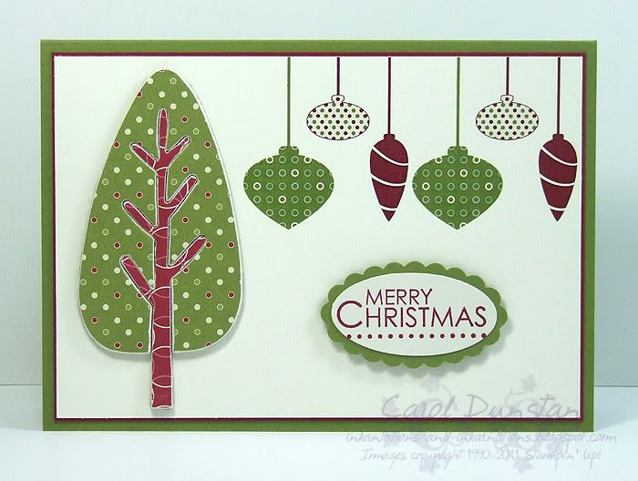
The third challenge for the Elite Stampers cyberstamp was to dip into embellishments we'd been a bit precious about, saving for that special occasion that never seemed to come along.
I've used chipboard, dsp and rubons that I hadn't really touched before. This card I am very happy with! I love how the rubons coordinate with the Jolly Holiday paper so well, I'm thinking I'll be revisiting that combination again inthe not-too-distant future. And I don't think I have said it yet, but I lurve how rich a colour Cherry Cobbler is. You think Riding Hood Red is a deep, rich red until you put it beside Cherry Cobbler. And no, I can't believe I've made another Christmas card and it's only June!
All supplies by Stampin' Up!
Cardstock: Old Olive, Cherry Cobbler, Whisper White
Stamp Sets: Season of Joy
Inks: Cherry Cobbler
Accessories: Mix & Match chipboard, Jolly Holiday dsp, Holly & Jolly rubons, large oval punch, scallop oval punch, dimensionals
Showing posts with label chipboard. Show all posts
Thursday, June 16, 2011
Wednesday, November 04, 2009
Dad's Birthday Card
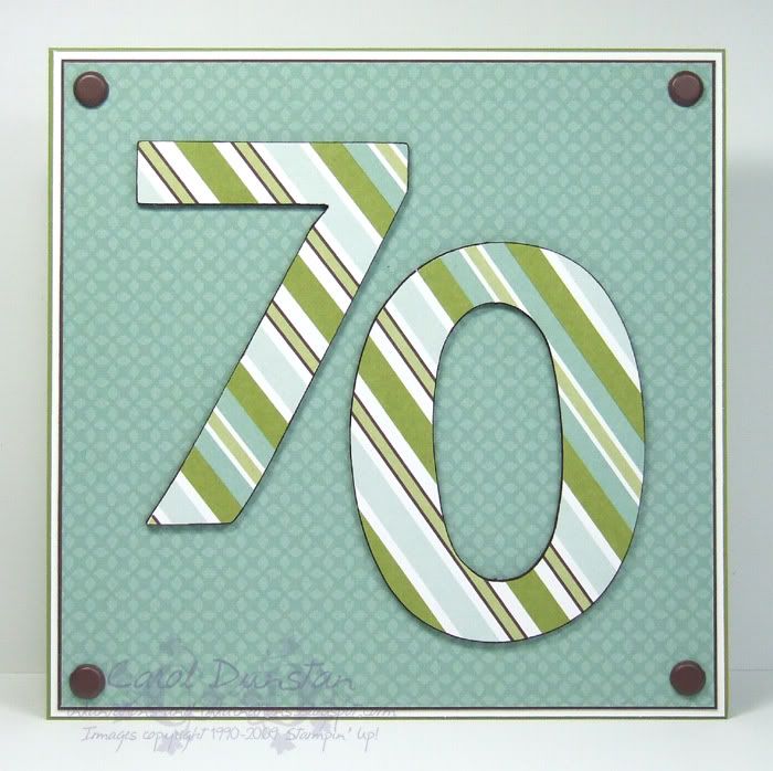
Sorry I went all quiet again! I've been away for a week to catch up with my Dad for his 70th - above you can see the card I made him - and it's proved harder than I thought to get back into the swing of things after everything else that has been going on.
I kept Dad's card pretty plain and straight forward as he's a no-fuss kind of guy. Both papers I used come from the Windsor pack, I really like the colours in this but it was still the first time I had used it. The chipboard numbers were covered in the diagonal stripe paper (which I didn't get on exactly evenly despite my best efforts, but it's only noticeable if you really look... which you are all doing now!) attached with Tombow Mono Multi glue, the edges sanded and the I ran the side of my Chocolate Chip marker around the edges to give them definition.
All supplies by Stampin' Up!
Cardstock: Old Olive, Whisper White, Chocolate Chip
Stamp Set: none
Ink: none
Accessories: Windsor DSP, 5/16" brads, On Board Simon Lower (retired), Chocolate Chip marker
I kept Dad's card pretty plain and straight forward as he's a no-fuss kind of guy. Both papers I used come from the Windsor pack, I really like the colours in this but it was still the first time I had used it. The chipboard numbers were covered in the diagonal stripe paper (which I didn't get on exactly evenly despite my best efforts, but it's only noticeable if you really look... which you are all doing now!) attached with Tombow Mono Multi glue, the edges sanded and the I ran the side of my Chocolate Chip marker around the edges to give them definition.
All supplies by Stampin' Up!
Cardstock: Old Olive, Whisper White, Chocolate Chip
Stamp Set: none
Ink: none
Accessories: Windsor DSP, 5/16" brads, On Board Simon Lower (retired), Chocolate Chip marker
Sunday, June 21, 2009
Cinema Saturday #37
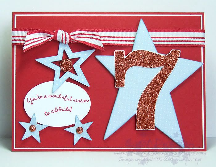
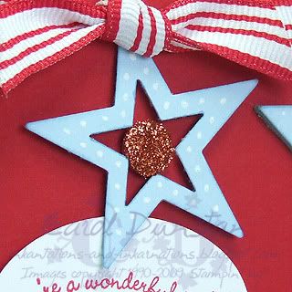
Thank you to Brooke and Sankari for picking my sweet lollipop card for the “Some Like It Hot” Audrey! That’s exciting in itself, but it’s a bonus when it means you get to be the guest designer the next week. And how fun that it is High School Musical! With two young daughters in the house this has been a favourite around here, although I didn’t think I would like it. I was pleased to find that it was better than most of the Disney tv movies I have seen, so I didn’t mind revisiting it for the challenge. There were a lot of ways I could go with my card, but I felt that I had to have a lot of red and white, and I wanted my card to be a bit of a celebration of the individual.I went with an age birthday card, using chipboard and punches for some stars and working in the number with a big glittery 7. In talking about it with Tiarna she had mentioned basketballs, so I decided to make orange a feature colour and threw in some blue for contrast. The 7 is from the Sticky Cuts Letters pack - this was the first time I had used them (finally!) and I think it is great, very easy to use. I stuck the 7 to some Whisper White and then trimmed around it before covering it in the orange Supernova glitter. To balance all the orange on the right I wanted to use some of the glitter on the left, so the two small brads have been covered with a mini glue dot and dipped in the glitter, while the large brad (from the Styled Silver hodgepodge) has had a scrap of the Sticky Cuts trimmed to size and stuck on top before dipping in the glitter. The white gel pen dots on the punched stars were inspired by the title on the disc cover, and it also carries over the look of the DSP on the chipboard.
Hope you all have fun with this challenge, I can’t wait to check out your entries!All supplies by Stampin' Up!
Cardstock: Real Red, Whisper White, Bashful Blue
Stamp Set: Curvy Verses
Ink: Real Red; Bashful Blue for sponging
Accessories: Large star punch, star punch, Wide Oval punch, sponge dauber, Bashful Blue marker (used on edge of chipboard and inside large punched star), white gel pen, Supernova glitter, Styled Silver Hodgepodge, Sticky Cuts Letters, Real Red 1/2" Striped grosgrain ribbon, Summer Picnic DSP (retired), On Board Accents (retired), dimensionals
Show watched while creating: High School Musical
Monday, June 01, 2009
Whoo Loves Baja Breeze?
Baja Breeze is easily my favourite In Color this year, so it's a wonder it took me this long to include it in one of the Colour Challenges over at the Elite Challenges blog. Today being a new month there are a bunch of new challenges up and I have just uploaded my card for June's Colour Challenge. Above you can see a little snippet of it. To make the sentiment I used my Basic Gray marker to ink up alternate lines (ie "guess" and "loves", then "whoo" and "you!") before stamping so I had plenty of room between lines to cut them out.
Monday, May 25, 2009
New Bundle of Joy
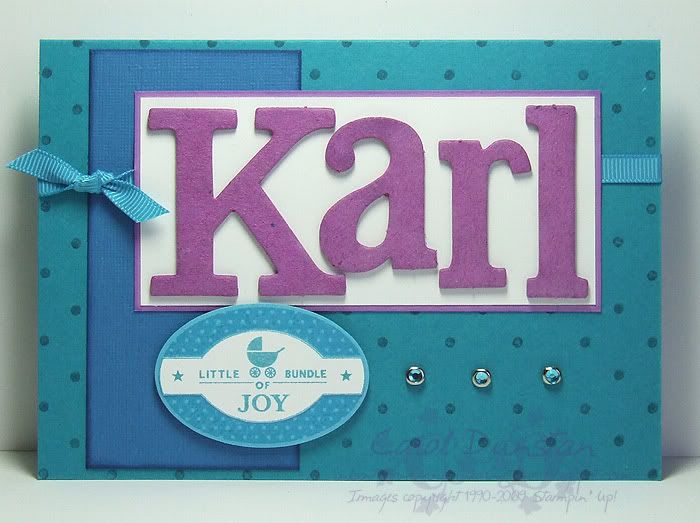
It's probably obvious to long-time readers that Bundle of Joy was my favourite baby set. Now that it has retired I don't have an actual baby stamp, but I made sure one of the first hostess sets I got was Punches Three so I could have this "Bundle of Joy" stamp. This card is for my new nephew Karl, using a colour combination I've been dying to use since I physically laid eyes on Pacific Point. Along with the decent splash of purple on the card I sent a couple of Target royal purple suits up for him - he's my nephew he's going to have purple! The chipboard letters have been coloured using a technique picked up from convention, inking them with a dauber and reinker. I actually can't remember if the technique was demonstrated with wetting the letters first but that's what I did by brushing my Aquapainter over them first. The layout was based on WSC81.All supplies by Stampin' Up!
Cardstock: Taken With Teal, Pacific Point, Orchid Opulence, Whisper White, Tempting Turquoise
Stamp Sets: Polka Dot, Punches Three
Inks: Taken With Teal, Pacific Point, Orchid Opulence, Tempting Turquoise
Accessories: Tempting Turquoise 1/4" grosgrain ribbon, Circle Ice Rhienstone Brads, Onboard Timeless Type, On Board Lots of Letters, dimensionals
Sunday, April 12, 2009
On Board Owl
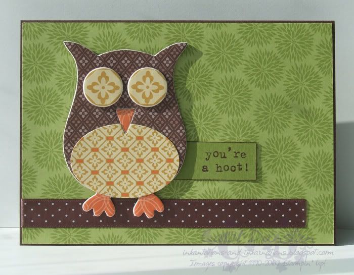
Last night I decided to just play, and so I pulled out something I'd been wanting to do for ages: cover one of the On Board So Tweet chipboard owls with DSP. I'm pleased to say that he pretty much came out as expected (though I was thrilled the Haiku pattern was such a perfect size for the eyes), but then I had to think what to do with him! I decided to put him on a card, and though the latest Weekend Sketch Challenge would suit... if you want to be particular the oval is the circle from the sketch and the owl is the large rectangle behind that. I was going to add a large rectangle of DSP behind the owl but everything I tried distracted from him, so he's just out on a (ribbon) limb with no treetrunk in sight!All supplies by Stampin' Up!
Cardstock: Old Olive, Chocolate Chip
Stamp Set: Owl Together Now
Ink: Chocolate Chip
Accessories: Chocolate Chip Patterns DSP, Haiku DSP, On Board So Tweet, Valet Ribbon Originals, wide oval punch
Shows watched while creating: Bones, Dead Like Me
Subscribe to:
Posts (Atom)