Showing posts with label CSCC. Show all posts

Wednesday, May 19, 2010

Cinema Saturday #79

Hey again everybody! I know I have been quiet again, I just never seem to think of blogging at the right time (ie when I am on the computer and have time), so you haven't heard a lot from me lately. I am off to Stampin' Up! Convention tomorrow, which is very exciting, but I just had to take time out from preparing for that to make a card for this weeks Cinema Saturday challenge: New Moon. As busy as I am, how could I NOT make a card for this??? Let's start with the inside of the card, since that is also the first thing I did...
I had come across a nice clear graphic of the wolf-pack tatoo at deviantart and really really wanted to use it but couldn't fit it on the front, so inside it went. Did a test print or two to get the position right since this was going directly on the inside of the card base.

Now for the front of the card... Quite some time back I had seen this card and had wanted to give it a go, I just never had the right motivation. I very nearly did a card like that for the Australia Cinema Saturday challenge, however I chickened out! This time, since having done numerous Twilight inspired cards and having no new ideas... I remembered the "man card" and the time was right.
If you don't recognise it, my card is based on Jacob Black's bare & buff New Moon body. Following Bevithia's directions, with close scrutiny of a few photos of Jacob (a girl has to suffer for her art...) and after whole lotta sponging - I was done and pretty happy with the result!

Even more impressive is getting through this post with no innuendo...

Most supplies by Stampin' Up!
Cardstock: Creamy Caramel, Basic Black textured
Stamps: none!
Inks: Creamy Caramel, Close To Cocoa, Whisper White
Accessories: Sponge dauber, Styled Silver Hodgepodge, cotton-bud
Show watched While Creating: New Moon

Friday, February 26, 2010

Cinema Saturday #67

Life has been so busy lately! There is just not enough hours in the day, particuarly when you are trying to get over a cold. After talking all weekend at the CraftExpo my kids have taken to calling me Croaky Carol! At least I can speak at a normal volume now.

Anyway, on to the fun stuff! This weeks Cinema Saturday challenge movie was Tristian + Isolde, an old favourite of mine. As usual, I shose to base my card on a costume. Sweet Stems was a perfect match for patterned sections on the dress, and I used some textured cardstock to give the look of the rough weave of most of the fabrics in the film. I had already been thinking of making it a gate-fold card before I double checked what the required element was, so that was no problem this week. I put the sentiment on the inside, hidden from the outside and close to the heart wink
All products by Stampin' Up!

Cardstock: Night of Navy, Baja Breeze, textured Not Quite Navy, Taken With Teal, Very Vanilla
Stamp Sets: Sweet Stems, Whimsical Words
Inks: Not Quite Navy, So Saffron (for sponging)
Accessories: Square Ice Rhinestone brads, Earth Elements brads, Curly Label punch
Show watched while creating: Tristian + Isolde

Tuesday, January 19, 2010

Cinema Saturday #62

This weeks Cinema Saturday movie is Night At The Mueseum. I really like this movie, and there were so many directions we could have gone in with inspiration. Brooke & Sankari made the required element "something minature", which did throw me a bit but it was a great idea, it tied in so well with the movie. I found I kept thinking about how it was the mueseum of natural history, so I went the nature tangent (I would have gone Egyptian if I'd had Egyptian stamps!). I guess my "minature" element is open to interpretation, but I decided to make a smaller than standard card, and to play with proportions... so I put a little birdie on a big flower smile


The card base is a scallop note card (which I received in a Secret Santa gift, thanks Santa!), and I added a strip of textured Chocolate Chip cardstock behind the scallops so the card could stand up on it's end. Colours were somewhat inspired by the outfit that Rebecca wears while showing a tour group around the muesem. I don't know that you'll necessarily look at this card and think "Night at the Mueseum!" (though there is that line about "a little birdie told me..."), but I think it turned out rather cute.

All supplies by Stampin' Up!
Cardstock: textured Chocolate Chip, Whisper White
Stamp Sets: Inspired by Nature, Cheep Talk, Jumbo Outline Alphabet, Best Yet
Inks: Kiwi Kiss, Pumpkin Pie, Chocolate Chip, Baja Breeze
Accessories: Scallop Notes II, Kiwi Kiss marker, Pumpkin Pie marker, Chocolate Chip marker, 1 1/4" circle punch, Button Latte, Earth Elements brads, dimensionals
Show watched while creating: Night At The Mueseum

Wednesday, January 13, 2010

Cinema Saturday #61

This week's Cinema Saturday is another favourite of mine, A Knight's Tale. I've been a Heath Ledger fan since the good ol' Roar days, and while I initially had issues with the historical inaccuracy of the costumes when this movie came out, I had no such issue with the modern music - go figure! Anyway, I had planned on putting a modern spin on this card, but my "Rock on" rub-on stuffed up, so I had to go with plan B (resulting in another sneak peek at a SAB set). Colours are inspired by Williams banquet outfit (I don't think those wooden toggles ended up on it!), and I have included the required element of stars in the form of a few brads.

I had plans for a scrap page featuring a pic of my girls at the medieval fair, but my darn sinuses are playing up so I'm not sure I'll get to it in time.

All supplies by Stampin' Up!
Cardstock: Chocolate Chip, Mellow Moss, Very Vanilla
Stamp Sets: Baroque, Framed With Love, Vintage Labels
Ink: VersaMark, Chocolate Chip, Pale Plum
Accessories: Very Vanilla 5/8" grosgrain ribbon, Mellow Moss taffeta ribbon, clear embossing powder, Styled Silver hodgepodge

Monday, September 14, 2009

Cinema Saturday #41 or Tiarna's Birthday Card

It's astounding, time is fleeting... sorry, wrong movie! But you are caught in a bit of a time warp here! Cinema Saturday #41 was Chamber of Secrets, and ever since I did the Beauty & The Beast castle card I was wanting to do a more realistic castle version, which all tied in nicely with Tiarna's birthday coming up... I got started but took quite a break from this card and only just finished it 11pm Saturday night, with Tiarna's 10th birthday being on Sunday. Here is the card I made for her:

Even though Tiarna has just recently read the LOTR books (and a LOTR themed card would have tied in nicely with this weeks Cinema Saturday movie), she has been a Harry Potter fan since she was 18 months old. There was no way I could make a card that included all of the Hogwarts castle, so I went through images I have on my harddrive and picked a section (the section to the right of this image) that would be relatively easy to replicate (though I of course took some liberties). I made two main changes to the construction of this card from the Beauty & The Beast one, the most obvious being to use textured cardstock instead of plain. This gave it more of the rough brick look, it is also thinner so less bulky when you have a lot of layers and the card is collapsed (this one still fits into a large square envelope, but only just!). I also used textured cardstock for the roofing, however it is turned inside out so the less textured side is showing and you get a contrast in the textures. The other change I made was a structural one: it was hard to get the castle to stand upright on it's own, the nature of the basic concertina fold meant it was always tilted backwards. For Hogwarts I lengthened the sides that weren't going to have cardstock attached to them, so those that did have cardstock attached would stand pretty much vertical.

Tiarna loved her card, but I have just remembered that I had stamped and coloured an owl for Hedwig that I had intended to use on this and forgot to put it on... so shall have to do that and see how long it takes her to notice ;)

All supplies by Stampin' Up!
Cardstock: Going Gray, Going Gray textured, Bordering Blue textured, Basic Gray
Stamps: none!
Inks: Going Gray, Old Olive, Garden Green
Accessories: Word Window punch, Horizontal Slot punch, 1/2" circle punch, 1" circle punch, cutter kit, dauber, scoring blade on paper trimmer
Show watched while creating: Aus v Eng limited overs cricket

...and because I am not quite ready to have a post without Karl Urban...

Sunday, June 21, 2009

Cinema Saturday #37

Thank you to Brooke and Sankari for picking my sweet lollipop card for the “Some Like It Hot” Audrey! That’s exciting in itself, but it’s a bonus when it means you get to be the guest designer the next week. And how fun that it is High School Musical! With two young daughters in the house this has been a favourite around here, although I didn’t think I would like it. I was pleased to find that it was better than most of the Disney tv movies I have seen, so I didn’t mind revisiting it for the challenge. There were a lot of ways I could go with my card, but I felt that I had to have a lot of red and white, and I wanted my card to be a bit of a celebration of the individual.

I went with an age birthday card, using chipboard and punches for some stars and working in the number with a big glittery 7. In talking about it with Tiarna she had mentioned basketballs, so I decided to make orange a feature colour and threw in some blue for contrast. The 7 is from the Sticky Cuts Letters pack - this was the first time I had used them (finally!) and I think it is great, very easy to use. I stuck the 7 to some Whisper White and then trimmed around it before covering it in the orange Supernova glitter. To balance all the orange on the right I wanted to use some of the glitter on the left, so the two small brads have been covered with a mini glue dot and dipped in the glitter, while the large brad (from the Styled Silver hodgepodge) has had a scrap of the Sticky Cuts trimmed to size and stuck on top before dipping in the glitter. The white gel pen dots on the punched stars were inspired by the title on the disc cover, and it also carries over the look of the DSP on the chipboard.

Hope you all have fun with this challenge, I can’t wait to check out your entries!

All supplies by Stampin' Up!
Cardstock: Real Red, Whisper White, Bashful Blue
Stamp Set: Curvy Verses
Ink: Real Red; Bashful Blue for sponging
Accessories: Large star punch, star punch, Wide Oval punch, sponge dauber, Bashful Blue marker (used on edge of chipboard and inside large punched star), white gel pen, Supernova glitter, Styled Silver Hodgepodge, Sticky Cuts Letters, Real Red 1/2" Striped grosgrain ribbon, Summer Picnic DSP (retired), On Board Accents (retired), dimensionals
Show watched while creating: High School Musical

Friday, June 19, 2009

Cinema Saturday #36

This weeks Cinema Saturday movie was Beauty and the Beast, with the required element being a fairytale theme. Initially I was at a loss as to what to do for this movie, we don't have it on disc so I wouldn't be able to watch it again to get inspiration. But then I saw Jaimee's card and it reminded me of something I had been meaning to try for ages. I had bought a kids "things to make and do" book with the intention of giving it as a present, but also thought there were some good ideas for my cardmaking in it. This was one of them... so book recipient, please over-look that it is now slightly second hand!I'm pretty ecstatic about how this came out! I had intended it to fit in a large square envelope, but now that I have finished it I am not sure it will... I haven't tested it out yet. It does fold up flat for postage, but I wanted it big so I could get some details in.
Here's a side view so you can see the concertina-style base that all the elements are stuck to. The scoring wasn't as precise as I had intended, so I have had to prop the back up a bit for photos, but I've already figured out a tweak so that the card won't need propping up, and the elements will sit pretty straight (rather than all tilt back).
And now a shot from the right. The Baja Breeze moat was cut using the cutting tool of the Cutter Kit. The edges were sponged with Baja Breeze ink. The drawbridge and entrance are large Tag punches with details drawn on with marker.
Above you can see some of the details on the towers. The shingles are stamped - the only stamping on this card! Windows are, appropriately enough, done with the Word Window punch. I've drawn on random bricks with my Pink Pirouette marker. This is the main thing I would change with the card - I had intended on using textured cardstock but completely forgot to pull it out. I realised my mistake only after everything was cut, so thought this solution would be the best alternative. I think the textured cardstock would give enough of a texture to make do for brick work. Oh well! The notches were cut out with the now retired 1/4" square punch - made the job so easy! The Spiral punch would probably also work really well, especially on something of a smaller scale. I also did some masking and sponging to help add some apparent dimension. The tower in the background has been shaped with a tag punch.

Along the front of the castle wall I drew some vine-type things with little Regal Rose dots for flowers. This is probably verging on more of a Sleeping Beauty card than Beauty and the Beast, but I wanted to work in some sort of rose. You can also see a bit more masking, sponging and hand-drawn bricks down here too.

All supplies by Stampin' Up!
Cardstock: Pink Pirouette, Certainly Celery, Baja Breeze, Close To Cocoa, Going Gray, Basic Gray, Regal Rose
Stamp Set: All Scallops
Ink: Regal Rose; Pink Pirouette and Baja Breeze for sponging
Accessories: Certiainly Celery marker, Regal Rose marker, Close To Cocoa marker, Basic Gray marker, Pink Pirouette "marker", sponge dauber, Word Window punch, small tag punch, large tag punch, 1/4" square punch, Cutter Kit

Sunday, April 19, 2009

Cinema Saturday #27

This weeks movie over at Cinema Saturday is The Lion King, and I am lucky enough to be guest designer!

The Lion King has been a long-time favourite for me, so I was thrilled when asked to be guest designer for it. I was about 18 when I first saw TLK, and initially thought "urgh, a kids movie?" but Timon & Pumbaa won me over, particularly with their distraction of the hyenas during the fight to regain Pride Rock. I'll quite often start singing this at random, and have got my kids hooked on it too - so this just had to be the scene I was going to base my card on.

While my sister has both a realistic meerkat stamp and some Lion King stamps I decided that nothing would really satisfy me, I had to have a big Timon in "drag"... I merged a few images in Photoshop, printed them out and then cut out the various sections for templates to create a paper-pieced Timon. The flower was created with bits and pieces from the Pretties Kit, the skirt is a lot of frayed Old Olive grosgrain ribbon and the lei is a whole heap of Trio Flower punchies. I had no idea what I was going to do for the background until my new catty order arrived with it's Urban Garden paper... this pattern reminded me of the "I just can't wait to be king" scene, where Simba pokes his head through a bunch of long grassy stuff to make it look like he has a bigger mane. I finally squeezed some stamping in with "luau", clear embossed on Bali Breeze paper, cut out and edged with a Basic Black marker.

All supplies by Stampin' Up!
Cardstock: Orchid Opulence, Naturals Ivory, Creamy Caramel, Whisper White
Stamp Set: Big Deal
Inks: VersaMark
Accessories: Basic Black marker, Chocolate Chip marker, Close to Cocoa marker, Tangerine Tango "marker", Rose Red marker, Regal Rose marker, Summer Sun marker, Pretties kit, Old Olive 5/8" grosgrain ribbon, Urban Garden DSP, Bali Breeze DSP, clear embossing powder, sticky strip
Show watched while creating: The Lion King

Thursday, April 09, 2009

Cinema Saturday #26

This week's Cinema Saturday movie was My Fair Lady, a movie that I hadn't seen in full until this week (which is a side benefit of these challenges for me, getting me to watch movies I had previously missed). I drew on a few things for my card, probably the most obvious being the art nouveau style of the interior decoration (namely the wallpaper at Mrs Higgins' house), and Eliza's ball gown (which was featured in one of the sneak peeks), with some of the Ascot dress thrown in for good measure (it looks white lace on cream to me). Flowers are also quiet prominent throughout the film, but I thought this sentiment was especially suitable for Eliza's journey in the movie. Both stamps are from new sets, and the DSP is from the absolutely gorgeous Bella Bleu pack.

All supplies by Stampin' Up!
Cardstock: Basic Gray, Whisper White
Stamp Sets: No One Like You Simply Sent Kit, Bella's Bloom
Inks: Going Gray, Basic Gray
Accessories: 2-way glue pen, Dazzling Diamonds glitter, Curly Label Punch, Basic Gray taffeta, Style Silver Hodgepodge, dimensionals
Show watched while creating: My Fair Lady

Tuesday, March 31, 2009

Cinema Saturday #25

This card was inspired by the movie Goldfinger, this weeks challenge over at Cinema Saturday. I based my card on the tux that Sean Connery is wearing (under his wetsuit...) at the start of the film... I could have done a lot of different things (especially with the martini glass from the new Cheers To You set) but decided to go with a simple, elegant and classic card which sums up Bond for me (particuarly the older movies). I also drove my kids mad singing the theme song. mrgreen

All supplies by Stampin' Up!
Cardstock: Whisper White, Basic Black, Brushed Gold, Very Vanilla
Stamp Set: Bloomin' With Beauty
Inks: StazOn Jet Black; Purely Pomegranate for watercolouring
Accessories: blender pen, Garden Green marker, Sahara Sand marker, scallop edge punch, Purely Pomegranate satin ribbon (from Spring mini), dimensionals
Show watched while creating: Goldfinger

Monday, March 30, 2009

Cinema Saturday #24

In keeping with my tradition of late...Here's my card for Cinema Saturday #24, the movie being Willy Wonka/Charlie and the Chocolate Factory. I've watched the Gene Wilder one many a time, so I watched the Johnny Depp one (for only the second time all the way through - it's the way it is when you have kids and they are watching something when you have things to get done) in preparation for this card. I had forgotten how funny the newer one was, lots of one-liners that had me giggling my head off. In the end though I feel I used elements common to both movies... Cocoa and Chocolate (for obvious reasons), both Wonka's have purple and red in their clothing, and the green is for the grass in that first real room of the factory that the kids go into - where everything is edible (though the shade of green is definately more of a 2005 shade).

All supplies by Stampin' Up!
Cardstock: Close To Cocoa, Orchid Opulence, Cameo Coral
Stamp Sets: Priceless, Everyday Flexible Phrases
Inks: Chocolate Chip, Close To Cocoa, Elegant Eggplant, Riding Hood Red
Accessories: Bold Brights brads, dimensionals
Show watched while creating: Charlie and the Chocolate Factory, Rabbit-Proof Fence

Tuesday, March 10, 2009

Cinema Saturday #22

Doesn't this card just scream Singin' In The Rain!?!

No? No it doesn't... but that is the movie that inspired it, for this weeks Cinema Saturday challenge. As much as I wanted this card to represent the singing and dancing, I just couldn't see a way to make it happen. And you know I am a sucker for costumes, right? Well, I was inspired by this costume:

Our additional recquirement this week was to include something related to water. If I had gone the singin' and dancin' route it would have been drops of Crystal Effects, but I didn't so I had to think of something else... and the jewelry worn with this dress has pearls so there's my water element. You could also say the clear beads and rhinestone brad fit that too (especially the "drop" shaped ones...). The sentiment reflects the singin' and dancin' though, so it's kinda in there!

All supplies by Stampin' Up!
Cardstock: Whisper White, Regal Rose, vellum cardstock, brushed silver
Stamp Sets: Happy Everything, Fine Lace, Leaves a la Carte
Inks: Whisper White, Encore silver
Accessories: Pretties Kit, Fairytale Ribbon Originals, clear embossing powder, dimensionals, mini glue dots
Show watched while creating: Singin' In The Rain

Thursday, February 19, 2009

Cinema Saturday #19

Another late night, another short post. This is for Cinema Saturday, the movie this week was Emma.

All supplies by Stampin' Up!
Cardstock: Certainly Celery, Vellum cardstock, Whisper White
Stamp Sets: Polka Dot, Yummy, So Many Sayings
Inks: Old Olive, VersaMark
Accessories: Old Olive marker, white embossing powder, Soft Subtles brads, Spring Bouquet punch, Certainly Celery narrow grosgrain ribbon, dimensionals
Show watched while creating: Emma

Friday, January 30, 2009

Cinema Saturday #16 part 2

Here's my second card for this week's Cinema Saturday inspiration, Wizard of Oz. I had this idea pretty much straight away, but wanted to do something for the whole movie first. The image is more like a little girl dressing up as Glinda rather than Glinda herself (maybe Glinda in her youth?), but you get the idea. The main image has been stamped on watercolour paper (using StazOn) then coloured with aquapainter and ink except for the silver, for that I used a blender pen a the tiniest drop of silver reinker. For the glitter on the dress I simply went over the desired areas with the 2-way glue pen and sprinkled on the glitter. The background has been achieved by stamping with VersaMark, applying & heating Heat and Stick powder, applying the glitter and reheating. It makes for a very sparkly card, and of course some of it got on me and is floating around the house now... the girls love it though!

All supplies by Stampin' Up!
Cardstock: Pretty In Pink, Blush Blossom, Regal Rose, watercolout paper
Stamp Set: Pretty Princess
Inks: StazOn, VersaMark; Blush Blossom, Pretty In Pink, Creamy Caramel, So Saffron, Groovy Guava and silver used for colouring
Accessories: Groovy Guava double-stitched ribbon, aquapainter, blender pen, 2-way glue pen, heat & stick powder, Dazzling Diamonds glitter, dimensionals
Show watched while stamping: LOST

Monday, January 19, 2009

Cinema Saturday #15

AKA "We'll always have Paisley" lol.

This weeks Cinema Saturday challenge is Casablanca. A classic no doubt, yet a movie I had not seen in full until last night. This week Sankari and Brooke also gave us colour guidelines, very fitting for this movie. I had initially picked out Pale Plum as my free choice, but as soon as Rick mentioned that Ilsa had worn blue the last time he'd seen her I changed my mind. I knew I was going to use this additional colour sparingly, aided by choosing a pale shade of the colour, though I wasn't quite sure how, but I made myself watch the whole movie before really starting on my card and I am glad I did. I was going to draw inspiration from Sam's piano though I have few stamps with a real Morrocan feel to them (ooooh, but how i would love it!), but as soon as I saw Ilsa's paisley blouse it was a done deal... I am a sucker for paisley, especially when I have such a gorgeous stamp of it! I ended up basing my card on that whole scene, the conversation that gave fond memories of Paris back to Rick and Ilsa. There's the paisley for her blouse, the ribbon for her sash/belt, the frame for a slightly Morrocan touch, the sentiment for the memories and the Carte Postale flower for the French connection.

All supplies by Stampin' Up!
Cardstock: Basic Black, Whisper White, Bashful Blue, Going Gray
Stamp Sets: Paisley, Frames With A Flourish, Baroque Motifs, Carte Postale
Inks: Going Gray, Basic Black, Basic Gray, Bashful Blue
Accessories: Basic Gray marker, Basic Black marker, Basic Gray taffeta ribbon, Pretties Kit, dimensionals
Show watched while creating: Casablanca of course!

Thursday, January 15, 2009

Cinema Saturday #14 part 6

This card, yet another for Cinema Saturday #14, is inspired by the outfit Arwen wears as she races the sick Frodo to Rivendell while being chased by the Ring Wraiths. Book readers will know that this part was taken from Glorfindel and given to Arwen, but I can forgive PJ because he did need to make sacrifices to condense the story (heck, if Tom Bombadill can't make it into the movie I don't think Glorfindel can complain!) and if it wasn't Arwen in this scene we would have missed out on this fantastic costume biggrin. Basically the outfit is a light grey suede with creamy metallic crinkle inner sleeves, dark grey/plum trims, silver butterfly belt "buckle" and plum leggins. The sleeves of the dress have a fine swirly pattern that was probably painted on, so I chose to make that my feature but used a stamp instead of copying the design to cardstock. The Basic Gray ribbon and crinkled Vanilla ribbon are to represent the sashes and inner sleeves and the butterfly is to represent her belt buckle (once again I chose not to copy the exact design because you don't always have to go for obsessive detail! Shocking, but true lol).

The butterfly was stamped with silver ink and then embossed with clear embossing powder to give a more subtle look. Nearly all of Arwen's outfits had some sort of link to butterflies and/or dragonflies so it is no wonder I am drawn to them since I love those bugs so much biggrin.

All supplies by Stampin' Up!
Cardstock: Perfect Plum, Going Gray, Basic Gray
Stamp Set: Priceless
Ink: VersaMark
Accessories: white embossing powder, clear embossing powder, Bsic Gray taffeta ribbon, Beachfront Ribbon Originals, dimensionals
Show watched while creating: Can you guess? Fellowship of course!

Wednesday, January 14, 2009

Cinema Saturday #14 part 5

The next card I have for you in the Cinema Saturday #14 series is for the other Fellowship member who parted ways in the FOTR movie: Boromir. Boromir's costume has a lot of texture and detail, and I have drawn on a few specific parts for this card. The background is based on Boromir's fur-line cloak, most prominent as they trudge through the snow. It was impossible to replicate burn-out velvet with cardstock so I just opted to stamp the swirly design in Chocolate Chip so it had the darker colour like the design on the cloak appears darker than the velvet nap (in truth the back of the velvet is the same colour as the nap it is just the lining fabric that makes it appear darker... some geeky costume details for you!). Of course the Close To Cocoa velvet ribbon had to come out again for the fur lining. The Ruby Red layer is inspired by the gorgeous bullion embroidery on the sleeves of his tunic (~cough~ sari fabric ~cough~), and the framed sentiment piece is supposed to be reminiscent of the decoration on his belt. This is another thank you card because in the end he did good (the EE gives a lot more to his story and thus his end isn't as big a turn-around as it seems in the original cinema version... and I will admit I was tainted with knowledge of ROTK EE too which adds to Boromir's story even more).

All supplies by Stampin' Up!
Cardstock: Close to Cocoa, Chocolate Chip, Basic Black, Ruby Red
Stamp Sets: Carte Postale, Simple Delights, Occasional Greetings, Baroque Motifs
Inks: Close To Cocoa, VersaMark, StazOn Jet Black
Accessories: Ruby Red marker, Close To Cocoa marker, Designer Label punch, Styled Silver Hodgepodge, gold embossing powder, dimensionals
Show watched while creating: Fellowship of course! (yes, I have watched this a lot over the last week)

Tuesday, January 13, 2009

Cinema Saturday #14 part 4

This is my card for Strider/Aragorn, the third member of the Fellowship. I combined elements from his two identities, the rugged Strider for the top layers (which I heavily distressed the edges on, I also scrunched up the top Gray layer a few times after stamping on it) and "belt" and the black layer is based on his "Council Velvets", the clothing he wore to the Council at Rivendell. I did some planning for the background but in practise it didn't come out so well, I rarely used the Stamp-a-ma-jig and it shows. Oh well! I kept this pretty simple because other than the brief talk at the Council about how he is the rightful King he is Strider in character. I'm sure there are a few people who think that Handsom Hunter is a fitting cardstock for Aragorn in name alone, but I have included it for the handle of his sword and the emerald in his ring.

To get the belt buckle I had to attack a buckle from the Pewter Hodgepodge set. My humble jewellery wire cutters made a dent in the metal but did nothing for cutting the back end of the buckle off. Thankfully I have my parents visiting and Dad happened to have something a bit heftier that did the trick (I know we will have heavier duty wire cutters somewhere in the garage... but organisation is not a strong point out there!).

The quote is reminscent of something Gandalf says to Frodo while pausing in Moria, but I think it is very apt for Aragorn considering his heritage, the life he has lead to date and the state of affairs in Middle Earth during the film.

All supplies by Stampin' Up!
Cardstock: Chocolate Chip, Basic Black, Handsome Hunter, Going Gray
Stamp Sets: It's Your Birthday, Lovely Letters
Ink: Basic Gray, Silver, Going Gray (for distressing)
Accessories: Chocolate Chip 1/4" grosgrain (retired), Pewter Hodgepodge, Cutter Kit, dimensionals
Show watched while creating: Fellowship of course! (am I sounding like a broken record yet?)

Monday, January 12, 2009

Cinema Saturday #14 part 3

My second character card for the Cinema Saturday Creative Challenge #14 is for Gandalf. Gandalf was the first person to join Frodo on his mission to take the Ring to Mordor, and thus the second member of the Fellowship. Obviously this card had the potential to be very drab and plain, but the thing with costumes for this movie is that they are much more interesting and complex than they first appear (which is apt for many of the characters as it gives a better indication of their true nature and Gandalf was greater than he appeared). Using textured cardstock was a given for me, since his clothing has such a "thick" weave. To add some interest I drew on the hem decoration of his culottes, stamping the lower part in Going Gray ink and the upper part in VersaMark. The strip of velvet ribbon is for the fuzz of his felt hat. I decided to make this a thank you card in recognition of the assistance he provided to Frodo, the Fellowship and the other races of Middle Earth in the struggle against Sauron. Just like Sam's praise of Gandalf in the Fellowship EE (Extended Edition, where the film was re-editted and some scenes were extended, others were completely brand new), this card does not do him justice but is fitting.

All supplies by Stampin' Up!
Cardstock: Basic Gray, Going Gray textured, Sahara Sand
Stamps: Brocade Basics, Party Punch
Inks: Going Gray, VersaMark, Basic Gray
Accessories: Pewter Hodgepodge, Beachfront Ribbon Originals, Cutter Kit
Show watched while creating: Fellowship of course!

Sunday, January 11, 2009

Cinema Saturday #14 part 2 - The Ringbearer

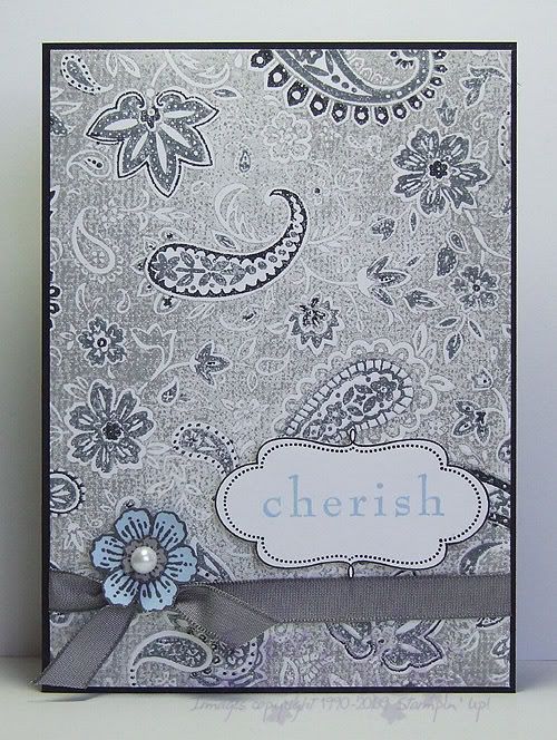
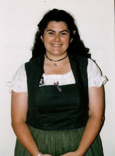
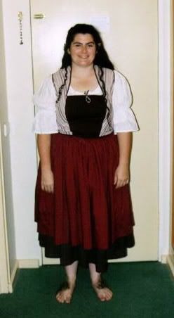
In my previous post I mentioned that I had done the LOTR costume thing (see exhibit A & B), so it probably comes as no surprise that when it comes to these movies, I'm highly inspired by the costumes. Translating a costume to papercraft means sacrificing a few costuming guidelines (largely accuracy wink), but for most of my cards this week I have used costumes for basic inspiration, so very few will look as close to the original piece as the 
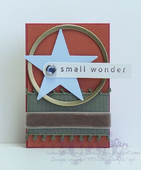
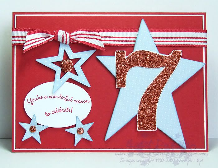
Legolas card. This card, for example, is inspired by Frodo, but you probably wouldn't pick it straight away.

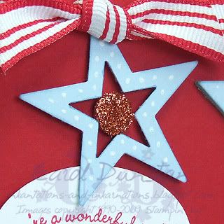
The earthy colours are drawn from Frodo's costume, his Really Rust vest, Always Artichoke cloak and reddish-brown coat (I used Ruby Red because it's the closest colour in some shots). The velvet Close To Cocoa does kind of match part of his costume, but I had to include something furry for the hobbity foot hair biggrin . With eyes like Elijah's I'd have to include bright blue somewhere, hence the turquoise rhinestone brad. The Bashful Blue punched star is for the phial Galadriel gives to Frodo, which contains the "Light of Earendil, our most beloved star"). And of course, the gold rim of the metal-edged tag (paper inner removed) is for the Ring. I chose this sentiment for a number of reasons, there are a few of Boromir's lines regarding both Frodo and the Ring that remind me of this but over-all I think it sums Frodo up pretty well, to carry out this task when it has been the ruin of so many others is a marvel.

Now I must confess that while I have watched Fellowship countless times and coveted many of the costumes, I wasn't as familiar with Frodo's so I did reference Alley Cat Scratch for description and detail images, so if you are feeling a little stuck for ideas take a wander through the Character pages over there biggrin . Alley Cat is where I went to for tips when making my own costumes, and through them I have become quite a stickler for detail when it comes to the costumes... so much so that this card is "to scale"... it is Halfling sized, being 2x3", about half the height of a standard card. At the end of the week I'll have to post a photo of all my Fellowship member cards so you can see the scales biggrin

All supplies by Stampin' Up!
Cardstock: Ruby Red, Really Rust, Bashful Blue, Confetti White
Stamp set: So Many Sayings
Ink: Chocolate Chip
Accessories: large star punch, Word Window punch, Ice Circle Rhinestone brad, gold metal edged tag (retired), Theater Ribbon Originals, mini glue dots, dimensionals
Show watched while creating: Fellowship of course!