Showing posts with label Soft Sky. Show all posts

Monday, December 07, 2015

Colourful Delicate Ornaments

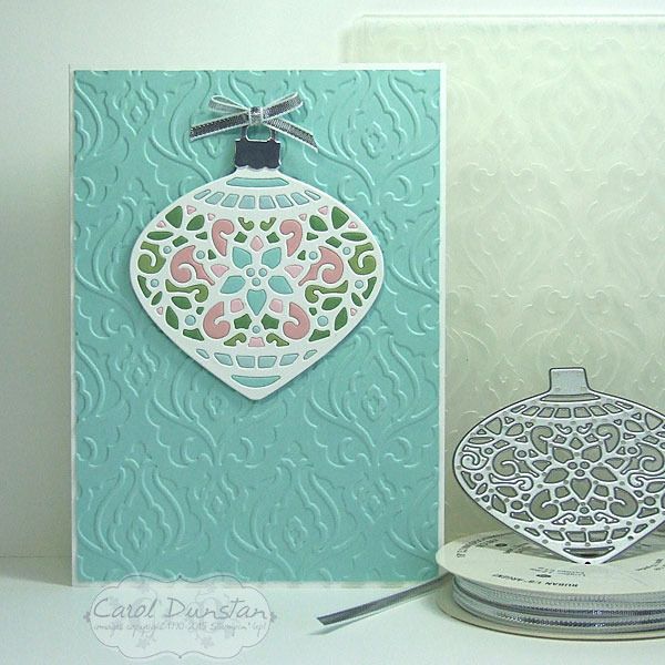
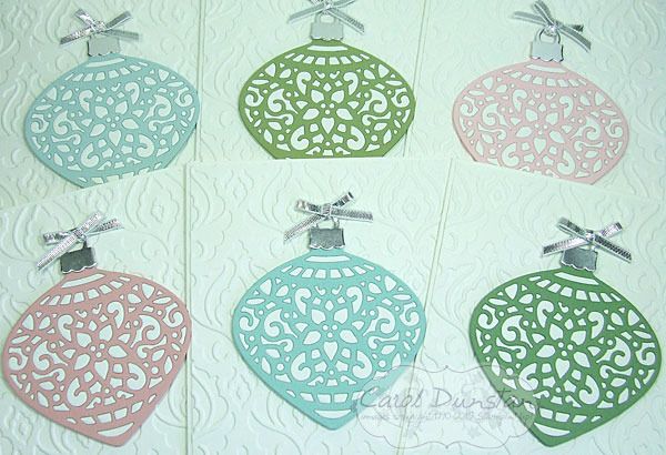
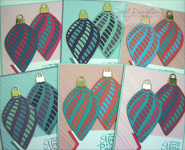
I have more Delicate Ornament cards to share with you today. These ones use the long ornament dies.


Once again I made a set of six cards, however my plans changed drastically once cutting a lot of the dies out. With some of the little pieces popped out I could start positioning them where I wanted them on the ornament and I decided that things weren't going to look quite how I wanted them. So Plan B was to change the colour combinations a little and cut more ornaments so there were two on each card.

 All of the ornament cards I have posted over the last few weeks I actually started on the same day. On the Saturday I cut all of the ornaments out (except for the extra ones I did for this once I changed my mind), and on the Sunday I started putting them together - as you can see in these Instagram photos. These are definately the easiest of the ornament dies to do this technique with as the majority of the pieces are a decent size - easier to pop out and easier to handle. I did start with these when putting them together, but they were the last to be made into actual cards. I did finish them all over the space of a few days but wanted to spread out the posts for them so you weren't looking at ornament cards for a whole week! After preparing this post I saw a card by Mary Brown on Pinterest that is remarkably similar - clearly a case of great minds think alike! I'm really glad to see someone else doing this :D

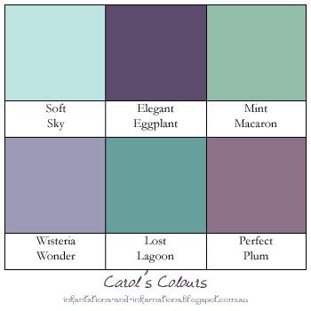
Very non traditional colours in these!

Built for Free Using: My Stampin Blog

Monday, November 30, 2015

Delicate Pastel Ornaments

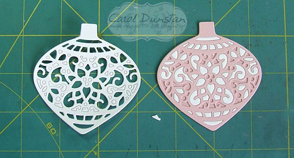
Last week I showed you another Delicate Ornaments card. This week I will show you what I did with the other pieces from those ornaments.


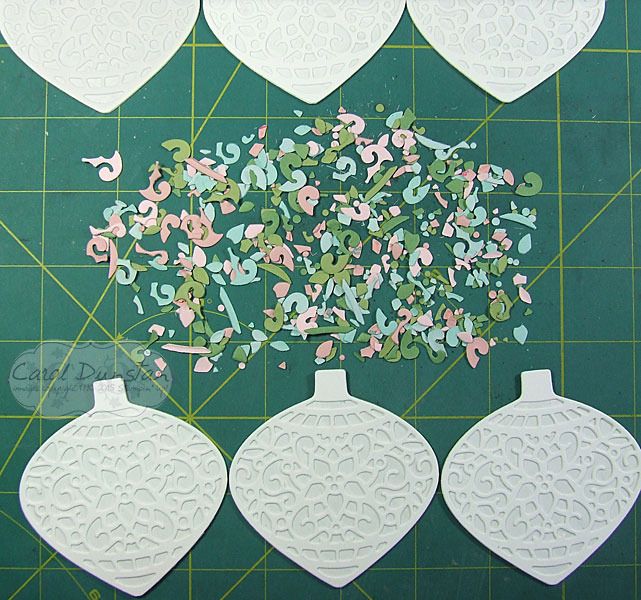
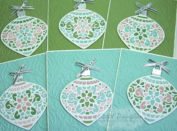
I kept the styling very similar to the matching ornament cards, but since the ornament frame was white I used a coloured background instead. I think I like these ones slightly more than their counterparts, I think it's the multiple colours in the ornaments themselves, but think both types come out really pretty. However, these ones were a bigger headache to make... if you think about it, with the other ones I was popping the white pieces straight out and into the coloured frame. So all those pieces from the coloured frames had to have already come out right? And I wasn't thinking terribly clearly when I did that. This is what I was working with for these cards:


What a mess! At least after a little while I stopped looking for specific pieces and just randomly picked up pieces to see if their shape could quickly tell me where they went. Eventually I caved to the idea that I should have done when popping them out of their frames: keep the colours separated. Oh well, I got there in the end! Here are all 6 cards finished:


I did "stuff up" a little when putting these together, as I had planned to put those ornaments with a lot of blue on the green background and vice versa, but I shuffled things around a bit too much and didn't realise till I had already stuck most of them down. Another "Oh well"! They still look nice, just not exactly what I had planned.

Colours and supplies are the same as the Pastel Delicate Ornaments.

Tuesday, November 24, 2015

Lovely As A Wonderland

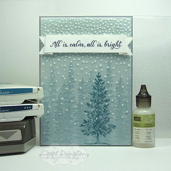
Back today with another Wonderland card for you. It really is going to be sad to see this one go, it pairs so nicely with Lovely As A Tree.


For this card I started off with a piece of Soft Sky cardstock and using Island Indigo ink stamped the Wonderland trees on it a few times side by side, then I stamped them inbetween after first stamping off on scrap paper to make the colour less intense. I then stamped the Lovely As A Tree image on a piece of vellum cardstock with the Island Indigo ink. Dye based inks are quick drying, except when you stamp them on something like vellum that won't absorb the ink straight away. While I was waiting for that to dry I stamped the sentiment on a strip of Whisper White cardstock and marked in some slightly slanted score lines so that when the banner was folded you would see a little underneath and the ends wouldn't be in-line with the main part. Once I had those score lines in place I could work out where I wanted the banner ends to go. The Triple Banner punch is made with guides for cardstock that is 1" (approx. 2.5cm), 1 1/5" (approx 3.8cm) and 2" (approx 5cm) wide. The strip I  was using was 2cm wide, but by holding it steady in the Triple Banner punch I was able to get a nice even banner finish to my cardstock. By now the ink on the vellum was dry so I was able to run it through the Softly Falling embossing folder in the Big Shot. It came out exactly how I hoped it would, the embossed dots turning the vellum white and looking a lot like snow. I put a bit of Fast Fuse behind the banner to attch the vellum at the top, then also placed a glue dot behind the tree, with a couple of little bits of glue dot snipped off and positioned behind and embossed dot to help hold the corners down. Once the card was all stuck together, I looked at it and thought "it's nice... but it needs a snowy sparkle" so I added just a touch of Dazzling Details glitter glue to the embossed dots - which of course doesn't show up int he photo but trust me it's there!

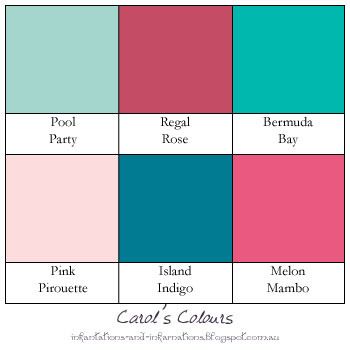
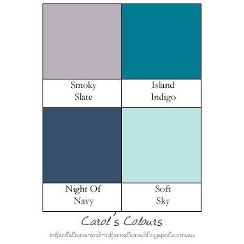
The colours for this card were inspired by Catelyn Stark from Game Of Thrones (Winter Wonderland is coming? hehehehe):

Built for Free Using: My Stampin Blog

Monday, November 23, 2015

Pastel Delicate Ornaments

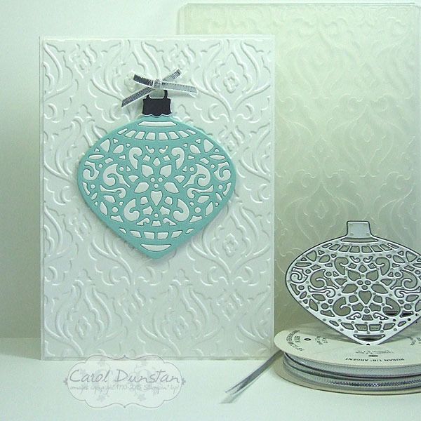
Today I have another Delicate Ornaments card for you, another made by inlaying the little bits from one or more colours into the frame of another.


For this card I kept the overall design simple, and even just the two colours for the ornament itself. By now I was learning...
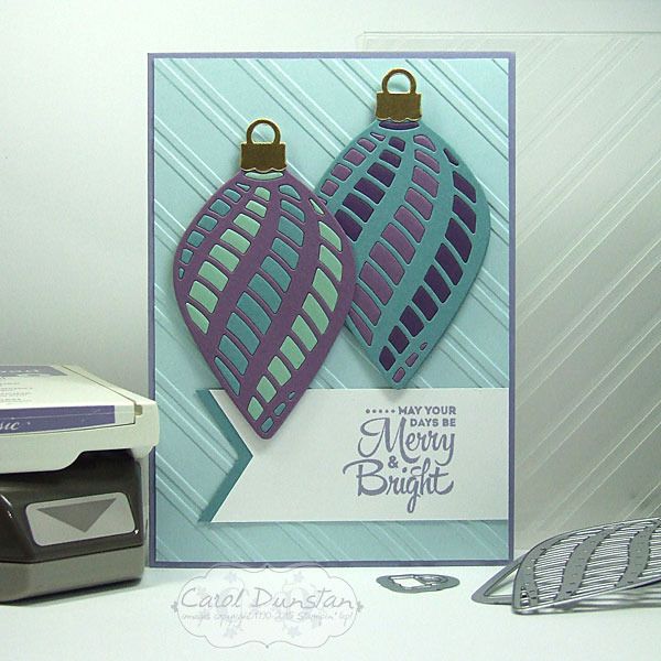
..take the bits from one and put them straight into another! You might already sense what is coming, but that will be a post for another day. Instead of punching a circle to back these ornaments, I used the matching bold ornament framelit die. It is ever so slightly larger, but this isn't a major issue - especially if you cut it in the same colour as the frame you used. Other than that, the rest of the construction was the same as the Stained Glass-esque Ornaments. As you can probably already tell, I cut some ornaments in white and some in a variety of colours. You might be wondering why I would bother doing this technique if I was just using one colour of the little bits. Basically, I hate to waste anything, but also it does give a different look to just backing the ornament frame with another colour. Here is a shot of this group of cards all finished:
While I wanted these cards over all plain I did want a little interest on my background, but didn't feel any of the current embossing folders had the look I wanted so for that I turned to the retired Beautifully Baroque folder.

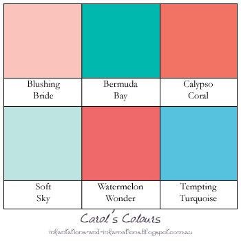
Colours used on these cards:

Built for Free Using: My Stampin Blog

Monday, July 27, 2015

Festival of Triangles

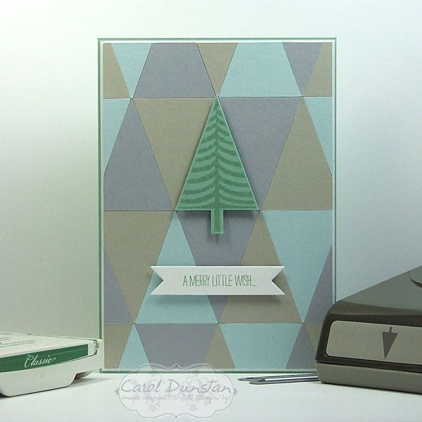
Sorry not a lot of creations to look at lately, been busy again! I started this card last month before the school holidays... and only finished it last week. Then it took me a few more days to take a proper photo of it! It was inspired by my last card, the Petite Pennants birthday card, but using all current products.
The background was created using the Tree punch. There were two ways to go about this: punch the whole tree out and trim the trunk off afterwards, or line the edge of my cardstock up with the bottom of the main tree section so there was no cardstock in the trunk to be punched. I opted for the later as it made it a little easier for using up cardstock scraps and fitting more trees into the limited space. Normally when making a background like this I would line one edge of the piece up with a straight edge of a base layer. This time though I wanted the stamped tree to line up with a triangle underneath it, and I could tell doing that my normal method would result in the tree being in an odd position. So instead I decided where I wanted the tree to go, lined up a ruler along the bottom of the main tree section, and then started placing the triangles up against this. It did mean I was having to trim off bits of triangle hanging off all four edges instead of three like I normally would have, but the overall result is far more satisfying so it's a small price to pay.

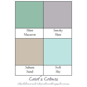
Here are the colours I used:

Built for Free Using: My Stampin Blog

Monday, June 08, 2015

Taupe Is Tops

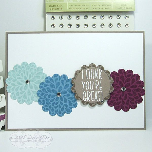
One of the new In Colours I haven't shared yet is Tip Top Taupe. Browns often get a bad rap, but Taupe really is a lovely grey-brown shade. This card is pretty straight forward, with the pattern stamped on cardstock in the matching colour then punched out with the 1 3/4" scallop circle, and the sentiment stamped on Whisper White with Taupe and cut out with a cricle die. To dress it up a little each "flower" has a rhinestone.

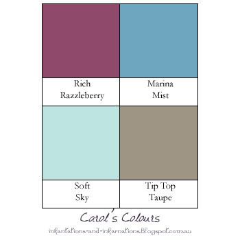
And here are today's colours:

Built for Free Using: My Stampin Blog