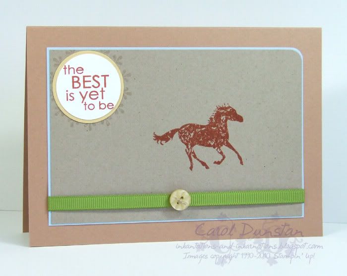
Some weeks ago, the Cinema Saturday Creative Challenge was Australia. I made my card, on Australia Day to boot, photographed it but just never got around to uploading it... so here it is! I hadn't seen this movie before, so I was happy to see it come up. I knew it had got a bit of a bagging but that doesn't always match our own personal views does it? I actually found it very funny, though that suddenly stopped about half way though (understandably, but then it would have been nice for it to be revived more at the end), it did seem a bit long but that may just have been because it seemed like the film was wrapping up and then there is another half hour to come! I also had no idea that David Wenham was in it so that was a nice surprise (even if he doesn't play the nicest of characters). Anyway, while I naturally had the temptation to base my card on a costume, the required element was to use the colour "Kraft" which lead me to do a more masculine card. I did sneak some ribbon on, but kept it all pretty simple. I did have a point behind picking that particular quote but it was so long ago I have forgotten it now!
All supplies by Stampin' Up!
Cardstock: Creamy Caramel, Bashful Blue, Kraft, So Saffron, Whisper White
Stamp sets: Wanted, Best Yet
Inks: Really Rust, VersaMark
Accessories: Old Olive 1/4" grosgrain, Button Latte designer buttons, linen thread, 3/16" corner rounder, 1 1/4 circle punch, 1 3/8" circle punch
Show watched while creating: Australia, cricket
Showing posts with label Wanted. Show all posts
Monday, March 08, 2010
Sunday, September 13, 2009
Cinema Saturday 49
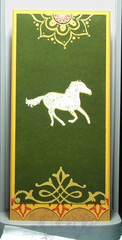
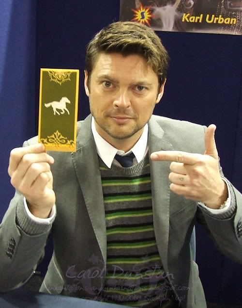
I'm sure you can imagine that I was exstatic to be asked to guest design for Cinema Saturday's Lord of the Rings: The Two Towers challenge. Those of you who have seen the Extended Edition dvd sets will have noticed that each one has a different style - FOTR is Elvish, TT is Rohirric (if that isn't a word it is now!) and ROTK... well maybe I will save that for when the girls nominate that as the weeks challenge! Anyway, it seemed that the thing to do would be to make something for The Two Towers that had a Rohan theme. One thing that really stood out for me was all the banners that are displayed in Meduseld, so I selected one and based my piece on that. I also have a bookmark of one of these banners, so I decided to make one of my own.
Thank you to my lovely assistant Karl Urban for helping me to present my bookmark to you.
Here's a closer shot of it. I used the emboss resist technique for most of this card as I wanted details in yellow on a green background. The horse was embossed with white, and I then went over it with my VersaMarker to fill the gaps and create a border and then embossed in clear. The base has a fold along the top so it will fold over your page.
Most supplies by Stampin' Up!
Cardstock: More Mustard, Summer Sun, So Saffron
Stamp Sets: Carte Postale, Wanted, One Of A Kind
Inks: VersaMark, Ruby Red, Garden Green (I think... it's been a while)
Accessories: white embossing powder, clear embossing powder, 1 3/8" circle punch (again I think, it's been a while), brayer
PS For the curious... I knew there would eventually be a CSCC for The Two Towers, and when working on cards for Fellowship I had ideas sparking for this. I then found out that Karl Urban would be attending the SupaNova convention in Sydney, so I made the bookmark and took it along and got him to pose with it. Squee!
Thank you to my lovely assistant Karl Urban for helping me to present my bookmark to you.
Here's a closer shot of it. I used the emboss resist technique for most of this card as I wanted details in yellow on a green background. The horse was embossed with white, and I then went over it with my VersaMarker to fill the gaps and create a border and then embossed in clear. The base has a fold along the top so it will fold over your page.
Most supplies by Stampin' Up!
Cardstock: More Mustard, Summer Sun, So Saffron
Stamp Sets: Carte Postale, Wanted, One Of A Kind
Inks: VersaMark, Ruby Red, Garden Green (I think... it's been a while)
Accessories: white embossing powder, clear embossing powder, 1 3/8" circle punch (again I think, it's been a while), brayer
PS For the curious... I knew there would eventually be a CSCC for The Two Towers, and when working on cards for Fellowship I had ideas sparking for this. I then found out that Karl Urban would be attending the SupaNova convention in Sydney, so I made the bookmark and took it along and got him to pose with it. Squee!
Wednesday, November 26, 2008
Paisley Peace
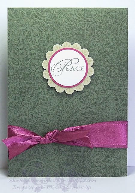
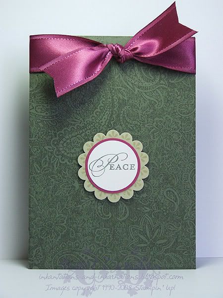
Here's another couple of cards I started last week and have finished this week. The hold-up with these ones was that I had only taken Christmas sets (well, obviously I also brought Paisley but that is because I had this sort of card in mind) to my friends house, and after punching the River Rock scallop circles I decided they need some stamping on them in the form of the large circular motif from Wanted. The sentiment comes from a stamp that actually says "Peace Love Joy", but since the whole thing wouldn't fit I just used my Artichoke marker to ink the one word. Good news for all you marker fans who haven't already snapped up your favourite colours - Stampin' Up! have extended the marker promotion until December 14!
That gorgeous Purely Pomegranate satin ribbon is only available in the current Spring mini catalogue. If you'd like some you had better be quick! The catalogue ends this Sunday, so contact me today if you'd like to order some before it is gone for good.All supplies by Stampin' Up!
Cardstock: Always Artichoke, River Rock, Purely Pomegranate, Whisper White
Stamp Sets: Paisley, Occasional Greetings, Wanted
Inks: Always Artichoke, River Rock
Accessories: scallop circle punch, 1 3/8" circle punch, 1 1/4" circle punch, Purely Pomegranate satin ribbon, Always Artichoke marker, dimensionals
Monday, November 03, 2008
Horsey Wishes
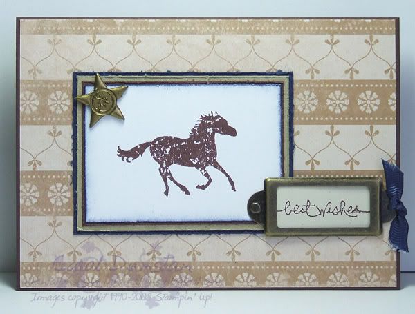
It's Melbourne Cup day tomorrow, so I felt a horsey card was in order. I had to use Navy and White for this, Victoria's colours (go the big white V!), and teamed it with some Outlaw paper and gold accents. The star in the top left has been made using the faux metal technique, very simple but effective. The layout is Jen's Sketch For You To Try this week.All supplies by Stampin' Up!
Cardstock: Chocolate Chip, Brushed Gold, Night of Navy, Whisper White, Ivory Neutrals
Stamp Sets: Wanted, Short & Sweet
Inks: Chocolate Chip, Night of Navy, VersaMark
Accessories: On Board Blossoms & Basics, gold embossing powder, cutter kit, Night of Navy grosgrain, Antique Brass hodgepodge
Wednesday, October 22, 2008
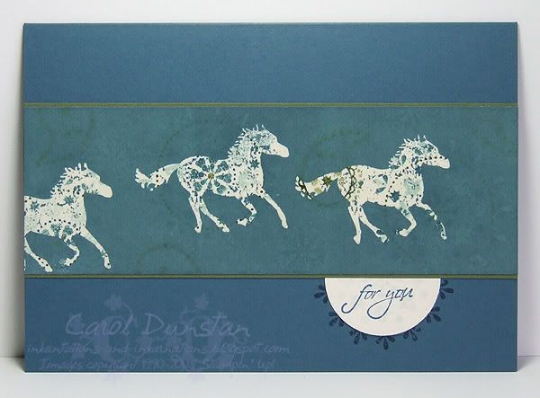
Horses For You

And here is my "stepped up" card. For this card I added the "emerging colour" technique: stamped the horse using VersaMark, clear embossed and brayered Blue Bayou ink over the top. Once you wipe away the ink from the embossing you have the coloured images showing through the embossing and a little bit through the brayered ink. It produces a more complicated looking card, but it's really just a combination of two simple techniques. Now if I didn't have to unplug my OTT light every time I wanted to heat emboss I'd be doing this much more!
All supplies by Stampin' Up!
Cardstock: Not Quite Navy, Always Artichoke, Very Vanilla
Stamp Sets: Wanted, Occasional Greetings
Inks: Not Quite Navy, Mellow Moss, Soft Sky, VersaMark
Accessories: Blue Bayou "marker" (blender pen + refill), Soft Sky "marker" (blender pen + refill), Not Quite Navy marker, Always Artichoke marker, 1 3/8" circle punch, clear embossing powder
Show watched while creating: Stargate Atlantis, Bones
Tuesday, October 21, 2008
Blue For You
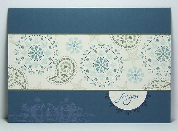
I've been wanting to break out Wanted again for a while, and the set has been sitting on my desk for about a week, waiting for the right moment. Last night was it... I hadn't wanted to use a typical colour combination for this set, then I thought of using a colour combination from a card Jayne demonstrated at our recent team meeting, and my brain started ticking over with ideas. The card is pretty simple in design, being based on Beate's latest sketch, but I also decided to make two cards at the same time and step up the second one a little. I'll share that one with you tomorrow.All supplies by Stampin' Up!
Cardstock: Not Quite Navy, Always Artichoke, Very Vanilla
Stamp Sets: Wanted, Occasional Greetings
Inks: Not Quite Navy, Mellow Moss, Soft Sky
Accessories: Blue Bayou "marker" (blender pen + refill), Soft Sky "marker" (blender pen + refill), Not Quite Navy marker, Always Artichoke marker, 1 3/8" circle punch
Show watched while creating: Stargate Atlantis, Bones
Tuesday, October 07, 2008
7 Loves of Card Making - Versatility
There are lots of beautiful stamps out there, and as nice as it might be to have all the ones you want it's not always feasabile. It makes sense to buy stamps you are going to get a lot of use out of, but you can also increase the value of a set by using for occasions other than waht it was intend. I actually do this quite a bit, by using general sets for Christmas (for example, this card with Big Pieces to make a random background, or this card also using Big Pieces for baubles). I also like to use alphabet sets for Christmas cards. However, I gave myself the added challenge of using something that was a little more specific in it's intended style and making a Christmas card with it. I ended up making three:
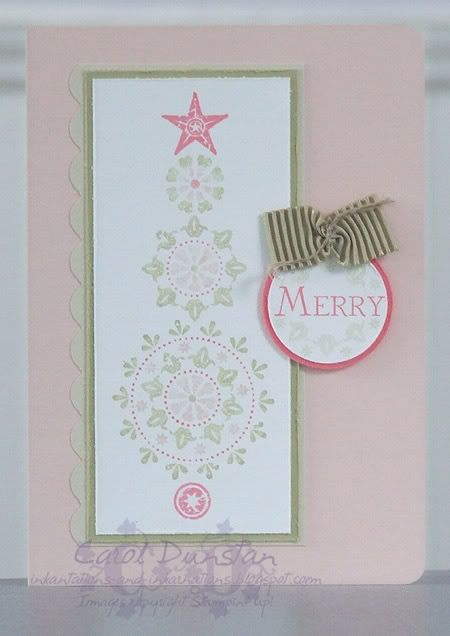
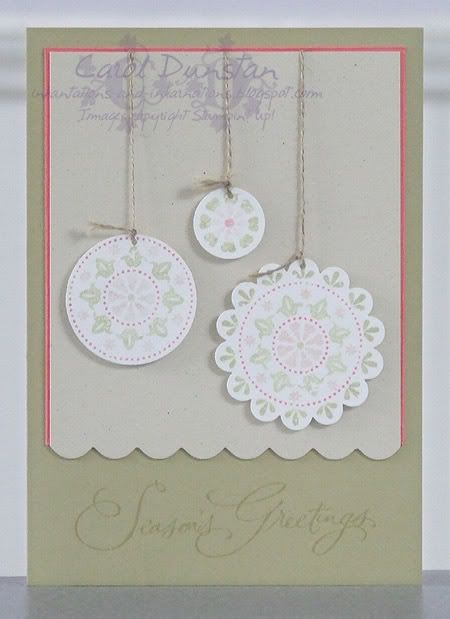
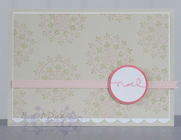
Using Christmas sentiments, colours that were similar to traditional colours and at least for the first two cards I used the stamps to make common Christmas images, baubles and trees, so the cards looked a little more obviously festive.
All supplies by Stampin' Up!
Cardstock: Blush Blossom, Groovy Guava, River Rock, Whisper White, Ivory Naturals
Stamp Sets: Wanted, Many Merry Messages
Inks: Groovy Guava, River Rock
Accessories: 3/16" corner rounder, River Rock "marker" (blender pen + reinker), Groovy Guava "marker" (blender pen + reinker), Blush Blossom marker, Beachside Ribbon Originals, white gel pen, Scallop circle punch, 1 3/8" circle punch, 3/4" circle punch, 1/16" circle punch, linen thread, cutter kit, dimensionals
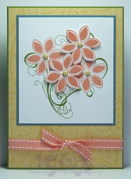
I then decided that a real challenge would be to use a Christmas set for a non-Christmas card. I've used Season of Joy for this card, inspired by Jodi Sutherland. I recieved a card from Jodi in a team swap and as soon as I saw it I thought "wow - I've gotta try that!" The flower from Season of Joy is non-descript enough that you can easily use it for other occasions.
All supplies by Stampin' Up!
Cardstock: Old Olive, So Saffron, Blue Bayou, Whisper White
Stamp Sets: Season of Joy, So Swirly
Inks: So Saffron, Old Olive, Groovy Guava
Accessories: Groovy Guava double-stitched ribbon, Rich Regals brads, dimensionals
My challenge to you is to use a non-Christmas set to make a Christmas card or use a Christmas set to make a card for an occasion other than Christmas. Put a link to your card in the comments for this post and at the end of the week I'll pick my favourite one and send a little something to that person. Australian residents only, SU! demos welcome.

Using Christmas sentiments, colours that were similar to traditional colours and at least for the first two cards I used the stamps to make common Christmas images, baubles and trees, so the cards looked a little more obviously festive.All supplies by Stampin' Up!
Cardstock: Blush Blossom, Groovy Guava, River Rock, Whisper White, Ivory Naturals
Stamp Sets: Wanted, Many Merry Messages
Inks: Groovy Guava, River Rock
Accessories: 3/16" corner rounder, River Rock "marker" (blender pen + reinker), Groovy Guava "marker" (blender pen + reinker), Blush Blossom marker, Beachside Ribbon Originals, white gel pen, Scallop circle punch, 1 3/8" circle punch, 3/4" circle punch, 1/16" circle punch, linen thread, cutter kit, dimensionals
I then decided that a real challenge would be to use a Christmas set for a non-Christmas card. I've used Season of Joy for this card, inspired by Jodi Sutherland. I recieved a card from Jodi in a team swap and as soon as I saw it I thought "wow - I've gotta try that!" The flower from Season of Joy is non-descript enough that you can easily use it for other occasions.All supplies by Stampin' Up!
Cardstock: Old Olive, So Saffron, Blue Bayou, Whisper White
Stamp Sets: Season of Joy, So Swirly
Inks: So Saffron, Old Olive, Groovy Guava
Accessories: Groovy Guava double-stitched ribbon, Rich Regals brads, dimensionals
My challenge to you is to use a non-Christmas set to make a Christmas card or use a Christmas set to make a card for an occasion other than Christmas. Put a link to your card in the comments for this post and at the end of the week I'll pick my favourite one and send a little something to that person. Australian residents only, SU! demos welcome.
Thursday, June 05, 2008
Plum Boho Box
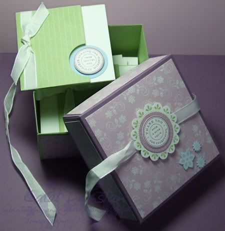
The third challenge for the Inklings cyberstamp the other night was to create a box that would fit the 3x3" Love Note cards and their envelopes. I based my box on Julie's tutorial, though made adjustments so I could use A4 cardstock. My box was made to coordinate with the Love Notes I shared with you earlier in the week. I used Certainly Celery for the base of my box and Perfect Plum for the lid, both with decorative panels of Pale Plum. I decorated the top with images stamped and punched out from the Wanted, Boho Backgrounds and Circle of Friendship sets and some Urban West white rubons that I applied to Bashful Blue cardstock and trimmed before mounting with some mini glue dots. The box is quite deep and would hold quite a few Love Notes no matter how lumpy you embellished them!
Thursday, May 22, 2008
Paisley Wishes
Do you have a stamp or set that you turn to time and again? The Paisley background is one of those for me. As my Mum commented when looking through all the swaps I got from convention, it's a versatile stamp that can look very different depending on how you use it. On this card (my SIL's birthday card) I have inked Paisley with VersaMark and stamped it on the River Rock card base. Subtle, but it adds interest. I then turned to a new favourite set, Wanted, and stamped the large circular image on the card base using River Rock ink. I punched the center of the image out with the 1 3/4" circle punch to create a window. I cleaned the stamp, inked it with Rose Red, Perfect Plum and Bashful Blue markers, stamped it on Whisper White, punched it out and mounted it to the inside of the card (using dimensionals) so it would show through the window. For the main image I randomly stamped images from the Wanted set in Bashful Blue on Whisper White, then stamped the horse over top using Perfect Plum ink and the sentiment (from Take Three) using Rose Red ink. The edges of this, and the Rose Red and Perfect Plum layers, were then distressed using the cutter kit, stuck together and mounted over some more Beachfront ribbon (I'm finding the neutral tones of that pack very useful!) using dimensionals yet again. The ribbon has been tied through a piece of pewter hodgepodge.
Subscribe to:
Posts (Atom)