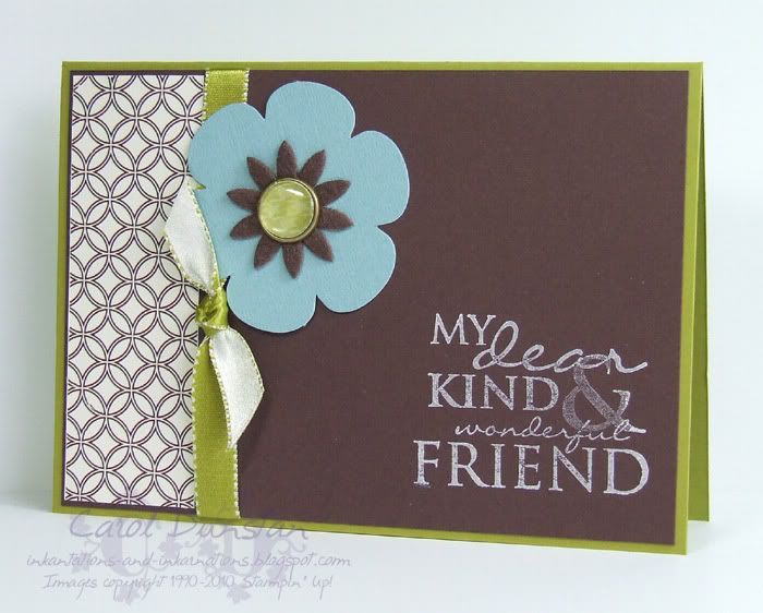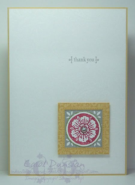
Thursday night was the Inklings February Cyberstamp, hosted by Kari Hughes. Challenge 1 was a colour challenge, to use Baja Breeze, Chocolate Chip and Kiwi Kiss - you could also include a neutral (White or Vanilla). Well, I guess I cheated a little as I used both Whisper White and Very Vanilla but never mind! Went with a style I haven't done a lot of lately and I like how this turned out.
All products by Stampin' Up!
Cardstock: Kiwi Kiss, Chocolate Chip, Very Vanilla
Stamp Set: Occasional Greetings
Ink: Whisper White
Accessories: Dots & Designs Rub-Ons, Kiwi Kiss/Very Vanilla satin ribbon, Blooms II die-cuts, Antique Brass Build-a-brad, Urban Oasis DSP, Flower Fusion II
Showing posts with label Occasional Greetings. Show all posts
Tuesday, March 02, 2010
Tuesday, May 19, 2009
May Inklings Cyberstamp Challenge 1, Part 2
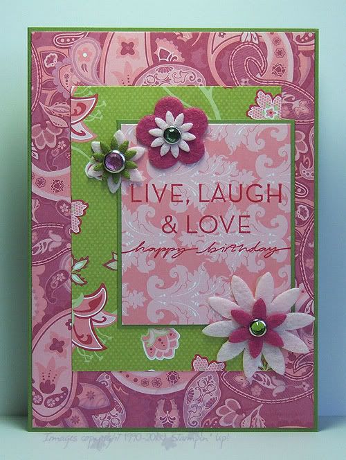
When Lin Mei posted her first challenge for the Inklings cyberstamp, I also thought of this card which I had also made a few weeks ago but hadn't posted yet. Once again I decided that I could easily whip up another version of it with different paper, as well as finish sticking together one that was a UFO (Un-Finished Object). The card was inspired by this card by Amy, which was made ages ago but has stuck in my head as a great use of patterned paper.All supplies by Stampin' Up!
Cardstock: Kiwi Kiss
Stamp Set: On Your Birthday
Inks: Real Red
Accessories: Raspberry Tart DSP, Flower Fusion, Flower Fusion Too, Circle Ice Rhinestone brads, Circle Fire rhinestone brads
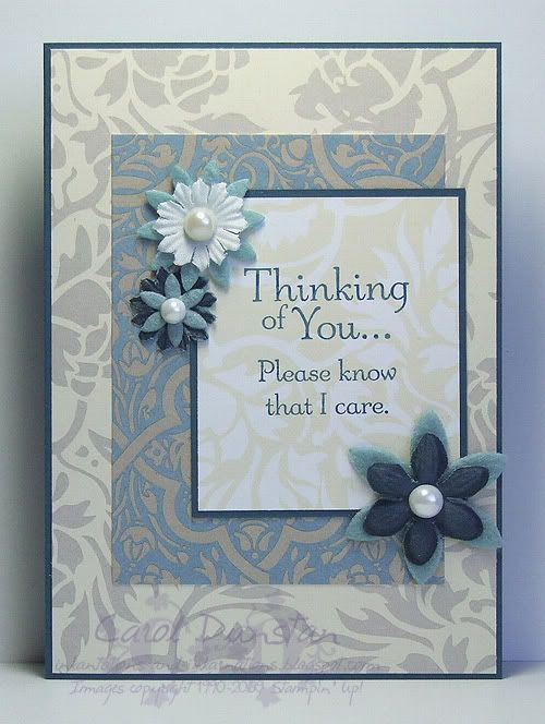
I had made most of this one at the same time that I had made the Raspberry Tart one, but I didn't finish it straight away as I was waiting for my died Pretties flowers to dry. I colour my flowers using the markers, mainly because it's the cleanest way to colour them (not that I am against inky fingers). Even though using the markers doesn't get them as wet as some other colouring methods, with darker colours I have found it prudent to give them a long time to dry, and then a bit longer just to make sure, other wise you'll return to your project some time later and find the ink has bled into the cardstock underneath.All supplies by Stampin' Up!
Cardstock: Not Quite Navy
Stamp Set: Thoughts & Prayers
Inks: Not Quite Navy
Accessories: Bella Bleu DSP, Pretties Kit, Flower Fusion Too
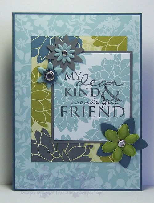
And finally, this one was completely made on the night. I am so loving the Urban Garden paper! The Basic Gray and Not Quite Navy flowers near the top were created by double punching cardstock: punch the shape once, then put the punched out shape back into the punch but rotated so it will be punched in a different place and create a brand new shape. The easiest way to do this is to attach a scrap of paper (using temporary adhesive like Dotto) to the punch so you have something to hold on to and you can position the shape much more easily. I coloured the Pretties flower on this one with my Kiwi Kiss marker, however because it was being layered on top of a darker colour I didn't worry about making sure it was dry first since any bleeding is unlikely to show.All supplies by Stampin' Up!
Cardstock: Not Quite Navy, Basic Gray
Stamp Set: Occasional Greetings
Inks: Basic Gray
Accessories: Pretties kit, Felt Fusion Too, Clear Rhinestone brads, 5-petal flower punch, Boho Blossoms punch
Wednesday, January 14, 2009
Cinema Saturday #14 part 5
The next card I have for you in the Cinema Saturday #14 series is for the other Fellowship member who parted ways in the FOTR movie: Boromir. Boromir's costume has a lot of texture and detail, and I have drawn on a few specific parts for this card. The background is based on Boromir's fur-line cloak, most prominent as they trudge through the snow. It was impossible to replicate burn-out velvet with cardstock so I just opted to stamp the swirly design in Chocolate Chip so it had the darker colour like the design on the cloak appears darker than the velvet nap (in truth the back of the velvet is the same colour as the nap it is just the lining fabric that makes it appear darker... some geeky costume details for you!). Of course the Close To Cocoa velvet ribbon had to come out again for the fur lining. The Ruby Red layer is inspired by the gorgeous bullion embroidery on the sleeves of his tunic (~cough~ sari fabric ~cough~), and the framed sentiment piece is supposed to be reminiscent of the decoration on his belt. This is another thank you card because in the end he did good (the EE gives a lot more to his story and thus his end isn't as big a turn-around as it seems in the original cinema version... and I will admit I was tainted with knowledge of ROTK EE too which adds to Boromir's story even more).All supplies by Stampin' Up!
Cardstock: Close to Cocoa, Chocolate Chip, Basic Black, Ruby Red
Stamp Sets: Carte Postale, Simple Delights, Occasional Greetings, Baroque Motifs
Inks: Close To Cocoa, VersaMark, StazOn Jet Black
Accessories: Ruby Red marker, Close To Cocoa marker, Designer Label punch, Styled Silver Hodgepodge, gold embossing powder, dimensionals
Show watched while creating: Fellowship of course! (yes, I have watched this a lot over the last week)
Wednesday, November 26, 2008
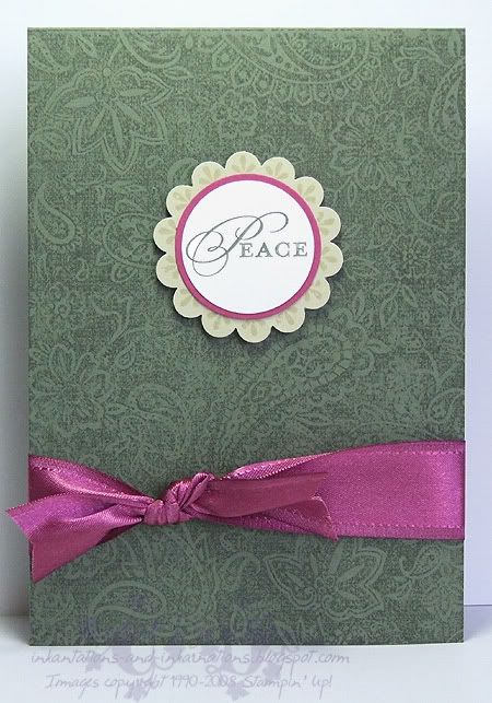
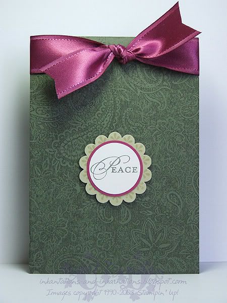
Paisley Peace
Here's another couple of cards I started last week and have finished this week. The hold-up with these ones was that I had only taken Christmas sets (well, obviously I also brought Paisley but that is because I had this sort of card in mind) to my friends house, and after punching the River Rock scallop circles I decided they need some stamping on them in the form of the large circular motif from Wanted. The sentiment comes from a stamp that actually says "Peace Love Joy", but since the whole thing wouldn't fit I just used my Artichoke marker to ink the one word. Good news for all you marker fans who haven't already snapped up your favourite colours - Stampin' Up! have extended the marker promotion until December 14!
That gorgeous Purely Pomegranate satin ribbon is only available in the current Spring mini catalogue. If you'd like some you had better be quick! The catalogue ends this Sunday, so contact me today if you'd like to order some before it is gone for good.All supplies by Stampin' Up!
Cardstock: Always Artichoke, River Rock, Purely Pomegranate, Whisper White
Stamp Sets: Paisley, Occasional Greetings, Wanted
Inks: Always Artichoke, River Rock
Accessories: scallop circle punch, 1 3/8" circle punch, 1 1/4" circle punch, Purely Pomegranate satin ribbon, Always Artichoke marker, dimensionals
Wednesday, October 22, 2008
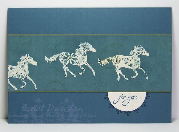
Horses For You

And here is my "stepped up" card. For this card I added the "emerging colour" technique: stamped the horse using VersaMark, clear embossed and brayered Blue Bayou ink over the top. Once you wipe away the ink from the embossing you have the coloured images showing through the embossing and a little bit through the brayered ink. It produces a more complicated looking card, but it's really just a combination of two simple techniques. Now if I didn't have to unplug my OTT light every time I wanted to heat emboss I'd be doing this much more!
All supplies by Stampin' Up!
Cardstock: Not Quite Navy, Always Artichoke, Very Vanilla
Stamp Sets: Wanted, Occasional Greetings
Inks: Not Quite Navy, Mellow Moss, Soft Sky, VersaMark
Accessories: Blue Bayou "marker" (blender pen + refill), Soft Sky "marker" (blender pen + refill), Not Quite Navy marker, Always Artichoke marker, 1 3/8" circle punch, clear embossing powder
Show watched while creating: Stargate Atlantis, Bones
Tuesday, October 21, 2008
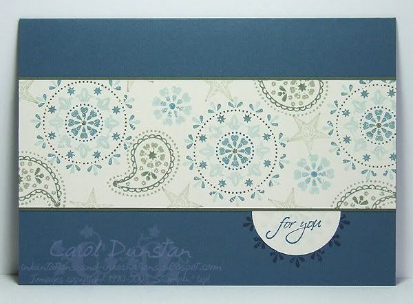
Blue For You
I've been wanting to break out Wanted again for a while, and the set has been sitting on my desk for about a week, waiting for the right moment. Last night was it... I hadn't wanted to use a typical colour combination for this set, then I thought of using a colour combination from a card Jayne demonstrated at our recent team meeting, and my brain started ticking over with ideas. The card is pretty simple in design, being based on Beate's latest sketch, but I also decided to make two cards at the same time and step up the second one a little. I'll share that one with you tomorrow.All supplies by Stampin' Up!
Cardstock: Not Quite Navy, Always Artichoke, Very Vanilla
Stamp Sets: Wanted, Occasional Greetings
Inks: Not Quite Navy, Mellow Moss, Soft Sky
Accessories: Blue Bayou "marker" (blender pen + refill), Soft Sky "marker" (blender pen + refill), Not Quite Navy marker, Always Artichoke marker, 1 3/8" circle punch
Show watched while creating: Stargate Atlantis, Bones
Thursday, October 09, 2008
7 Loves of Card Making - Embellishment
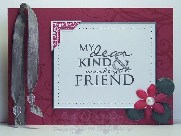
Like most people I think, when I started stamping my cards were quite simple with no real embellishment. These days I rarely make a card that doesn't have a bit of ribbon or a brad on it - how times change! My card today gets most of its embellishments from the Pretties Kit, a fabulous collection of flowers, beads, brads, pearls and hatpins. I've also used the very yummy Basic Gray taffeta ribbon and created a corner feature by punching a stamped image. Paper piercing is a simple embellishment method that I often use as it adds a little bit of extra interest without overdoing things.All supplies by Stampin' Up!
Cardstock: Purely Pomegranate, Blue Bayou, Whisper White
Stamp Sets: Occasional Greetings, Frames With A Flourish, Baroque Motifs
Inks: VersaMark, Purely Pomegranate, Basic Gray
Accessories: Pretties Kit, Basic Gray taffeta ribbon, crafters tool kit, photo corner punch, mini glue dots, dimensionals
My challenge to you today is to create a card using a variety of embellishments. Put a link to your card in the comments for this post and at the end of the week I'll pick my favourite one and send a little something to that person. Australian residents only, SU! demos welcome.
Sunday, September 07, 2008
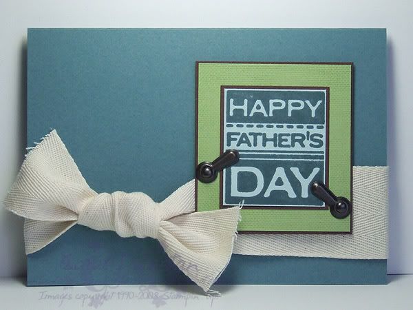
Happy Father's Day
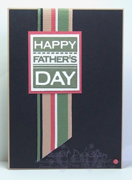
I know it's getting very late in the day, but I just wanted to wish all the Dads a happy Father's Day for today. This is a very simple card that I made for the school's Father's Day stall and also donated a couple to charity. I made them in various colour schemes to match the ribbon I was using - all of which came from retired Ribbon Originals packs.All supplies by Stampin' Up!
Cardstock: Creamy Caramel, Basic Black, Ruby Red, Whisper White
Stamp Set: Occasional Greetings
Inks: Always Artichoke
Accessories: Rustic Retreat Ribbon Originals, Earth Elements brads
Wednesday, August 27, 2008
Father's Day #3
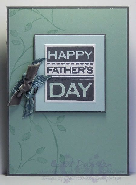
Yay, I'm finally back! Still some sorting out to do (like my desk! In serious need of a tidy), but at least I am online and I didn't loose any of my important files.Here's the third Father's Day card I have made, this one being for my Dad who is a mad keen gardener. I have used the same sentiment as the other two Father's Day cards, however this time I have stamped it in the waterproof Basic Gray ink and coloured some of the lettering. In honour of Dad's green thumb I used Watercolor Vine on the background, and once again couldn't escape the lure of ribbon.
All supplies by Stampin' Up!
Cardstock: Basic Gray, Sage Shadow, Soft Sky, Whisper White
Stamp Sets: Occasional Greetings, Watercolor Vine
Inks: Basic Gray, Sage Shadow
Accessories: Sage Shadow marker, Soft Sky "marker" (blender pen + refill), Pewter Hodgepodge, District Ribbon Originals, Beachfront Ribbon Originals, dimensionals
Show watched while creating: Olympics
Saturday, August 16, 2008
Father's Day #2
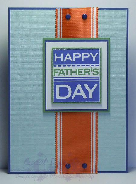
The next Father's Day card I made is for the girls to give to their Daddy. Since it's from the girls, I went for brighter colours (I'm not saying he's not a bright person...), carefully inking the ends of the sentiment with the Brilliant Blue inkpad then using my Wild Wasabi "marker" to ink up "Father's". I very nearly used linen to stamp on the Soft Sky, but decided to opt for real texture with some textured cardstock. Even though the sentiment is mounted similarly to the previous card, changing the colours has given it quite a different look. And once again I've snuck some ribbon on a guys card All supplies by Stampin' Up!
Cardstock: Brilliant Blue, textured Soft Sky, Wild Wasabi, Whisper White
Stamp Set: Occasional Greetings
Inks: Brilliant Blue
Accessories: Wild Wasabi marker (refill + blender pen), District Ribbon Originals, Bold Brights brads, dimensionals
Friday, August 15, 2008
Father's Day #1

Father's Day in Australia is just over 3 weeks away, which might sound like it is still a way off but these things have a way of sneaking up on you. I also have to mail my Dad's card, so like to get it done with a bit of breathing space as it could take a while to get to him in the mail. This year, thanks to the Occasional Greetings set, I actually have a stamp that says "Happy Father's Day" so it is getting quite a work out! For this card I have used one of my favourite "non feminine" colour combinations, and I'm sure I can get away with the twill because it's not really ribbon is it?
All supplies by Stampin' Up!
Cardstock: Blue Bayou, Chocolate Chip, Certainly Celery, Soft Sky
Stamp Sets: Occasional Greetings, Linen
Ink: Blue Bayou, Certainly Celery
Accessories: Twill, Aged Copper Hodgepodge, dimensionals
Show watched while creating: Olympics
Wednesday, August 13, 2008
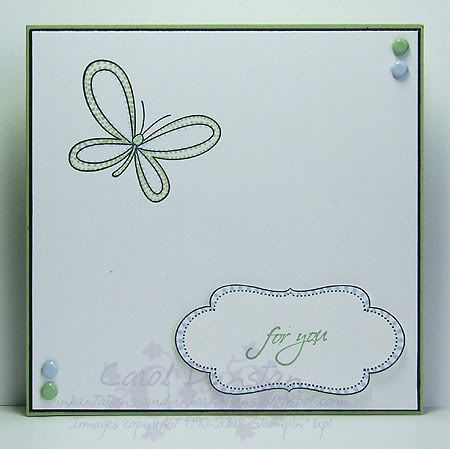
Stippled Butterfly

The other week (yes, I am slow!) Jayne challenged her Inklings to try out the Stippling technique, and this is my response. I varied the spacing, size and shape of the dots to accentuate the colour I wanted in specific areas. It didn't feel right to make the card too busy, so again I have gone with simple and lots of white.
All supplies by Stampin' Up!
Cardstock: Certainly Celery, Basic Black, Whisper White
Stamp Sets: Celebrate Everyday, Occasional Greetings, Frames With a Flourish
Inks: StazOn Jet Black, Wild Wasabi
Accessories: Soft Subtle brads, Certainly Celery marker, Bashful Blue marker, Wild Wasabi marker (blender pen + refill), dimensionals
Thursday, July 24, 2008
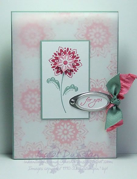
KW Colour Inspiration #17 MK II
Well, I could help myself and have indeed kept playing with these colours. Then again, I did have to make up for the absence of ribbon, dimensionals and hardware on my previous card! For the background I have used second generation impressions of the large medallion stamped in Regal Rose and to soften this even more I have laid vellum cardstock over-top. The flower center on the main image is from the circular stamp in the True Friend set, punched out with the Boho Blossoms punch... I was so excited last night when I realised that it has six petals too and created such a pretty punchie, I love the shape of that flower in the punch!ETA: to answer Tina/travellingmama's question about the vellum, I haven't done anything special to keep the vellum down in the corners (you can probably see in the photo how the vellum has tipped forward a bit and the light is shining through it from the back!). The SU! vellum cardstock is very good at not curling at the edges, so for this card I only stuck it down a bit behind the main image; it's also been secured along the right edge by the ribbons and in the middle by the brad.
All supplies by Stampin' Up!
Cardstock: Sage Shadow, Whisper White, vellum
Stamp sets: True Friends, Occasional Greetings
Inks: Regal Rose, Rose Red
Accessories: Rose Red marker, Regal Rose marker, Sage Shadow marker, Styled Silver hodgepodge, 1/8" circle punch, District Ribbon Originals, Fairytale Ribbon originals, dimensionals, Boho Blossoms punch, small oval punch
Show watched while constructing card: Elektra
Friday, July 11, 2008
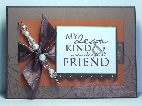
KW Colour Challenge #15
Kristina has posted her latest colour challenge, and this card is my response. While the colours lend them selves to autumn themes, and are also similar to the Outlaw papers and Round Up kit, I wanted to do something a bit different with them. Normally I'd use Vanilla with brown tones so I decided to use white as a bit of a feature with the beads and white gel pen. Once again it's quite a simple card but I do like how it has come out.All supplies by Stampin' Up!
Cardstock: Chocolate Chip, Close To Cocoa, Really Rust, Certainly Celery, Whisper White
Stamp sets: Occasional Greetings, So Swirly
Inks: Close To Cocoa, Chocolate Chip
Accessories: Pretties Kit, Theater Ribbon Originals pack, dimensionals, 3/16" corner rounder, white gel pen
Tuesday, July 01, 2008
Swirly and Sassy
The other day I gave my scrap drawer a clean out and found a bunch of Sassy Stem images I had coloured, trimmed and layered. They'd been in there for almost three months, so it was high time I did something with them. Based on the colours used on the image, I pulled out a heap of matching ribbons and set to playing. In the end each card had a slightly different combination of ribbons and brads but the rest of the design was the same. That came together quite quickly when half the work was already done!All supplies by Stampin' Up!
Cardstock: Old Olive, Soft Sky, watercolour paper
Stamp Sets: Sassy Stems, So Swirly jumbo wheel, Occasional Greetings
Inks: StazOn Jet Black, Tempting Turquoise, Rose Red, Cameo Coral, Groovy Guava, Apricot Appeal, Old olive, Certainly Celery, Soft Sky
Accessories: Aquapainter, Pewter Hodgepodge, Soft Subtles brads, dimensionals
Saturday, June 21, 2008
KW Colour Inspiration #12
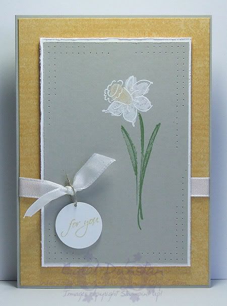
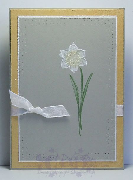
Yes, it's time for another colour challenge from Kristina! The card you see above is actually my third attempt at this... I'll show you my first attempt below, while I wanted a good deal of "clean space" around the daffodil, I didn't like how much I had left, so when I got up this morning I tried again and was much happier with the results. I've used the Beautiful Life set as I have had this idea in my head for a while, to stamp the flower in white. It also took me a few goes to figure out the best way to achieve that as the outline image wasn't showing up enough for my liking. A few of you have probably read me grumble about the lack of powerpoints in here. Well, that situation has not changed, but no telling Glenn! I had no other alternative than to crawl under the desk (someone should really clean under there) and unplug the print so I could plug my heat gun in. A girl should not have to go through that, her heat gun should be plugged in at all times so it is ready to use whenever the need arises, right? Right! Anyway...I stamped the leaves first using Wild Wasabi ink and then stamped the solid flower using Whisper White craft ink and applied So Saffron pastels to part of it using a dauber. I then went out shopping and bought all four seasons of Enterprise and some Rooibos Fireside while the ink dried
Friday, June 20, 2008
Colour Challenge with a Twist
A few days ago Julia Stainton posted a challenge to create something using colours taken from patterned paper. I do do this from time to time, but as I was thinking over what paper I could pick colours from, a combination Julia posted jumped out at me. The colours I chose to use are Regal Rose, Ruby Red, Sage Shadow and Creamy Caramel. I started with an A6 piece of Confetti White card stock and stamped images from the Scribble This set all over it using StazOn Jet Black. I then coloured it in using an aquapainter to pick up ink from the inkpad lids. I made my background Sage Shadow first, then coloured the areas that I wanted Rose, moving on the Ruby and finishing with Caramel. I decided that I liked how the whole piece turned out, so I cut it in half to make two cards (bonus!). The Pretties Kit flowers were coloured using markers, and the scallop edge done with the Slit punch. I stamped the sentiment (from Occasional Greetings) using StazOn Jet Black, then decorated the scallops by adding my own scribbles with the fine end of a Basic Black marker and adding a hint of colour with the Creamy Caramel marker. I love how this came together, and love even more that it made me use colours I wouldn't normally put together (Ruby and Rose???).
Saturday, June 14, 2008
KW Color Inspiration #11
Yesterday afternoon I saw that Kristina Werner has posted another colour challenge. The colours this time were Rose Red, Old Olive, Whisper White, So Saffron and Going Gray. With the girls' swimming lesson and dinner at the inlaws, I didn't get a chance to work on it till late (well, late for me), but that did give me plenty of time to think about it. I decided to go with the light, airy feel I got from the inspirational photo so I stamped a piece of Whisper White with the ever wonderful (Thursday, June 12, 2008
Leaves For You
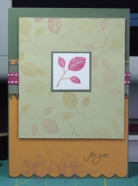
This is a card I made a little while ago. I'm sharing it with you now as the photo is already taken and edited and I really need to try and get to bed earlier (this cool night air seems to have my cold lingering). I pulled the colours from an In Color colour chart provided by Stampin' Up! as I wanted to play with more Pomegranate leaves. The focal image is a stamp from All Through the Year, inked with More Mustard and Purely Pomegranate then stamped on Confetti White cardstock, punched with the 1 1/4" square and layered on 1 3/8" square of Always Artichoke. The layer underneath is River Rock that has been randomly stamped with second, third and fourth generation impressions of the leaves (that is the stamp has been inked, stamped once on scrap paper then stamped several times on the card before being inked up again), some inked with the same colours as the main image, some with Mustard and Artichoke. The little sentiment is from Occasional Greetings, stamped in Always Artichoke on More Mustard. The Mustard layer has had the bottom edge scalloped with the corner rounder and then I tried distressing all the edges with the tool from the Cutter Kit but this was a bit tricky to get into the crevices of the scallops. I've also used some Purely Pomegranate double-stitched ribbon and Always Artichoke ribbon from the Theater Ribbon Originals pack.Even though it is winter here a lot of trees around the place are still in the process of changing colours and loosing their leaves, which I was reveling in again this afternoon on my walk for school pick up, so this card is quite appropriate.
Thursday, June 05, 2008
Frames with a Greeting
This was my card for the Inklings cyberstamp challenge number 2, a sketch challenge using a CPS sketch. For my card I used stamps from the Occasional Greetings and Frames With a Flourish sets, Linen background stamp, Old Olive and Always Artichoke ink, papers from the Secret Garden Simply Scrappin' kit, Sherbet and Theater Ribbon Originals, Always Artichoke brads and cardstock in Whisper White, Groovy Guava, River Rock and Always Artichoke and the Cutter Kit to rough up the edges on my top two layers. I really liked how this turned out, the only downside is that my central panel is so large it didn't leave much room to show off the papers!
Subscribe to:
Posts (Atom)