Showing posts with label masking. Show all posts

Friday, October 24, 2008

KW Colour Inspiration #27


Kristina's latest colour challenge coincided nicely with my desire to create a Hallooween-ish card for Shaelea (since Tiarna is getting Boo). We don't ever really do anything for Halloween but the girls do like dressing up and getting a bit spooky. Anyway, Shaelea likes pink and cats, and I felt like doing another Zindorf-styled card. However, after all the masking, brayering and stamping I realised my trees needed highlights and shadow. The highlights I did easily enough, using a blender pen to pick up Whisper White pigment ink, but the shadows... clearly my cold was starting to affect my thinking because I didn't think to go to Michelle's blog and she how she usually adds such shadows... and I winged it. I used my Purely Pomegranate "marker" for the shadow of the trunks, then thought that was going to be too dark for the shadow of the branches so I tried picking up colour using a clean blender pen. Big mistake! When the blending had dried I was left with a paler halo around the area I had tried shadowing, as the blender pen had caused a bit of colour to run. I tried scribbling colour out of my Purely Pomegranate marker (so the colour was less intense), but that didn't make much difference so I just had to use it as it was. In the end the bulk of it is covered by the ribbon and cat - which I had always planned on using, it wasn't like my mistake required embellishment to cover it up - and what you do see looks ok. I probably should have made the edges a bit darker too but I felt changing from Purely Pomegranate to Basic Black around the edge would be too dramatic. Anyway, it's pink and has a cat, I'm sure Shaelea will love it!

If parts of this post don't make a lot of sense please excuse me... the cold is still affecting my brain! I probably should go back to bed but wanted to cross a few simple things off the to-do list!

All supplies by Stampin' Up!
Cardstock: Pixie Pink, Basic Black, Barely Banana, Whisper White
Stamp Sets: Lovely As A Tree, Party Punch
Inks: Basic Black for stamping; Barely Banana, Pixie Pink, Pink Passion, Purely Pomegranate for brayering; Whisper White for highlights
Accessories: Purely Pomegranate "marker" (blender pen + refill), blender pen, 1" circle punch, designer label punch, 1 1/4" circle punch, horizontal slot punch, Purely Pomegranate double-stitched ribbon, dimensionals

Sunday, October 05, 2008

7 Loves of Card Making - Colour

I don't think it is any secret that my favourite colour is purple. But for todays card I thought I would give myself a challenge: instead of just using any purple (in which case I probably would have used Almost Amethyst or Lavender Lace AGAIN), I decided to challenge myself to make something using my least used purple, Elegant Eggplant. I don't have a problem with Elegant Eggplant, I just never seem to use it. I then started thinking about what other colours I could use with it, if there was some already exsisting colour combination that could inspire me. I suddenly thought of the Melbourne Storm. Since they're playing in the NRL grand final tonight I thought it would be very appropriate to make a card based on their team colours. It didn't take long for me to think of using these colours in a Zindorf style and using the cute little owl from Celebrate Everyday. I actually made two versions of this card, the only difference being what size the moon is, I couldn't decide before hand which would look best and as it has turned out both look fine. I was very happy with how all the brayering came out too, being the first time I have tried this technique.

So now I pose the same challenge to you: create a card using purple (as a significant portion of the card, one little brad doesn't count!), and if you normally use purple a lot try to use a shade that you normally don't use. Put a link to your card in the comments for this post and at the end of the week I'll pick my favourite one and send a little something to that person. Australian residents only, SU! demos welcome.

All supplies by Stampin' Up!
Cardstock: Orchid Opulence, Night of Navy, Summer Sun, Whisper White, watercolour paper
Stamp Sets: Celebrate Everyday, Spring Solitude
Inks: StazOn Jet Black, Basic Black; Orchid Opulence, Elegant Eggplant, Night of Navy, Summer Sun for brayering and watercolouring
Accesories: aquapainter, brayer, Fire Circle Rhinestone brads, word window punch, round tab punch (for masking)
Show watched while creating: Bones

Monday, September 29, 2008

Leaves With A Flourish

I promise this will be the last Carte Postale card I share with you for a while - I hope you're not sick of it! I think I am going to have to hide it again so I will actually use some other sets. This is a card I have been demonstrating lately, it's a reincarnation of this card, however the above card features masking, In Color markers/blender pen markers and of course one of the bundles from the Free Wheelin' special that ends tomorrow. If I've inspired you with all my Carte Postale cards, or any of the other bundles catch your eye, get your order to me quickly so you don't miss out!

All supplies by Stampin' Up!
Cardstock: Purely Pomegranate, Whisper White, Soft Sky
Stamp Sets: Carte Postale, Leaves a la Carte, Frames With A Flourish
Ink: River Rock, Purely Pomegranate, Basic Gray, VersaMark
Accessories: Pretties Kit, Purely Pomegranate blender pen marker, Soft Sky blender pen marker, River Rock blender pen marker, dimensionals

Monday, August 11, 2008

Sweet Heart Giraffe


Another swap I was recently involved in was for Patterned Paper ATC's. I decided to go the whole hog (or should that be giraffe?) and use patterned paper for the base of my ATC, however the part that started it all was the giraffe. I had made a similar giraffe on another card (which I hope to share soon) and with all it's patterned paper felt I had to do that for my ATC's as well. Well... 9 ATC's with 9 paper-pieced giraffes is a lot of cutting! But it's just so cute, it was worth it lol. Once again my 3/16" corner rounder was hard at work: scalloping the bottom edge, creating faux ric-rac and scalloping a 1 1/4" circle! I love how perfectly the scalloped circle fits around the 1" circle.

All supplies by Stampin' Up!
Cardstock: Whisper White, Close to Cocoa
Stamp Set: Bundle of Joy

Inks: Purely Pomegranate, Close To Cocoa

Accessories: Berry Bliss paper, 3/16" corner rounder, Soft Subtles brads, Dimensionals
Shows watched while creating: Out Of The Blue, The Chronicles of Riddick, August Rush, Dan In Real Life, Casanova

Monday, July 28, 2008

Tutorial - Markers on Whisper White

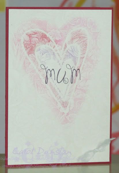
Here is the tutorial on how I coloured the True Friend motif in my first KW#17 card. Not that long ago I never would have used markers to colour on Whisper White for fear of the card pilling, and memories of colouring with markers as a kid - streaky images where I had coloured back and forth over things. But just recently I decided to given it a go and found it to be relatively simple. I think the main thing to remember is that the technique is limited, it will not be as successful if you try colouring large areas with it, but for small areas it's quite quick and easy. This tutorial is based on my trial and error in a short space of time, I certainly do not claim to be an expert at it! I'm also no photography expert, complicated by being right handed and needing the same hand to colour and take a photo at the same time... so there are none of those shots. Where you see a marker in the photo I was holding it in my left hand and it's a posed shot rather than an action shot but hopefully you'll still get the idea.

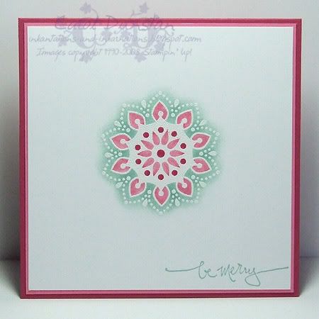
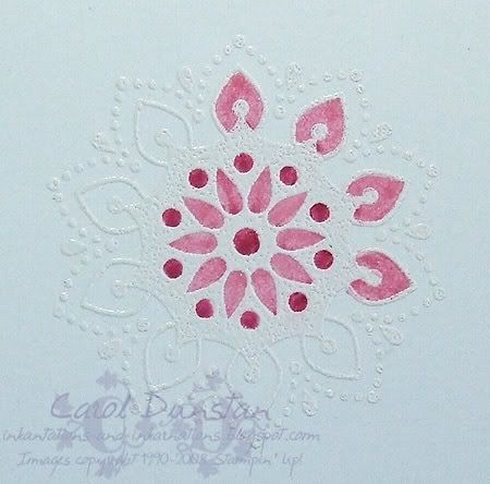
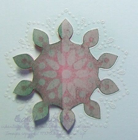
To start things off I thought I would share some comparison shots. When I first posted my card I mentioned that I had rejected a similarly coloured image for that card. You can see this reject below, showing what an image could look like just using the markers to colour.

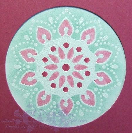
The central petal shapes have a dark spot in the middle and the outer petal shapes have a dark spot at their point where the marker has gone over the same place twice, concentrating colour in this small area.
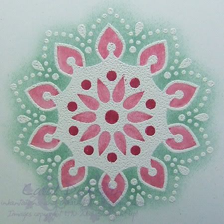
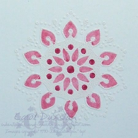
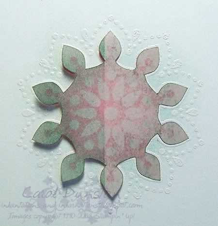
This is a close up of the motif I did use on the card I posted, where I wet some areas with my Aquapainter before colouring. As I was colouring it on the fly, I didn't use water on the inner petal shapes. I did however change the direction I coloured the central petals, starting at the point, down one side and then up the other. The over-lap is quite noticable on some petals, but by changing where the marker was last in contact with the cardstock I have deliberately used what may be an undesirable effect, that dark spot where colour pools, as part of my design. The outer petals were each coloured by first wetting the area with the aquapainter and then colouring with the marker. Having the cardstock damp before you start to colour helps the colour spread, minimising harsh lines of overlapping.
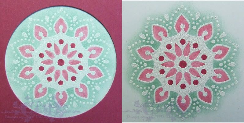
I thought I'd give you a side by side shot of these first two images for easier comparison. Click to view larger.

OK, now on to step-by-step instructions! To start, you'll need to stamp and emboss your image. I stamped in VersaMark and embossed with detail white because that's what I had close at hand, hence the uneven coverage over the solid area. If the image looks like it has a pink tinge that is because I hadn't cleaned it after stamping the background of my second card and there was still some Regal Rose on it. Oops! You'll also want your aquapainter and marker of choice.
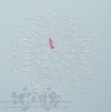
I decided to start this off with a "worst case scenario" shot, colouring in one side of the area and lifting the marker. Notice how the colour has pooled where the marker last had contact with the surface?
Here it's twice as bad, as it now has twice the ink on it! In this instance there is also a large area in the middle where the strokes have overlapped. You could of course use this as an effect, replicating it in each petal, but that's not why we are here!

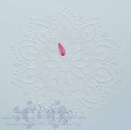
This shot is a slightly less "worst case scenario", I have coloured the area with a single stroke. The colour is much more even but there is still quite a puddle of darker colour where the marker was lifted up from.
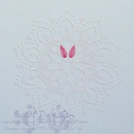
Here I have coloured the rest of the petals by first swiping the aquapainter over the area, then colouring it. I do each section individually: wet then colour, wet then colour etc. This way the area is still quite damp when you add the colour. You should be able to notice that the colour is even more evenly distributed and there is very little "pooling effect".
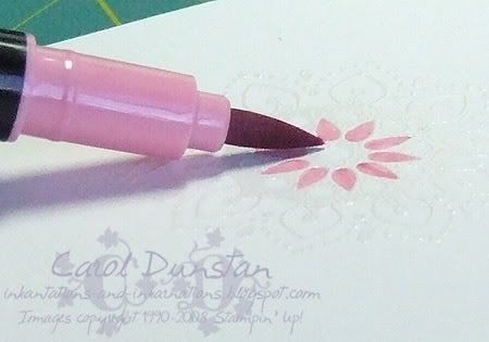
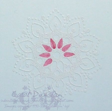
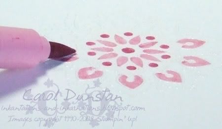
To colour the petals most efficiently this is the angle I hold the marker. Sometimes you may miss colouring a small bit (eg along one edge). I have found it is best to touch these up with the fine or writing end of the markers, and the sooner the better while the cardstock is still slightly damp to help minimise any harsh over-lap lines.
I didn't bother wetting the circle areas before colouring as there was little variance in colour on my other attempts at this. You'll notice some haven't been completely coloured, check the later images and see if you can notice where I have touched them up.
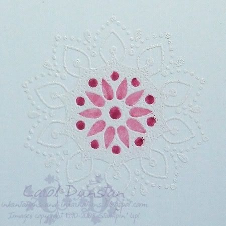
Now to colour the outer petal shapes. Once again I have started by not using water. This one was coloured with one stroke, starting at the bottom left, up tot eh top then down to the bottom right. You can see at the top that there is a dark spot where I paused with the marker before changing direction.
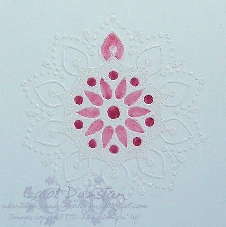
The second petal has been coloured the same way, but the cardstock has been wet first. the "pause spot" isn't quite so dark and defined. It's still not as good as it could be though.

The next two petals have been coloured by wetting first then using the marker. The third petal still has a pause mark as I came at it from the same angle. The fourth one was coloured by turning the cardstock so I could colour from side on, as seen below.

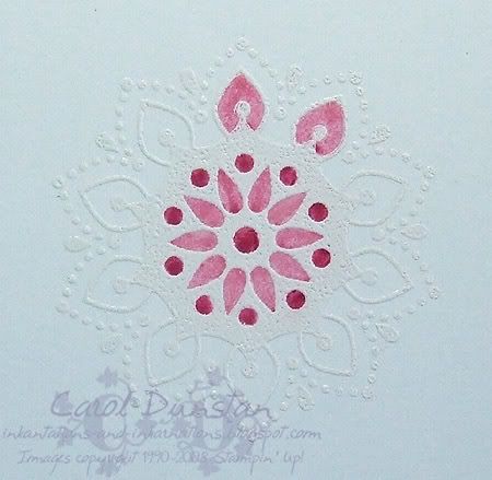
Instead of colouring from bottom-top-bottom or vice-versa, I have coloured the remaining petals by starting at the bottom right, going to the left and then sweeping up to the top right. By colouring it from this angle I can get a more continuous movement and thus barely pausing as I change direction.

And here we are with all the petals coloured in. Ignore the large blob on the bottom petal, that is where the marker slipped while I was taking a photo! Personally I don't think these outter petals have been executed as well as the ones on the card I posted the other day, but I think you can still see the difference. You'll undoubted get some colour on top of the embossing, just wipe it off with a tissue.

And since I showed you all, that I thought I may as well go ahead and finish the image, so here are a few shots of sponging around the motif.
Firstly, this is my mask to cover areas I don't want to sponge. The image was stamped on a Post-It note and then cut out. On these particular Post-It notes the sticky seemed to resist the ink. It was also when I went to use this for the first time that I discovered just how unsymmetrical this image is! Don't be surprised if you sit there for a minute rotating that bit of paper till you find which way it goes (note to self: mark the top with a T so you don't waste so much time next time!)
Here I have done my first little bit of sponging: dabbing the dauber on the inkpad a few times then dabbing over the motif. I don't always dab when I sponge, but if I want a really soft effect it is what I find myself doing. I work from the middle out, dabbing lightly to start with and then heavier as the ink is used up and less ink is coming off on to the cardstock.Here I have gone all around the motif at least once (sorry, I didn't take notes as I took the photos!). Most of the colour is between the petals with very little out to their tips and beyond.

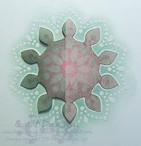
And here we are, fully sponged around the motif so the white embossing shows up better. As I wasn't planning on using this for a card, and I was rushing at this point, I haven't been completely careful with my sponging and can see a few places where I have dabbed a bit too hard towards the edge. If I was going to use this I would continue to work on it, even things up a bit and disguise those dark spots more.
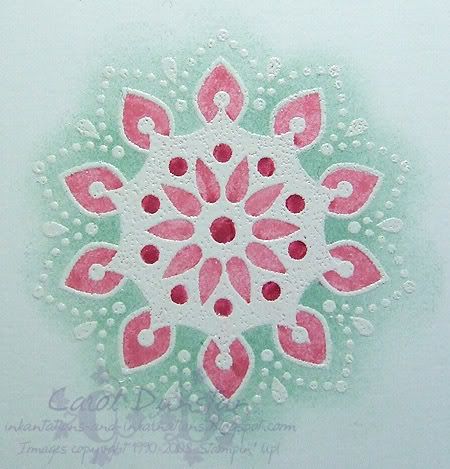
And here we are with the mask removed and our image is finished!

So there you have it, now you hopefully have a better idea of how I coloured that image and I hope find it helpful in getting more use out of your markers. If you want to try this out for yourself my basic tips are:

~ use a light hand. The more pressure you use the more likely you are to rough up the surface of the cardstock, causing pilling and things can get a little ugly then.
~ lift the marker as little as possible. The less you break contact with the surface, the less "pooling" you will get.
~ the more continuous the motion you use to colour, the less likely you are to get "pooling".
~ hold your marker at a low angle to increase the area in contact with the cardstock, thus reducing how many movements or strokes you will need to colour an area.
~ wet each area just before you colour it. You don't want to flood it, just have it nicely damp when you colour (there are no shots of this as the water soaked in too quickly to be visible by the time I had the camera ready). Wetting the cardstock helps the colour spread and give a more even result.
~ touch up with the fine/writing end of your marker

If you do give this a try I'd love to see your results, so leave a comment with a link so I (and others) can check it out biggrin

Thursday, July 24, 2008

KW Colour Inspiration #17

The inspiration pic for Kristina's latest colour challenge is soooo sooo pretty! I got an idea in my head pretty much straight away, but half way through I decided it wasn't quite right... looking back at the inspiration pic my card felt too dark and heavy. So I went back to very simple with lots of white and ended up with a Christmas card! I do think this card is super cute (it's a 10.5cm square card), but it feels like it is lacking something... though that may just be because I have five coordinating ribbons sitting on my desk and I didn't use one of them lol. The central motif, from the upcoming Spring Mini set True Friend, was stamped in VersaMark and embossed with white embossing powder. Then I coloured the Rose areas with markers, wetting each of the larger sections with the aquapainter before colouring to minimise any lines from where the colour overlapped. I then masked this inner section of the motif and sponged Sage Shadow around the outside - I loved the soft outline this provides! With my original card I had this area frames and this soft edge was lost, but I am hoping to go back to it and finish it off when I have distanced myself from the need to be light and airy with it. It's a rather grey and wet day outside, so I'm hoping to play with these pretty colours a bit more and perk myself up.

All supplies by Stampin' Up!

Cardstock: Rose Red, Regal Rose, Whisper White
Stamp Sets: True Friend, Warm Words
Inks: Sage Shadow, Versamark
Accessories: white embossing powder, Rose Red marker, Regal Rose marker, aquapainter, sponge dauber

Monday, June 16, 2008

Beate's Sketch #52

This is the card I made for Beate's WSC #52. Admittedly it doesn't look a great deal like the sketch, but the sketch was the inspiration! All this nice rainy cold weather (nice because it reminds me of winters in Victoria) has had me thinking about nice warm drinks, so I pulled out another old favourite set to play with, Like It A Latte. Because of the packaging of the Jarrah Chocolate Chai Latte drink mix (can be seen in the middle, right down the bottom. Sorry, that really is the best image I have been able to find online!), I decided to go with the Berry Bliss paper and colours. For the main image I stamped the cup on Whisper White cardstock in Purely Pomegranate ink, stamped the froth in Close to Cocoa, masked the froth and stamped the steam in Pretty in Pink ink. I then masked the steam and sponged a little Close to Cocoa on the top of the froth, then masked the cup and sponged Close to Cocoa around it's base. The sentiment was stamped on the paper using Chocolate Chip ink AFTER I had stuck it on the chipboard. I debated whether to do it before hand, but thought I'd probably get the paper crooked and have to start all over again. I felt it needed something underneath the main image, so I attached some Pretty in Pink brads. I don't think the balance of this card is perfect, but I am quite pleased with the masked sponging, I really should do it more often.

Mmm, now I feel like a Choc Chai Latte!

Sunday, May 20, 2007

Mother's Day card the 2nd

Sorry for such a long break between posts. I've had a bit of a cold and sinus headaches, and then my camera software was playing up and I didn't get beyond thinking of just posting a message without something for you to look at. Anyway, here's the card I made for my Mum for Mother's Day:The hearts were created using a Heidi Swapp mask set that I won at Scrapbooking Divas a while back. As soon as I saw them I had this basic idea... it just took me an awfully long time to put it into action! I started by stamping the Stampin' Up! Floral background on Very Vanilla cardstock using VersaMark. I then put the masks over this and dusted pastels on them using daubers. Over the top of this I stamped "MUM" using the EK/Image Tree Loopy uppercase alphabet using VersaFine Imperial Purple ink. These stamps were actually the driving force behind the card. In talking to my Mum about my first published projects she asked about the butterfly I had used that was from this alpha set (well, the upper or lower, can't remember now). My Mum stamps too and was after another alpha set in a size between what she had, so I decided the best way to show her the size of them was to use them on a card for her! Unfortunately, this was pretty much the state the card sat in for a week because I just couldn't decide on what to do to finish it off. I scanned what I had and emailed it to my sister and mentioned the few ideas I had and she replied "even a strip of lace along the bottom would be too much". And once again I went to bed without the card progressing any further: every idea seemed to throw the card off balance. When I woke up the next morning it suddenly hit me: yes, a strip of lace would be too much, but a little bow of it in the corner would be perfect. Thus, finally, what looks like a simple card was finished days (and many canned ideas) later!

I should point out that the previous card I uploaded was made by me, but using my daughters design. She'd particuarly struggle with cutting out the butterflies, I think largely because she is left handed. Will have to pluck up the courage to let her use my paper snips and see if that makes it any easier for her.