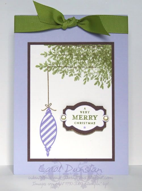
Two Christmas cards in two days and it's only August! It's a bit crazy, but that's all that I have photographed at the moment sorry! This card uses another set from the Spring mini, Tree Trimmings, which features three ornaments and the string/tie image for hanging. With Peaceful Wishes retiring in April, I had to think or another set with greenery I could hang my ornament from for this card. It suddenly hit me that by stamping "the" Lovely As A Tree tree sideways, I could make a branch without a branch stamp! I say "the" Lovely As A Tree tree as this tree gets used a lot on Christmas cards and is quite possibly the most used stamp from that set. I embossed my ornament 'string' in gold, and to compliment this I used gold brads on the sentiment. I also edged the Chocolate layer under the sentiment with my VersaMarker and embossed that with gold too.
It hasn't come up well in the photograph, but the tips of the leaves are a lighter colour than the rest of the branch. After inking the image with Old Olive, and going over the wood part with the Chocolate marker, I stamped off the edges onto scrap paper, then touched them up with the Celery marker.
Most supplies by Stampin' Up!
Cardstock: Almost Amethyst, Chocolate Chip, Whisper White
Stamp Sets: Tree Trimmings, Lovely As A Tree, Punches Three
Inks: Lovely Lilac, VersaMark, Old Olive
Accessories: Chocolate Chip marker, Certainly Celery marker, Lovely Lilac marker, Designer Label punch, gold embossing powder, gold brads, 5/8" Old Olive grosgrain ribbon, dimensionals, VersaMarker (not available through SU!)
Showing posts with label Lovely As A Tree. Show all posts
Saturday, August 22, 2009
Sunday, January 11, 2009
Cinema Saturday #14
Firstly I have to say I was so dang surprised, chuffed and excited when I was asked to be guest designer for this week’s Cinema Saturday movie. I am a huge LOTR fan - I've done the convention and costume thing (see exhibit A to the right -> they are not my natural ears), my ringtone is LOTR related, there are multiple things throughout the house that are LOTR related… you get the picture
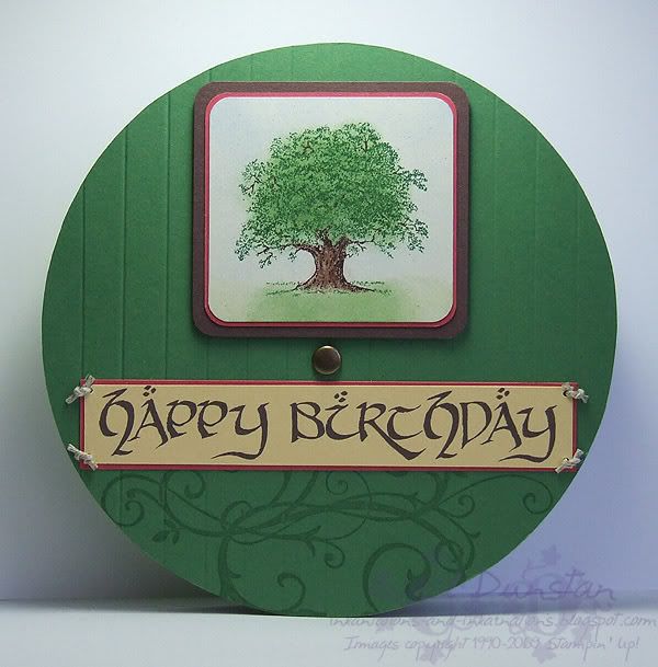
. I have been literally bouncing, and randomly giggling to myself all week as another idea pops into my head. Initially I couldn’t think where to start, and then I realised that starting wasn’t the problem… the problem would be stopping! Anyway, when I really thought about the one main thing that I wanted to focus on for this movie, it was the hobbits. Particularly their homey nature and fun-loving ways despite everything that is going on. While there is that undercurrent of trouble through the early part of Fellowship, it’s still largely fun times with Gandalf’s arrival and Bilbo’s party, so I kind of went with those. I had two main ideas in my head: the Party Tree and Bilbo’s door. I decided to combine them. So we kind of have a framed picture of the tree hanging on the front of Bilbo’s door, brass doorknob and all, along with the birthday banner. The tree and frame was simple enough, I had to dig around for a “brass” brad large enough for the proportion, and for the banner I printed that out from my computer (I have like 10 LOTR fonts, this one is ‘Hobbiton Brush Hand’). In the movie the banner has some green swirls around the writing, but I chose to move those to the bottom of the door. For me, LOTR is where I really fell in love with all those swirly sorts of patterns.
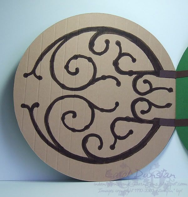
Being such a huge fan of these films, and knowing the incredible about of work and detail that went into making them, I felt I too had to put some work into this card that wouldn’t be initially obvious… so inside the card you have the hinge. I’m trying to be less anal and ignore the fact that my door opens on the wrong side and opens out rather than in as Bilbo’s does…
Now, how was it all done? The first thing was to make the door... I spent a good while walking around the house for something round and the right size to trace around since I don't have any fancy circle cutting tools. Upon finding a bowl the perfect size, I traced it on Garden Green and Caramel cardstock and cut them out. I then cut another slightly larger Garden Green one for the front of the door. Of course, it was only after I had the card all together that I realised the back piece didn't have to be Green as well, and a better colour would have been Naturals Ivory to match Bilbo's walls...
Moving along... I used the scoring blade in my trimmer to score the front and back of the door so it looked like planks of wood. The "Party Tree" was inked with markers and stamped before I sponged the other colours over top. Because the tree trunk is narrower than the sponge dauber I used the side of a cotton bud instead, which worked even better because it created a mottled effect. I rounded all the corners for the tree layers and stuck them all together.
Like I said above, I printed out the "Happy Birthday". I did it this way for a couple of reasons... one being I didn't have an alphabet stamp set that was the right size and style, another being I had this font already, so why not use it? And thirdly... because I am anal and there really was no other option! I attached the banner to the door using pipeweed twine (I mean hemp twine!).
To replicate the hinge decoration on the back of the door I merged a couple of screen shots from the movie together so I had most of the pattern in one image, resized it and printed it out. I then laid the print out over my Caramel cardstock and traced over the outlines to indent the cardstock. Then I simply went over those indentations with the fine tip of my Chocolate Chip marker before filling it all in with the brush tip. I very nearly put Aged Copper brads where all the bolts should be but I decided that was going a bit far and would make the card very heavy and lumpy on the inside.
Now, remember how earlier I mentioned that I kept getting ideas for cards inspired by this movie? Well, I managed to carry out a few of those ideas, so you'll be seeing many more Fellowship of The Ring cards here over the rest of the week
. In the mean time I will point you towards one other Lord Of The Rings card I have already made, a Legolas card.
Most supplies by Stampin' Up!
Cardstock: Garden Green, Chocolate Chip, Ruby Red, Naturals Ivory, So Saffron, Creamy Caramel
Stamp Sets: Lovely As A Tree, Baroque Motifs
Inks: VersaMark; Certainly Celery, Wild Wasabi, Bashful Blue and Chocolate Chip used for sponging
Accessories: Chocolate Chip marker, Garden Green marker, 3/16" corner rounder, non-SU brad, 1/16" hole punch, hemp twine, Hobbiton Brush-hand font, sponge dauber, cotton bud, dimensionals
Show watched while creating: Fellowship of course!
Being such a huge fan of these films, and knowing the incredible about of work and detail that went into making them, I felt I too had to put some work into this card that wouldn’t be initially obvious… so inside the card you have the hinge. I’m trying to be less anal and ignore the fact that my door opens on the wrong side and opens out rather than in as Bilbo’s does…
Now, how was it all done? The first thing was to make the door... I spent a good while walking around the house for something round and the right size to trace around since I don't have any fancy circle cutting tools. Upon finding a bowl the perfect size, I traced it on Garden Green and Caramel cardstock and cut them out. I then cut another slightly larger Garden Green one for the front of the door. Of course, it was only after I had the card all together that I realised the back piece didn't have to be Green as well, and a better colour would have been Naturals Ivory to match Bilbo's walls...Moving along... I used the scoring blade in my trimmer to score the front and back of the door so it looked like planks of wood. The "Party Tree" was inked with markers and stamped before I sponged the other colours over top. Because the tree trunk is narrower than the sponge dauber I used the side of a cotton bud instead, which worked even better because it created a mottled effect. I rounded all the corners for the tree layers and stuck them all together.
Like I said above, I printed out the "Happy Birthday". I did it this way for a couple of reasons... one being I didn't have an alphabet stamp set that was the right size and style, another being I had this font already, so why not use it? And thirdly... because I am anal and there really was no other option! I attached the banner to the door using pipeweed twine (I mean hemp twine!).
To replicate the hinge decoration on the back of the door I merged a couple of screen shots from the movie together so I had most of the pattern in one image, resized it and printed it out. I then laid the print out over my Caramel cardstock and traced over the outlines to indent the cardstock. Then I simply went over those indentations with the fine tip of my Chocolate Chip marker before filling it all in with the brush tip. I very nearly put Aged Copper brads where all the bolts should be but I decided that was going a bit far and would make the card very heavy and lumpy on the inside.
Now, remember how earlier I mentioned that I kept getting ideas for cards inspired by this movie? Well, I managed to carry out a few of those ideas, so you'll be seeing many more Fellowship of The Ring cards here over the rest of the week
Most supplies by Stampin' Up!
Cardstock: Garden Green, Chocolate Chip, Ruby Red, Naturals Ivory, So Saffron, Creamy Caramel
Stamp Sets: Lovely As A Tree, Baroque Motifs
Inks: VersaMark; Certainly Celery, Wild Wasabi, Bashful Blue and Chocolate Chip used for sponging
Accessories: Chocolate Chip marker, Garden Green marker, 3/16" corner rounder, non-SU brad, 1/16" hole punch, hemp twine, Hobbiton Brush-hand font, sponge dauber, cotton bud, dimensionals
Show watched while creating: Fellowship of course!
Labels:
Baroque Motifs,
card,
CSCC,
geek,
LOTR,
Lovely As A Tree,
stamping
Thursday, November 13, 2008
Gift Vouchers
Tonight I wanted to show you a couple of wallets I have made for gift certificates. Unfortunately I forgot to take a photo of the inside showing the gift certificate, but I assure you they're nicely done too. We are down to 6 weeks till Christmas and the shops are really starting to get busy. Avoid that hassle and purchase a gift certificate from me, to any value, and make your crafting friend or family member very happy. Gift certificates are perfect if you are finding it too hard to decide just what SU! products someone would want (or NEED for that matter, 'coz we all know you need it all!
Friday, October 24, 2008
KW Colour Inspiration #27

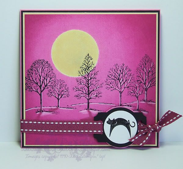
Kristina's latest colour challenge coincided nicely with my desire to create a Hallooween-ish card for Shaelea (since Tiarna is getting Boo). We don't ever really do anything for Halloween but the girls do like dressing up and getting a bit spooky. Anyway, Shaelea likes pink and cats, and I felt like doing another Zindorf-styled card. However, after all the masking, brayering and stamping I realised my trees needed highlights and shadow. The highlights I did easily enough, using a blender pen to pick up Whisper White pigment ink, but the shadows... clearly my cold was starting to affect my thinking because I didn't think to go to Michelle's blog and she how she usually adds such shadows... and I winged it. I used my Purely Pomegranate "marker" for the shadow of the trunks, then thought that was going to be too dark for the shadow of the branches so I tried picking up colour using a clean blender pen. Big mistake! When the blending had dried I was left with a paler halo around the area I had tried shadowing, as the blender pen had caused a bit of colour to run. I tried scribbling colour out of my Purely Pomegranate marker (so the colour was less intense), but that didn't make much difference so I just had to use it as it was. In the end the bulk of it is covered by the ribbon and cat - which I had always planned on using, it wasn't like my mistake required embellishment to cover it up - and what you do see looks ok. I probably should have made the edges a bit darker too but I felt changing from Purely Pomegranate to Basic Black around the edge would be too dramatic. Anyway, it's pink and has a cat, I'm sure Shaelea will love it!
If parts of this post don't make a lot of sense please excuse me... the cold is still affecting my brain! I probably should go back to bed but wanted to cross a few simple things off the to-do list!
All supplies by Stampin' Up!
Cardstock: Pixie Pink, Basic Black, Barely Banana, Whisper White
Stamp Sets: Lovely As A Tree, Party Punch
Inks: Basic Black for stamping; Barely Banana, Pixie Pink, Pink Passion, Purely Pomegranate for brayering; Whisper White for highlights
Accessories: Purely Pomegranate "marker" (blender pen + refill), blender pen, 1" circle punch, designer label punch, 1 1/4" circle punch, horizontal slot punch, Purely Pomegranate double-stitched ribbon, dimensionals
Thursday, October 23, 2008
Jingle Shells

Time for my weekly Christmas card... can you believe there are only 9 weeks left now??? I've gone back to Crab & Company for this one, but I've focused on some of the smaller images from the set. I'll blame the local Christmas Shop for this one as they have one tree decorated in an Aussie way, there are even thong decorations (Flip-flops)! As it is Summer at Christmas time in Australia (not that you'd know it today - it's very cold and rainy today) the beach tends to figure highly in Aussie-fied Christmas imagery, so the idea of teaming these little cuties with the Lovely As A Tree tree popped into my head and I just had to do it! I decided to use the colours from this months Elite Challenges blog colour challenge as I thought the roses would work well for the shells. I chose to use two slightly different colour methods for these: for the starfish I swished the clean aquapainter over the images before picking some ink up from the lid of the inkpad and swishing the aquapainter over the images again. Since I was cutting these out I didn't have to worry about staying in the lines! I then went over the dotted "shadow" areas of the starfish with the Regal Rose marker for emphasis. I also used this method on the large shell, though I had to be carfeful to avoid his eyes and I used the fine tip of the marker to emphasise the lines on his shell. For the small shells I swished over the images with the clean aquapainter before colouring with the Regal Rose marker, then added emphasis with the Rose Red marker.
All supplies by Stampin' Up!
Cardstock: Wild Wasabi, Rose Red, Whisper White
Stamp Sets: Crab & Company, Lovely As A Tree
Inks: StazOn Jet Black, Wild Wasabi
Accessories: aquapainter, Rose Red & Regal Rose markers, Styled Silver hodgepodge, mini glue dots
Show watched while creating: 30 Days of Night
Friday, October 10, 2008
7 Loves of Card Making - The Joy of Giving
As much as I have enjoyed making a card, the real satisfaction comes from giving it to the intended recipient. I love being there in person so I can see how they react to the card, kids in particular seem amazed that you made a card with their name on it, etc. Part of the giving is the envelope, so I stamped some envelopes to match the cards I have made for the week.

My challenge to you is to decorate some envelopes and send out some cards... couldn't get much more simple but I often make the card and then don't send it out and I know others do this from time to time too. If you've made Christmas cards just get your envelopes addressed as it's still too early to send them out (though if you have left-over 50c stamps you can stick them on too).

My challenge to you is to decorate some envelopes and send out some cards... couldn't get much more simple but I often make the card and then don't send it out and I know others do this from time to time too. If you've made Christmas cards just get your envelopes addressed as it's still too early to send them out (though if you have left-over 50c stamps you can stick them on too).
Monday, October 06, 2008
7 Loves of Card Making - Occasions
As I mentioned before, I got into stamping and card making initially so I could making birthday cards for family members. That soon extended to Christmas cards. I don't know what it is about Christmas cards, but every year I love making heaps of them, even when I have left it to the last minute and it's a bit of a mission to get them done in time.
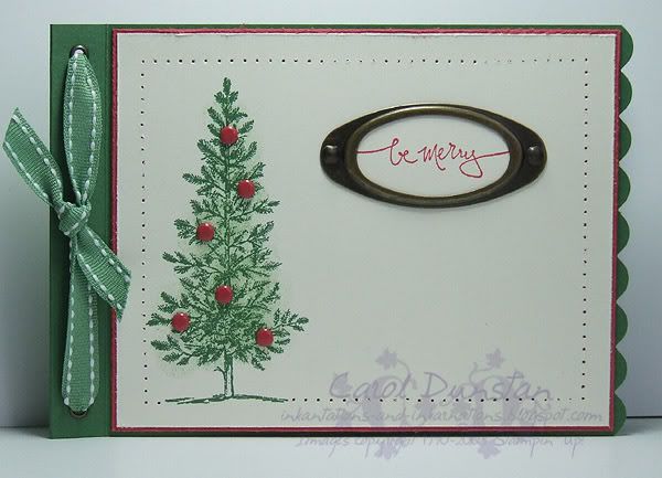
I'm not big on the traditional colours for Christmas, but I know I have relatives who do prefer traditional coloured cards, so this one is for them. The stamping on this is very basic but i have added a lot of little features so it is a little time intensive but if you do it product-line style (complete each step on all cards before moving onto the next step) things do go quicker.
All supplies by Stamping Up!
Cardstock: Garden Green, Ruby Red, Very Vanilla
Stamp Sets: Lovely As A Tree, Warm Words
Inks: Garden Green, Ruby Red, Wild Wasabi (for sponging)
Accessories: 3/16" scallop punch, large oval punch, 1/8" circle punch, metallic eyelets, Wild Wasabi double-stitched ribbon, Earth Elements brads, Crafters Tool Kit, Antique Brass hodgepodge, sponge dauber
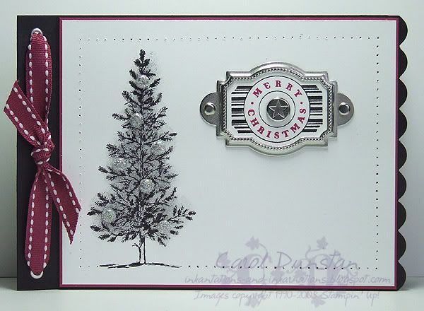
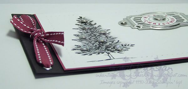
For this card I thought I would go even further than I normally do on the "non-traditional" colour scale. I still think a black Christmas tree looks a little odd, but i have seen a few this year in particular that when decorated look very striking.
Here's a close-up of the brads. I've attached a mini-glue dot to the top of a silver brad and then dipped the brad in Dazzling Diamonds glitter to get my sparkly brads.
All supplies by Stampin' Up!
Cardstock: Basic Black, Purely Pomegranate, Whisper White
Stamp Sets: Lovely As A Tree, Party Punch
Inks: Basic Black; Basic Gray and Going Gray for sponging
Accessories: 3/16" corner rounder, designer label punch, 1/8" circle punch, metallic eyelets, Purely Pomegranate double-stitched ribbon, Styled Silver hodgepodge, Vintage brads, mini glue dots, Dazzling Diamonds glitter, Basic Black marker, Purely Pomegranate "marker" (blender pen + reinker), sponge dauber
And now for my challenge to you: create aChristmas card using a colour combination you've never used for Christmas before (eg if you usually use red and green, use something non-traditional). Put a link to your card in the comments for this post and at the end of the week I'll pick my favourite one and send a little something to that person. Australian residents only, SU! demos welcome.
I'm not big on the traditional colours for Christmas, but I know I have relatives who do prefer traditional coloured cards, so this one is for them. The stamping on this is very basic but i have added a lot of little features so it is a little time intensive but if you do it product-line style (complete each step on all cards before moving onto the next step) things do go quicker.All supplies by Stamping Up!
Cardstock: Garden Green, Ruby Red, Very Vanilla
Stamp Sets: Lovely As A Tree, Warm Words
Inks: Garden Green, Ruby Red, Wild Wasabi (for sponging)
Accessories: 3/16" scallop punch, large oval punch, 1/8" circle punch, metallic eyelets, Wild Wasabi double-stitched ribbon, Earth Elements brads, Crafters Tool Kit, Antique Brass hodgepodge, sponge dauber
For this card I thought I would go even further than I normally do on the "non-traditional" colour scale. I still think a black Christmas tree looks a little odd, but i have seen a few this year in particular that when decorated look very striking.
Here's a close-up of the brads. I've attached a mini-glue dot to the top of a silver brad and then dipped the brad in Dazzling Diamonds glitter to get my sparkly brads.All supplies by Stampin' Up!
Cardstock: Basic Black, Purely Pomegranate, Whisper White
Stamp Sets: Lovely As A Tree, Party Punch
Inks: Basic Black; Basic Gray and Going Gray for sponging
Accessories: 3/16" corner rounder, designer label punch, 1/8" circle punch, metallic eyelets, Purely Pomegranate double-stitched ribbon, Styled Silver hodgepodge, Vintage brads, mini glue dots, Dazzling Diamonds glitter, Basic Black marker, Purely Pomegranate "marker" (blender pen + reinker), sponge dauber
And now for my challenge to you: create aChristmas card using a colour combination you've never used for Christmas before (eg if you usually use red and green, use something non-traditional). Put a link to your card in the comments for this post and at the end of the week I'll pick my favourite one and send a little something to that person. Australian residents only, SU! demos welcome.
Tuesday, May 27, 2008
Purely Pretty Trees
Another old Kristina Werner colour challenge, this time without combining it with a sketch challenge. I love "warm" colour combinations like this, though I have to say I don't think I would have put Pumpkin with Pomegranate. Lovely As A Tree is another old favourite stamp set of mine, though as I haven't played with it for a while I thought this was the perfect opportunity: for a few weeks now I have been daily walking past trees with their changing leaves and loving the mix of hues, though the purple end of their spectrum is often left out so I felt it was my duty to do something about it! I used my markers to ink the stamp (remember, I have created my own In Color markers by using a pack of blender pens and the ink refills) and stamped it on Pretty In Pink cardstock. With an aquapainter I washed in some Pretty in Pink along the horizon, blurred/blended the trees a bit and added a bit more Chocolate Chip to the ground. I mounted this to a piece of Whisper White, the edges of both layers having been distressed with the Cutter Kit, and mounted this on top of a piece of Pumpkin Pie that had been stamped with good ol' Paisley using VersaMark. A piece of Pomegranate stitched ribbon and Aged Copper hodgepodge were added and then it was all mounted onto the Whisper White card base. The sentiment, from Occasional Greetings, was stamped on Whisper White with Purely Pomegranate, punched out with the 1 1/4" circle punch and layered on a Chocolate Chip designer label punched piece, and all this was mounted to the card front using some dimensionals.
Sunday, November 25, 2007
Peaceful Pop-Up
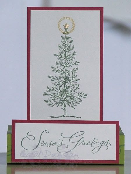
I've wanted to make one of these free-standing pop-up cards for years, but always thought they'd be a bit tricky. Last night I finally bit the bullet and had a go... and it really wasn't that hard, they are a lot easier than they look. I found instructions on Dawn's website, but I ended up looking at a few of them for different photos etc (though the two glasses of Kahlua may have had something to do with that too). This is what my card looks like "closed":
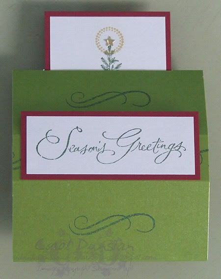
And here it is "open":
I've used Lovely As A Tree and Many Merry Messages sets for my main images, along with Finest Flourishes and Sweet Spot for some finishing touches. The tree, sentiment and flourish have been stamped using Brilliance Pearlescent Ivy (after yesterday's blingy card I stepped back a bit to just shimmery), and I used VersaMark to stamp the circle around the tree top, then applied Brilliant Gold Pearl Ex. The tree is topped with a star punchie. Cardstock is all shimmery stuff though I'm not sure of the brands now, it was bought from Eckersley's a few months back and efficiently stored on the table...
And here it is "open":
I've used Lovely As A Tree and Many Merry Messages sets for my main images, along with Finest Flourishes and Sweet Spot for some finishing touches. The tree, sentiment and flourish have been stamped using Brilliance Pearlescent Ivy (after yesterday's blingy card I stepped back a bit to just shimmery), and I used VersaMark to stamp the circle around the tree top, then applied Brilliant Gold Pearl Ex. The tree is topped with a star punchie. Cardstock is all shimmery stuff though I'm not sure of the brands now, it was bought from Eckersley's a few months back and efficiently stored on the table...
Thursday, November 08, 2007
Lovely Season's Greetings
Wednesday, November 07, 2007
Cool Season's Greetings
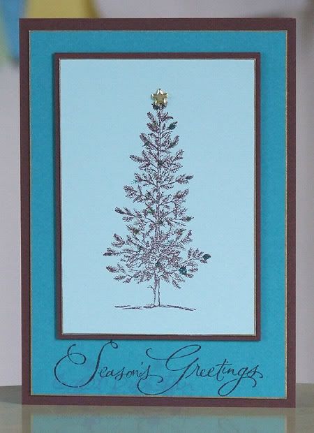
The colour combination for this card was also inspired by some Myer decorations. The Lovely As A Tree tree and Many Merry Messages sentiment were stamped with Chocolate Chip ink. The tree (on Cool Caribbean cardstock) was layered on Choc Chip, then blinged up with some Kindy Glitz, Ice Stickles and a mini gold star brad. You have to be very careful when applying the glitter glues, as the Choc Chip is a dye ink and can easily run. The Cool Caribbean and Taken with Teal layers have also been edged with a gold Krylon pen. I suspect I'll be playing with these colours more as I think they are a great combination.
Monday, July 09, 2007
Pine Thyme
Friday night was a cyber night over at The Inklings forum. The first challenge was a sketch challenge, I decided to go very simple.
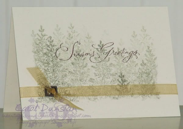
The card base is Naturals Ivory. I made a mask for the cardfront by tearing the centre out of a scrap of paper. The tree (from Lovely As A Tree) was inked in True Thyme, stamped off once then stamped on the cardfront (sometimes stamping a second time on the cardfront). I also stamped some in Mellow Moss. The sentiment, from Many Merry Messages, was stamped with Chocolate Chip. The gold organdy is wrapped around the whole cardfront and tied through a buckle from the Aged Copper Hodge Podge tin. I love how this turned out, and so simple it could well be the design of a heap of my Christmas cards this year.
On a completely different note... has anyone seen Shrek The Third? There was a song in it that I thought I knew, but I just couldn't recall. That really bugs me. So I finally looked up the songs on the soundtrack, and as soon as I saw Led Zep's "The Immigrant Song" listed I knew that was it. I'm obviously not a huge Led Zep fan, but I know the song thanks to the Viking Kittens. It was done about 5 years ago, but it still cracks me up... so here is the Viking Kittens video for The Immigrant Song
The card base is Naturals Ivory. I made a mask for the cardfront by tearing the centre out of a scrap of paper. The tree (from Lovely As A Tree) was inked in True Thyme, stamped off once then stamped on the cardfront (sometimes stamping a second time on the cardfront). I also stamped some in Mellow Moss. The sentiment, from Many Merry Messages, was stamped with Chocolate Chip. The gold organdy is wrapped around the whole cardfront and tied through a buckle from the Aged Copper Hodge Podge tin. I love how this turned out, and so simple it could well be the design of a heap of my Christmas cards this year.On a completely different note... has anyone seen Shrek The Third? There was a song in it that I thought I knew, but I just couldn't recall. That really bugs me. So I finally looked up the songs on the soundtrack, and as soon as I saw Led Zep's "The Immigrant Song" listed I knew that was it. I'm obviously not a huge Led Zep fan, but I know the song thanks to the Viking Kittens. It was done about 5 years ago, but it still cracks me up... so here is the Viking Kittens video for The Immigrant Song
Thursday, June 28, 2007
Rusty Tree
Today I decided I had had enough of NOT stamping, and set to to get creative again. I picked out a set, thought of who I would send it to and why... and nothing! It took a while to get the brain into gear, but finally I got there:
I inked the tree by using the Old Olive inkpad on the tree top, then used the Really Rust marker to ink the trunk and some branches and the Garden Green marker to ink the grass and some leaves. I then coloured the tree trunk with a blender pen, using Creamy Caramel and a touch of Close to Cocoa, and I filled in the grass with Garden Green. I sponged the leaves with more Old Olive and added some dots of True Thyme to add some subtle depth. The Buckaroo Blue sky was also added with the blender pen. I was going to layer the tree (stamped on Naturals Ivory) on Garden Green (inspired by Marelle), but in the end it just didn't look right and I went back to trusty Old Olive, then layered on Buckaroo Blue. For the card base I inked my Print Pattern with VersaMark and went around the edges of the diamonds with the Creamy Caramel marker. The sentiment is from the level 1 hostess set Warmest Regards, and I inked that with the Really Rust marker. The tree layers are mounted on dimensionals. This card didn't quite turn out as I had hoped, but it was nice to get back into the saddle (I just hope it's not too long before I stamp again!)
Subscribe to:
Posts (Atom)