Showing posts with label Baroque Motifs. Show all posts

Monday, March 29, 2010

Hippity Hoppity Easter is on it's Way

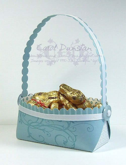
A couple of weeks ago Ariane posted a very cute Easter basket on her blog. Many of us hounded her for a tutorial, and while we waited, and I studied her pictures, I got to playing and came up with a template of my own. Ariane has now posted her tutorial, and our templates are a little different but the made up baskets look the same to all but the closest observers. Anyway, here is the basket I came up with, all ready for Tiarna's guitar teacher tomorrow afternoon, filled with a whole bag of little Lindt bunnies biggrin


All supplies (except chocolate...) by Stampin' Up!
Cardstock: Baja Breeze
Stamp Set: Baroque Motifs
Ink: Baja Breeze
Accessories: Baja Breeze Patterns designer series paper, scallop edge punch, Whisper White 1/4" grosgrain ribbon, Button Bouquet designer buttons, 5/16" Neutral brads, Sticky Strip

Thursday, August 06, 2009

Over Embellished?

Here's a snippet of my latest upload to the Elite Challenges Blog. This is another card I made on the team weekend away, using one of the colour challenges (which was an old KW one, shall have to check up which one). There was some suggestion that I had over-embellished this card... I think it went close! Those that saw it on the weekend may also notice it looks a little different now. That's because I was not happy with the sentiment being on a circle, but you see with the Carousel Note being a circle, I felt the sentiment had to be too (you know, like you have to wear brown shoes if you are wearing a brown belt...). But it really wasn't working, so when I got home I ripped it off and re-did it with the new scallop oval punch. Looks much better! I also had to move one of the buttons&brads, so the card is a little ugly on the inside but looks fine from the front wink

Monday, January 19, 2009

Cinema Saturday #15

AKA "We'll always have Paisley" lol.

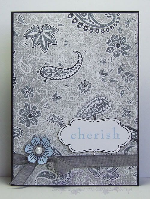
This weeks Cinema Saturday challenge is Casablanca. A classic no doubt, yet a movie I had not seen in full until last night. This week Sankari and Brooke also gave us colour guidelines, very fitting for this movie. I had initially picked out Pale Plum as my free choice, but as soon as Rick mentioned that Ilsa had worn blue the last time he'd seen her I changed my mind. I knew I was going to use this additional colour sparingly, aided by choosing a pale shade of the colour, though I wasn't quite sure how, but I made myself watch the whole movie before really starting on my card and I am glad I did. I was going to draw inspiration from Sam's piano though I have few stamps with a real Morrocan feel to them (ooooh, but how i would love it!), but as soon as I saw Ilsa's paisley blouse it was a done deal... I am a sucker for paisley, especially when I have such a gorgeous stamp of it! I ended up basing my card on that whole scene, the conversation that gave fond memories of Paris back to Rick and Ilsa. There's the paisley for her blouse, the ribbon for her sash/belt, the frame for a slightly Morrocan touch, the sentiment for the memories and the Carte Postale flower for the French connection.

All supplies by Stampin' Up!
Cardstock: Basic Black, Whisper White, Bashful Blue, Going Gray
Stamp Sets: Paisley, Frames With A Flourish, Baroque Motifs, Carte Postale
Inks: Going Gray, Basic Black, Basic Gray, Bashful Blue
Accessories: Basic Gray marker, Basic Black marker, Basic Gray taffeta ribbon, Pretties Kit, dimensionals
Show watched while creating: Casablanca of course!

Wednesday, January 14, 2009

Cinema Saturday #14 part 5

The next card I have for you in the Cinema Saturday #14 series is for the other Fellowship member who parted ways in the FOTR movie: Boromir. Boromir's costume has a lot of texture and detail, and I have drawn on a few specific parts for this card. The background is based on Boromir's fur-line cloak, most prominent as they trudge through the snow. It was impossible to replicate burn-out velvet with cardstock so I just opted to stamp the swirly design in Chocolate Chip so it had the darker colour like the design on the cloak appears darker than the velvet nap (in truth the back of the velvet is the same colour as the nap it is just the lining fabric that makes it appear darker... some geeky costume details for you!). Of course the Close To Cocoa velvet ribbon had to come out again for the fur lining. The Ruby Red layer is inspired by the gorgeous bullion embroidery on the sleeves of his tunic (~cough~ sari fabric ~cough~), and the framed sentiment piece is supposed to be reminiscent of the decoration on his belt. This is another thank you card because in the end he did good (the EE gives a lot more to his story and thus his end isn't as big a turn-around as it seems in the original cinema version... and I will admit I was tainted with knowledge of ROTK EE too which adds to Boromir's story even more).

All supplies by Stampin' Up!
Cardstock: Close to Cocoa, Chocolate Chip, Basic Black, Ruby Red
Stamp Sets: Carte Postale, Simple Delights, Occasional Greetings, Baroque Motifs
Inks: Close To Cocoa, VersaMark, StazOn Jet Black
Accessories: Ruby Red marker, Close To Cocoa marker, Designer Label punch, Styled Silver Hodgepodge, gold embossing powder, dimensionals
Show watched while creating: Fellowship of course! (yes, I have watched this a lot over the last week)

Sunday, January 11, 2009

Cinema Saturday #14

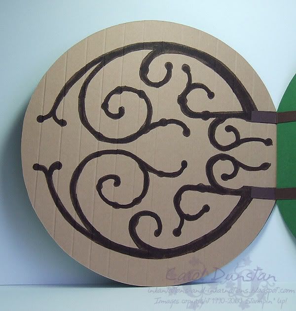
Firstly I have to say I was so dang surprised, chuffed and excited when I was asked to be guest designer for this week’s Cinema Saturday movie. I am a huge LOTR fan - I've done the convention and costume thing (see exhibit A to the right -> they are not my natural ears), my ringtone is LOTR related, there are multiple things throughout the house that are LOTR related… you get the picture biggrin. I have been literally bouncing, and randomly giggling to myself all week as another idea pops into my head. Initially I couldn’t think where to start, and then I realised that starting wasn’t the problem… the problem would be stopping! Anyway, when I really thought about the one main thing that I wanted to focus on for this movie, it was the hobbits. Particularly their homey nature and fun-loving ways despite everything that is going on. While there is that undercurrent of trouble through the early part of Fellowship, it’s still largely fun times with Gandalf’s arrival and Bilbo’s party, so I kind of went with those. I had two main ideas in my head: the Party Tree and Bilbo’s door. I decided to combine them. So we kind of have a framed picture of the tree hanging on the front of Bilbo’s door, brass doorknob and all, along with the birthday banner. The tree and frame was simple enough, I had to dig around for a “brass” brad large enough for the proportion, and for the banner I printed that out from my computer (I have like 10 LOTR fonts, this one is ‘Hobbiton Brush Hand’). In the movie the banner has some green swirls around the writing, but I chose to move those to the bottom of the door. For me, LOTR is where I really fell in love with all those swirly sorts of patterns.
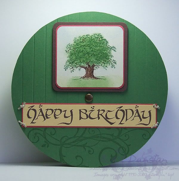
Being such a huge fan of these films, and knowing the incredible about of work and detail that went into making them, I felt I too had to put some work into this card that wouldn’t be initially obvious… so inside the card you have the hinge. I’m trying to be less anal and ignore the fact that my door opens on the wrong side and opens out rather than in as Bilbo’s does…Now, how was it all done? The first thing was to make the door... I spent a good while walking around the house for something round and the right size to trace around since I don't have any fancy circle cutting tools. Upon finding a bowl the perfect size, I traced it on Garden Green and Caramel cardstock and cut them out. I then cut another slightly larger Garden Green one for the front of the door. Of course, it was only after I had the card all together that I realised the back piece didn't have to be Green as well, and a better colour would have been Naturals Ivory to match Bilbo's walls...

Moving along... I used the scoring blade in my trimmer to score the front and back of the door so it looked like planks of wood. The "Party Tree" was inked with markers and stamped before I sponged the other colours over top. Because the tree trunk is narrower than the sponge dauber I used the side of a cotton bud instead, which worked even better because it created a mottled effect. I rounded all the corners for the tree layers and stuck them all together.

Like I said above, I printed out the "Happy Birthday". I did it this way for a couple of reasons... one being I didn't have an alphabet stamp set that was the right size and style, another being I had this font already, so why not use it? And thirdly... because I am anal and there really was no other option! I attached the banner to the door using pipeweed twine (I mean hemp twine!).

To replicate the hinge decoration on the back of the door I merged a couple of screen shots from the movie together so I had most of the pattern in one image, resized it and printed it out. I then laid the print out over my Caramel cardstock and traced over the outlines to indent the cardstock. Then I simply went over those indentations with the fine tip of my Chocolate Chip marker before filling it all in with the brush tip. I very nearly put Aged Copper brads where all the bolts should be but I decided that was going a bit far and would make the card very heavy and lumpy on the inside.

Now, remember how earlier I mentioned that I kept getting ideas for cards inspired by this movie? Well, I managed to carry out a few of those ideas, so you'll be seeing many more Fellowship of The Ring cards here over the rest of the week biggrin. In the mean time I will point you towards one other Lord Of The Rings card I have already made, a Legolas card.

Most supplies by Stampin' Up!
Cardstock: Garden Green, Chocolate Chip, Ruby Red, Naturals Ivory, So Saffron, Creamy Caramel
Stamp Sets: Lovely As A Tree, Baroque Motifs
Inks: VersaMark; Certainly Celery, Wild Wasabi, Bashful Blue and Chocolate Chip used for sponging
Accessories: Chocolate Chip marker, Garden Green marker, 3/16" corner rounder, non-SU brad, 1/16" hole punch, hemp twine, Hobbiton Brush-hand font, sponge dauber, cotton bud, dimensionals
Show watched while creating:
Fellowship of course!

Sunday, October 26, 2008

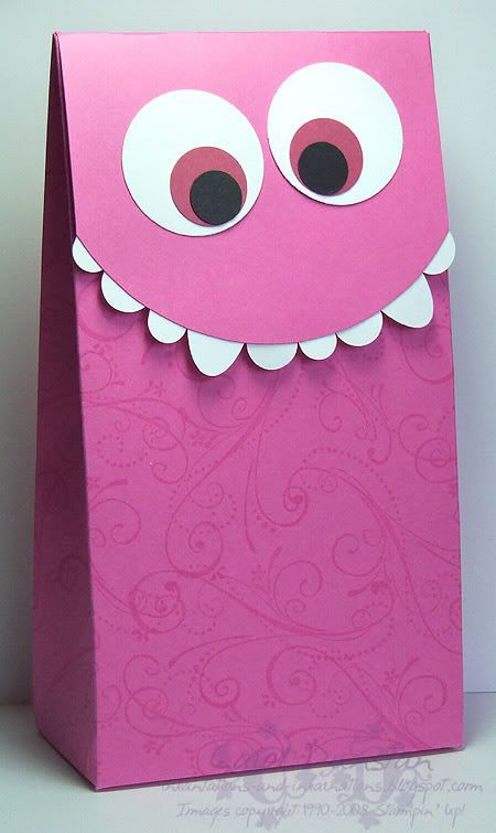
Monster Boxes

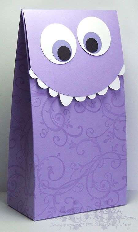
I know, I said we don't really do anything for Halloween... but I came across some glow in the dark M&M's and some glow worm jube thingies (there is a light thing that then has the lolly around it). And since I bought them I had to make something fancy to put them in! With a nice long afternoon nap yesterday I was feeling pretty good last night, so once the girls were in bed I got started.

Rather than doing a lot of trial and error, I made the boxes as big as I easily could with one sheet of 12x12. The box stands about 7" tall with a 3" flap coming over the front for the monsters face. I originally wanted my boxes black so I could have these eyes and teeth coming out of "nowhere" (inspired by Amy Sheffer), but alas the only black 12x12 I had was textured and that wasn't going to work as well for the stamping. The flaps are held down by a bit of magnetic tape I picked up at the cheap shop, which I had to added sticky strip to to keep the magnets stuck on the cardstock instead of each other.

Most supplies by Stampin' Up!
Cardstock: Lavender Lace, Pink Passion, Whisper White, Basic Black, Lovely Lilac, Rose Red
Stamp Sets: Priceless, Baroque Motifs
Ink: VersaMark
Accessories: Five-in-one Card Cover template, sticky strip, various punches as described below:
* Eyes: 1 3/8" circle, 3/4" circle, 1/2" circle
* Teeth: Small oval, 1/2" circle, Word Window
Shows watched while creating: Stargate Atlantis, Survivor (US are in front of Aus and on a completely different season so I ain't even going there!)

Friday, October 10, 2008

7 Loves of Card Making - The Joy of Giving

As much as I have enjoyed making a card, the real satisfaction comes from giving it to the intended recipient. I love being there in person so I can see how they react to the card, kids in particular seem amazed that you made a card with their name on it, etc. Part of the giving is the envelope, so I stamped some envelopes to match the cards I have made for the week.

My challenge to you is to decorate some envelopes and send out some cards... couldn't get much more simple but I often make the card and then don't send it out and I know others do this from time to time too. If you've made Christmas cards just get your envelopes addressed as it's still too early to send them out (though if you have left-over 50c stamps you can stick them on too).

Thursday, October 09, 2008

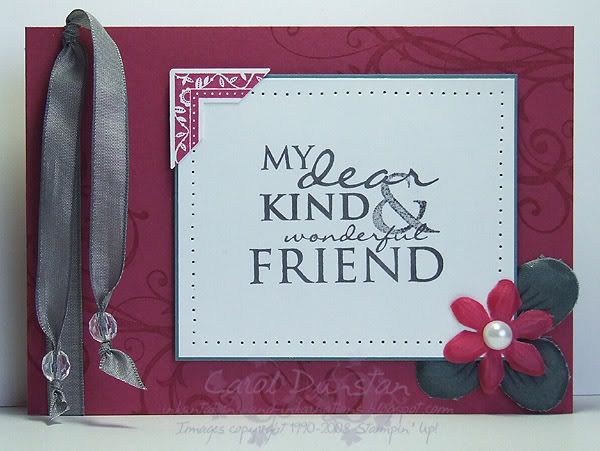
7 Loves of Card Making - Embellishment

Like most people I think, when I started stamping my cards were quite simple with no real embellishment. These days I rarely make a card that doesn't have a bit of ribbon or a brad on it - how times change! My card today gets most of its embellishments from the Pretties Kit, a fabulous collection of flowers, beads, brads, pearls and hatpins. I've also used the very yummy Basic Gray taffeta ribbon and created a corner feature by punching a stamped image. Paper piercing is a simple embellishment method that I often use as it adds a little bit of extra interest without overdoing things.

All supplies by Stampin' Up!
Cardstock: Purely Pomegranate, Blue Bayou, Whisper White
Stamp Sets: Occasional Greetings, Frames With A Flourish, Baroque Motifs
Inks: VersaMark, Purely Pomegranate, Basic Gray
Accessories: Pretties Kit, Basic Gray taffeta ribbon, crafters tool kit, photo corner punch, mini glue dots, dimensionals

My challenge to you today is to create a card using a variety of embellishments. Put a link to your card in the comments for this post and at the end of the week I'll pick my favourite one and send a little something to that person. Australian residents only, SU! demos welcome.

Thursday, August 14, 2008

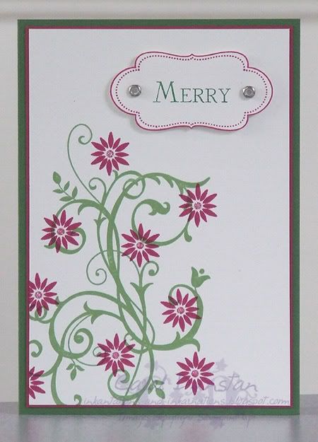
Merry Baroque

Yep, we are yet another week closer to Christmas! This card is a mix of simple and more complex elements, the simple being the abstract Baroque Motifs tree, and the more complex part is the sentiment and frame. I first stamped the frame, then used a marker to ink just the one word from the Many Merry Messages stamp and used the Stamp-A-Ma-Jig to help me position it. It's really not that complex, but does lift the card from "quick and easy" status. I just love trimming that frame and popping it up on dimensionals!

All supplies by Stampin' Up!
Cardstock: Garden Green, Purely Pomegranate, Whisper White
Stamp Sets: Baroque Motifs, Frames With A Flourish, Many Merry Messages
Inks: Purely Pomegranate, Wild Wasabi
Accessories: Garden Green marker, dimensionals, Pretties Kit, 2-Way glue pen, Dazzling Diamonds glitter

Friday, May 30, 2008

Resistance is...

I apologise in advance if this post is a bit... off. I didn't get around to preparing this earlier and I've just finished watching the LOST finale and I'm a bit... well "Jack, we are in shock" isn't a bad summation. Anyway... to the card!

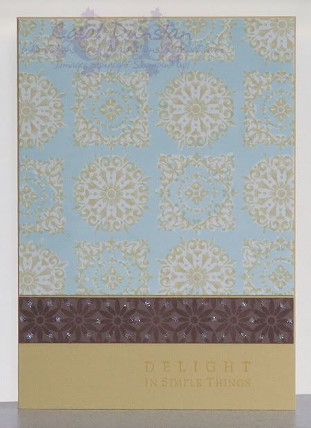
This card was inspired by more bedding! I saw this Sheridan quilt cover in the Myer catalogue the other week and just had to make a card based on it. My method with this card was a little haphazard... living with an electrician does not mean you will be free from electricity related issues. I have asked for some time now to have a double powerpoint put in behind the desk so I can plug my heat gun in, and I am still waiting. Of course I could go out to the kitchen and heat emboss there, but you do it once and they say you can do it that way every time. Don't tempt fate! So, no emboss resist. I decided to give crayon resist a go on this one but I ended up rushing it a bit and didn't get everywhere I wanted to. Still, I can live with it (especially after seeing the sheets in the flesh - not as pretty as the catty pic!) and I do like how the card came out. I've used the Simple Delights Simply Sent kit stamps for most of this card, as well as once stamp from Baroque Motifs (there's no stopping it wink). I stamped the circular and square motifs on the gloss white card using So Saffron ink, let them dry thoroughly then went over it with a white wax crayon (the kids haven't noticed it missing). I then brayered over the whole piece with Soft Sky ink, buffed off the wax, trimmed it to size and mounted it to my So Saffron card base. I stamped the small flower along a piece of Close To Cocoa using VersaMark, dotted some 2-Way glue on it then sprinkled it with Dazzling Diamonds glitter. I attached this to the card front then stamped the sentiment using So Saffron ink.

Friday, May 23, 2008

Cherished Paisley

This was my response to the second Inklings cyberstamp challenge, a sketch and colour combo challenge. As I was playing catch-up with the challenges I had only skimmed what they were, opened the corresponding images in separate tabs in my browser, yadda yadda yadda... created a card based on the colours, then created a card base on the sketch. At some point I went back and saw they were to be combined... d'oh! Ah well lol

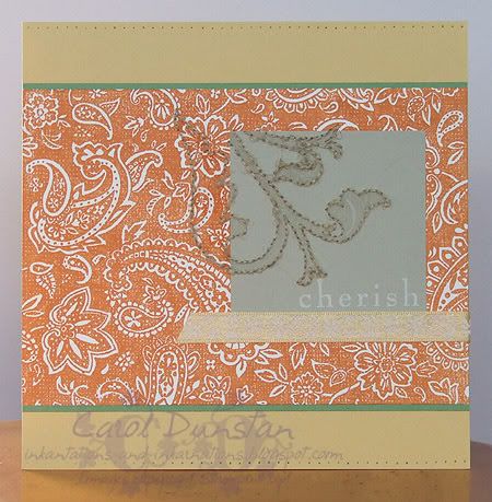
For this card I used a So Saffron card base (14.8 cm square), a layer of Whisper White stamped with Paisley in Pumpkin Pie on a slightly larger Wild Wasabi layer, and a small piece of Sahara Sand with that "cherish" stamp from Baroque Motifs again stamped in Whisper White. I stamped the large image from Brocade Basics on both the Sahara Sand piece and Paisley layer (masking a lot of it off) using VersaMark, pierced holes around the edge and then stitched this outline with linen thread. This took ALL DAY and nearly KILLED my fingers... I tend not to like large holes showing in my stitching and my fingers really paid for it that day, pulling the needle through rather than making extra large holes that the needle would just glide through. I also pierced holes along the horizontal edges of the base card and ran a piece of So Saffron ribbon (from the Fairy Tale Ribbon Originals pack) across the card. Like a lot of people who took up the challenge, these are not colours I would normally team-up, but I really what I came up with.

Cherished Florals

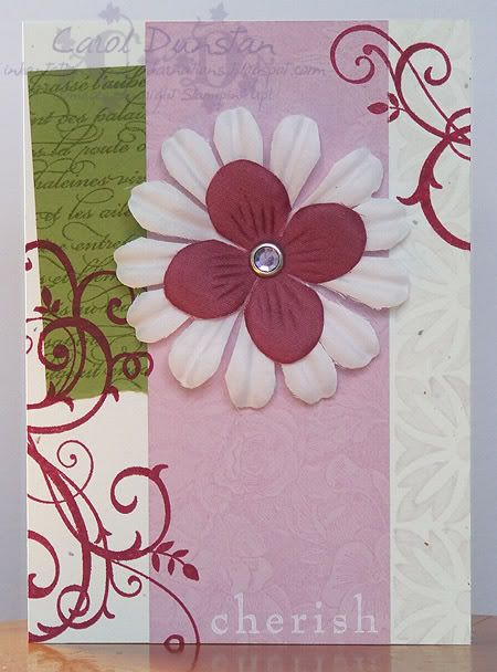
Last week the Inklings had a cyberstamp. I was a bit slow with completing the challenges, and with my net troubles I'm only just getting them uploaded now! This one was my response to challenge 1. It was a scrapping sketch challenge, but well all know I don't scrap wink (well, I didn't have any photos on hand, the print needs new ink etc etc...) but I thought it'd make a nice card. I've used the En Francais and Floral backgrounds as well as a few stamps from Baroque Motifs (yes, that one is a new favourite!), lots of VersaMark, some Purely Pomegranate, Old Olive and Whisper White ink (I'm falling back in love with that). Cardstock is Confetti White, Pale Plum and Old Olive. The card is covered in stamped images so I decided to have a non-stamped focal point and pulled out the Pretties kit again. The smaller flower has been died with a few drops of Purely Pomegranate ink, the large one left white and in the centre is a medium lilac circle rhinestone brad. If I had my time over the Old Olive piece would be a little lower, but it's a minor quibble... I really enjoyed making this card because I forced myself not to think about it too much, just get on with the stamping!

Thursday, May 22, 2008

Well-worn Motif

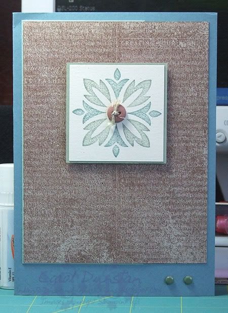
Today is Glenn's birthday so I thought I would share the card I made for him. I know I'm not alone when I say I struggle with cards for men, but I thought this turned out OK. I can't remember where I got the colours from, I think they were a happy accident of my pile of swatches being in a mess! I used Well-worn Words for the background, stamped in Close To Cocoa on Kraft cardstock, mounted on a piece of Sage Shadow. The central image is a stamp from Baroque Motifs, inked with Sage Shadow and Mellow Moss markers and stamped on Ivoy Naturals, layered on Mellow Moss with a Close To Cocoa button in the centre. This is all popped up with dimensionals, and to finish it off I added a couple of Always Artichoke brads to the Blue Bayou card base.

I plan to be back later tonight with another card to share with you (May is just full of birthdays for people I know!), but if I don't make it, you can probably blame the weather... it's overcast and storms are predicted, though my net connection has taken to playing up whenever there's a bit of rain around.

Tuesday, May 06, 2008

Baroque Mother's Day

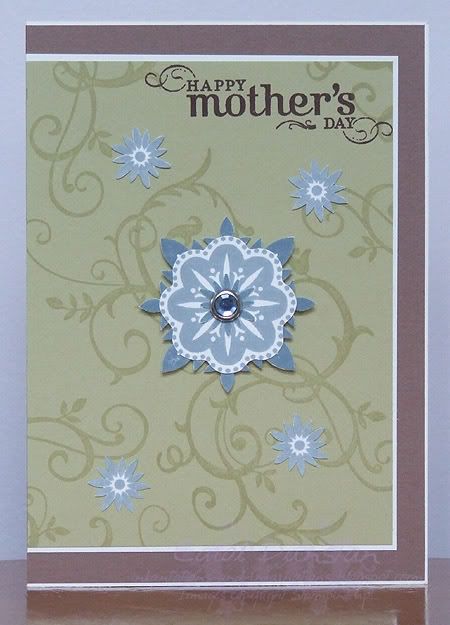
Here's the card I have made for MIL, and it was after I made this one that I realised Mther's Day was a whole extra week away. The colours for this card were inspired by some bedding I saw in Myer made by Kas Australia, but unfortunately they don't have it on their website and I have been unable to find it elsewhere. I think (going by my scrawled note on the back of a bus ticket...) that the bedding was called Vivid something, though it doesn't look very vivid to me and was just stripes from what I remember! Anyway, my daughter Tiarna and I agreed that the colours were Close To Cocoa, River Rock, Bordering Blue and Whisper White (yes, my daughters know SU!speak too, LOL). All of the gorgeous floral and swirly images are from the Baroque Motifs set and the sentiment is from Occasional Greetings, stamped in Chocolate Chip. In the center of the large layered flower is a medium Ice Rhinestone circle brad in blue, and the flower is popped up on dimensionals (what a surprise!)